
Beloved in Birmingham
Julia and Peter
Birmingham, MI
Brett Mountain Photography
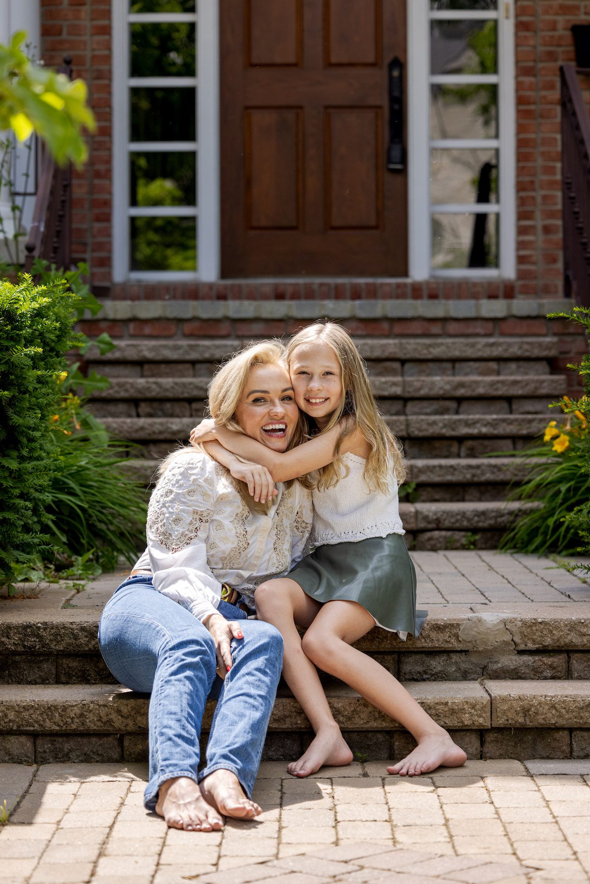
When Peter and his son welcomed his girlfriend, Julia, and her child into his gorgeous Birmingham home, they were excited to start their new life together. But there was one issue—the ornate, colorful decor left behind by the previous owners didn’t align with their style. Peter had worked with an interior designer before, but his existing furniture did not fit the vibe of his new home. The mix of the old design and mismatched furniture made it clear—they needed Concetti’s expertise to turn this house into their dream home.
Our Goal:
Our goal was to create spaces that truly reflected the homeowners—stylish, functional, and uniquely theirs, starting with the primary bedroom and bathroom, their daughter’s room, and the guest bedroom and bathroom. Discover how Phases 1 and 2 of our three-phase approach designed modern, timeless, and cohesive spaces that made the house a stylish, functional sanctuary for years to come.
Our Solution:
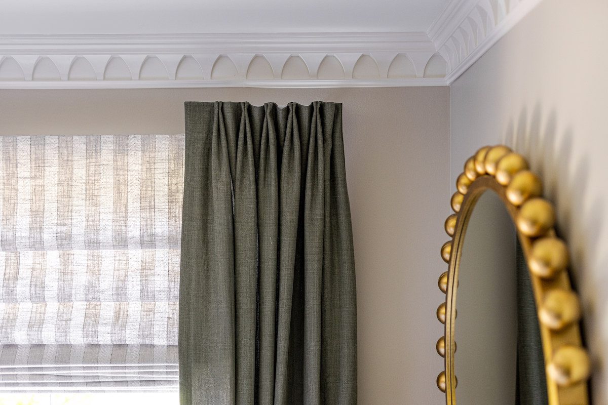
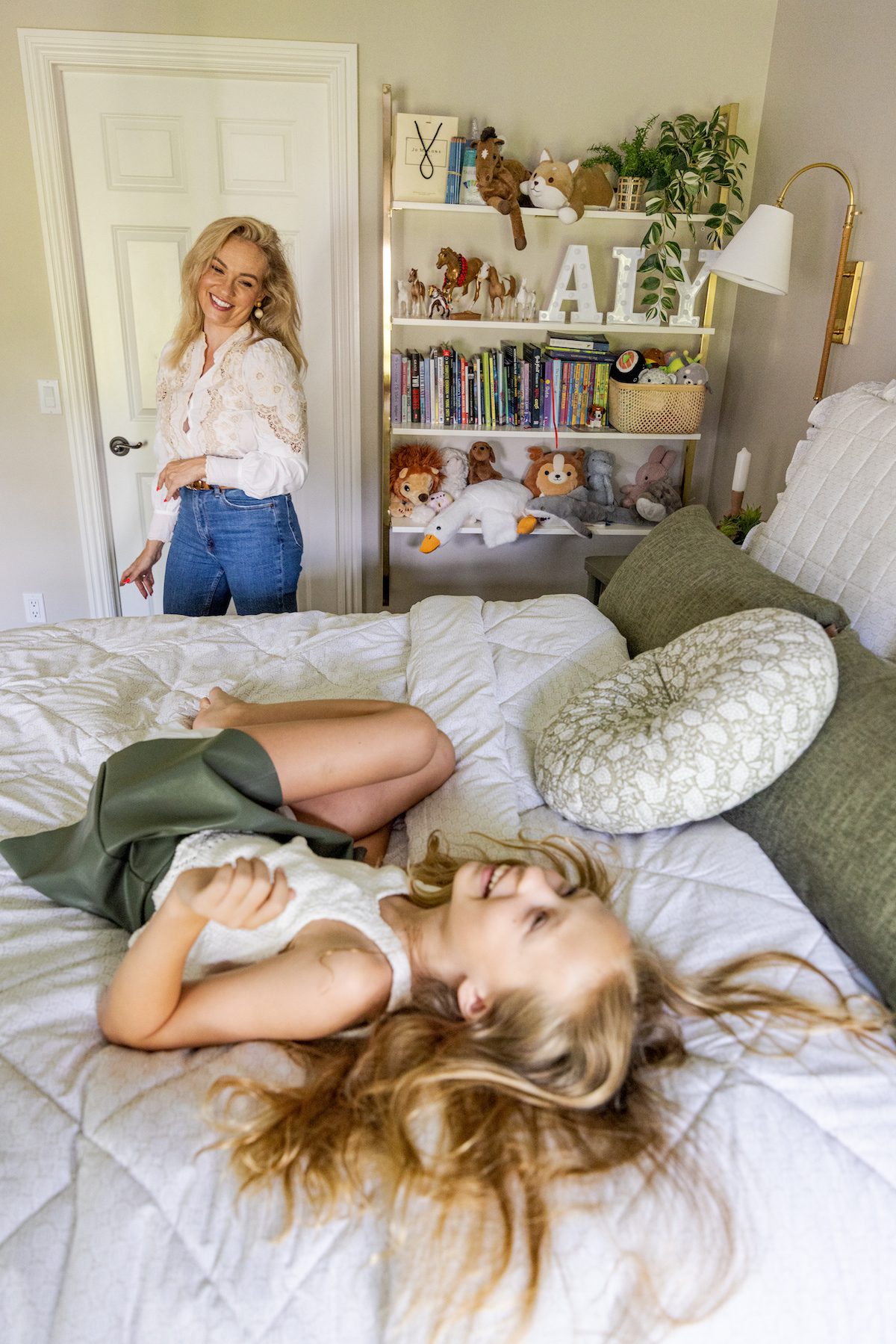
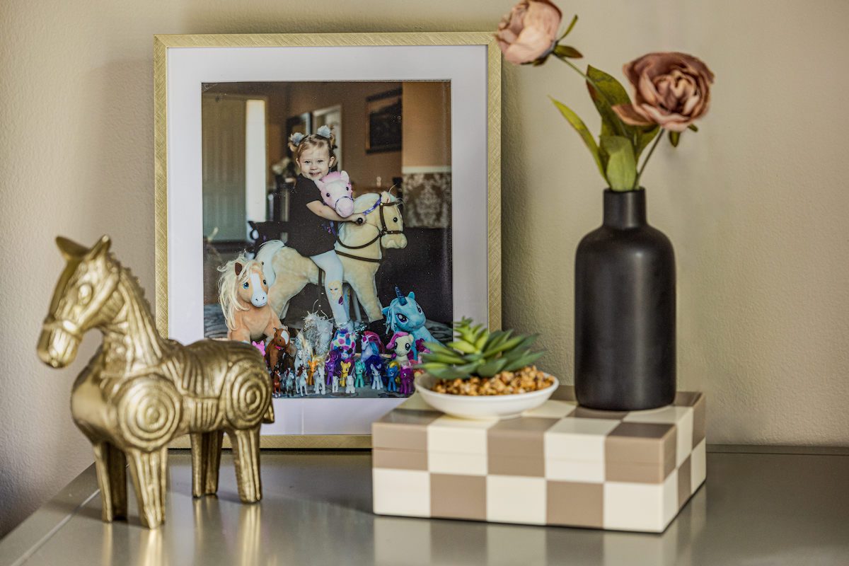
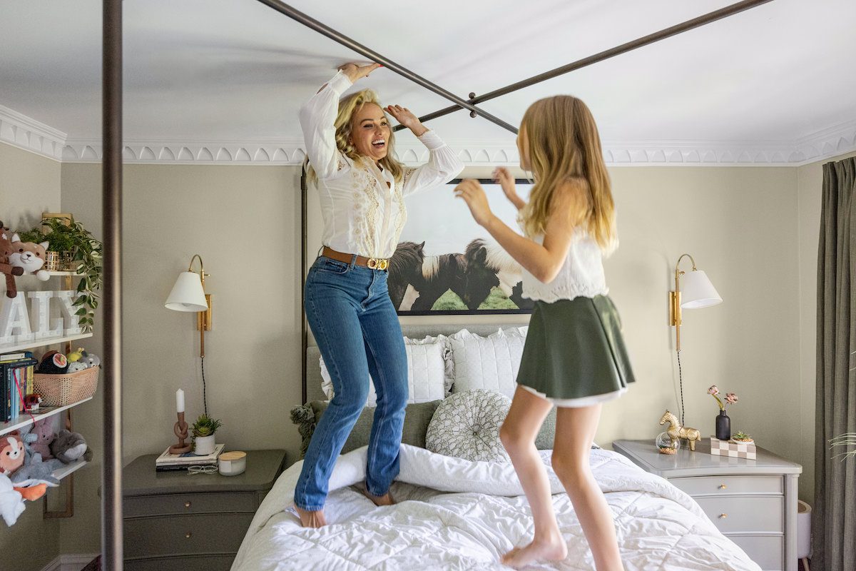
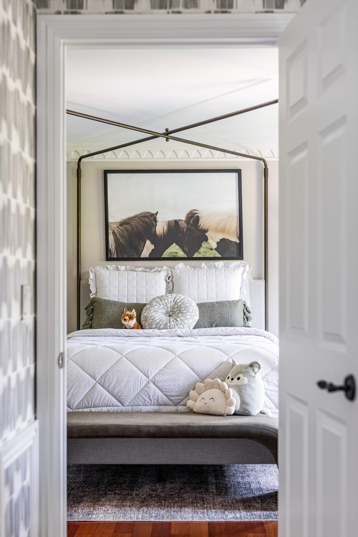
As a Phase 1 & 2 project, all upgrades were made through furnishing and finishes, meaning there was little to no construction involved in the transformation. Beginning in their daughter’s room, Julia and Peter wanted a space that would grow with her. The layout stayed the same, but we updated the furniture and used thoughtful consideration with other elements in the room, like using the vertical stripes in the roman shades to mimic the structure of the canopy style, bringing the eye upwards to gorgeous existing molding. To avoid the disruption of electrical work, we chose plug-in sconces instead of traditional table lamps. This decision created extra space for a young girl’s growing collection of personal items and mementos.
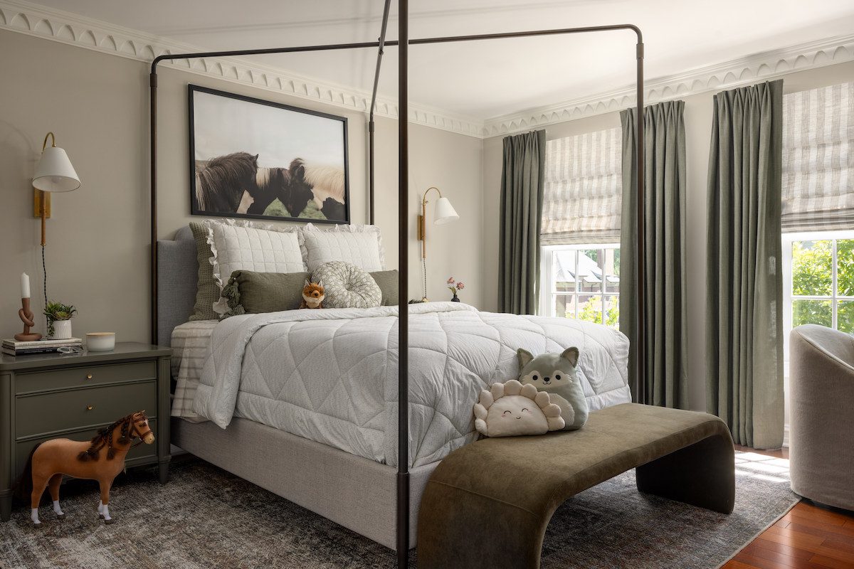

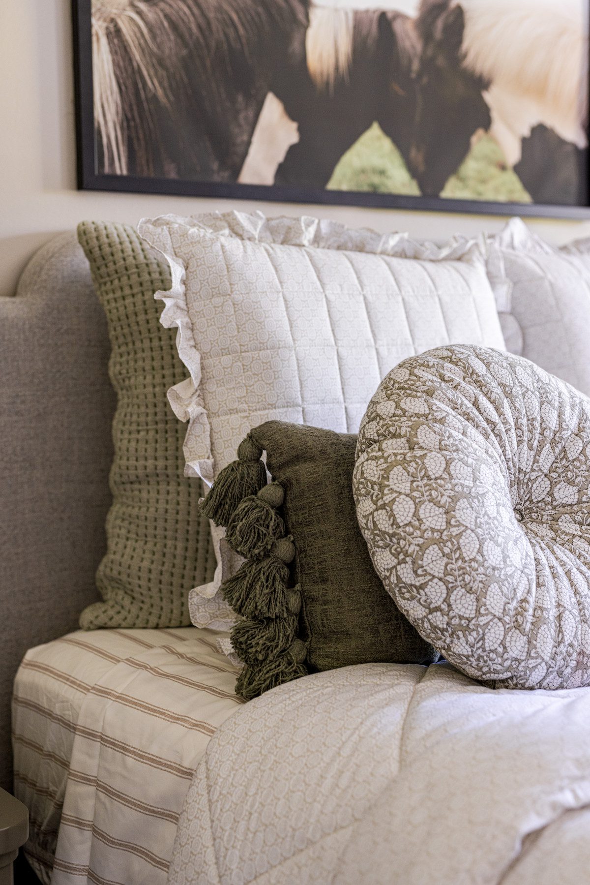
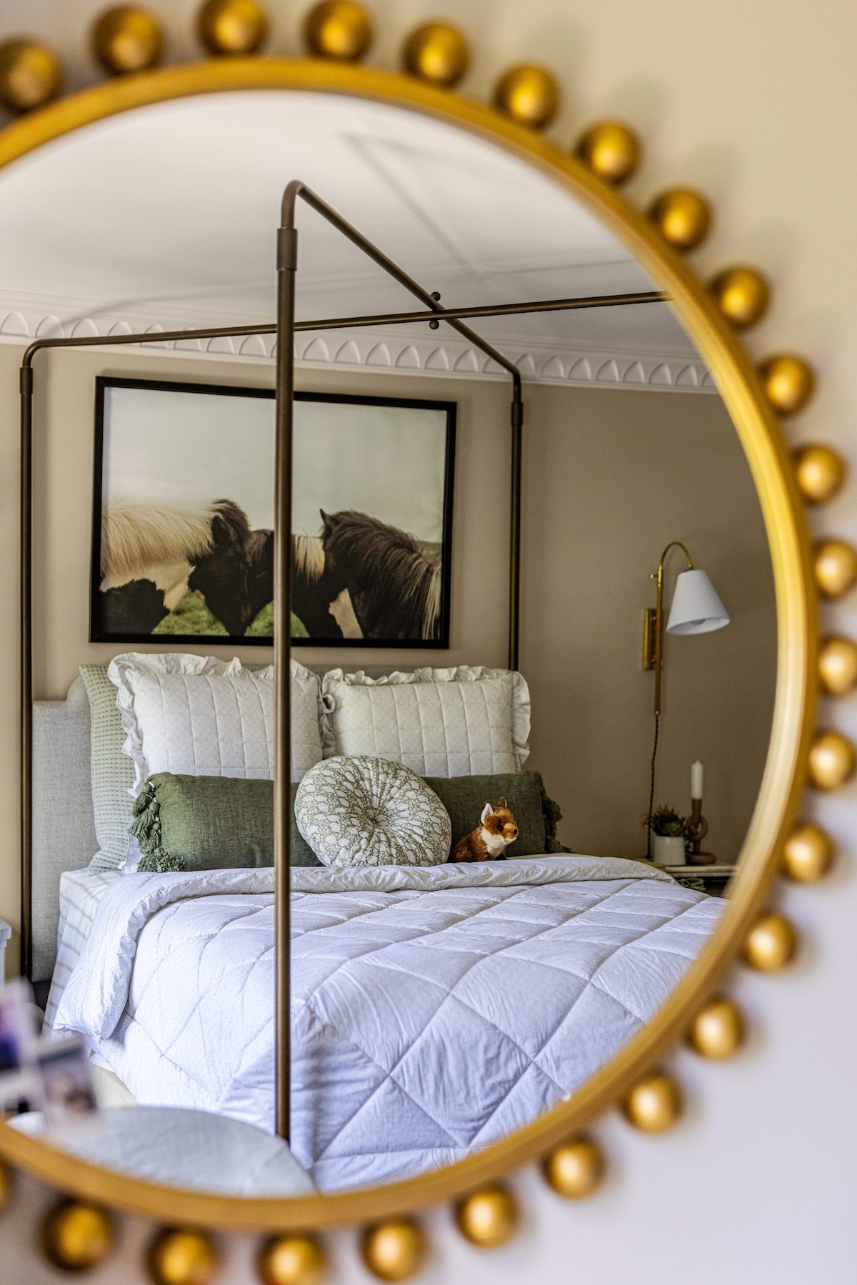
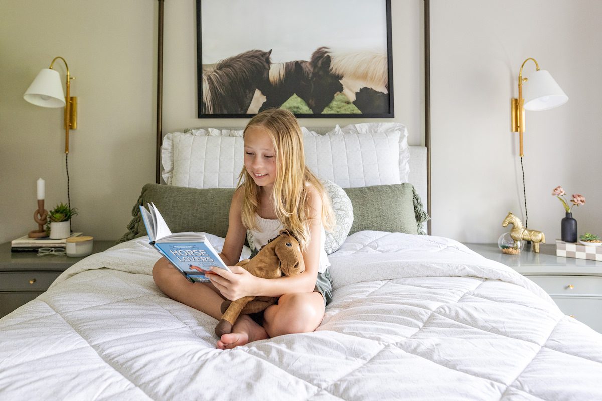
Their daughter has always loved horses, so we aimed to design a space inspired by her current passion that she could grow into. We maintained a neutral color palette that is both playful and sophisticated, drawing colors from the horse artwork above the bed. The outcome? A cozy, elegant space she’ll cherish for years to come.
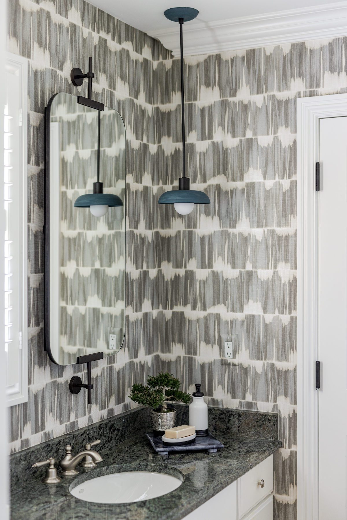
Right off their daughter’s bedroom is the Jack and Jill bathroom, which also connects to the newly refreshed guest bedroom. We used a modern blue and green textured wallpaper to seamlessly link both rooms and complements the existing vanity in the space. Modern updates to the hardware, vanity mirror, and light fixtures align the bathroom with the family’s personal style, creating a cohesive look throughout.
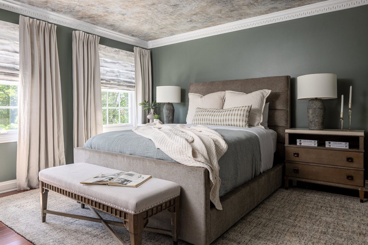
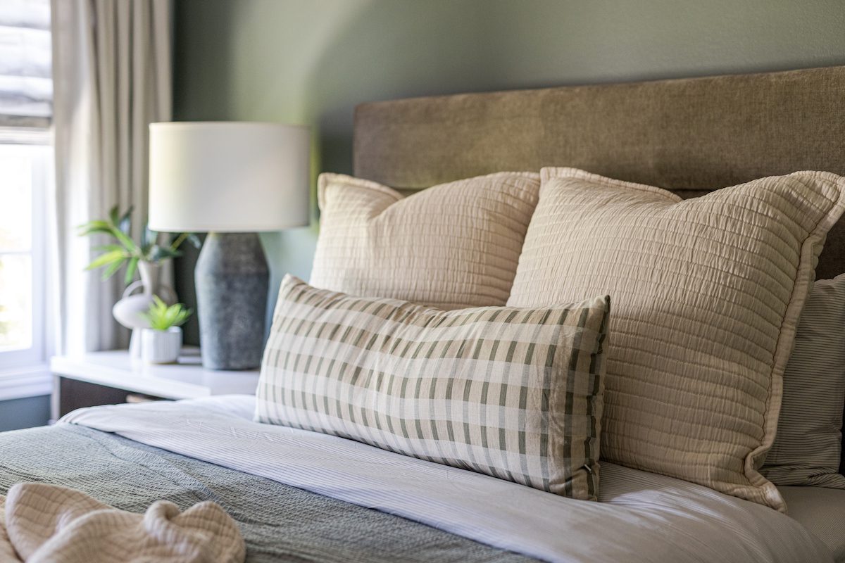
The guest room design was inspired by the ceiling wallpaper, which naturally draws the eye up, accentuating the beautiful scalloped molding. We extended this theme throughout the space with a neutral, layered palette, creating a serene and inviting atmosphere for guests. We paired functional soft treatments, like Roman shades with solid stationary panels, to enhance the room’s style. The texture of the wallpaper is echoed in the table lamps, creating a cohesive and connected feel within the space.
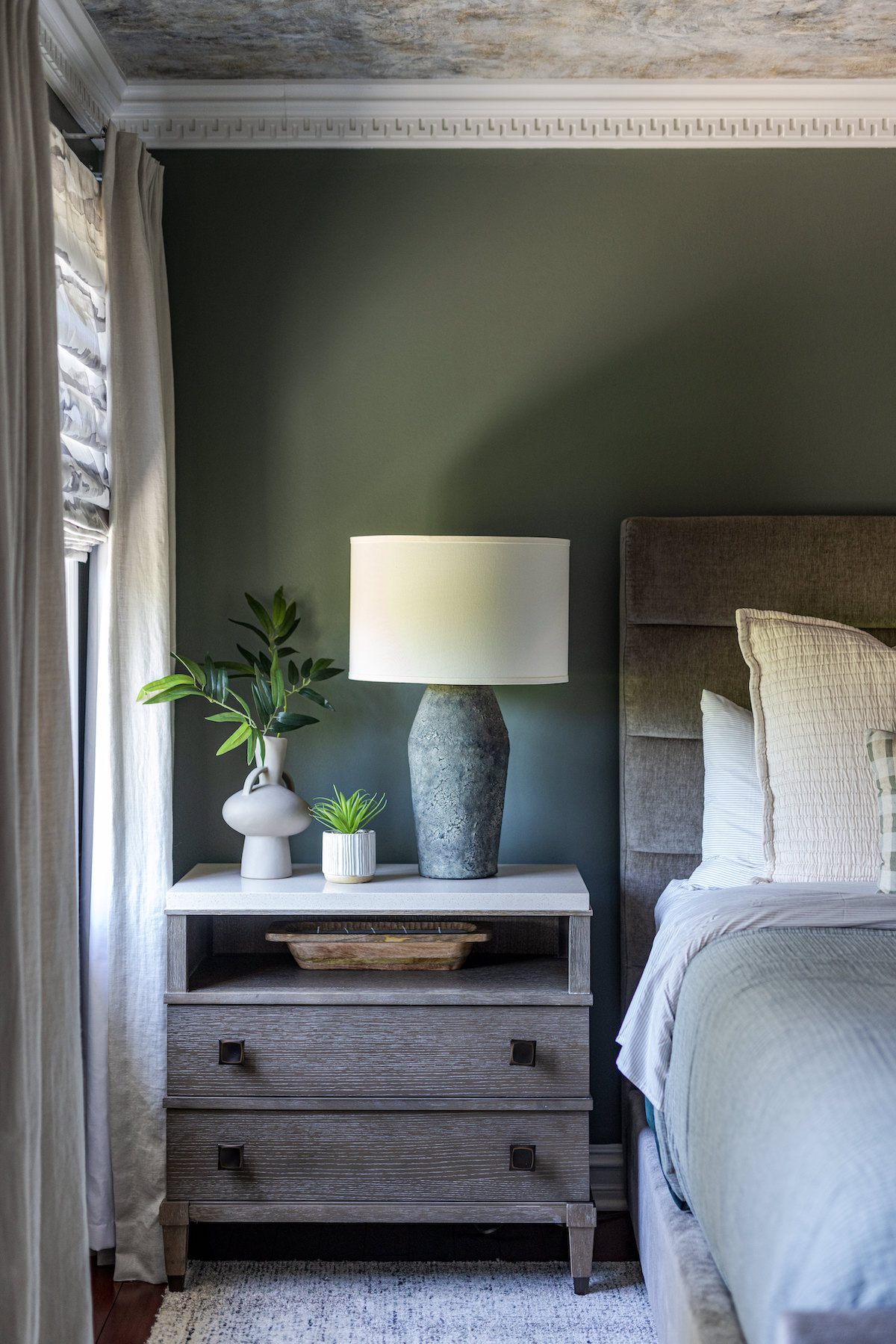
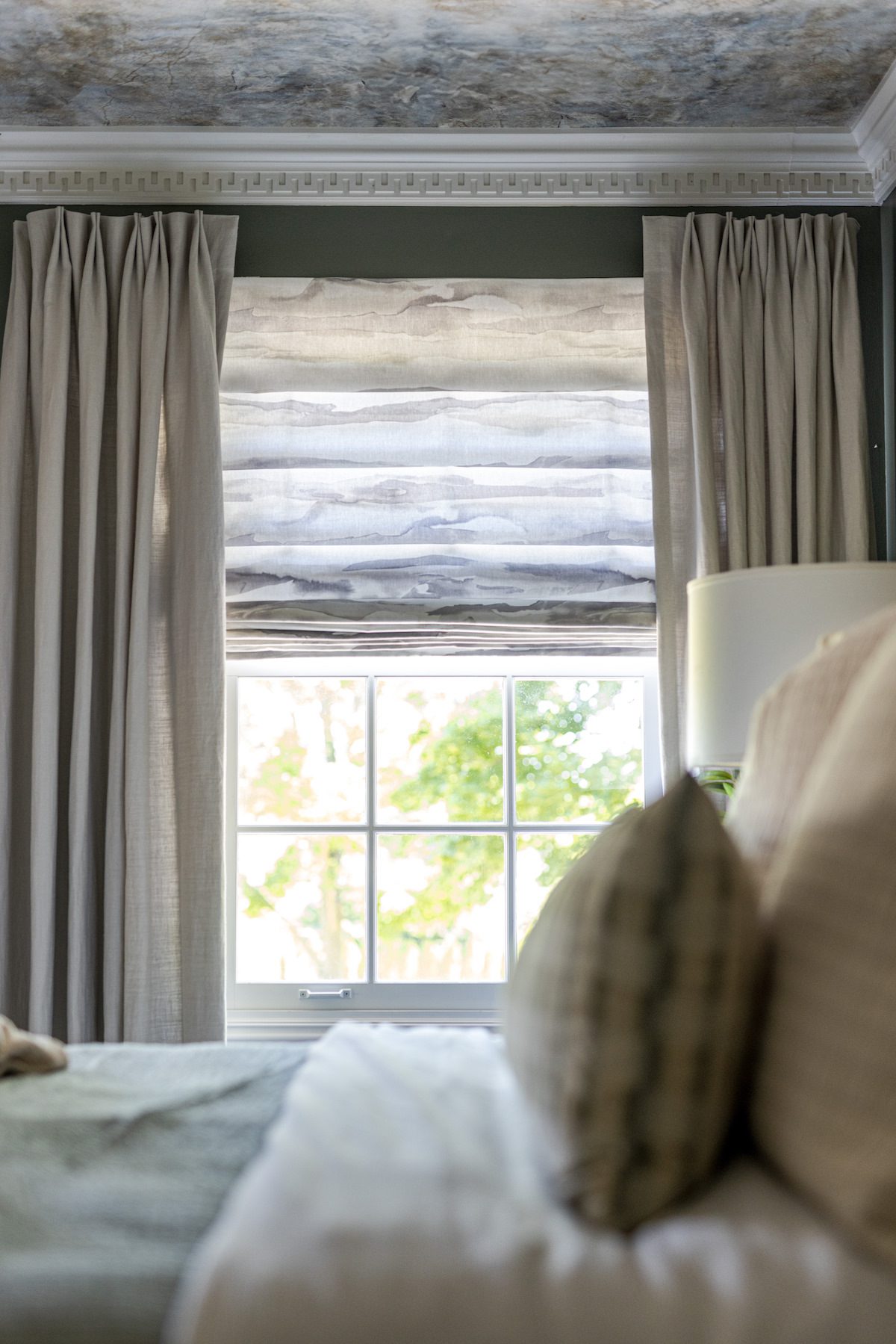
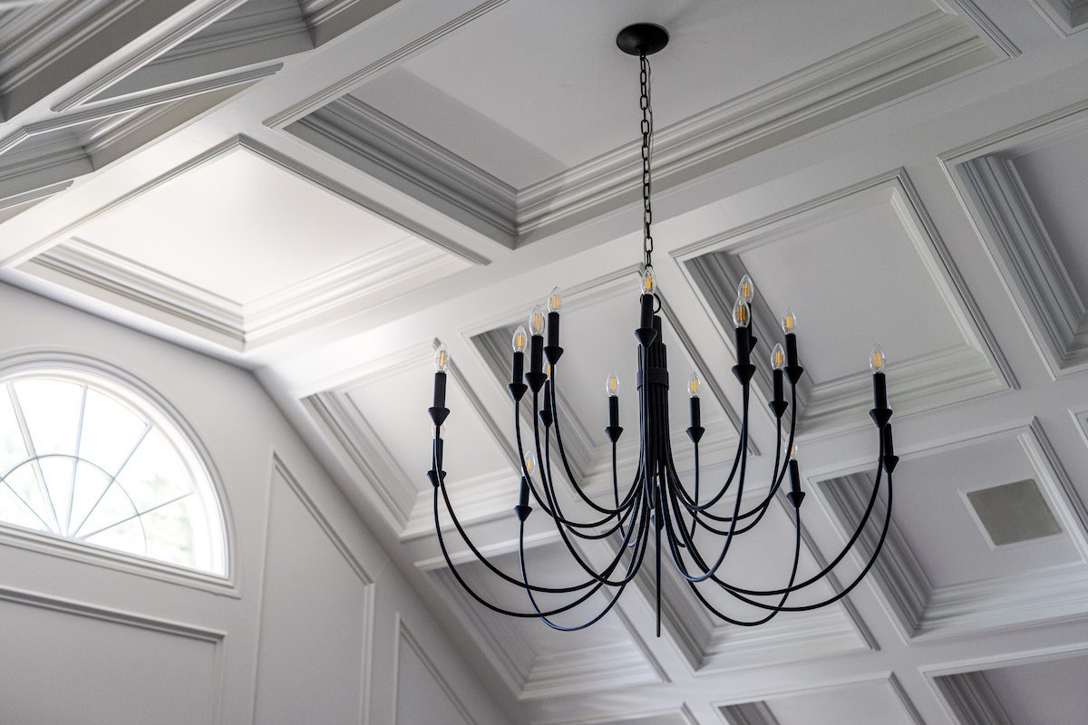
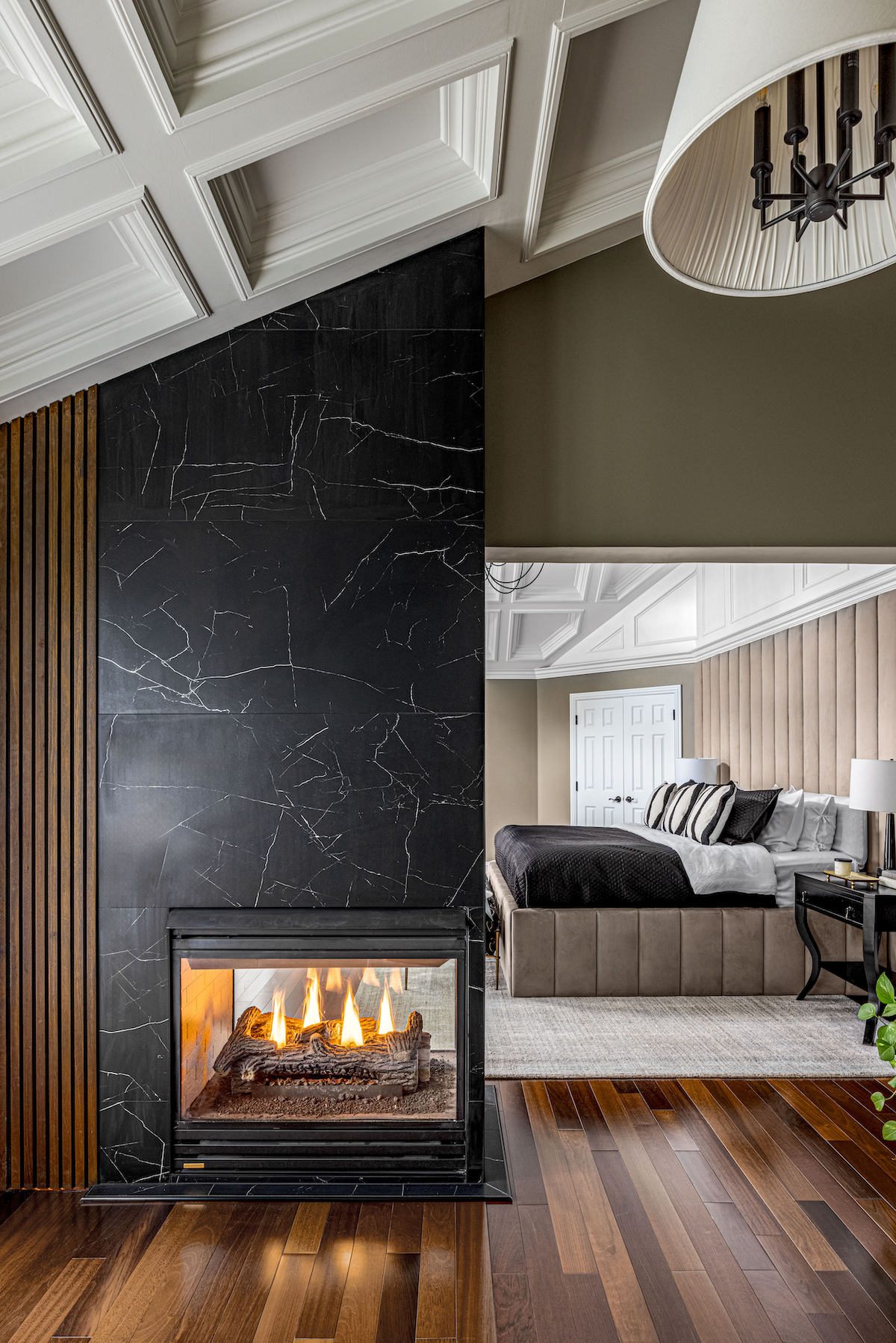
The final room we transformed is the true showstopper: the primary bedroom. While the space had beautiful existing elements, it was long overdue for a makeover, as the current furniture and fireplace failed to complement its grandeur. We were thrilled to unlock its full potential. One of the biggest challenges was the asymmetrical ceiling detail. As it’s misaligned with the center of the room, it made bed placement difficult.
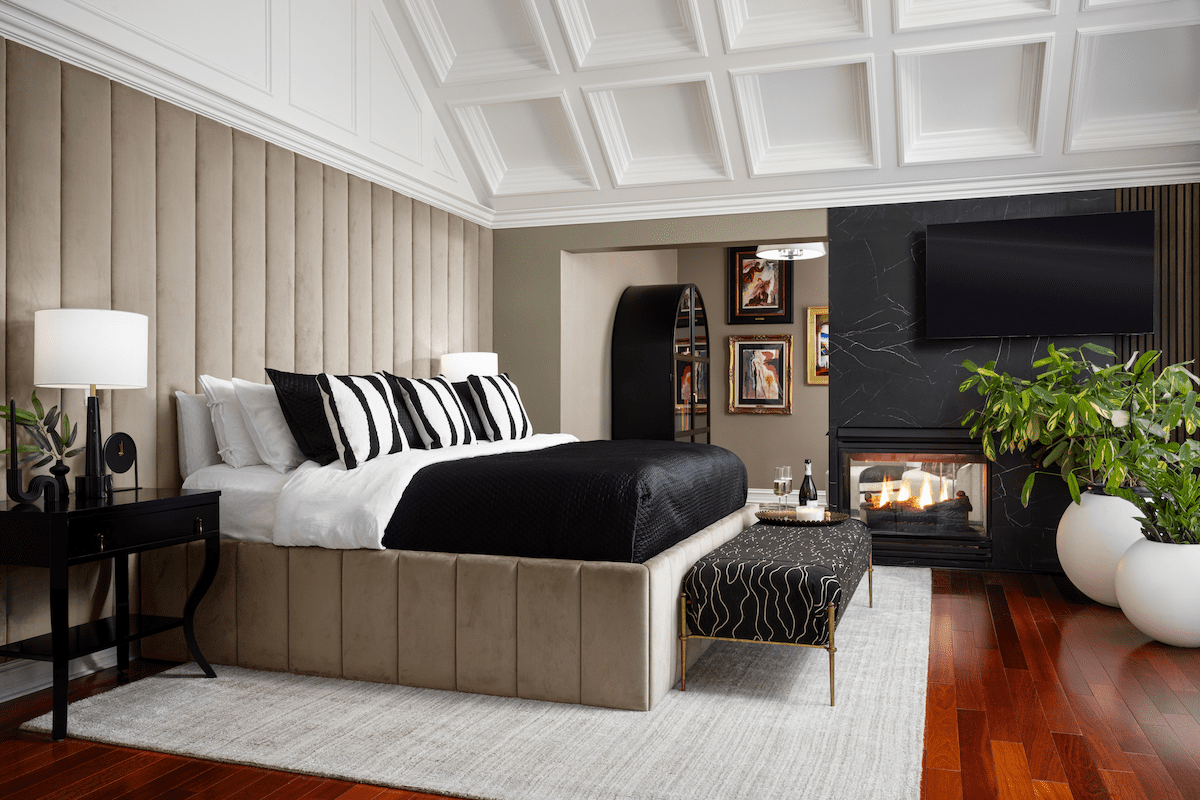
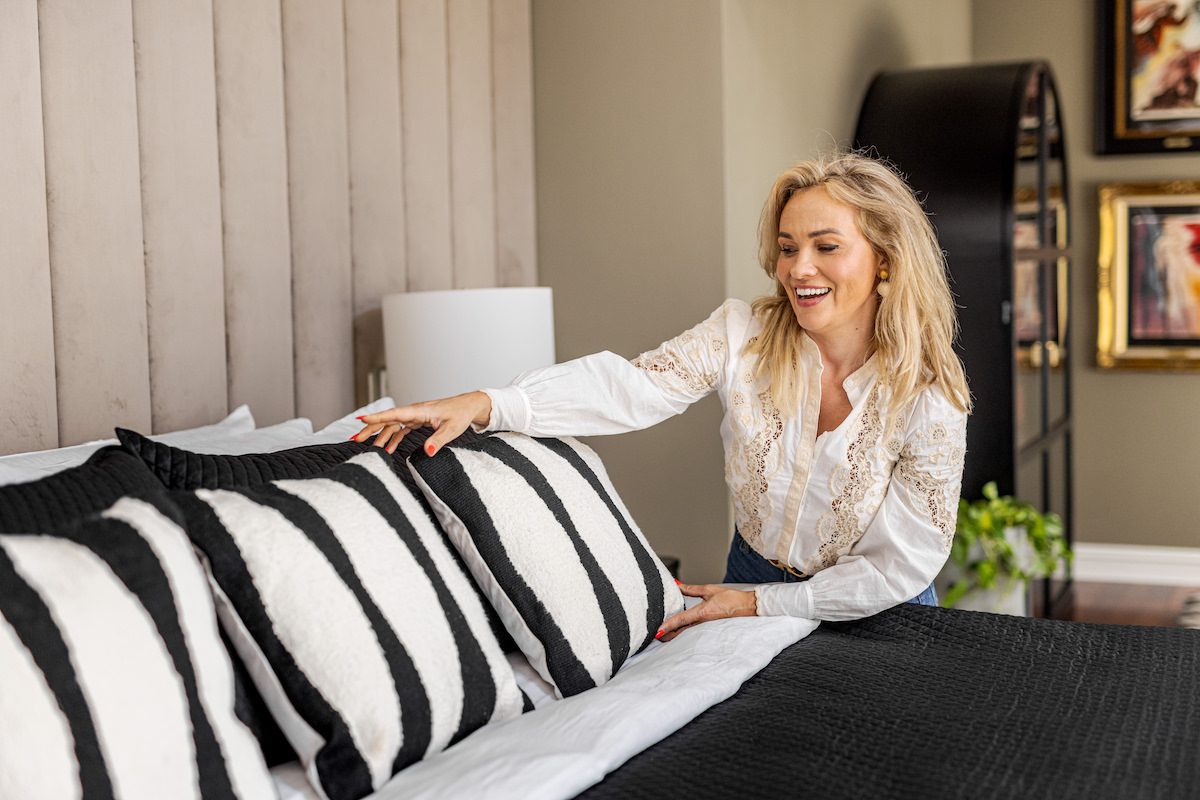
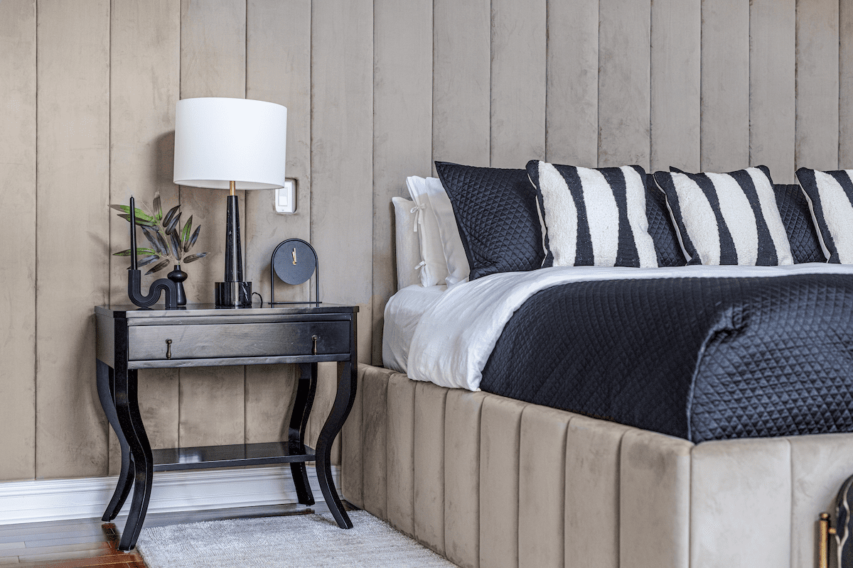
To overcome this, we designed a full-wall headboard that not only concealed the tricky bed placement but also grounded the intricate ceiling details. This headboard became the room’s focal point, adding a sense of balance and enhancing the room's grandeur without major construction. Though the color palette may seem simply neutral, a lot of strategic thought went into selecting the taupe shade for the headboard and walls. We chose a taupe with significant green undertones to tone down the existing red flooring. Since red and green are opposites on the color wheel, they counteract each other, allowing the stark whites and blacks to take center stage.
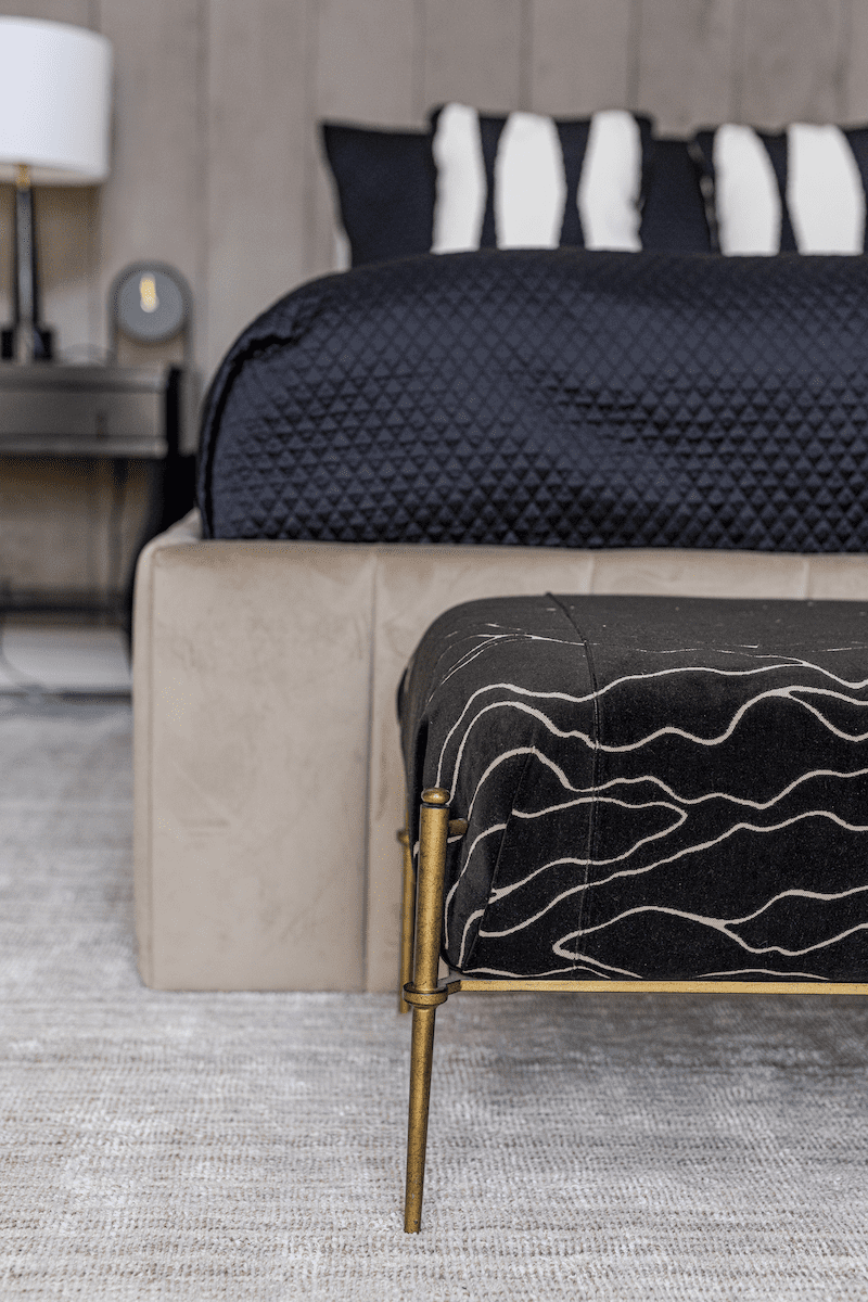
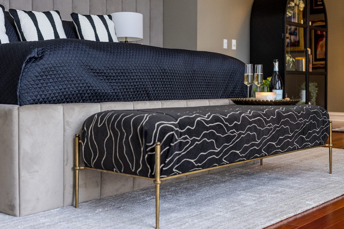
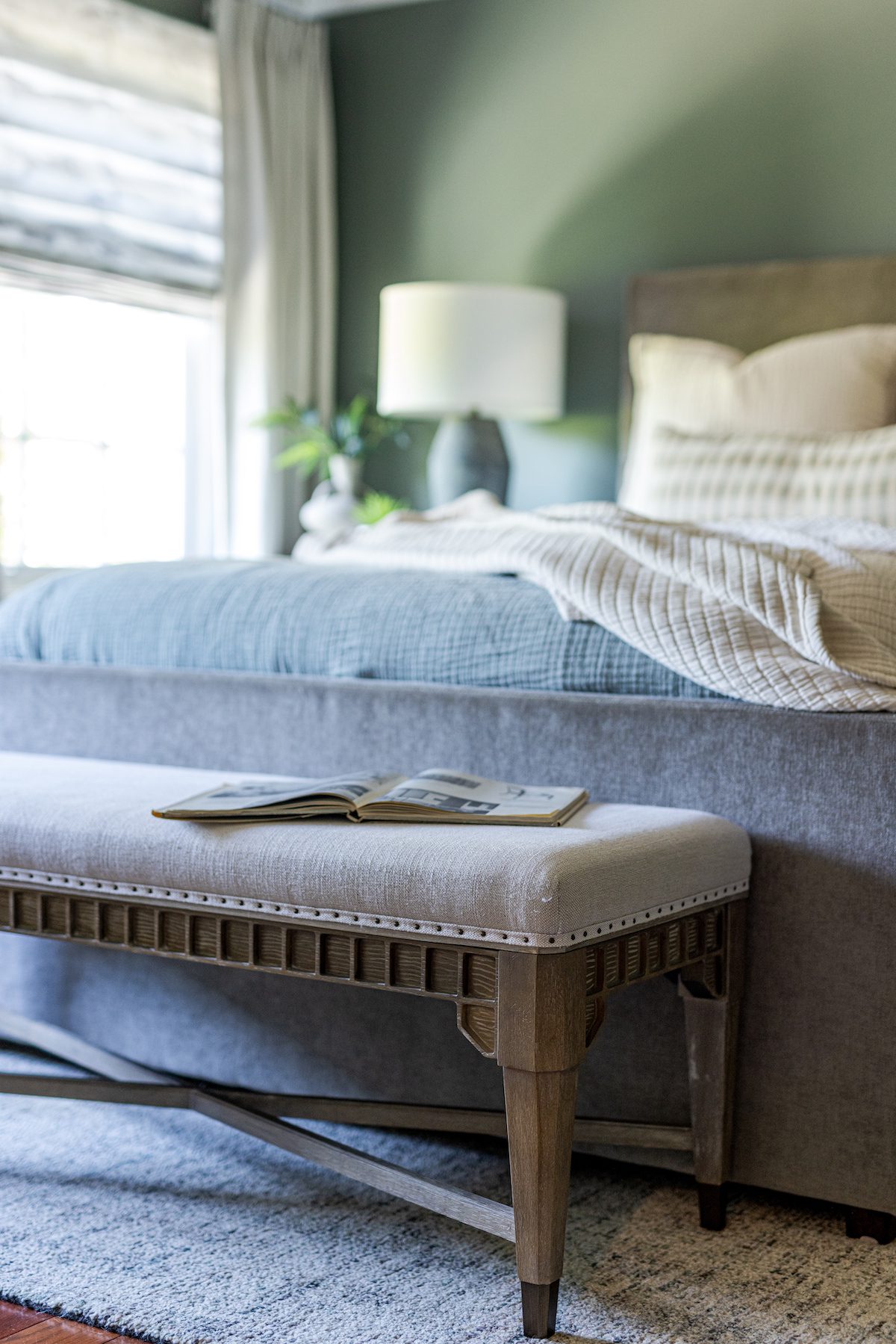
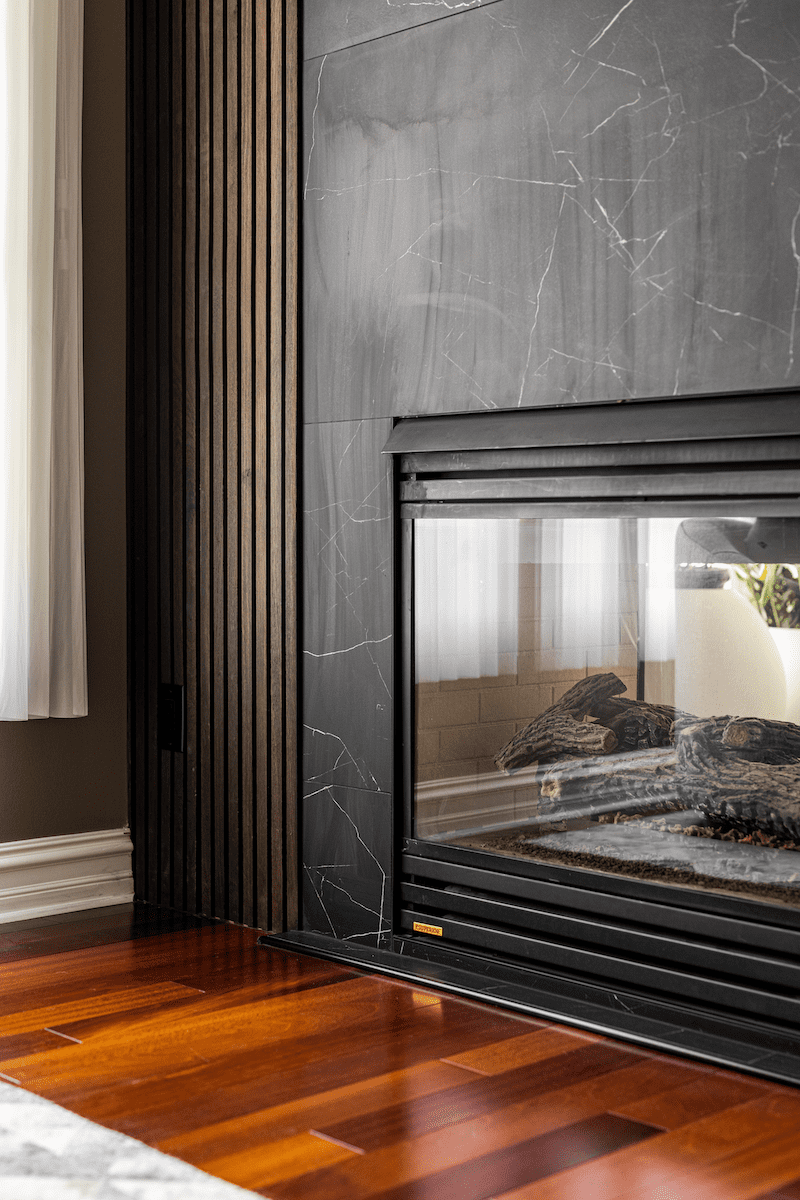
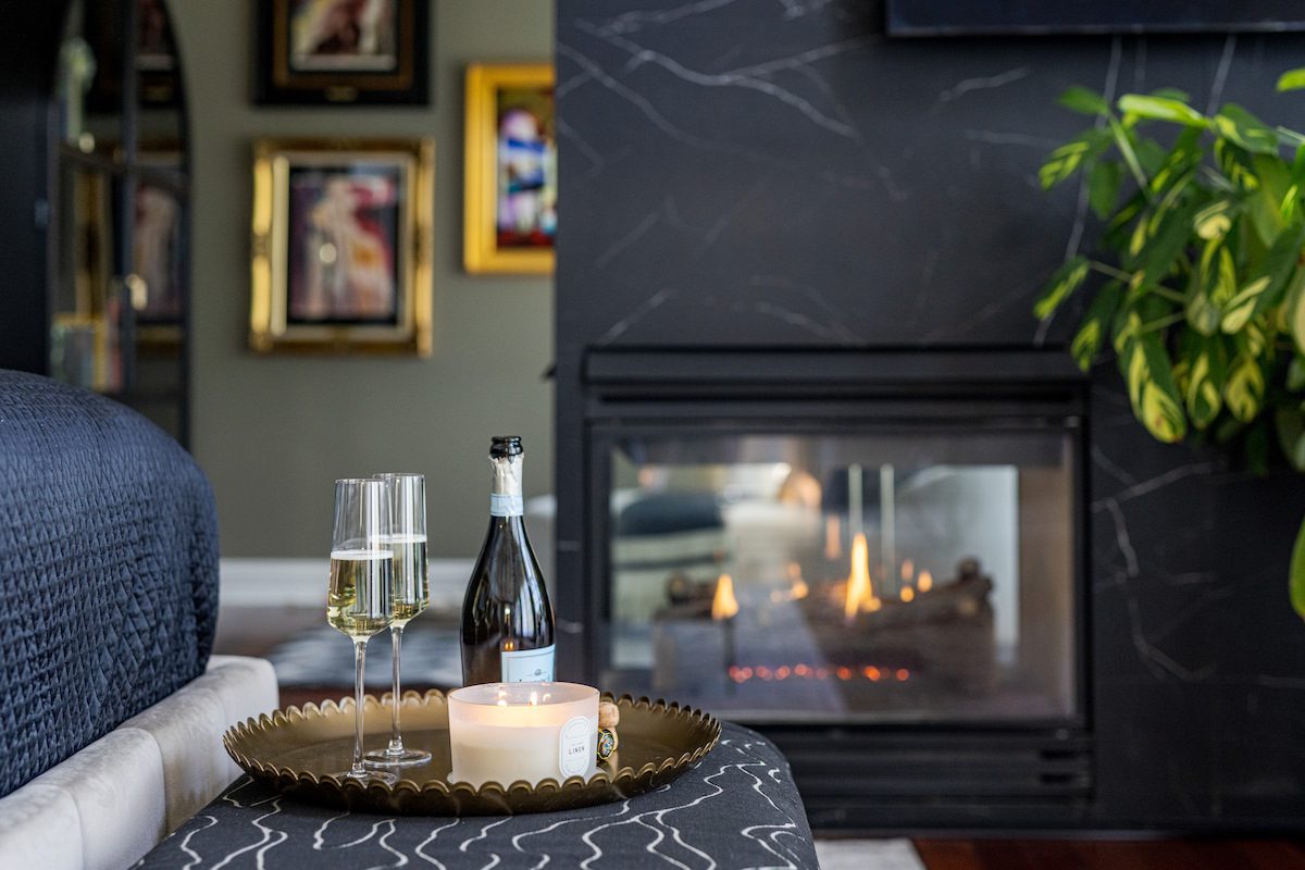
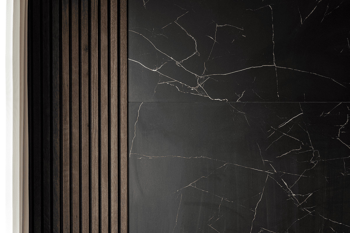
The bench at the foot of the bed is upholstered in a custom-cut velvet fabric that mimics the veining of the new large-scale tile cladding the fireplace. The existing traditional mantel and surround didn’t fit the new contemporary style, so we opted for bold, large-scale tiles to make a statement with the three-sided fireplace, which separates the main bedroom from the adjacent reading nook.

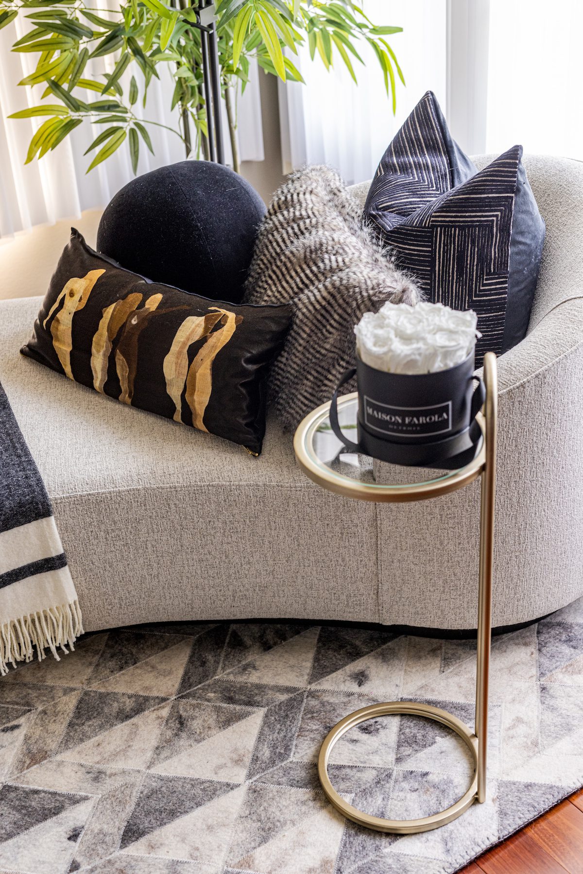
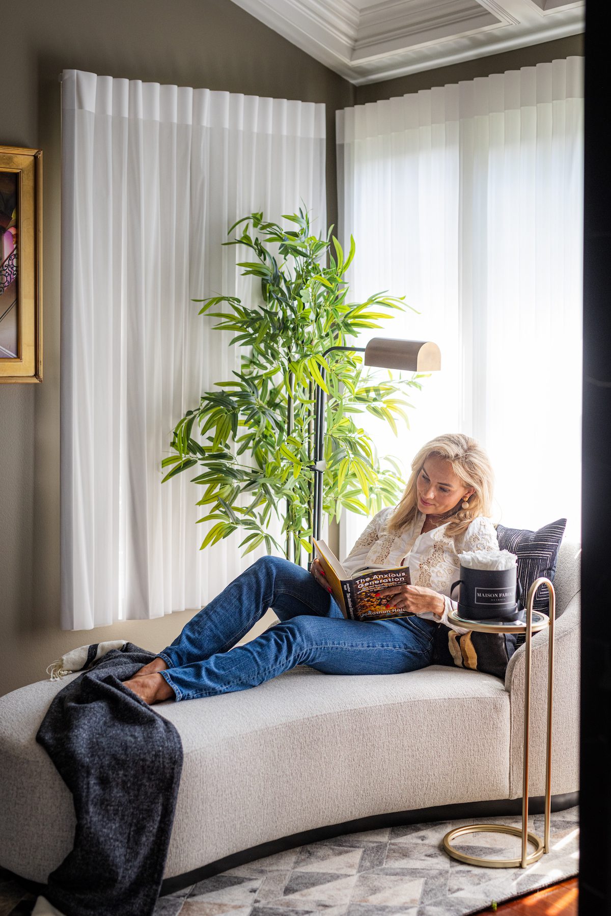
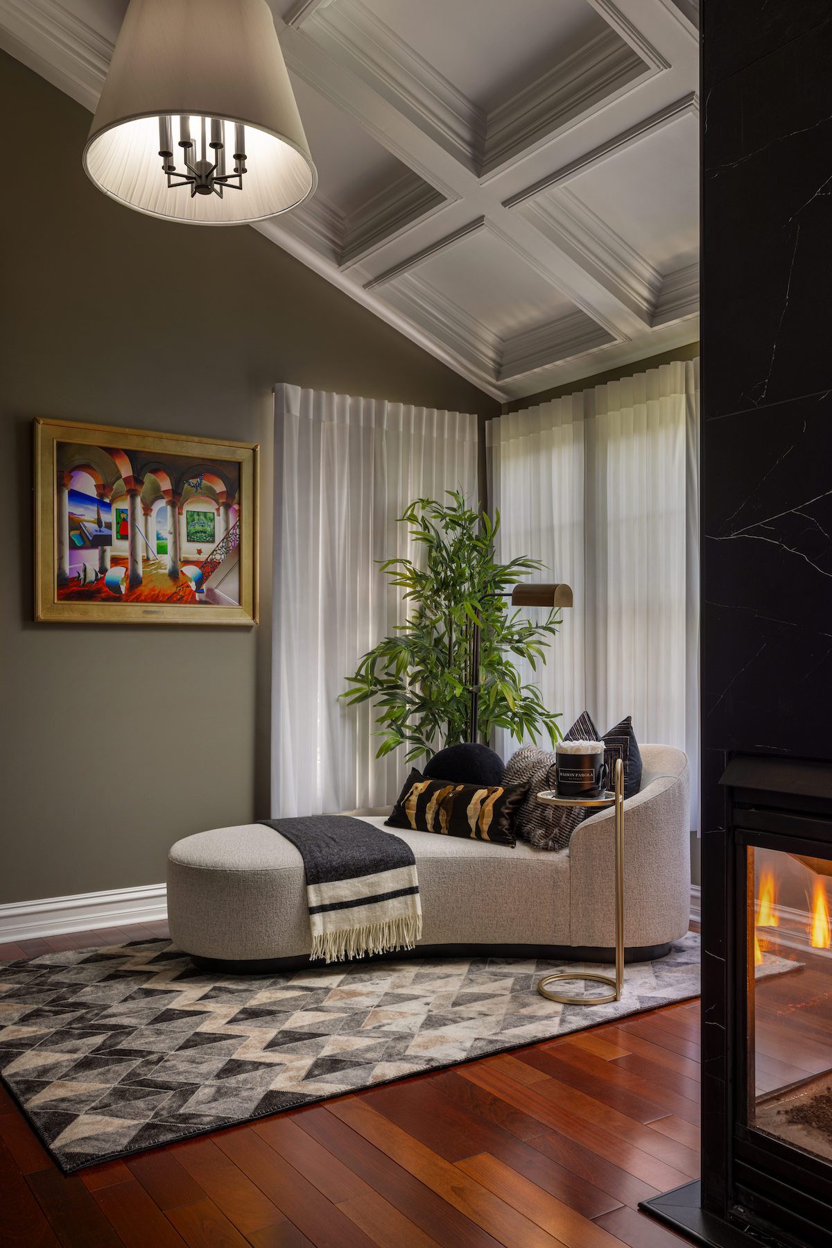
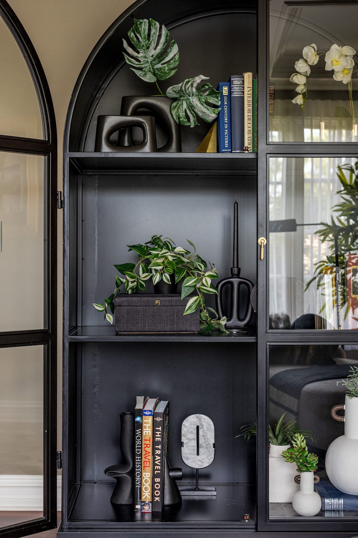
On the other side of the fireplace, we created a cozy reading nook—a separate yet cohesive space within the primary suite. Since Julia loves to read, we completed the nook with a modern chaise lounge and a large bookshelf, creating her perfect retreat.
A unique aspect of Concetti’s phased process is our ability to meet clients exactly where they are. For Peter and Julia, they were ready to upgrade furniture and finishes in the bedroom spaces but weren’t yet prepared for a full renovation of their primary bathroom. By completing Phase 1 for that space—Discovery and Co-Creating—we were able to develop a vision for the space that they can use to complete the project in their own time.
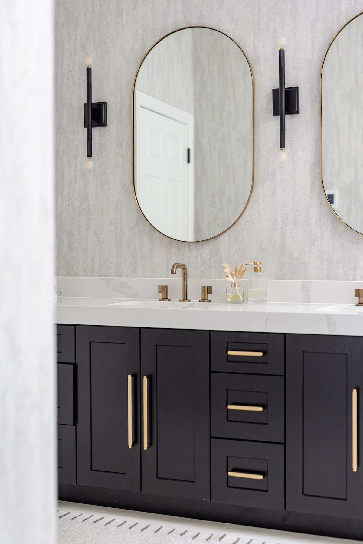
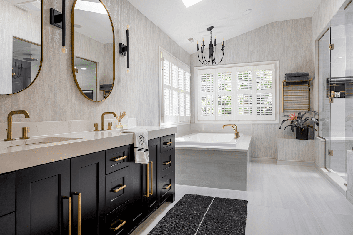
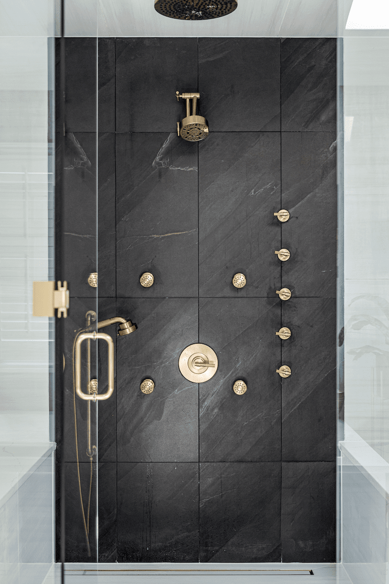
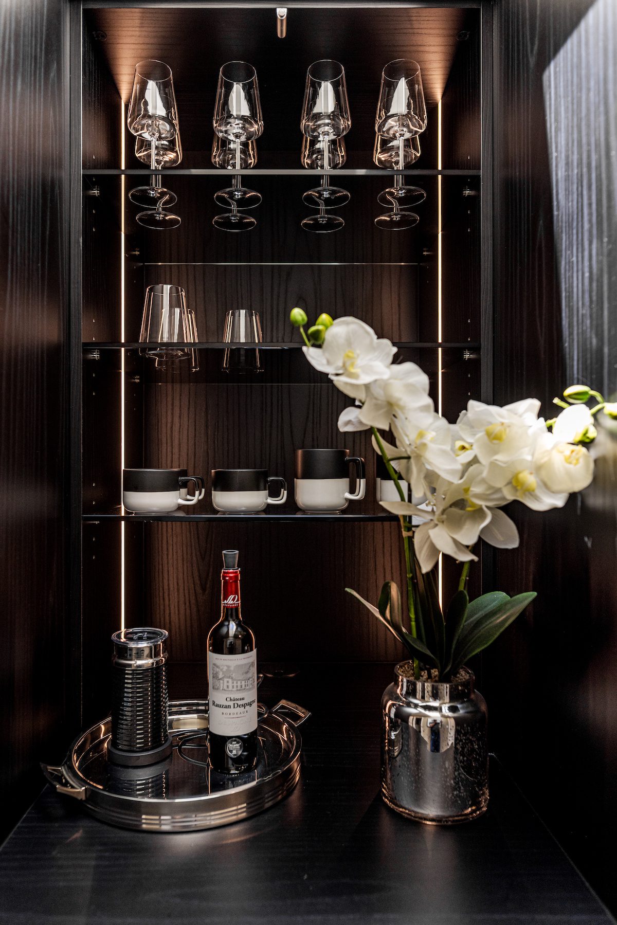
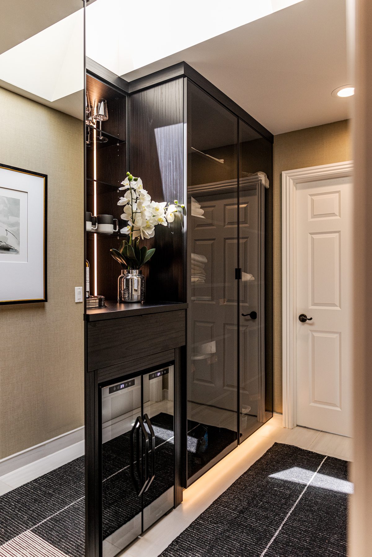
In the vestibule between the bedroom and bathroom, we repurposed an oversized vanity into additional closet space, complete with a wine fridge for storing crisp champagne. The original bathroom had a challenging layout and didn’t match their taste or the newly updated bedroom. Our design introduced a more functional floor plan paired with black-and-white palette, gold hardware, and sleek furnishings to enhance the modern feel.
Peter and Julia’s home transformation centered around bringing their authentic style to life, ensuring each room was as functional as it was beautiful. Through the first two phases of our three-phase approach, we used thoughtful furnishings and finishes to turn a once mismatched and uninviting space into a home that truly reflects their identity.