
Luxury Loo for Two
Scott and Julie
Canton, MI
Brett Mountain Photography, Ellie Frances Photography
AGH Construction
Scott and Julie first teamed up with Concetti nearly a decade ago for a kitchen remodel, and now, in 2024, they’re back for an even bigger transformation—this time tackling two bathrooms! With their sons growing up fast, they wanted to elevate the kids' shared bathroom and their own primary suite. Using our three-phase approach, we didn’t just meet their vision—we enhanced it, with upgraded features, boosted functionality, and smart storage solutions to create two stunning, timeless spaces.
Our Goal:
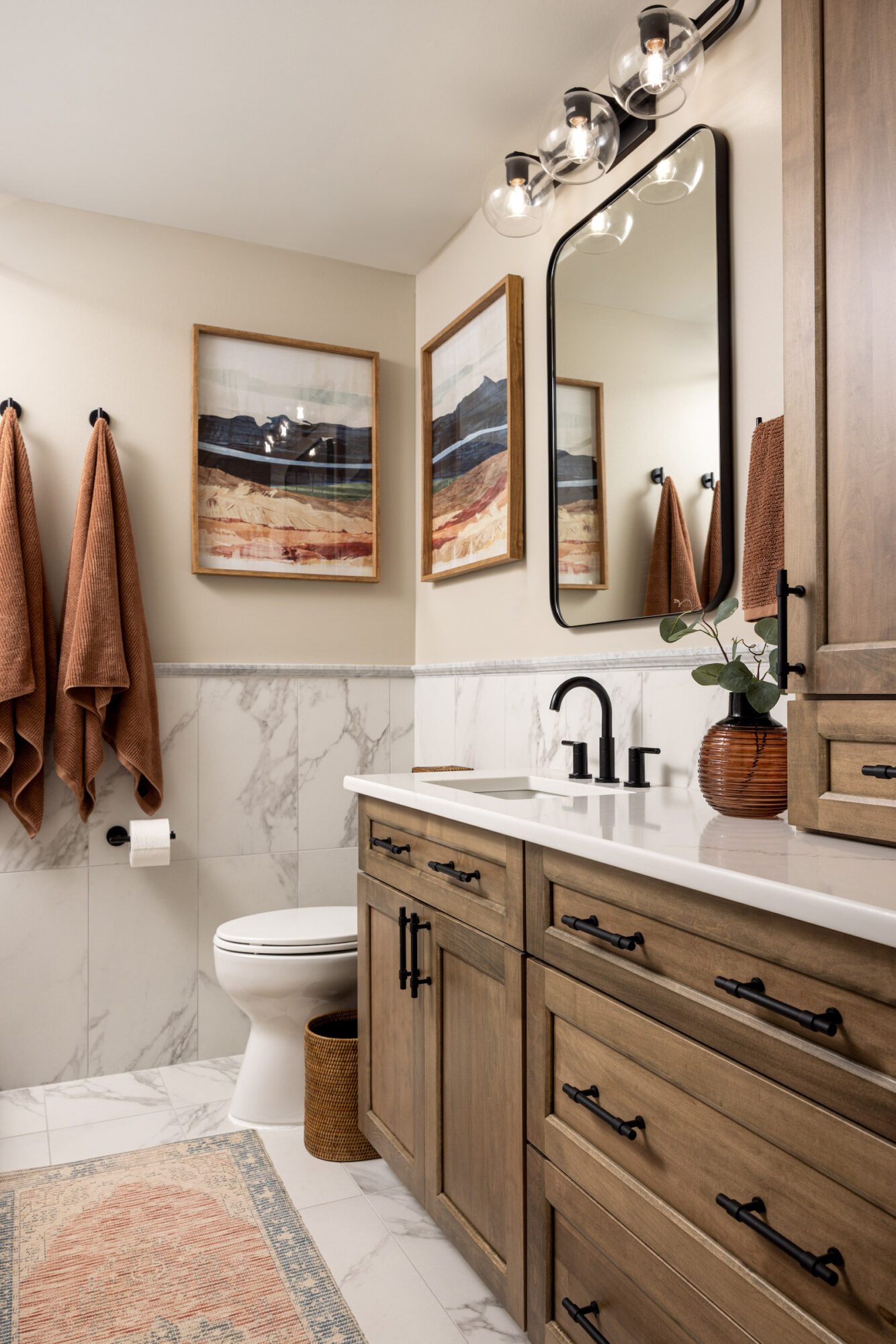
During phase 1 of our three-phrase approach, we worked closely with Scott and Julie to identify their goals for each bathroom. For the boys' bathroom, they wanted to create a space that would grow with their teenage sons, so we introduced warm wood elements, enhanced functionality, and upgraded builder grade cabinets and countertops. A deep soaking tub with a handheld shower was also a must for added convenience. In their primary bathroom, the focus was to keep the double vanity while elevating the space with modern materials and thoughtful upgrades for a light, airy, and luxurious feel.
Our Solution:
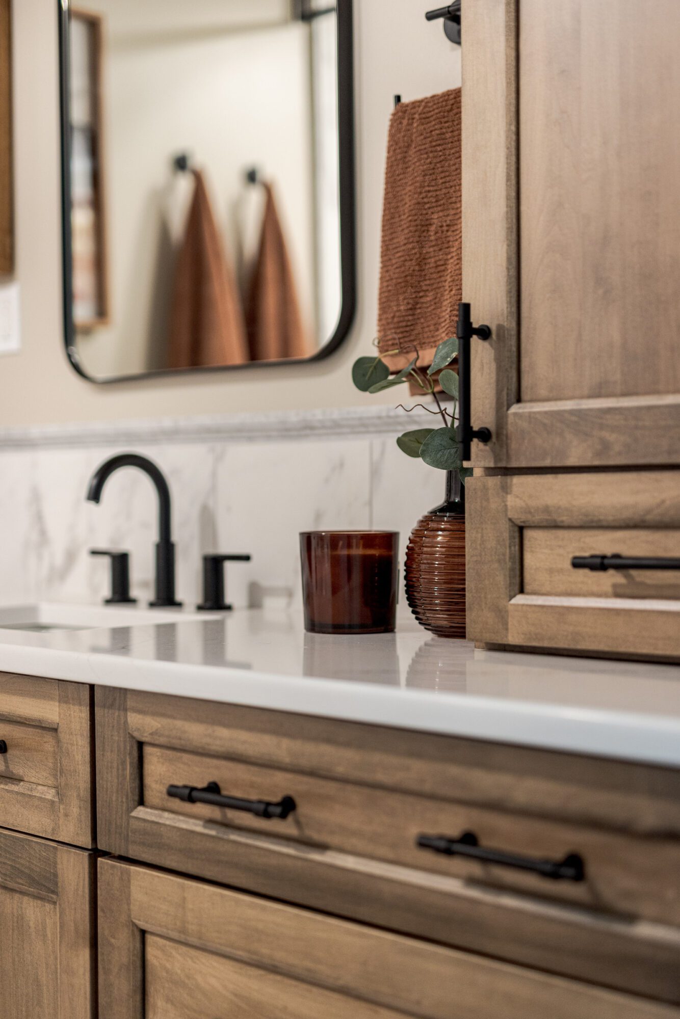
Starting in the boys' bathroom, we knew it was time for a major upgrade to match their growing needs and style, meaning the frog wallpaper and builder-grade cabinets had to go. We swapped out the outdated look for warm wood tones and sleek black fixtures, all working together to create that classic Carrara marble vibe with durable porcelain quartz countertops identified in their visual guidelines. Not only does it look incredible, but it's also durable and incredibly easy to maintain, perfectly aligning with Scott and Julie's goal of a timeless design that won’t need another remodel down the road.
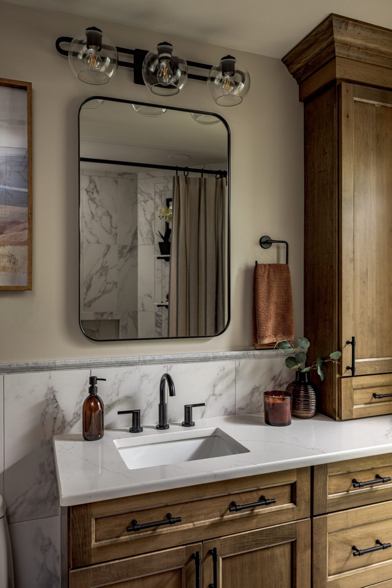
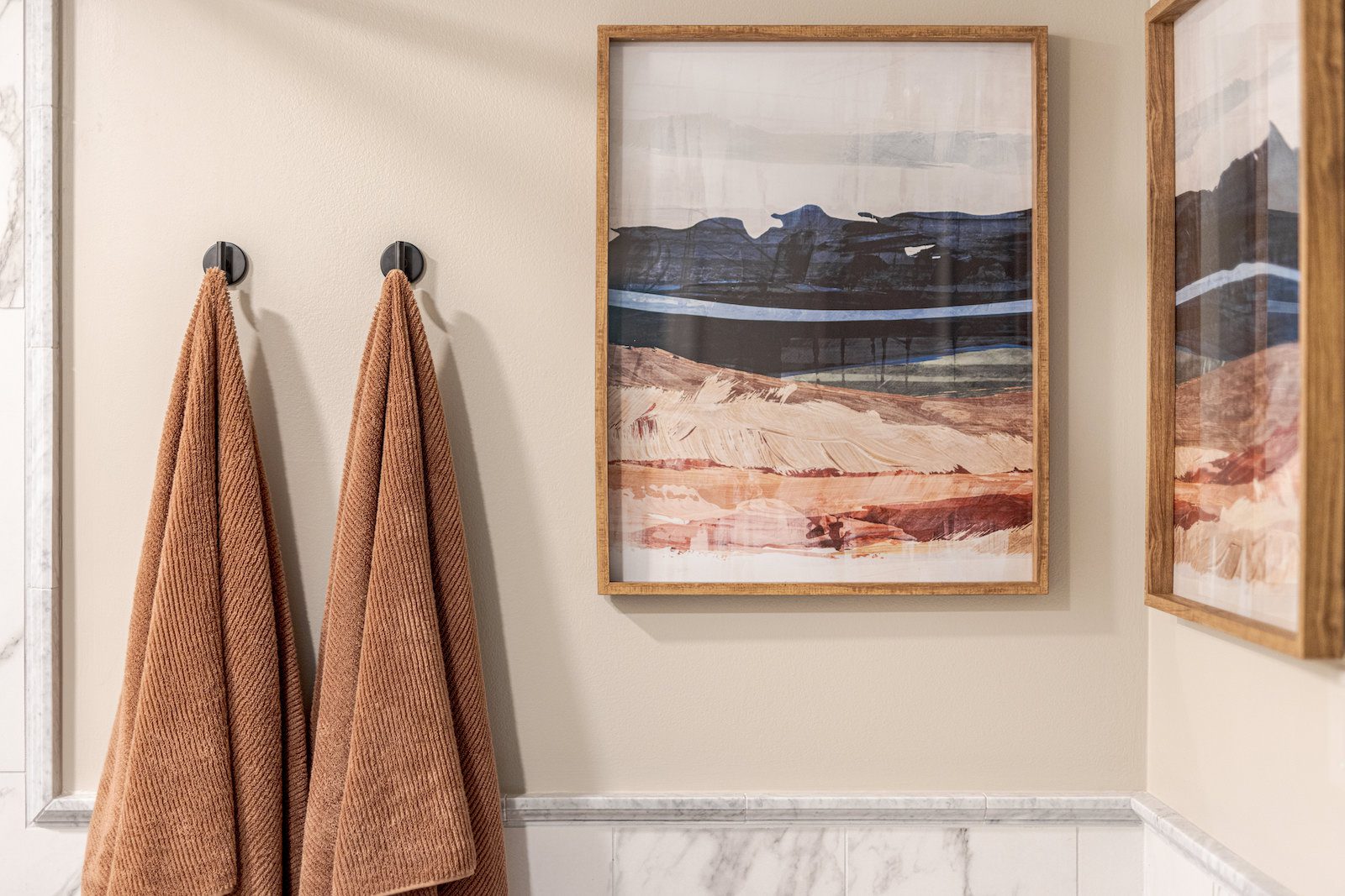
One of the biggest game-changers? We went from a double sink to a single undermount sink, which allowed for additional storage underneath the vanity. The black fixtures and a chic medicine cabinet mirror brought in a fresh, modern touch, while cozy details like art, towels, and a runner softened the overall look, making the space feel warm and inviting.
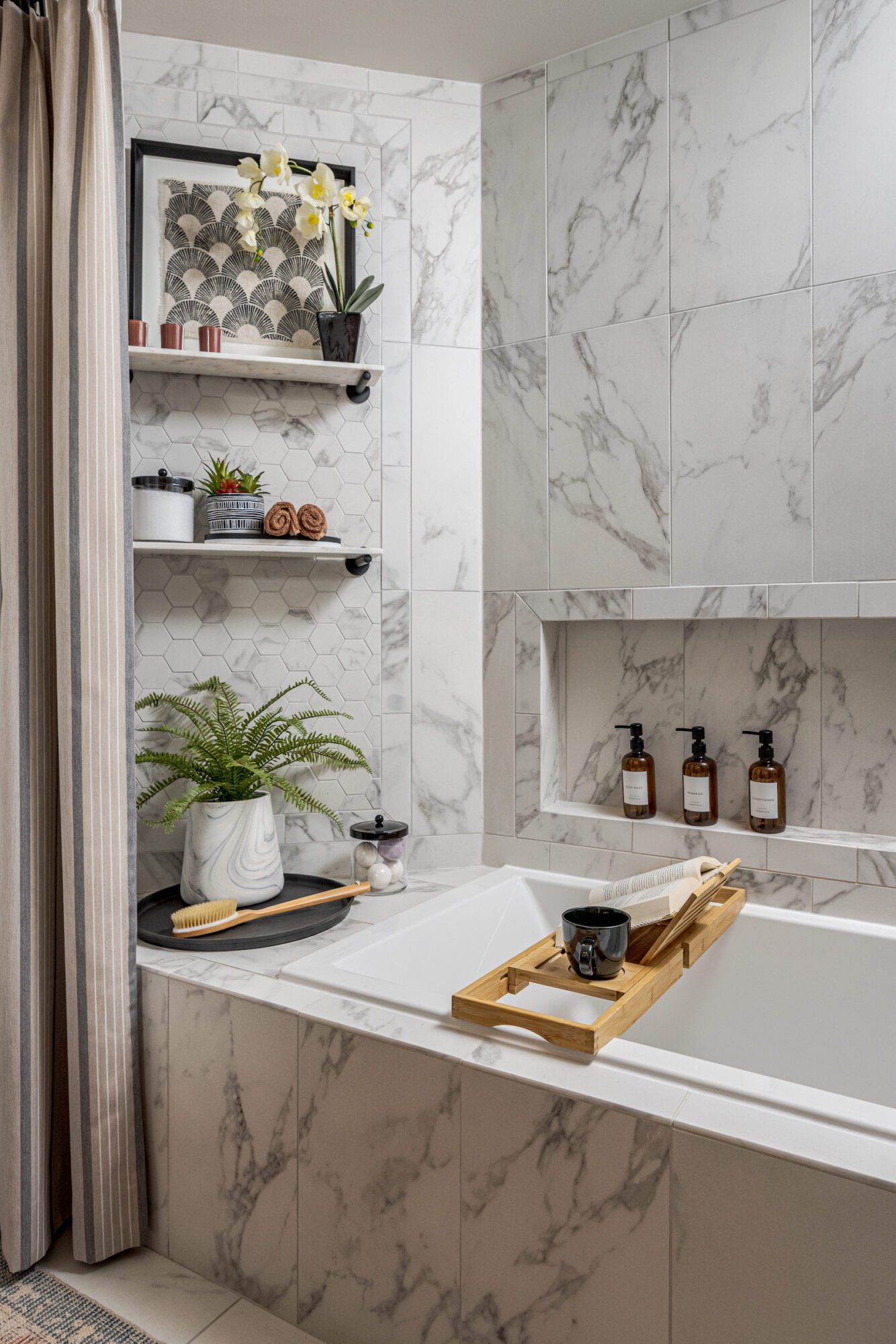
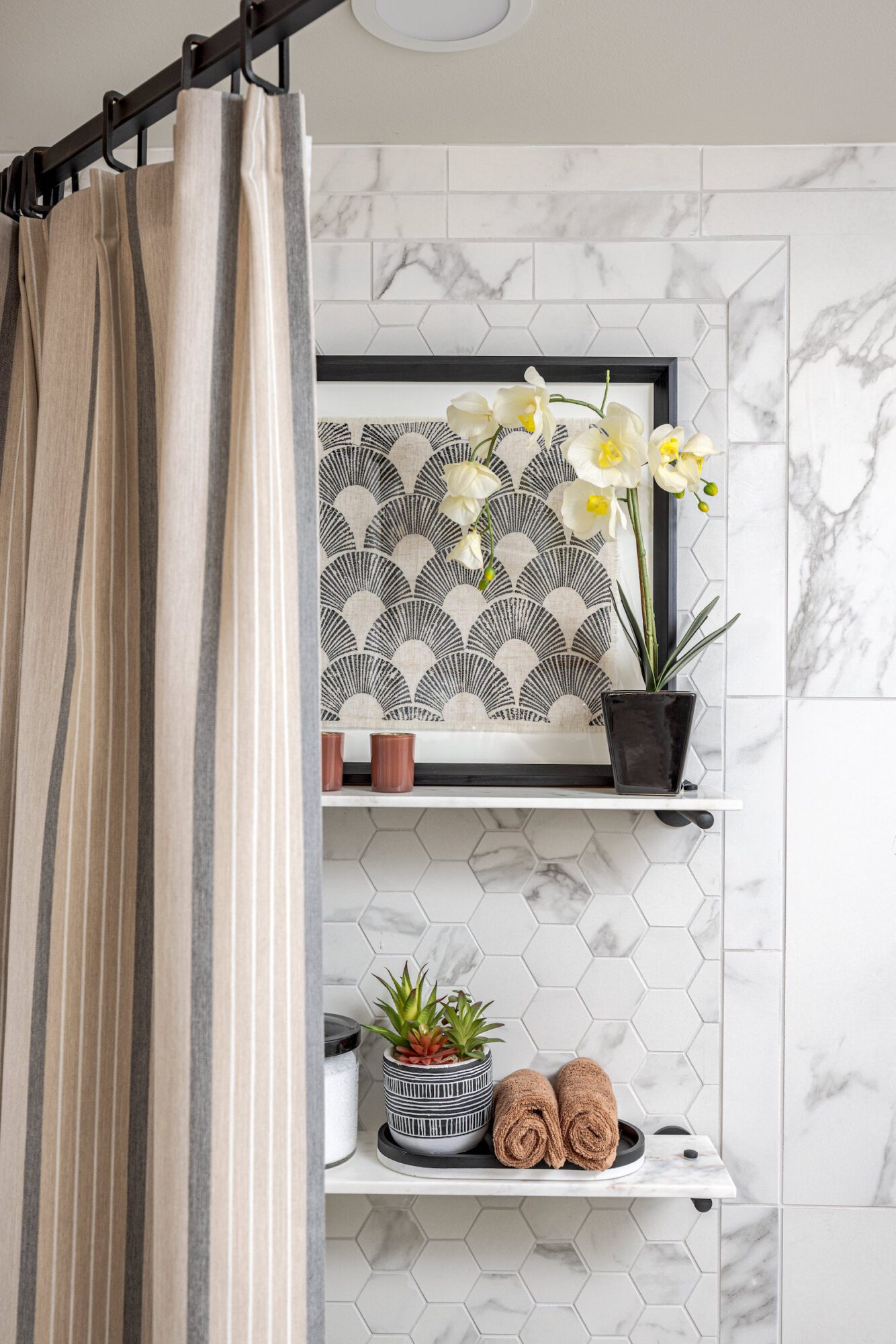
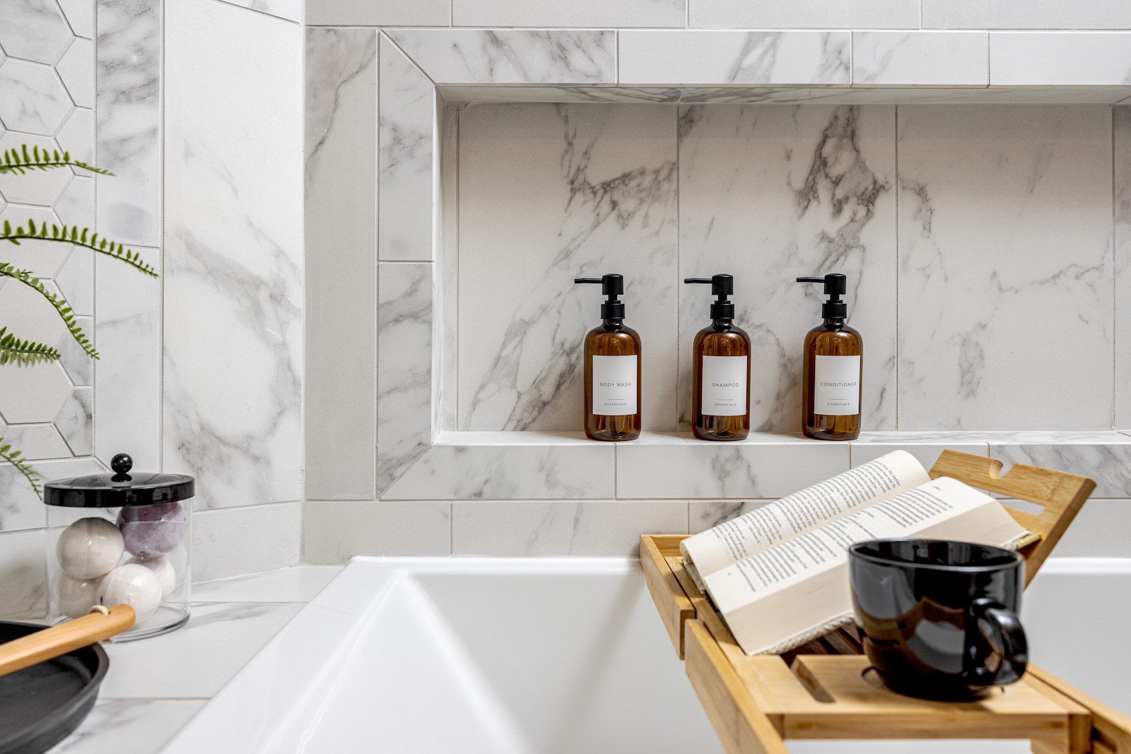
The existing linen closet was only accessible from the hallway and took up valuable space. So we said goodbye to that awkward setup and gave that space back to the bathroom. This not only made the room feel bigger but also allowed us to add something that was high on their wishlist: a deep soaking tub. We made it happen and now they’ve got a tub and shower combo with stunning stone tiles and extra storage.
We also added a ceiling-mounted rod and custom shower curtain that spans the entire length of the wall for a super clean, seamless look.
This bathroom upgrade not only modernized the look but also significantly improved the functionality, creating a bathroom that will easily grow with the boys as they transition into young adulthood.
Next on the list was the primary bathroom. Scott and Julie came to us with a vision that just didn’t match the existing design, which featured coral-colored walls, a small enclosed shower, a double vanity with outdated golden oak cabinets, laminate countertops, and a cramped layout. They wanted to keep the double vanity (because who doesn’t love a “his and hers” moment?) while creating a timeless design that wouldn’t need another remodel anytime soon. Their wish list included modern upgrades like stone countertops, undermount sinks, and a custom vanity, all wrapped up in a light and airy vibe with a travertine-inspired look, featuring warm taupes and cool grays. Challenge accepted!
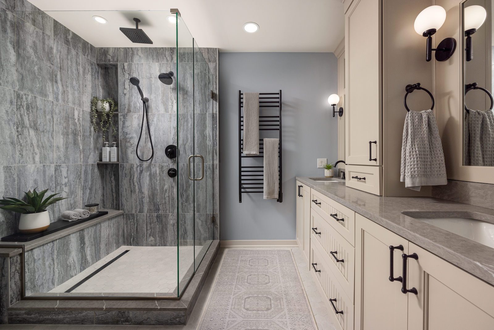
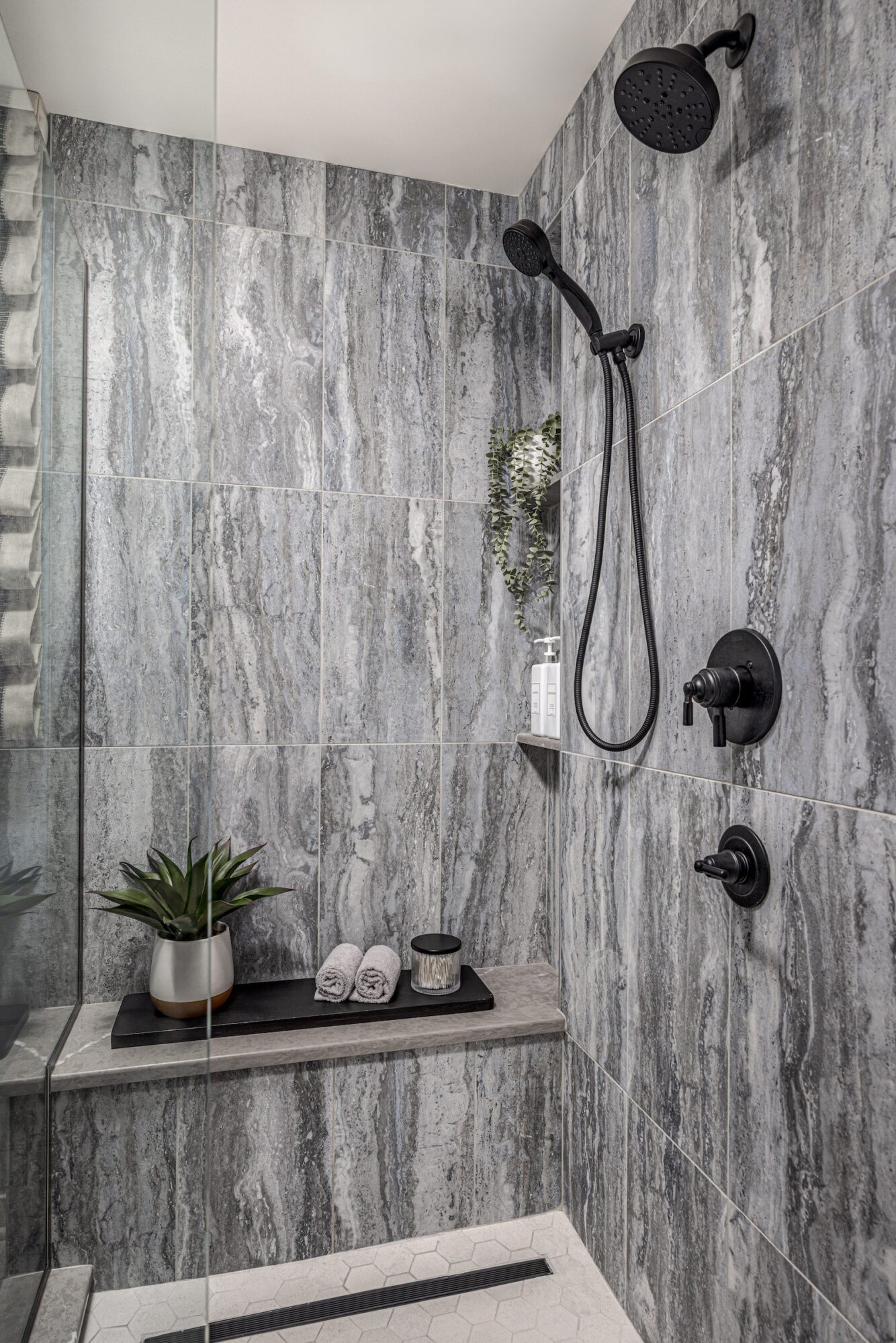
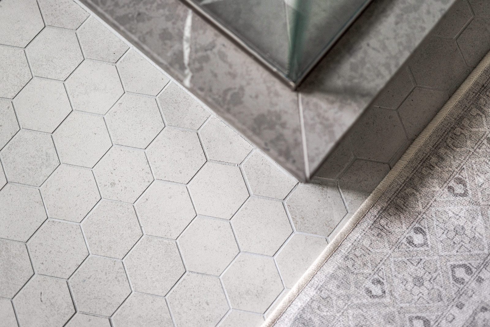
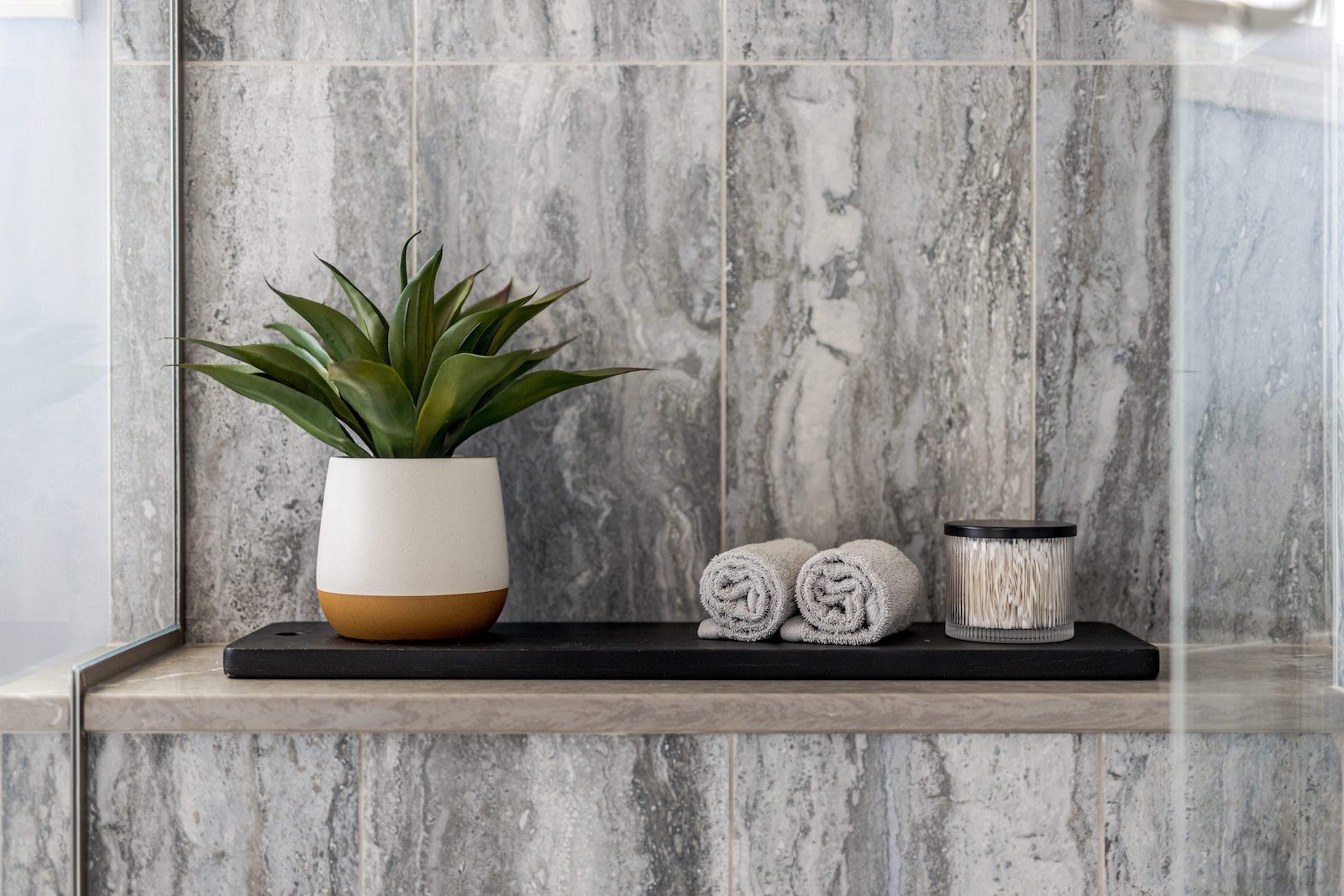
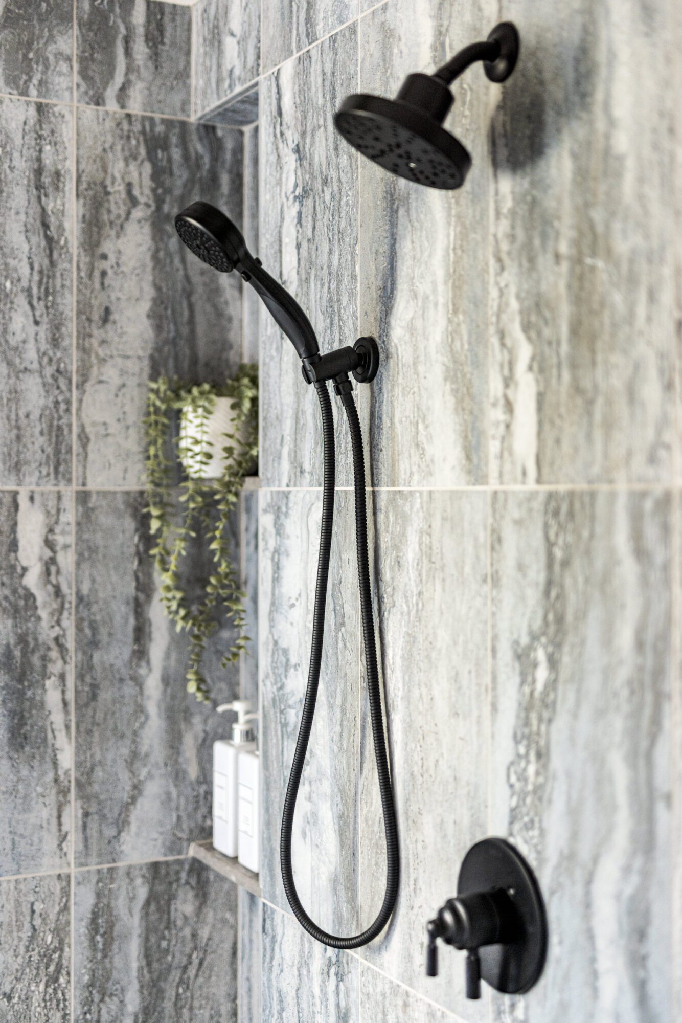
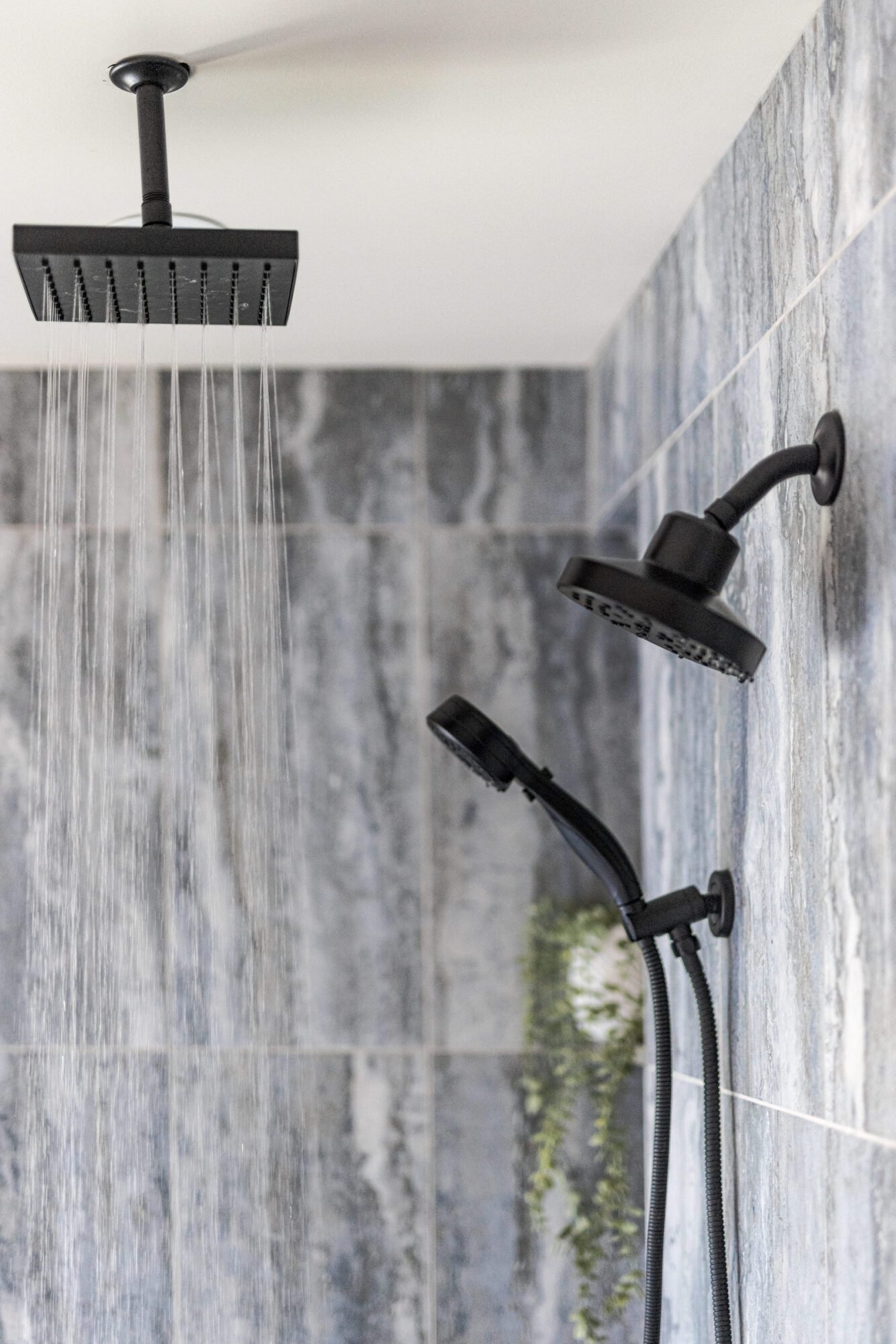
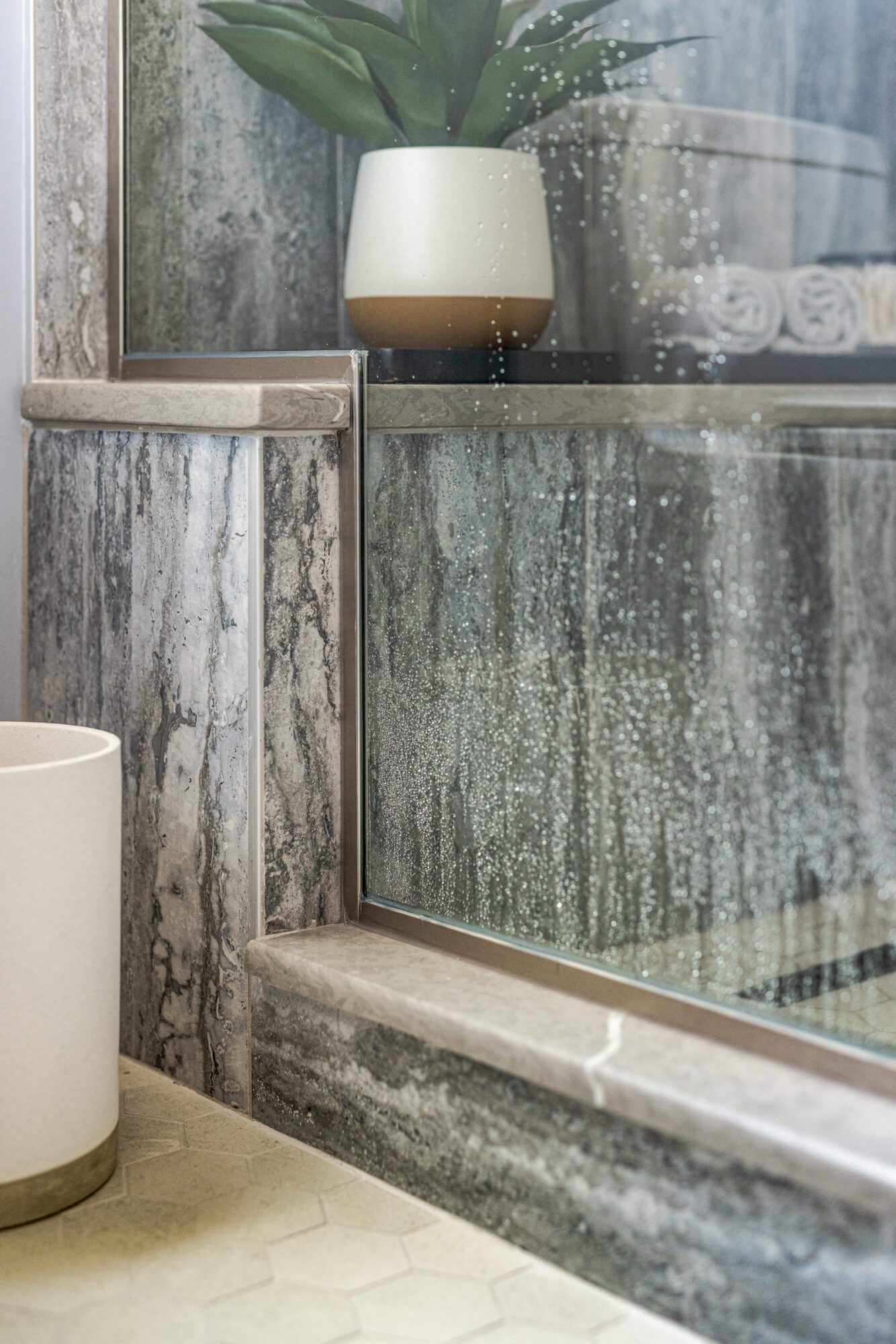
We took on the task of blending those warm and cool tones seamlessly throughout the space. The upgraded shower is a showstopper, complete with a handheld showerhead, a raincan, and a beautiful custom bench. We opened up the previously enclosed shower by removing walls and swapping in a sleek glass design, to give it an airy feel while maximizing unused space. The porcelain tiles mimic travertine with their stunning linear patterns, while thoughtful touches like a niche for easy access make this shower a dream.
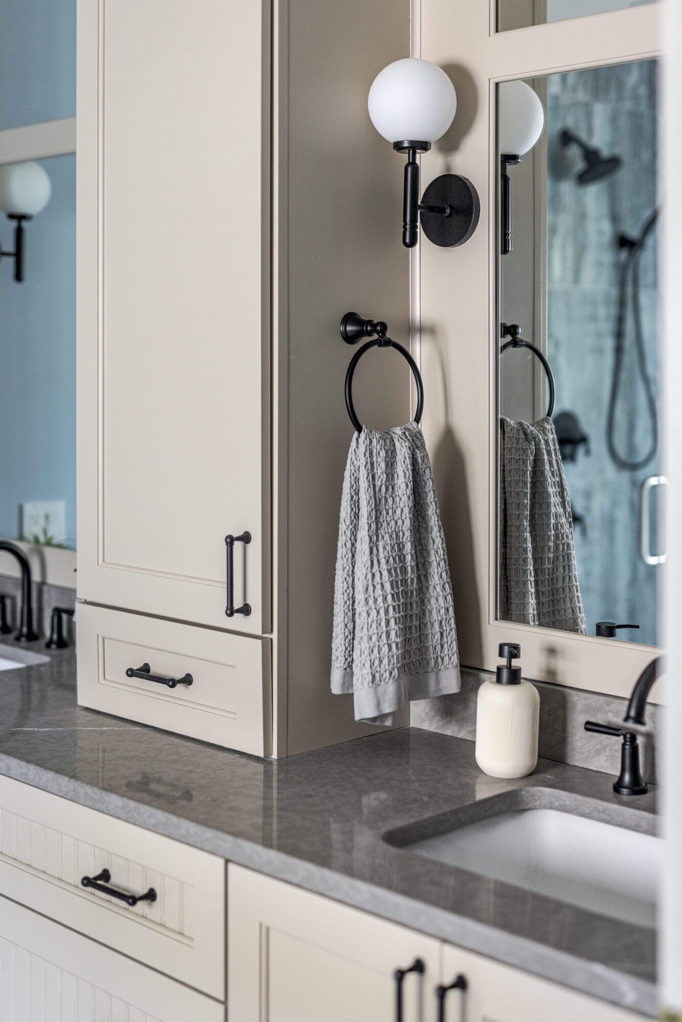
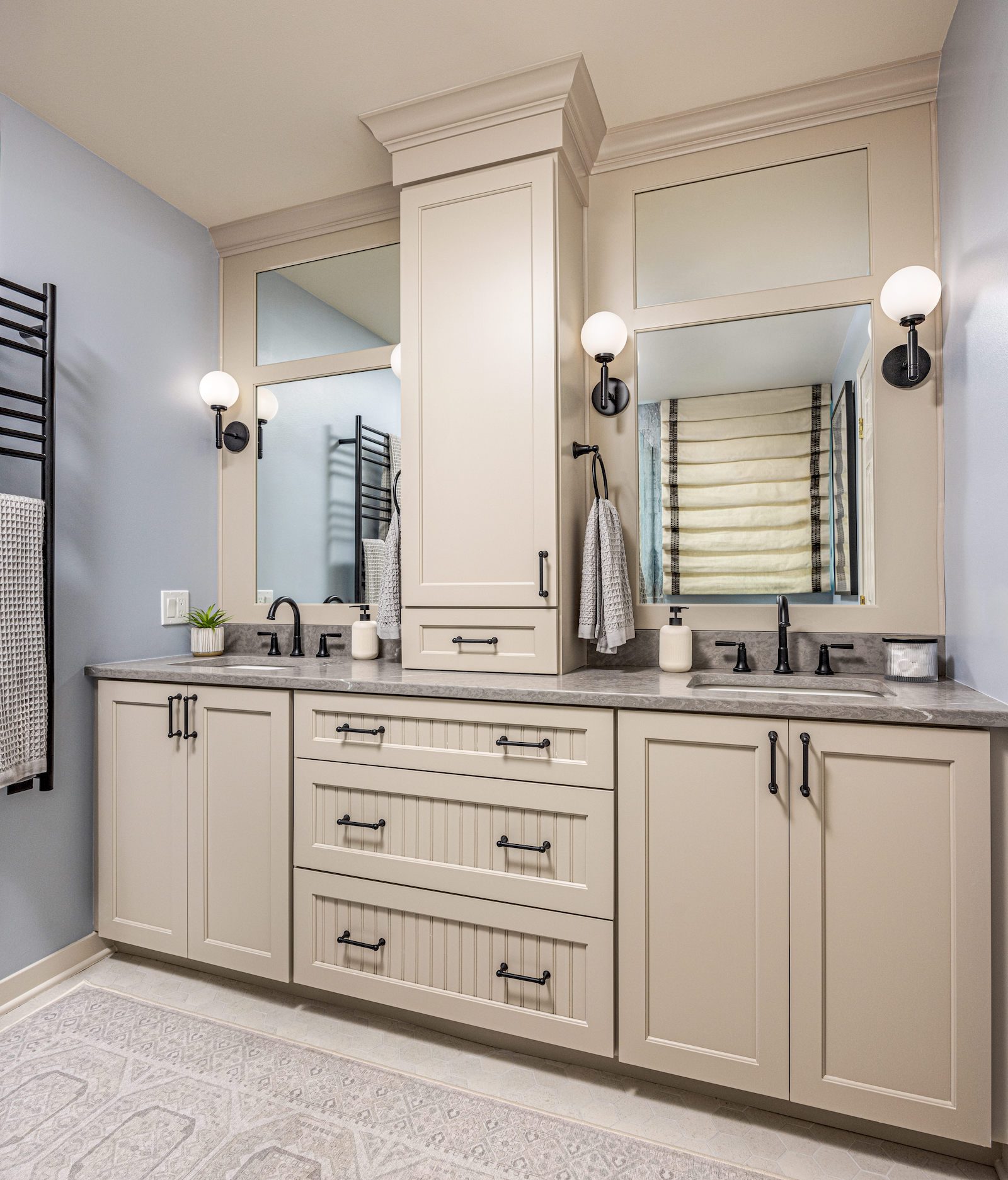
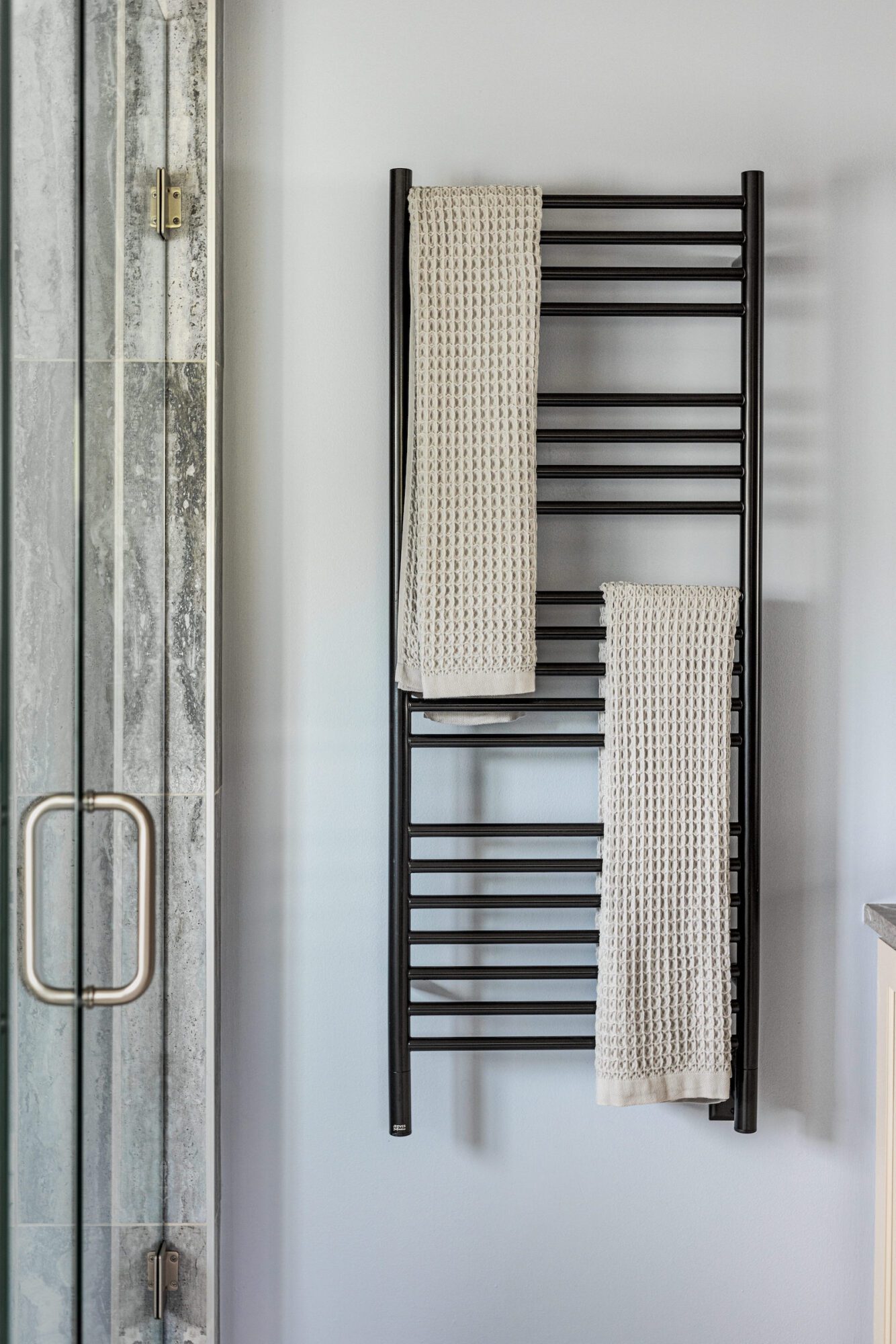
Now, let’s talk about the custom vanity. We mixed warm tones with cool gray countertops, adding custom wainscoting and built-in sconces for that luxe look. The integrated mirrors create a cohesive moment that ties the whole design together beautifully. To top it all off, we added heated towel bars—because who wouldn’t want a little extra luxury? This bathroom makeover didn’t just modernize the space; it made it functional, stylish, and ready to grow with Scott and Julie for years to come.
Overall, this project was all about transformation—turning datedspaces into stylish, functional retreats that truly reflect Scott and Julie’s lifestyle and needs. From the boys' bathroom that now balances warmth and modernity to the primary bathroom that combines luxury with practicality, every detail was thoughtfully crafted to enhance both aesthetics and functionality. With a blend of timeless design and modern upgrades, these spaces not only meet the family’s current needs but also set them up for years of enjoyment ahead.