 Originally built around 1916, The Murray stood vacant for nearly twenty years…until one day, a group of high school students approached Mayor Duggan with safety concerns about walking past the abandoned building on their way to and from school. Shortly after, renovation plans led by Detroit native and developer W. Emery Matthews of Real Estate Interests, LLC. began to unfold.
The goal was to draw inspiration from both the past and the present to breathe new life into an abandoned structure that was once a bustling multi-family housing unit. To successfully honor the history of the past with the modernization of the future, Matthews knew he would need to find a partner who truly understood his vision and could successfully implement his ideas.
To restore The Murray to its former glory, we found ways to marry the design aesthetic of the original building with representation of today’s community. The Murray was built in a time when Art Deco design and neo-classical architecture movements were at their peak, so we embraced the challenge of enhancing previous historic details rather than starting anew.
Rather than thematic or high New York style, we conceptualized this project by learning about the people, Matthews’ core values, and what the heart of this project was. We thought about who would live here, who would use a multi-family space, and how they would live here.
This led us to the goal of honoring and celebrating the community now residing in Hubbard Farms. We looked to Statistical Analysis to find that it is one of few predominantly Hispanic neighborhoods in Detroit. With this in mind, we drew inspiration from traditional Hispanic artwork and textiles to marry the design aesthetic of the original building with the neighborhood’s current cultural representation.
When it came to sourcing materials, Matthews never took the easy way out. He always wanted to do what made sense and pulled colors, patterns, materials, and fabrics that were true to the vision and embodied what The Murray stood for in the community.
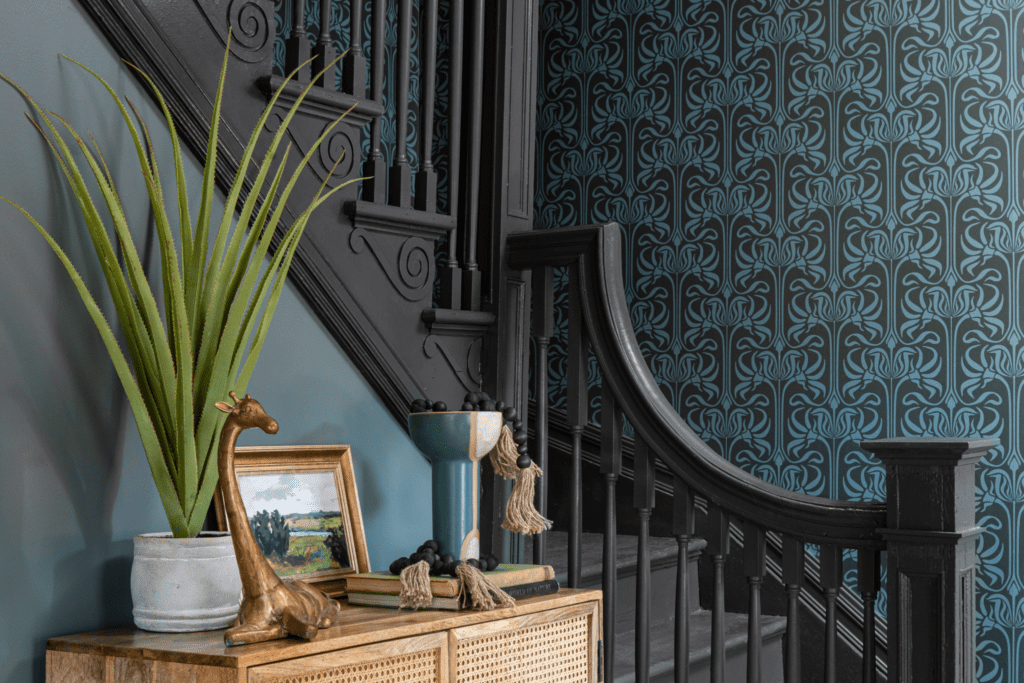
To create depth and uniqueness within each unit, specific colorways were chosen so that each tenant felt as though their space was personal. Cool and warm colorways of blue and green were seamlessly blended between floors and units with a custom period appropriate wallpaper sourced through Detroit Wallpaper Co.
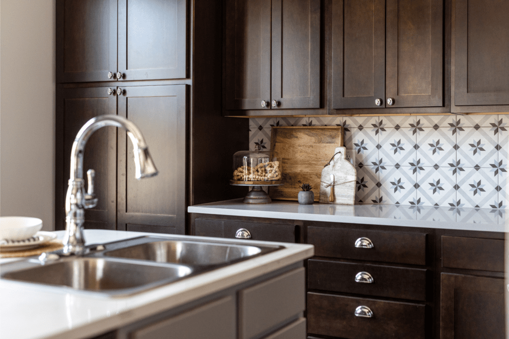
- Kitchen backsplash
- Colorways-inspired wallpaper
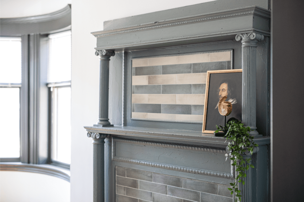
- Original fireplace surrounds, hearths, and tiling
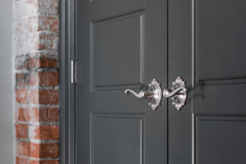
- Original exposed brick
Unique tile consideration was also a huge priority. The kitchen backsplash tile was strategically chosen to honor pattern repetition often seen in both Hispanic culture and 1915-era designs. A custom mosaic designed in penny tile was applied on the bathroom floor while a classic subway tile was applied in a way that mimicked tile applications of the past.
Speaking of flooring, we kept the original hardwood floors whenever possible and only replaced flooring when absolutely necessary. When flooring was replaced, it was replaced with period appropriate selections and was only done when absolutely necessary.
All the molding stayed where it could and received fresh coats of paint. While typical new developments often feature bright white, our visual guideline led us to a stark black to highlight the beautiful details of the existing millwork. We also chose to highlight any exposed brick rather than cover it up whenever applicable.
Although the fireplaces of the original building were no longer functional, we chose to honor their existence by keeping their surrounds, hearths, and tiling over the existing openings with period appropriate tile.
Although a clear vision and a deep appreciation of the space had much to do with the final result, what really made this project a success was a phenomenal developer-designer relationship.
Thanks to shared common interests and an understanding for the history and culture of the space, we worked with Matthews to transform The Murray from a vintage seven-unit townhome complex into a certified historic renovation with 12 units in less than a year. Appealing to the current market with a contemporary interior aesthetic while respecting the historic character of the property and neighborhood, it is now a positive force in the community and a way for the community to showcase its spirit and resilience.
An outcome like this requires far more than just a presentation of pretty spaces. This project reinforced how satisfying it can be when developers and designers come together to co-collaborate and co-create in a design situation.
We are so happy that Matthews came to us as a trusted partner!
Ready to breathe new life into your space?
We can help you revitalize your space with the history of the past and the modernization of the present.


