In Their Edison Era - Concetti

In Their Edison Era

TYPE
Residential
COLLABORATORS
Location
Boston Edison Historic District Detroit, MI
PHOTOGRAPHY BY
Brett Mountain Photography, Ellie Frances Photography
CLIENT
Parker + Alex
When your dream is to live in Detroit’s historic Boston Edison district, you’ll do just about anything to make it happen – even if that means touring the home via FaceTime across the country. It was love at first sight for Concetti Associate Designer Parker, aside from one thing–the incredibly small primary bathroom. With her plate full from moving to a new state, starting a new job, and expecting their first baby, she knew exactly who to call to design the perfect space while preserving the historic charm that she initially fell in love with.

Our Goal:

As a designer, Parker had a clear vision for her remodeled space. It included a freestanding claw foot tub, a separate toilet room, and a walk-in closet. However, like most historic homes, the primary bathroom's small footprint hindered the possibility of all the modern amenities on her wishlist. There was hardly any standing room, and most of the space was taken up by door swings.

Although this bathroom was remodeled by a previous owner decades ago, it didn’t match Parker’s personal style nor the original style of the home. The original molding was lost and the ceilings were lowered, making the already tiny space feel even smaller.

Discover how our three phrase approach transformed a historic bathroom into a beautiful, functional space that honors its past and serves present-day needs.
Our Solution:

Remodeling a historic bathroom presents a unique set of design challenges. Designers must carefully balance maintaining historic character and introducing modern conveniences. In order to preserve the original door frames, the door placement had to stay as-is. The small square footage coupled with a door leading to an off-suite old-fashioned dressing room meant we had to be intentional about our design and schematic solutions.

We began this design process as we always do: by understanding Parker & her husband’s goals for design and functionality. In Phase 1 of our 3-phase process, she shared inspiration photos featuring checkered tile floors, natural textures and tones, and of course, pops of sage green – Parker’s signature color.

Parker’s functional goals included:

  • Two under mount sinks
  • Brass metal finish for a historically accurate feel
  • Single person shower
  • Freestanding claw foot tub
  • Walk in closet with Stacked washer and dryer
  • Private toilet room

We then created three different layout options to present to her, each one offering different solutions to her functional needs. She gravitated towards, and ultimately selected, the final floor plan which utilized the most space and allowed for a large walk-in closet–one of her primary goals. We did so by stealing space from the existing dressing room and guest bedroom right next to the primary bathroom. This new layout also created a beautiful sightline into the bathroom from the primary bedroom, utilizing the natural light pouring in from the original windows.
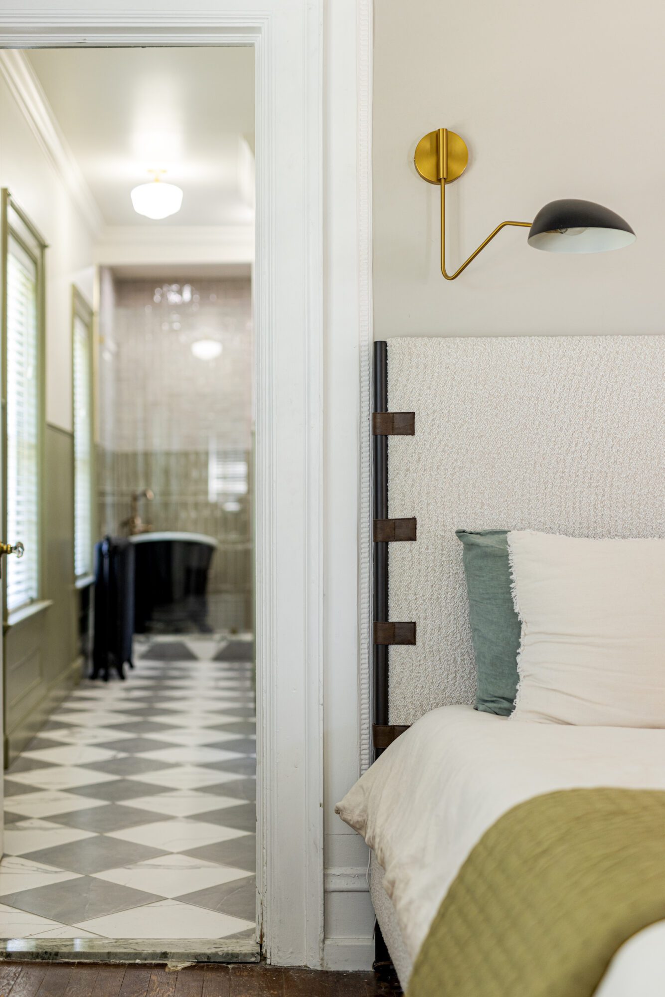
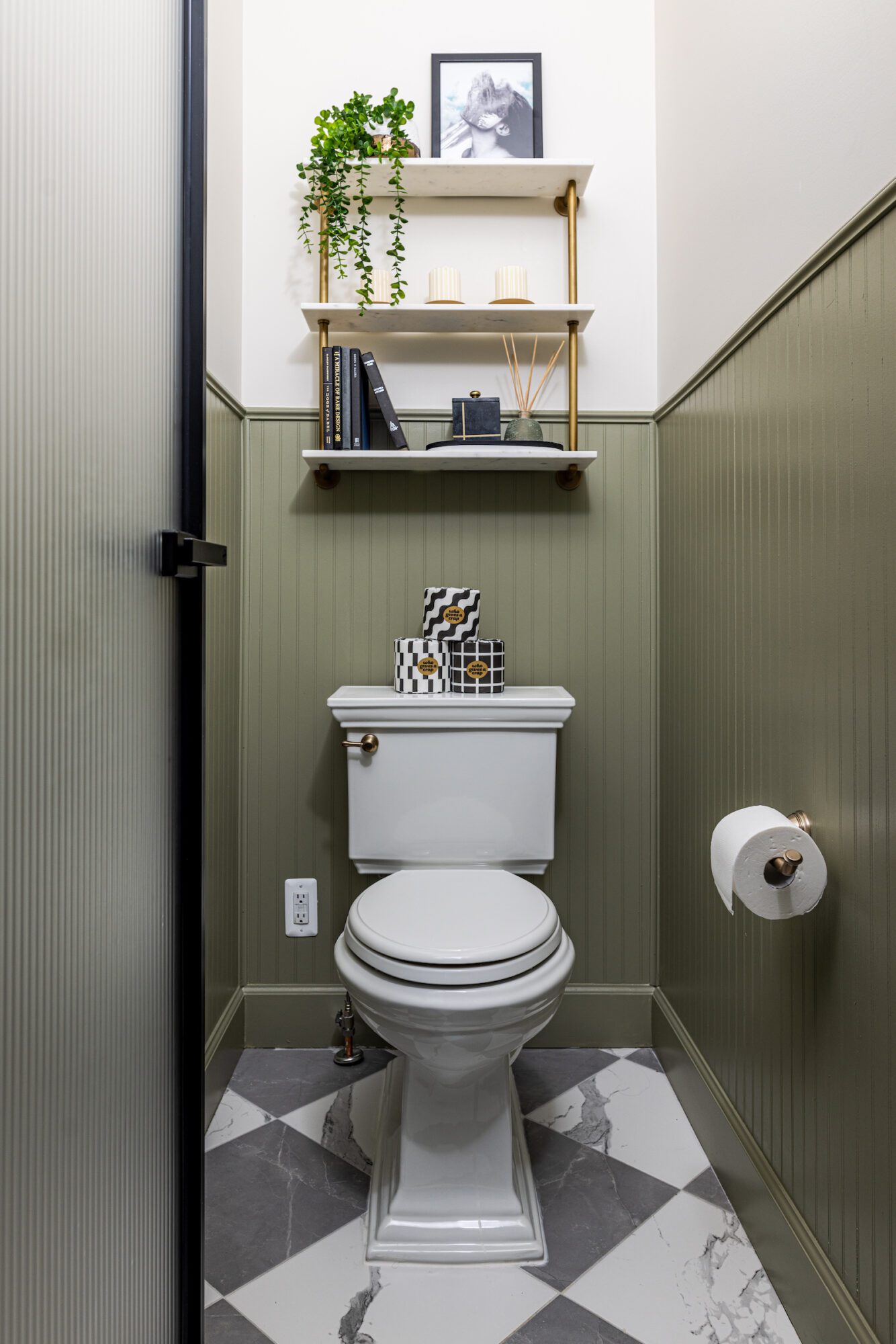
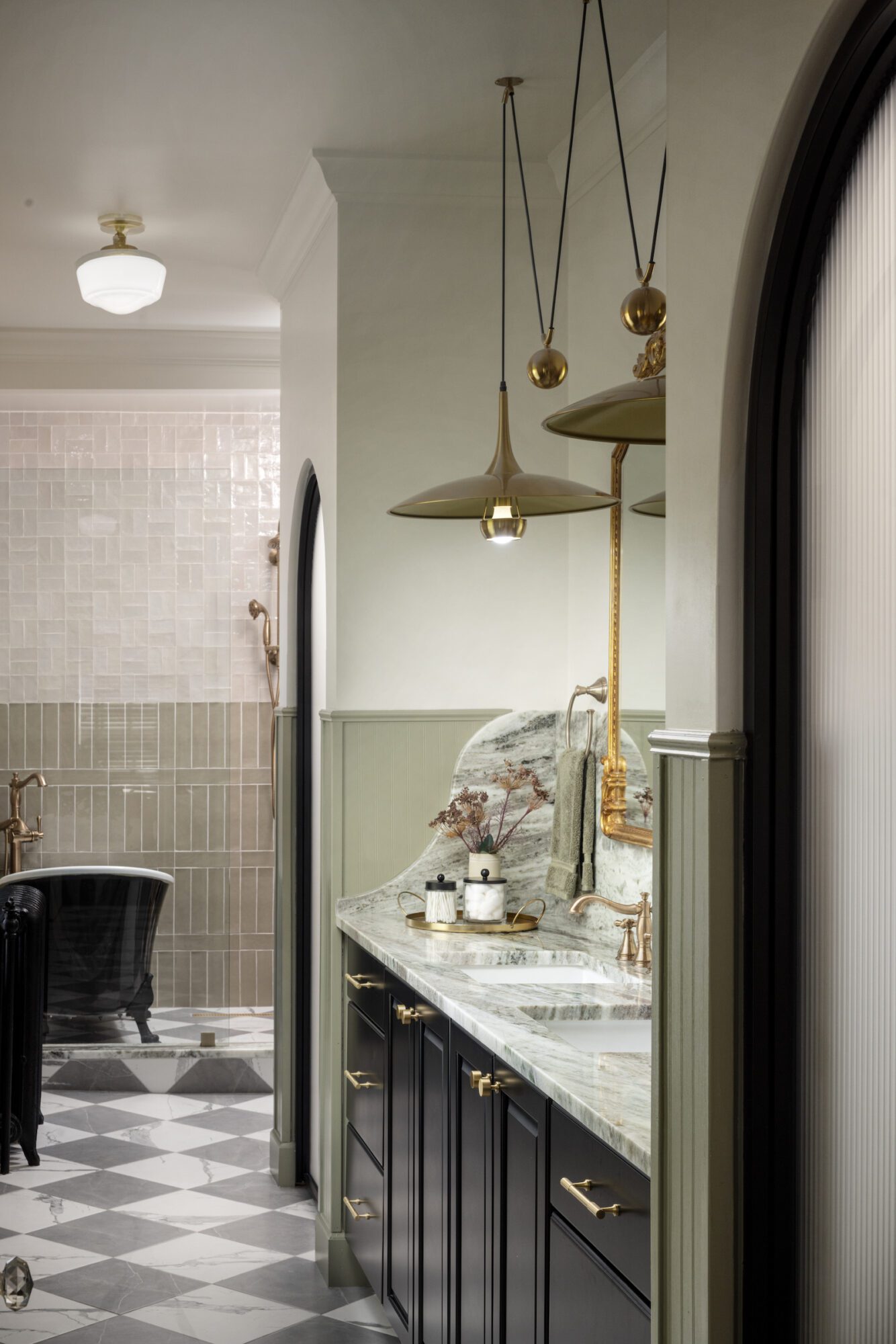
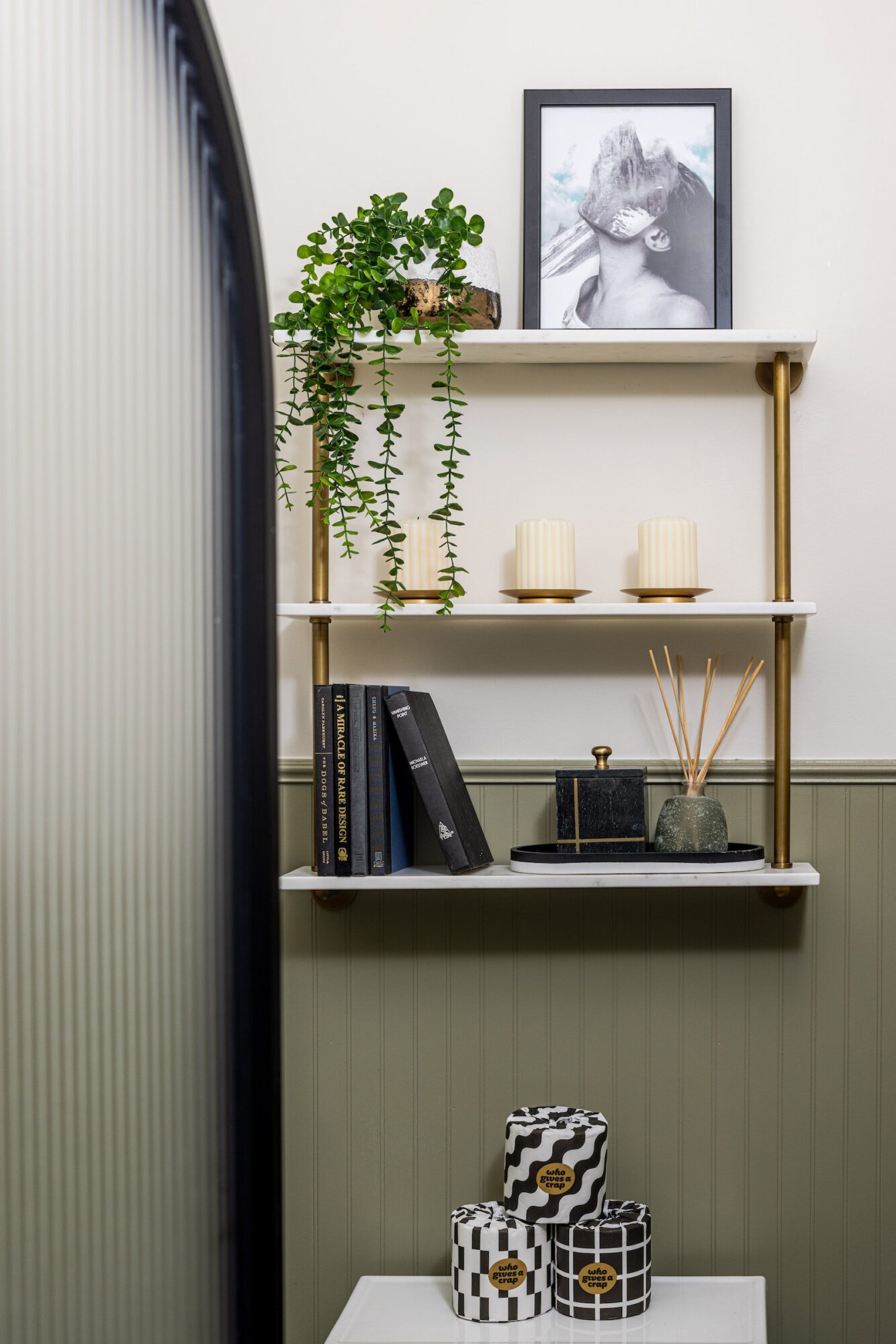
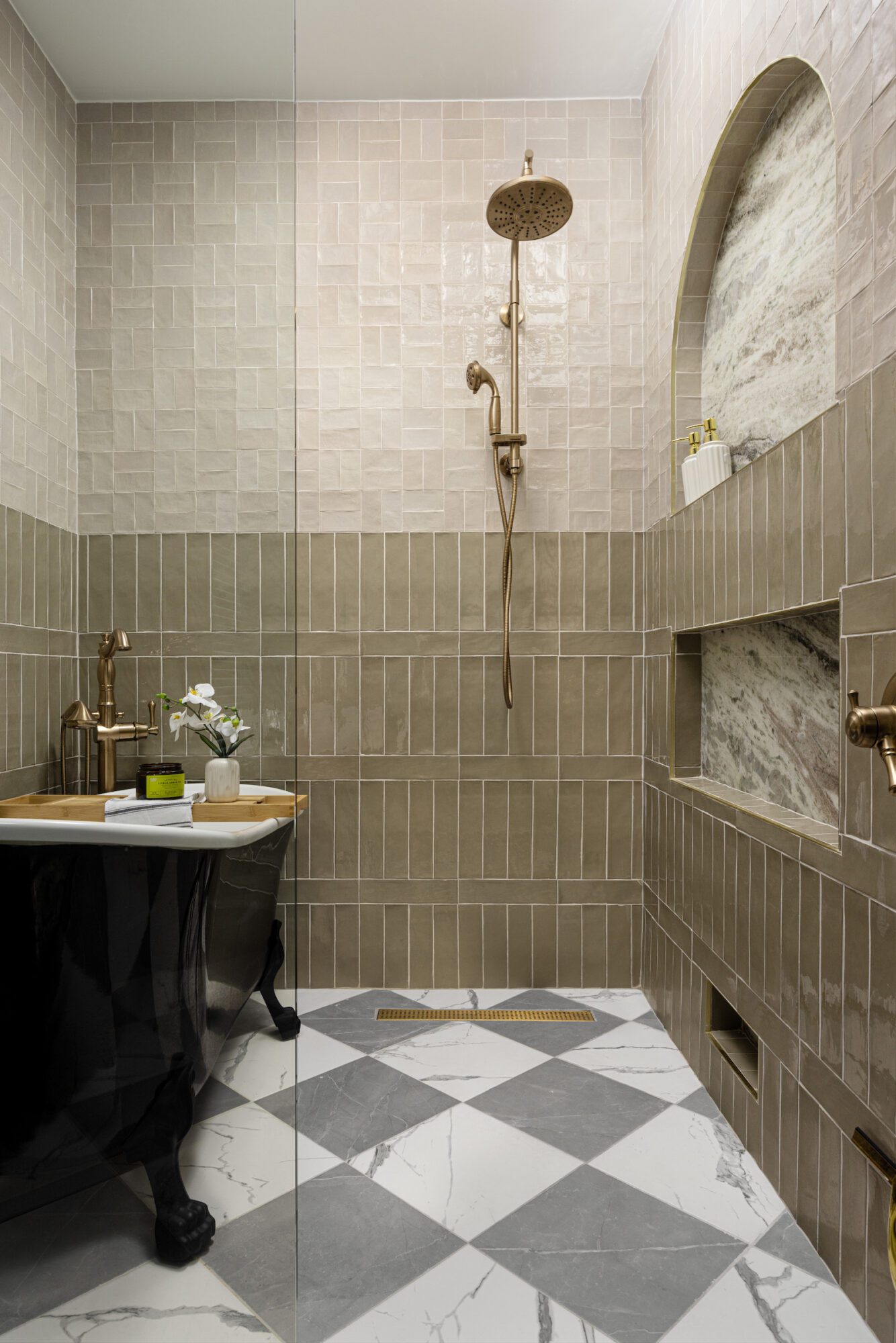
Stepping into the finished space, you will find the separate toilet room immediately to the right, framed by an arched metal door with frosted, fluted privacy glass. The existing floor tiles were replaced with gray and white checkered stone tiles–just like the ones from her visual guideline. We also painted the wainscoting green to incorporate her signature color.
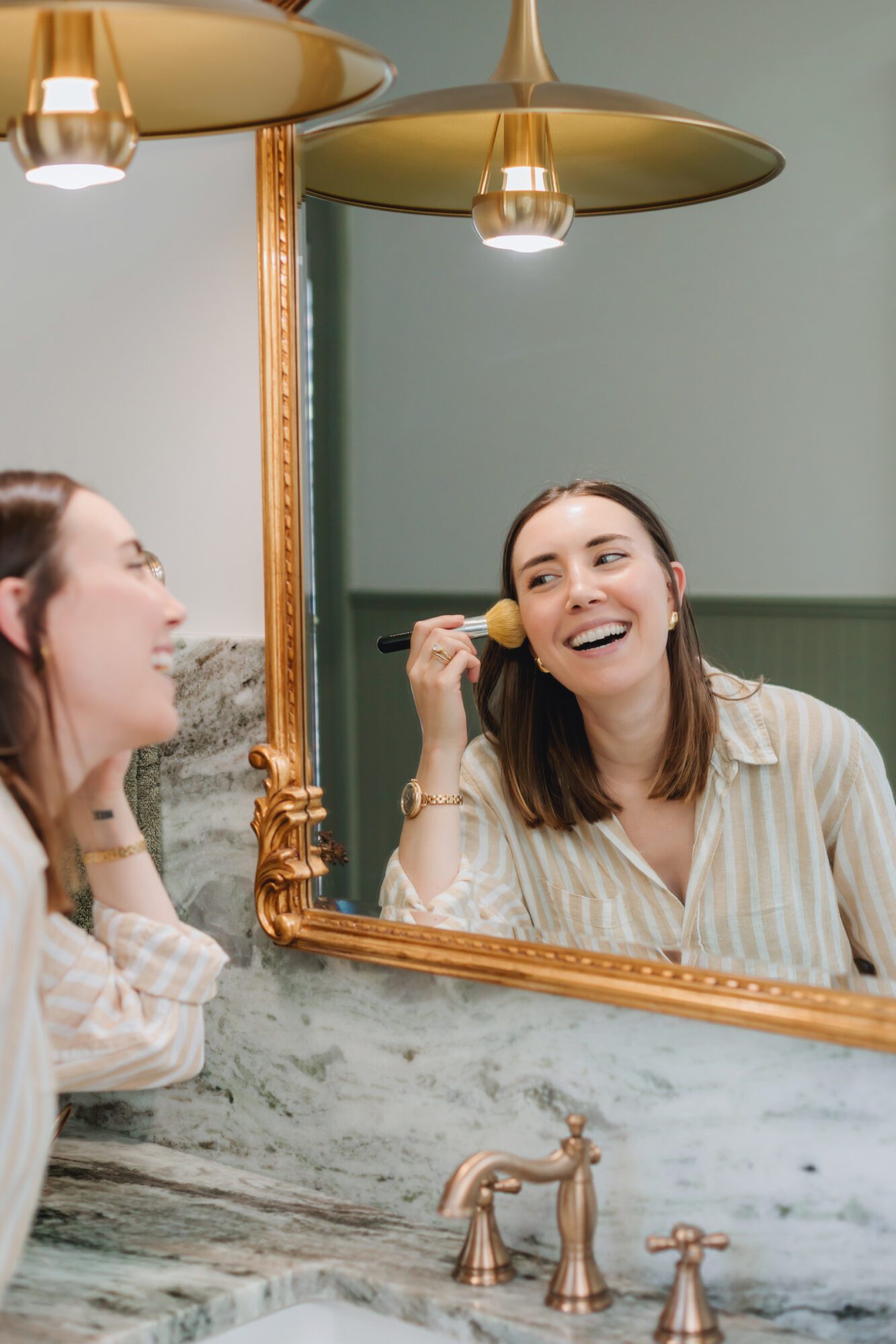
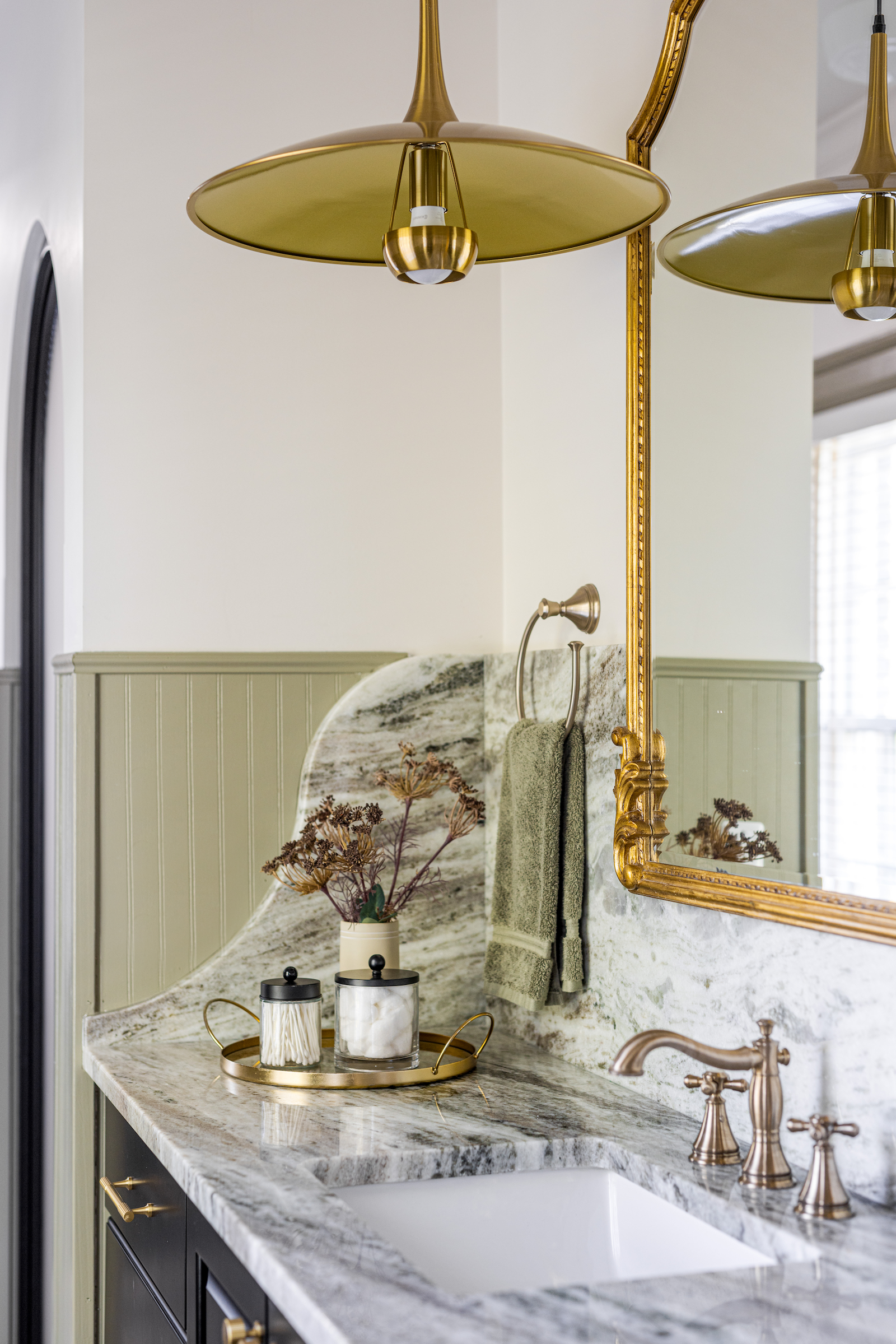
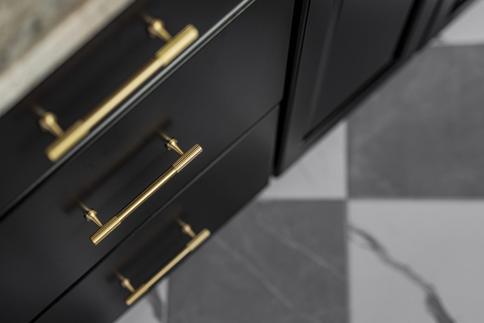
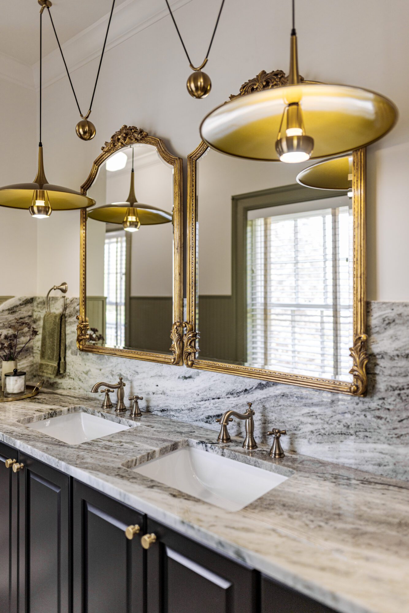
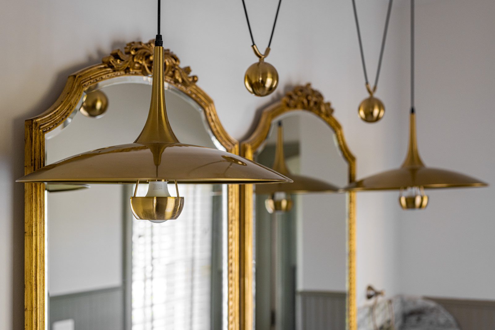
The double vanity perfectly captures the idea of “historically modern” with granite countertops, an exaggerated arched backsplash, unique gold weighted light fixtures, and ornate mirrors. The plumbing and electrical were not updated in the previous remodel and needed to be replaced. We were able to incorporate a historically accurate feel with a brass metal finish in the new plumbing fixtures and bring the original molding, which was repurposed from the original dressing room to fit the windows, back to its former glory.
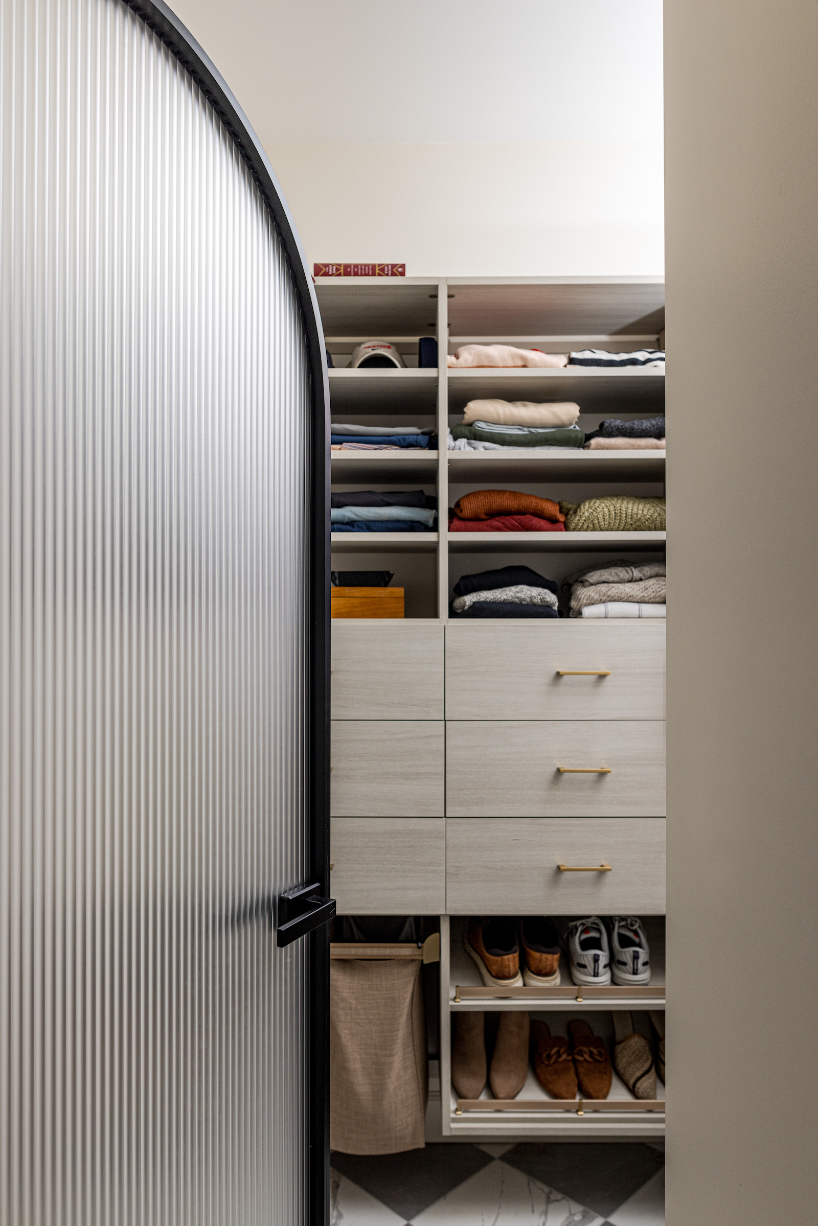
Left of the vanity is a large walk-in closet, framed by the same arched privacy door as the toilet room, creating a cohesive and symmetrical look. The closet is packed with built-in storage, offering plenty of space for both Parker's and her husband's clothes. Custom shelves and drawers ensure everything has a place, making it super easy to stay organized.

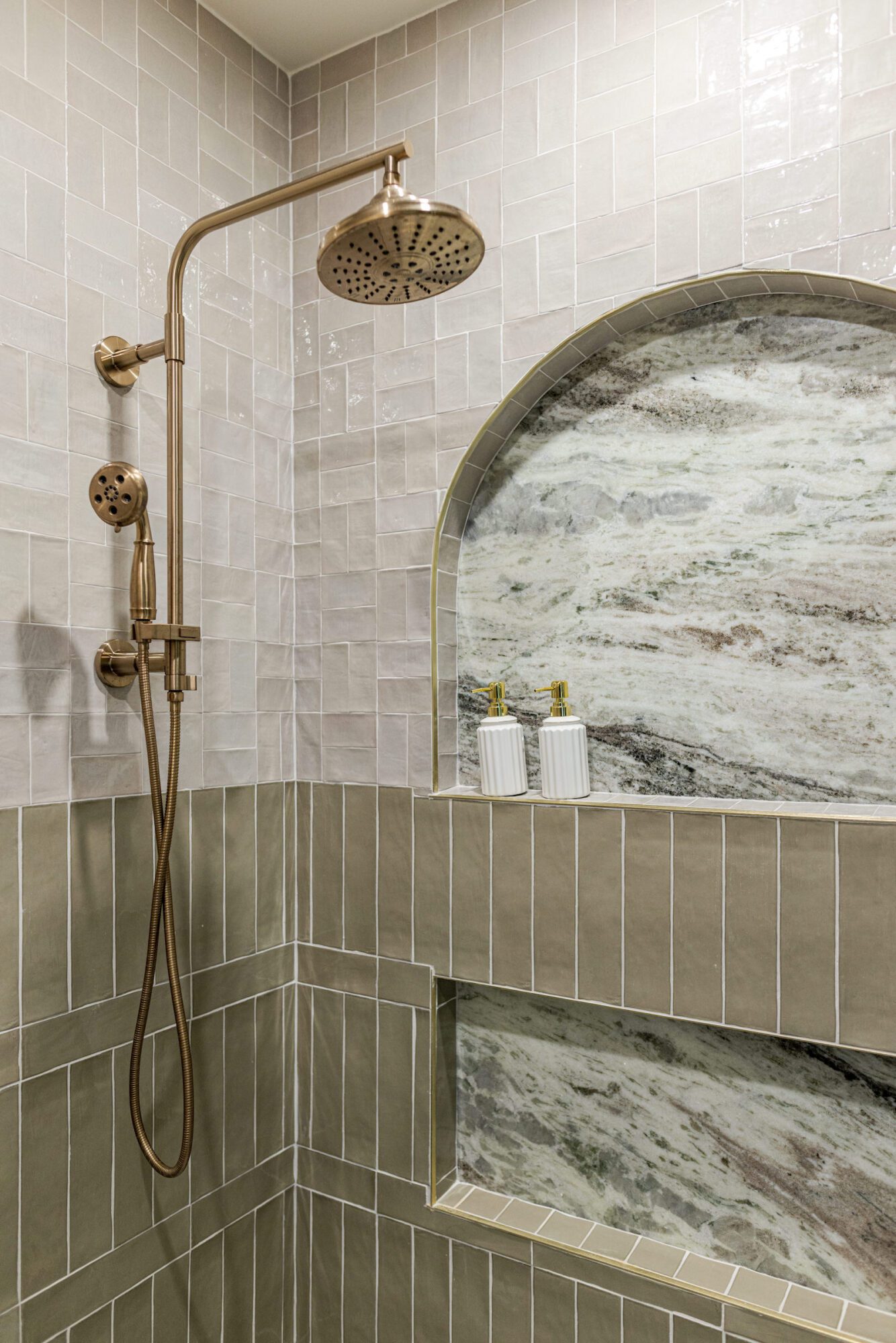
At the far end of the room is the centerpiece: the bathtub and shower. Parker’s heart was set on a clawfoot tub with a floor-mounted tub filler, so we chose this stunning black tub with brass plumbing fixtures to create contrast and maintain the historically accurate feel. The shower also embraces this aesthetic with more brass through the showerhead and an arched niche that matches the shape of the closet and toilet room doors. The sage green wainscoting height carries into the shower tile, maintaining the cohesive theme of natural tones.
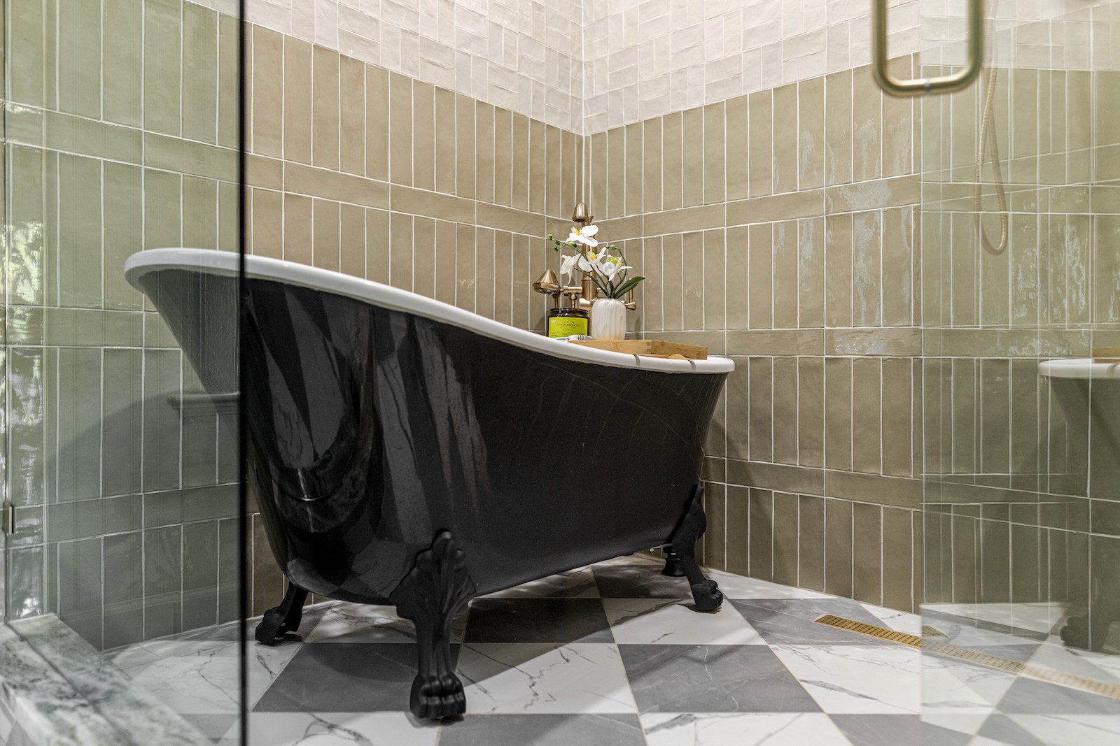
And of course, we didn't forget Parker's other request—a custom shaving area at the perfect height for her to prop her foot on for maximum convenience. The attention to detail and thoughtful design make this space both beautiful and practical, perfectly tailored to Parker's vision.

Checking every last box on Parker’s bathroom wishlist, the space also received a stacked washer and dryer with its own closet to keep it out of sight when not in use and maintain the room's clean and elegant aesthetic. This thoughtful addition seamlessly blends practicality with style, completing Parker's dream bathroom.

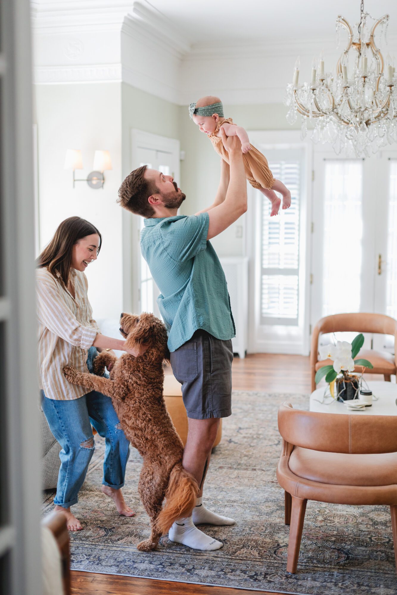
Although that’s it for the primary bathroom, Parker beautifully designed the rest of her historical home herself. She seamlessly blended her personal style into every room she touched, creating the perfect setting for her growing family’s Edison Era.
Parker aimed to blend modern and historic elements in their home, creating a welcoming atmosphere that highlights the unique historical details. Unlike many historic homes styled strictly with period pieces, Parker wanted a space that reflects both her and her husband Alex’s personal styles. By incorporating a touch of green in every room and using architectural furniture pieces, each room she designed seamlessly coordinates with the rest of the home.
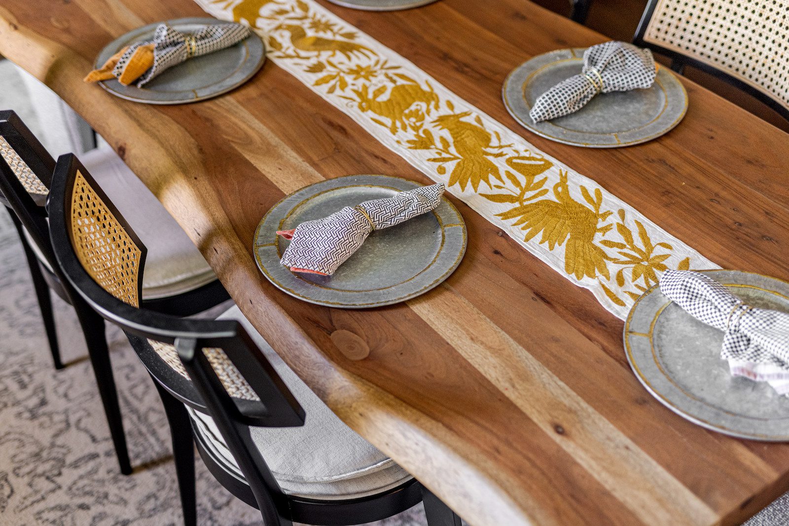
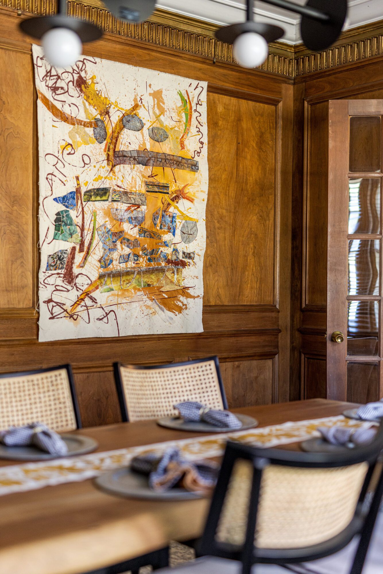
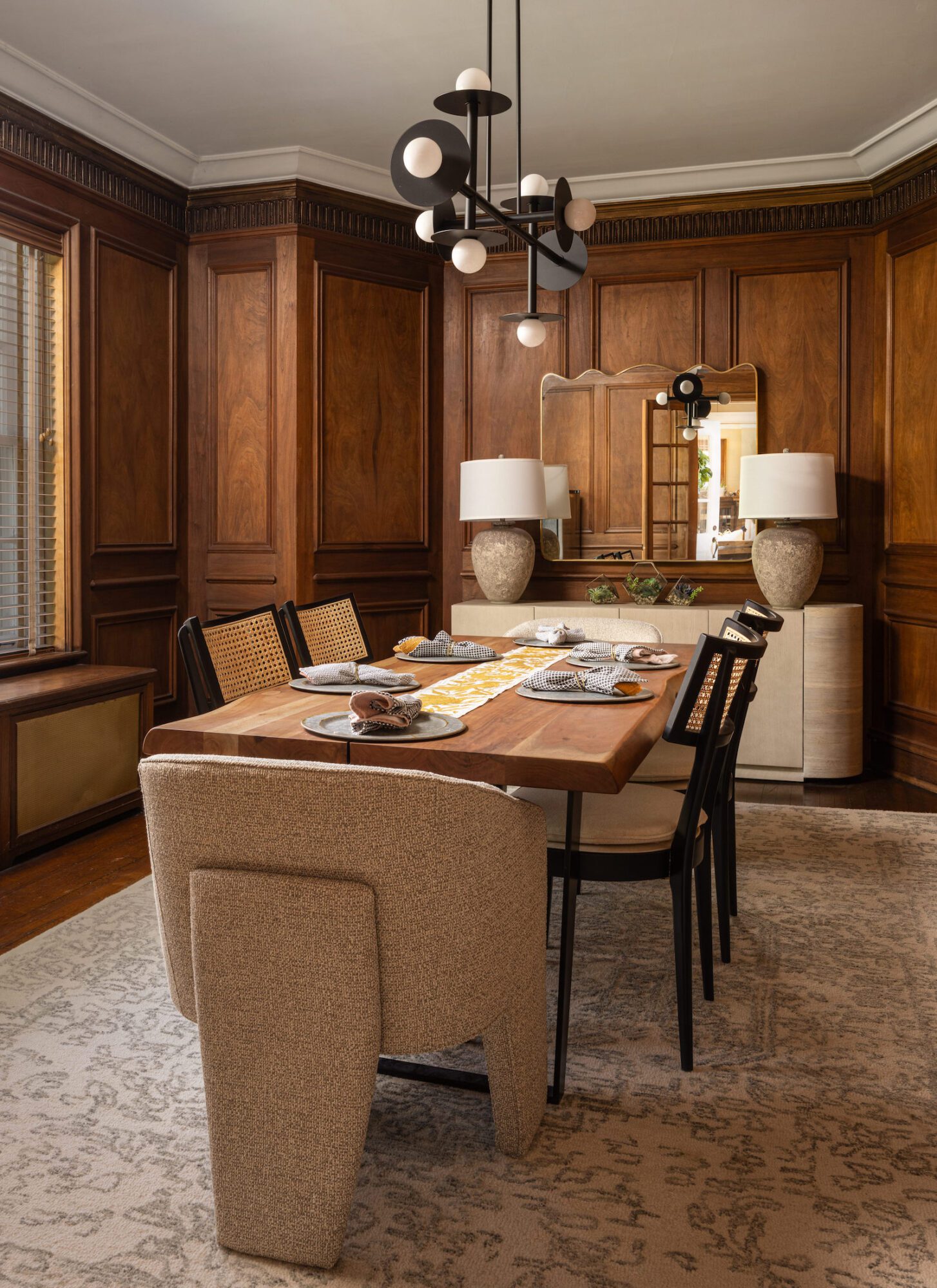
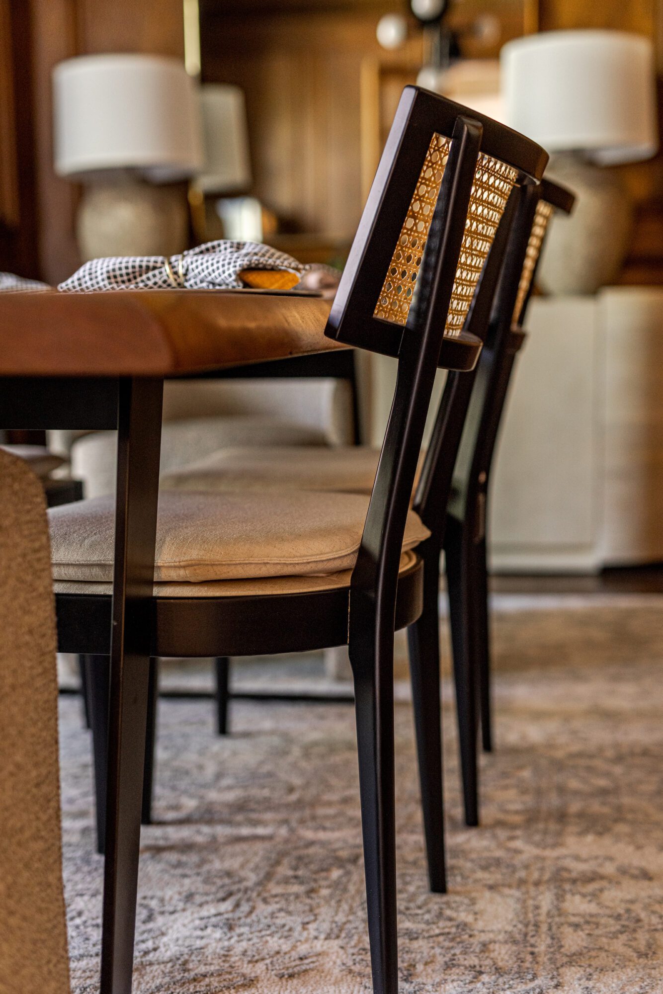
In the dining room, Parker aimed to create a traditional yet modern space perfect for entertaining. The room retains its original wood paneling, preserving the historic character of the home. To juxtapose this traditional element, Parker incorporated modern furniture pieces and fixtures, such as her own original art, adding a contemporary flair. She also added lighter furniture pieces, a white rug, lamps, a mirror and Kelly Wearstler light fixtures to brighten up the space while still maintaining the wood paneling as the feature of the room. The dining table, the only piece of furniture they used from their first floor apartment in Denver serves, as a central element around which the room's design is built. This careful balance of old and new elements ensures the dining room is both functional and aesthetically pleasing, providing the perfect backdrop for family gatherings.


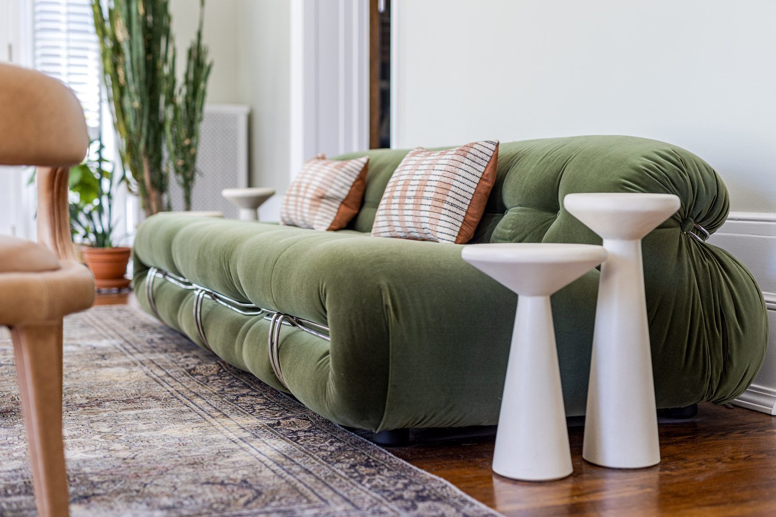
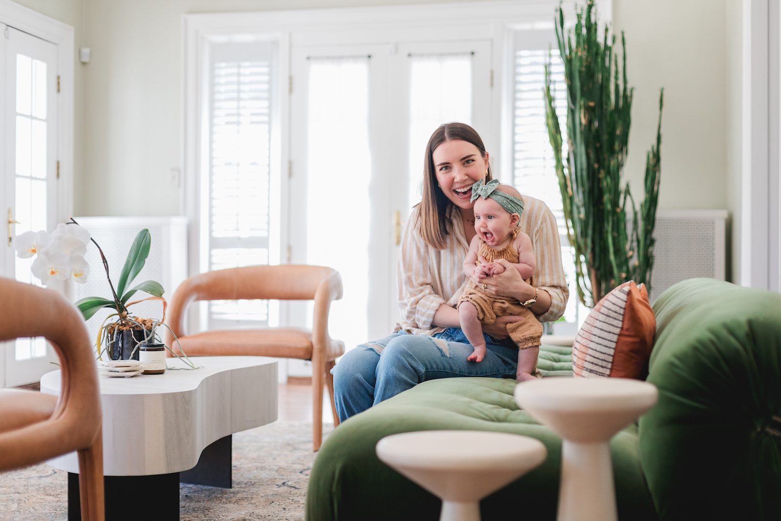
The sunroom was designed to be a light and airy space, reflecting Parker's love for the color green. The room features the lightest green wall color in the home, creating a fresh and serene atmosphere. The design of the sunroom centered around a specific green sofa that Parker and Alex loved, with all other elements chosen to complement this key piece. The room is filled with natural light, enhancing its airy feel and making it a perfect space for relaxation and enjoying the view outside. The furniture in the sunroom, like in the rest of the home, has organic shapes and soft curved lines, adding to the cohesive and harmonious design that Parker aimed to achieve throughout the house.
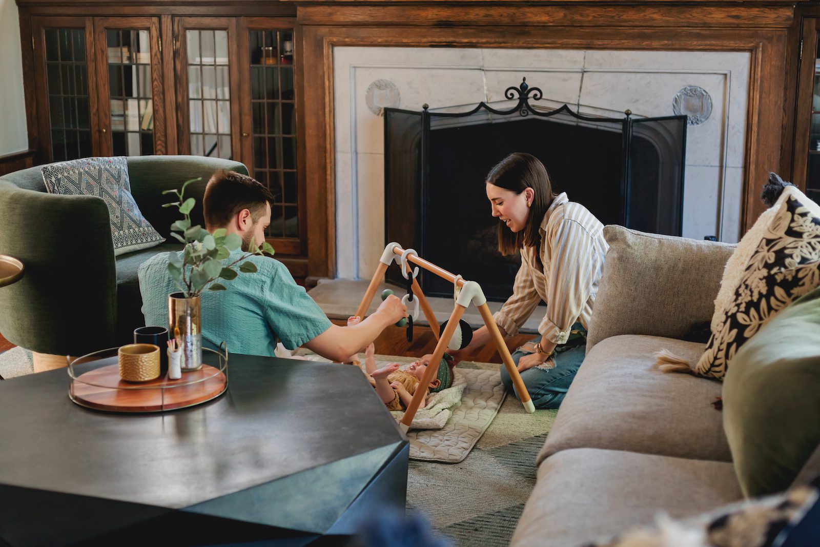
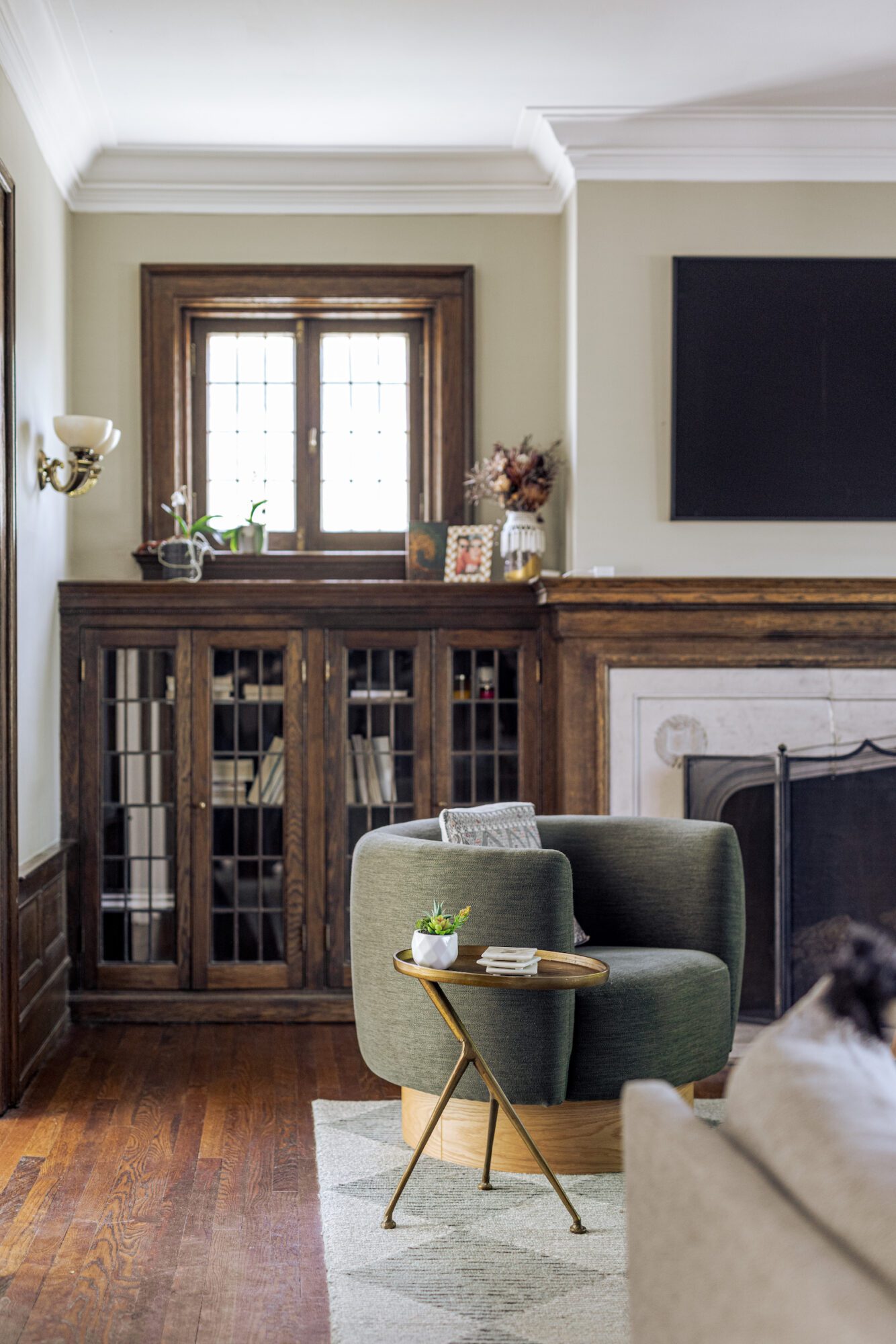
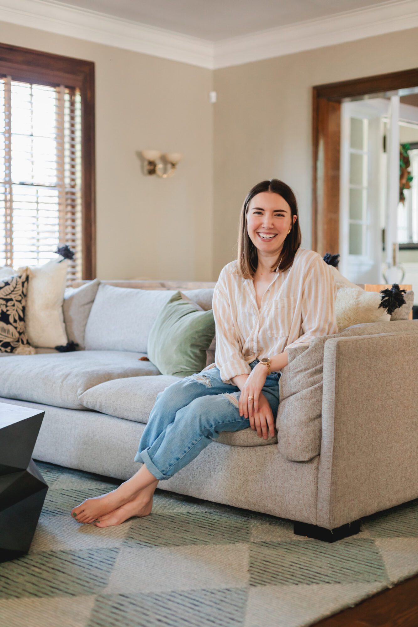
Parker's intention for the living room was to create a cozy and grounded space that blends modern comfort with historic charm. To enhance the cozy atmosphere, a large, comfortable sectional sofa is centered around the original fireplace, making it an ideal spot for their family to relax and gather. The living room also features built-in bookshelves that add to the room's charm and functionality. Parker chose furniture with clean, simple lines to complement the architectural details without overpowering them. The cohesive design ensures the living room feels both inviting and stylish, reflecting Parker and Alex's personal styles.

“I chose Concetti because, having vetted them as an employee, I knew they would be a trusted partner. Their reputation in the community and the quality of their past projects gave me confidence, especially being new to Detroit. Concetti brilliantly addressed our space planning challenges, making our small primary bath functional and beautiful, while seamlessly integrating modern amenities into our historic home.”