
Revolutionary Revival
AGH Construction
Dexter, MI
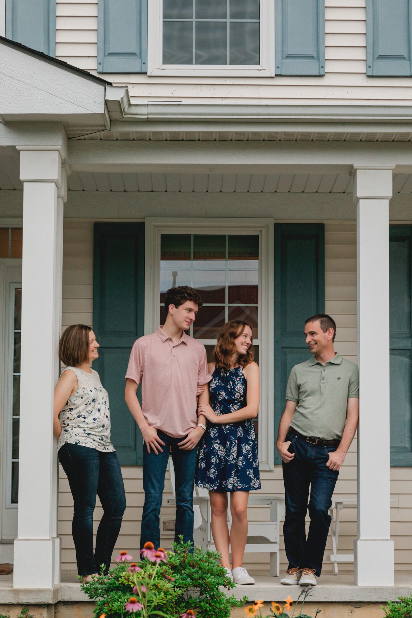
Elise + Mike
When Elise and Mike first contacted us in 2015, none of us anticipated how special our partnership would eventually become. It all started with their purchase of a piano, which led to the need to rearrange the furniture and relocate their living room TV. This sparked the realization that they could benefit from the expertise of interior design strategists. After discovering us and understanding how our team could assist them, Elise and Mike knew they found the perfect solution to confidently proceed with their living room and primary bedroom renovation plans.
Now, nearly a decade later, they reconnected with us to renovate their kitchen, powder room, children’s bathroom, and primary bathroom, to ensure everything aligns with what we co-created almost 10 years ago.
Our Goal:
With their two children graduating from high school and heading to college in the fall, Elise reached out to us to renovate their spaces before hosting graduation parties in the spring. The living room, foyer and bedroom redesigns were completed nine years ago and still authentically reflect the family's personal style. So, we aimed to design the remaining spaces to seamlessly coordinate with one another and align with the family’s new chapter.
Discover how our three-phase approach seamlessly integrated the newly remodeled rooms with the spaces we transformed a decade ago, blending personality and function.
Our Solution:
The living room is where it all began. Elise and Mike initially contacted us for help arranging furniture around a new piano, which quickly evolved into a full-scale renovation to reflect their personal style. Built in the early 2000s, their home originally had a generic builder-grade look, lacking the east coast charm and character that Elise, a Boston native, adored.
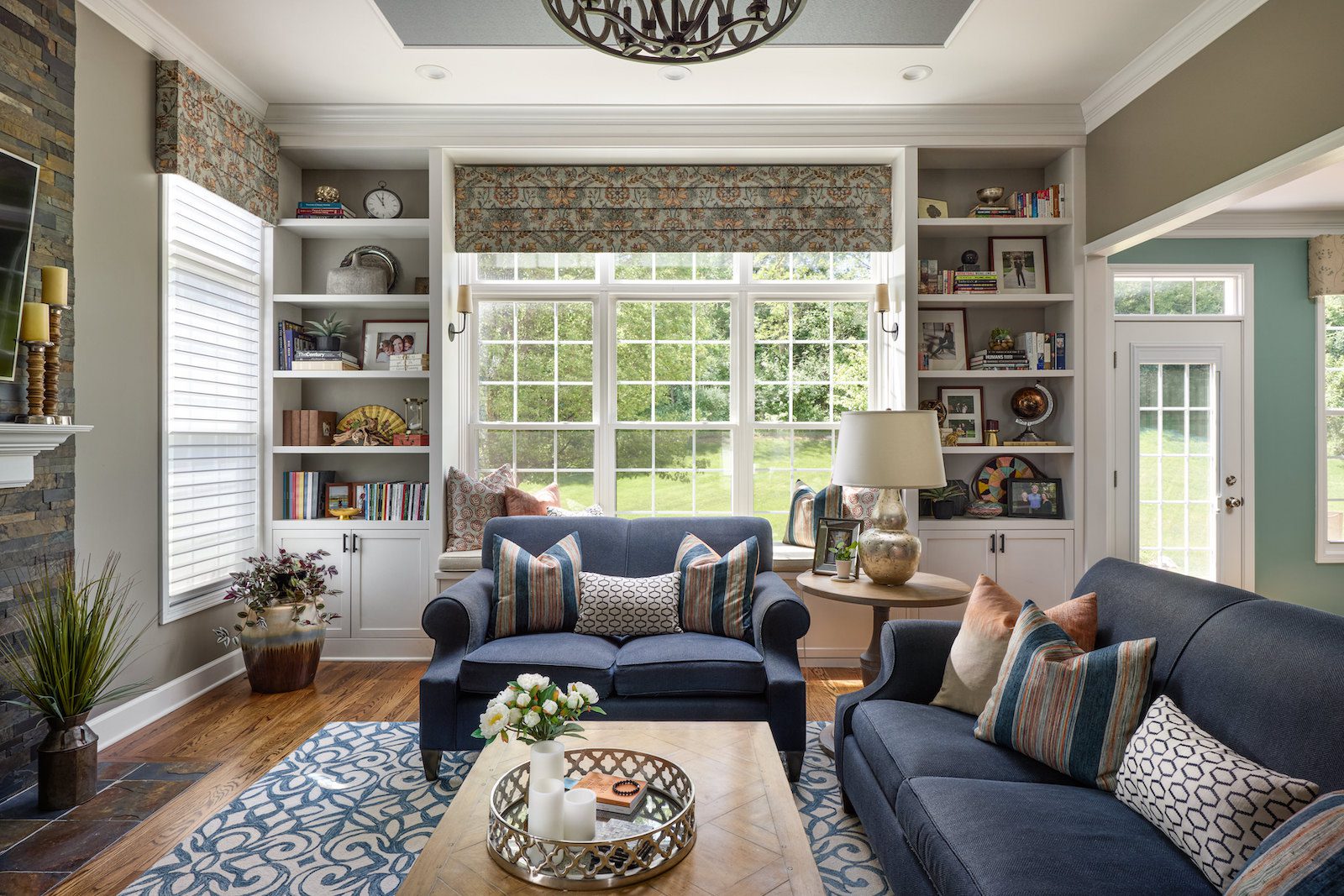
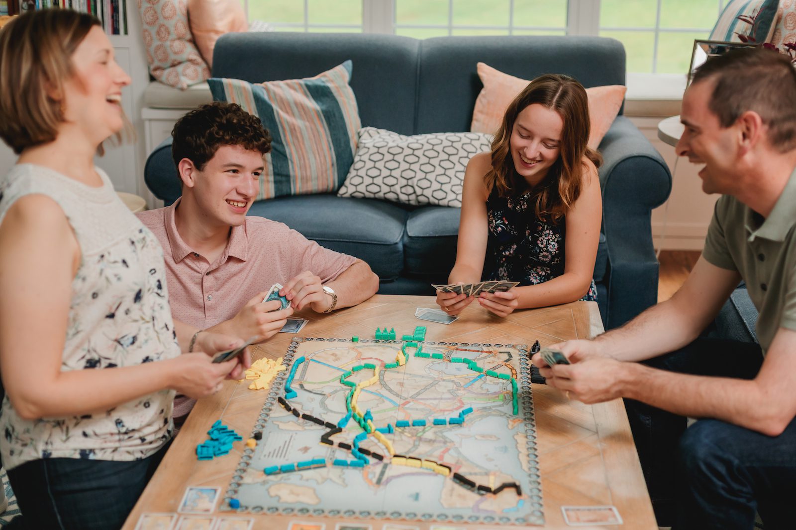
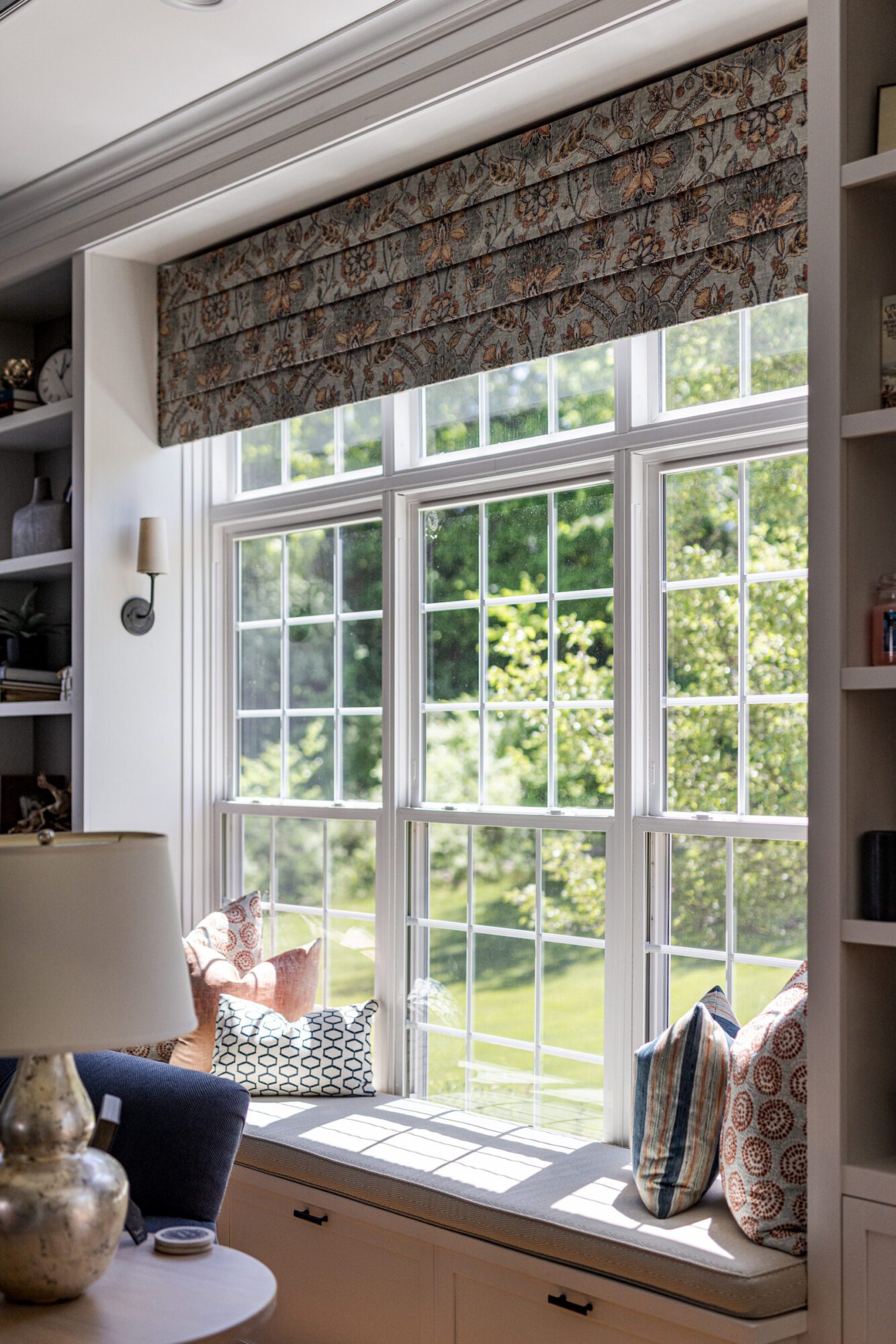
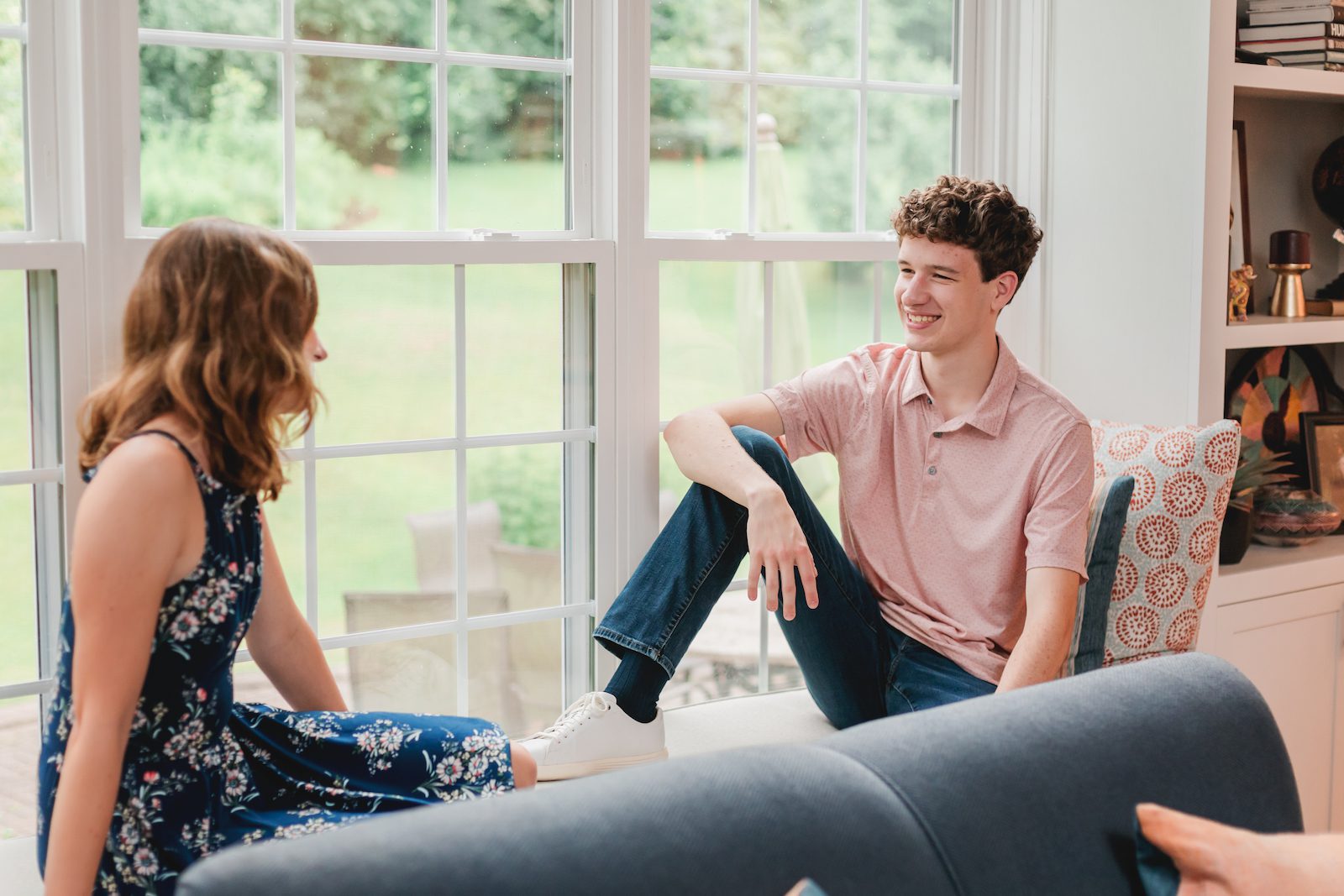
Our design vision was serene, featuring abundant blues, greens, and custom molding. We incorporated slate into the existing white fireplace, and added trim, ceiling details, custom built-ins, new furniture, refinished the wood floors, additional lighting, and a reading nook for their daughter, Charlotte. Now, the space beautifully embodies Elise’s east coast roots while meeting the style and functional needs of the family.
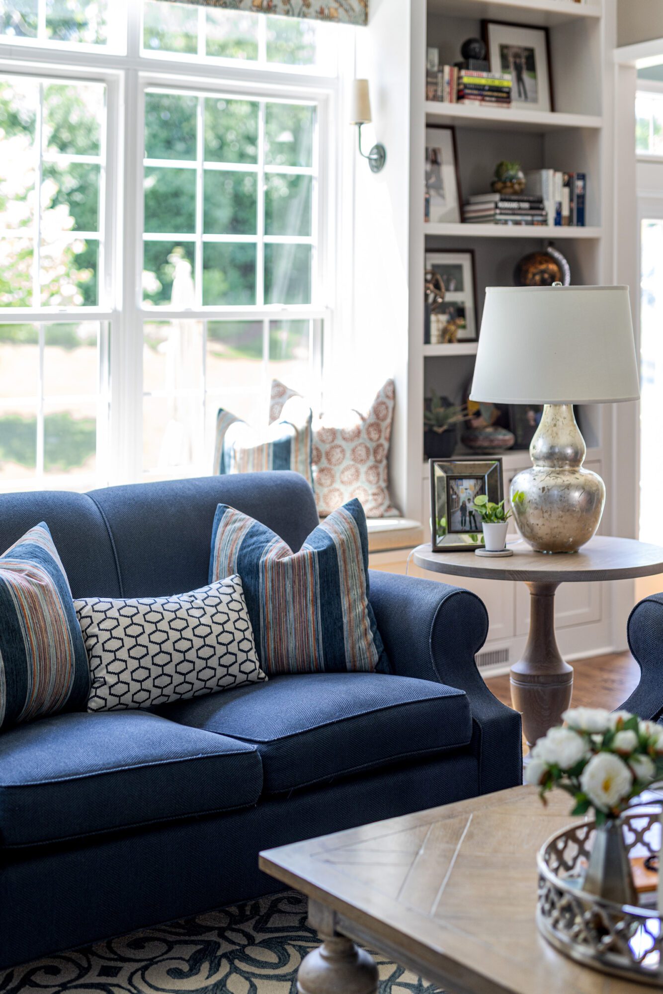
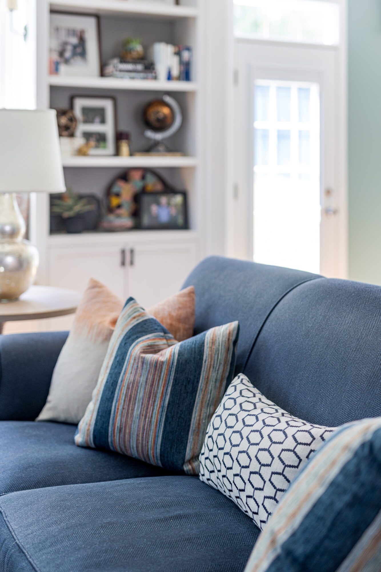
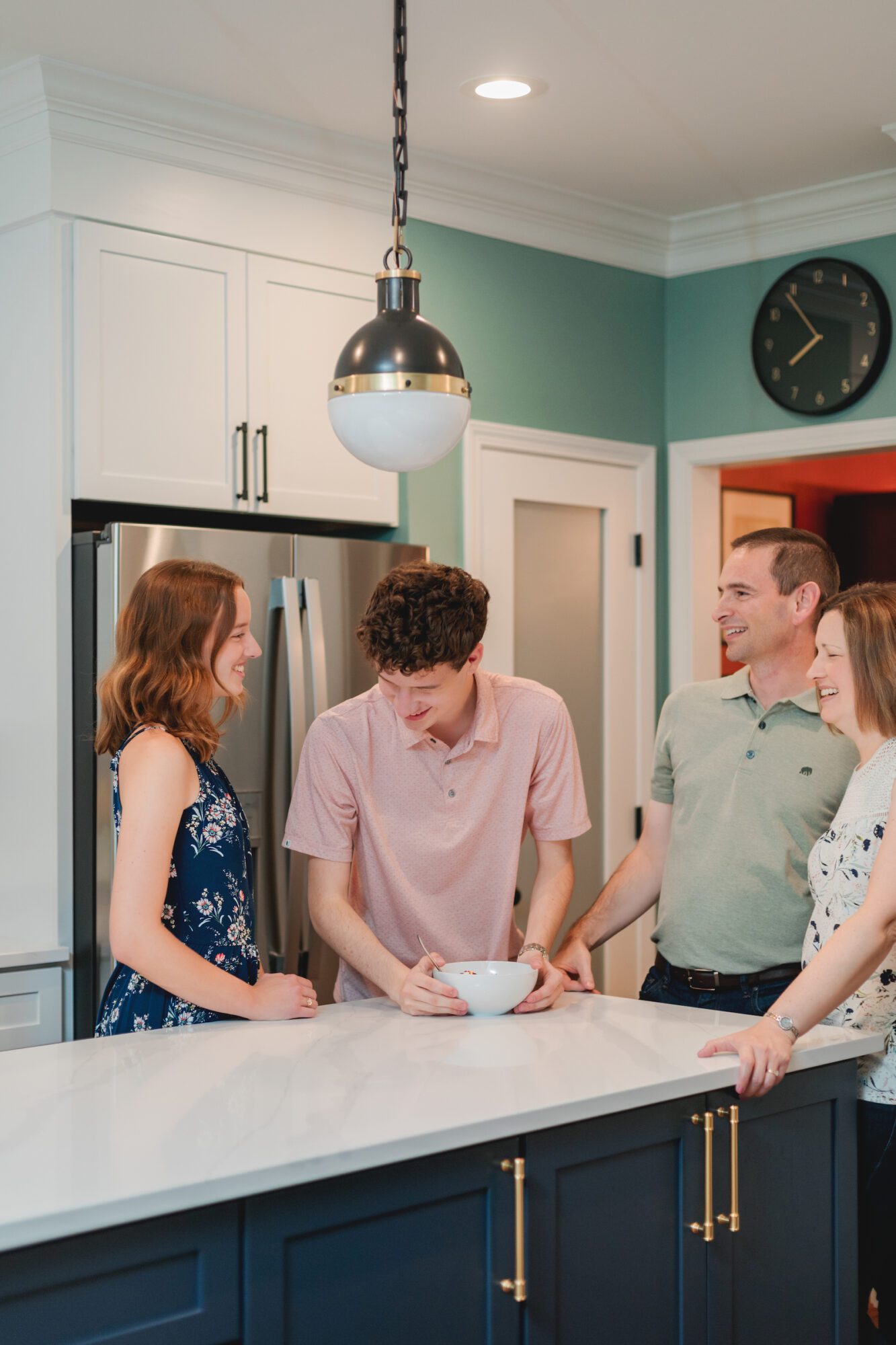
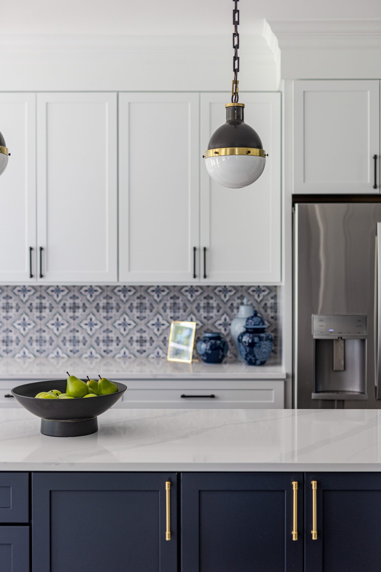
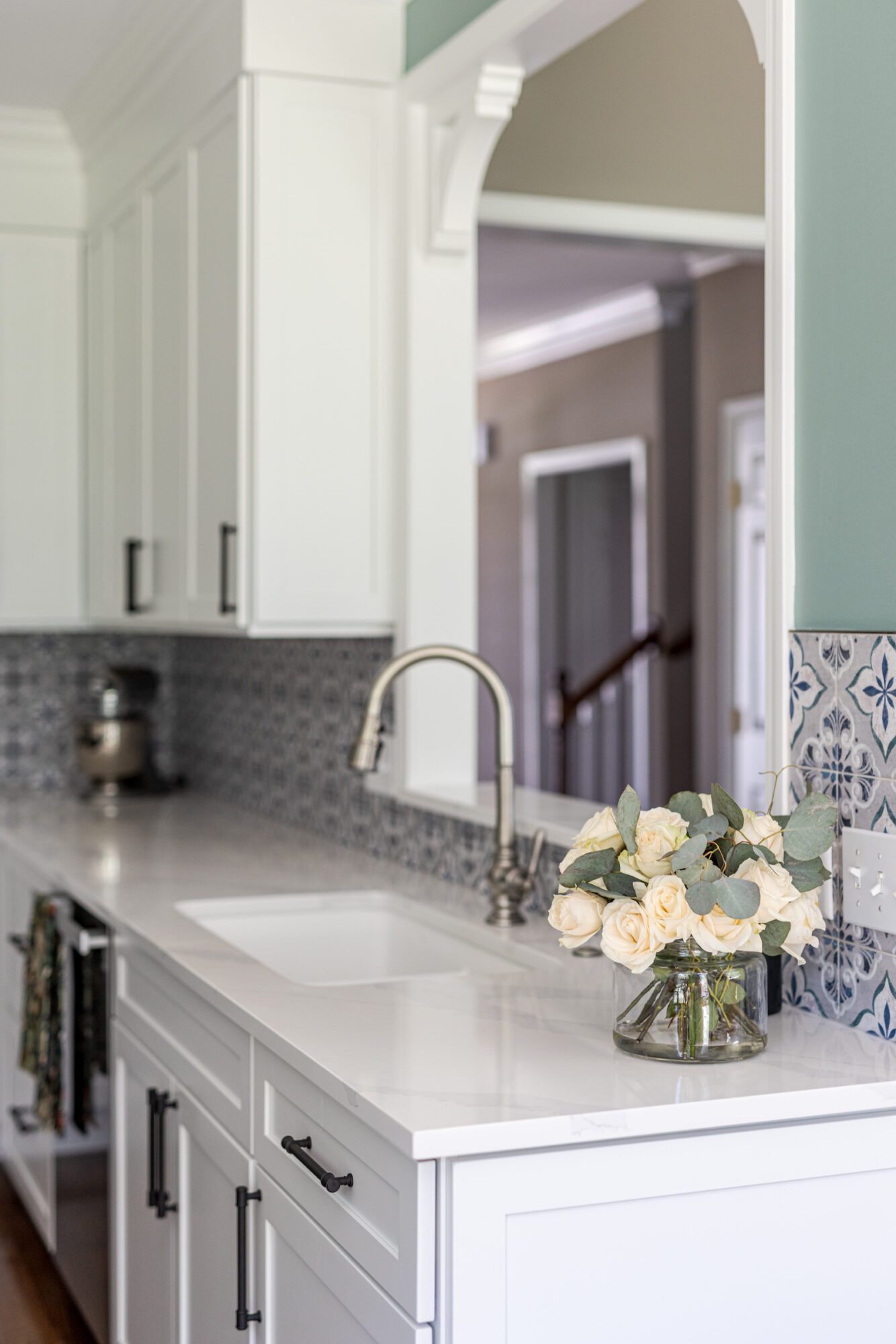
Fast-forward to today, with Elise and Mike entering a new season in their lives. They reconnected with us to renovate their kitchen, which is directly adjacent to the living room and is visible through an opening between the two spaces. This project achieved several goals: the new kitchen design harmonizing with the existing living room décor (particularly the custom cornices), maintaining the existing footprint, and addressing their functional needs. This included all new cabinet countertops, reimagining the workflow to be more efficient the original microwave placement, and updating cabinets that no longer served their purpose.
Since they had already invested in refinishing their floors, we decided to keep the kitchen layout unchanged and focus on upgrading the builder-grade cabinets and countertops. Our goal was to create a seamless transition between the kitchen and living room, making them look as if they were designed and executed together.
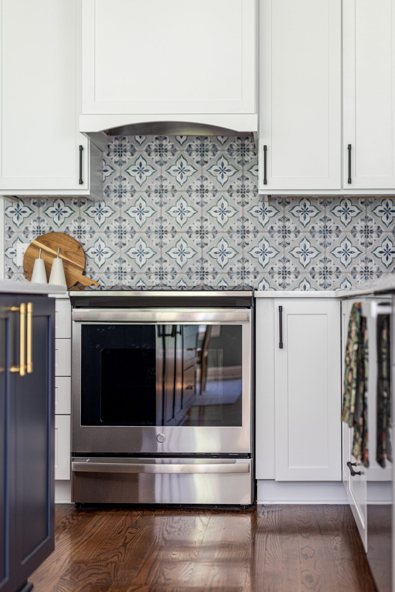
We achieved this by incorporating recurring elements such as blue tones, bright and light elements, and white trim—key design features in the living room. To further connect the two spaces, we echoed the navy blue sofa in the living room with a navy blue island in the kitchen and the blue found in the statement backsplash. The subtle green from the living room cornices is reflected in the kitchen's green walls, and we added gold hardware, a bumped-out crown hood, and cabinet molding for extra visual interest.
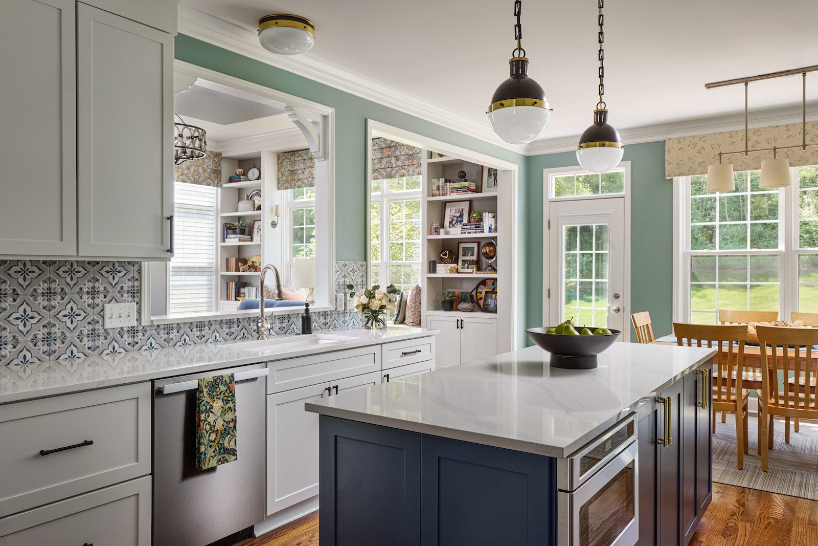
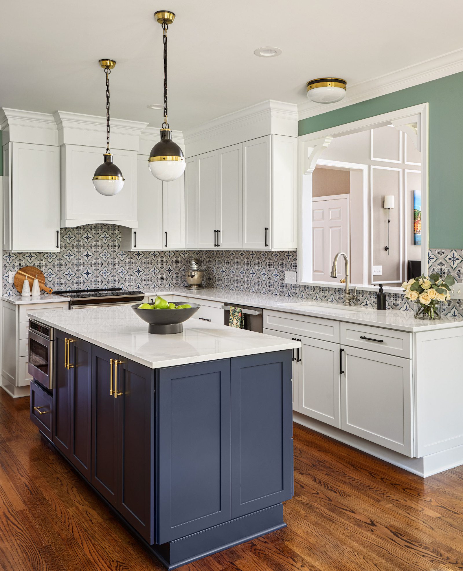
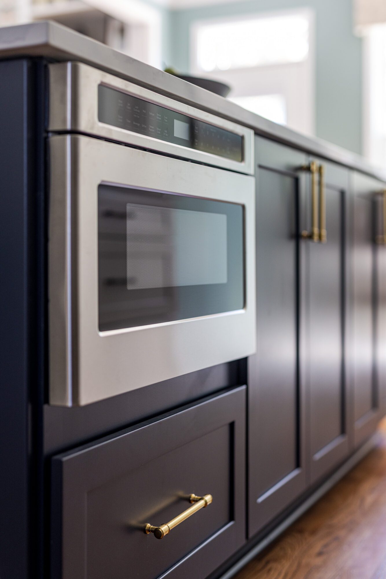
To address the functionality issues, we expanded the island while maintaining the same footprint, ensuring the flooring remained uninterrupted. We also relocated the microwave from above the range to a drawer in the back of the island, making the space more functional and aesthetically pleasing.
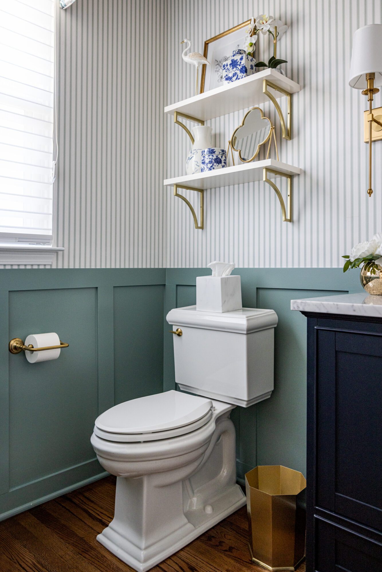
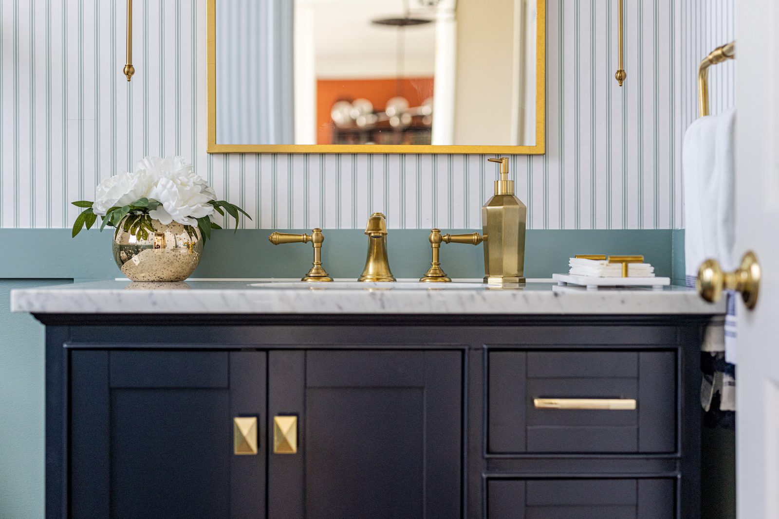
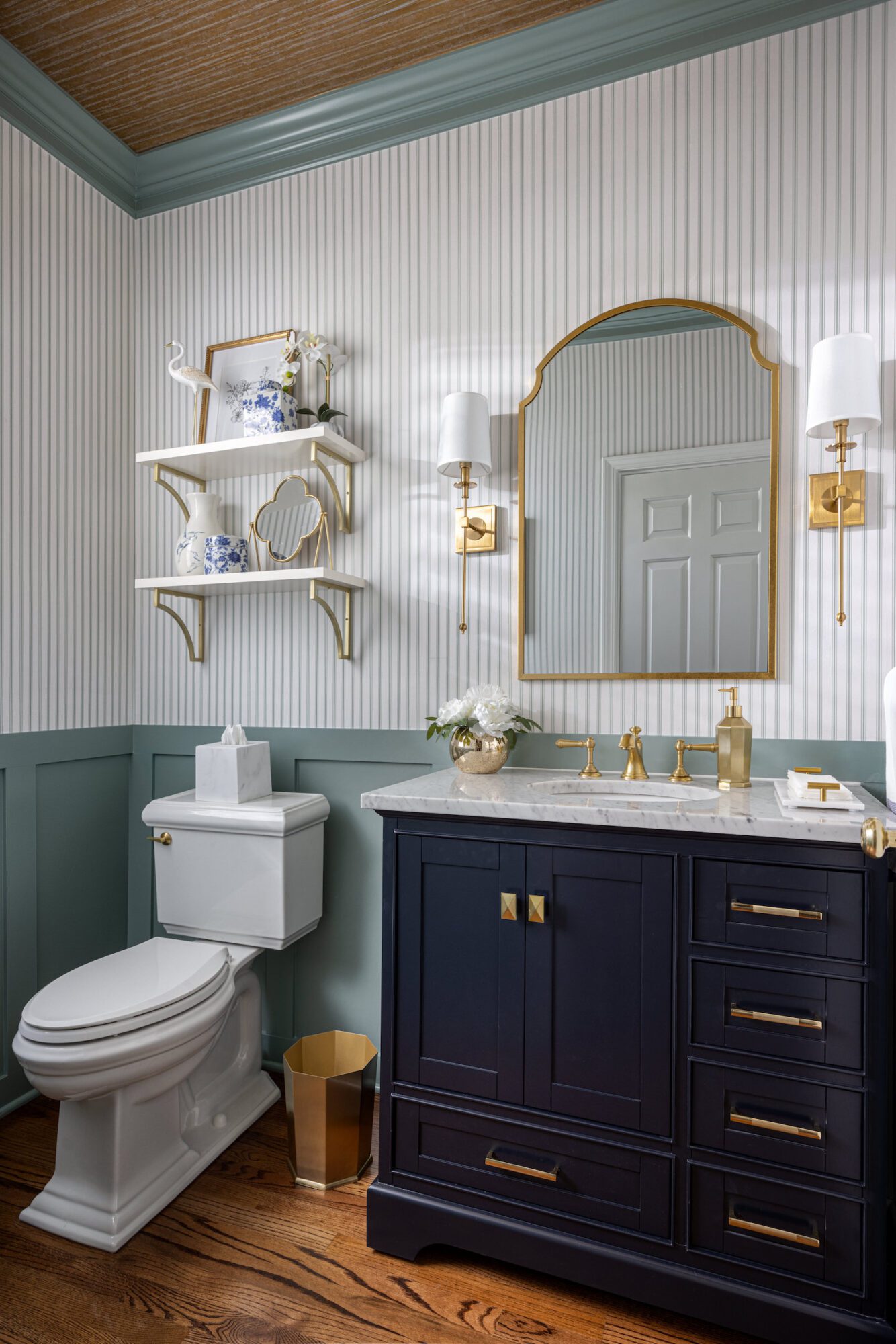
Our team also renovated the first-floor powder room, designing it to complement the custom cornice we installed nine years ago.
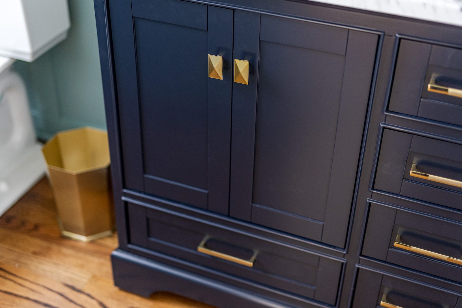
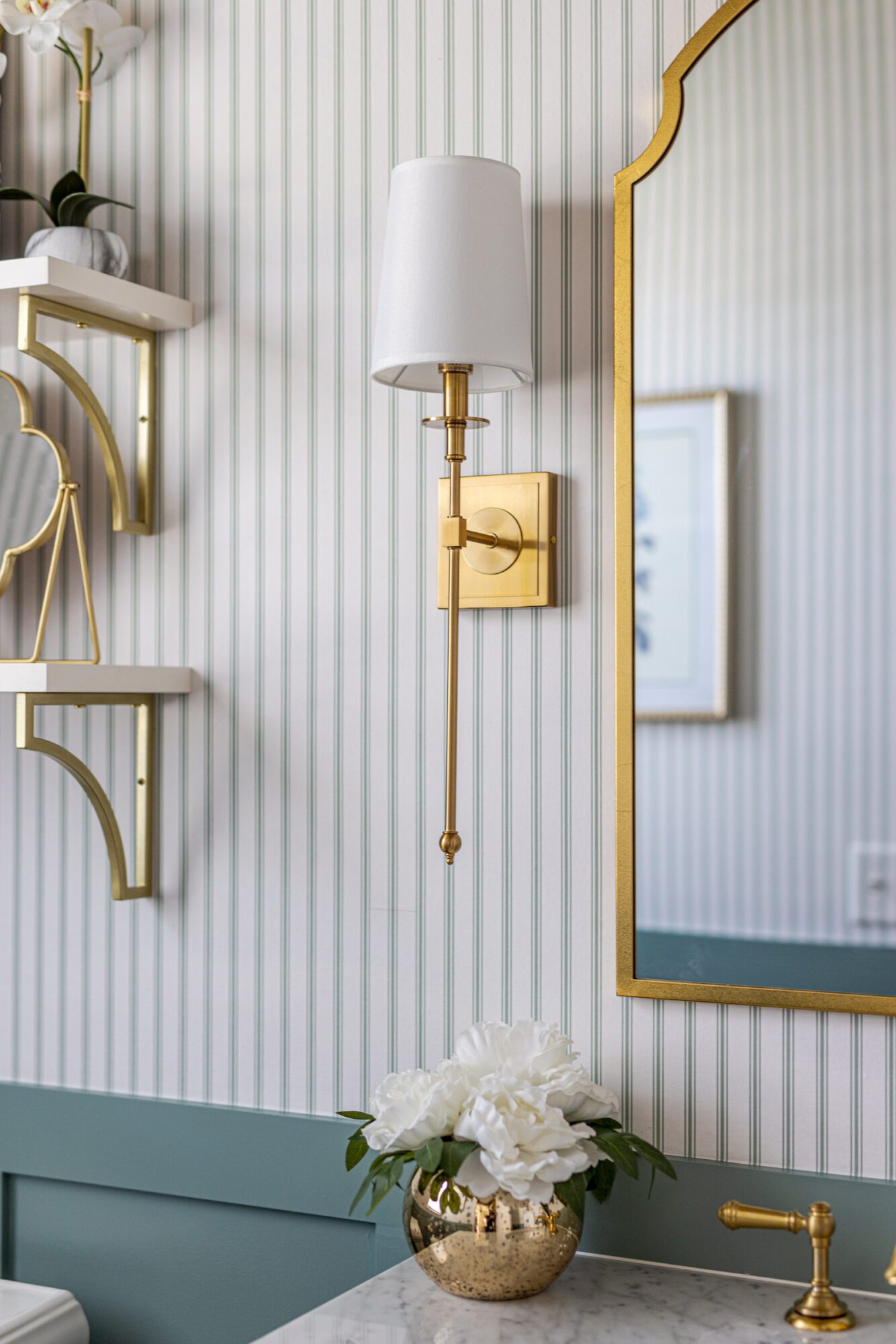
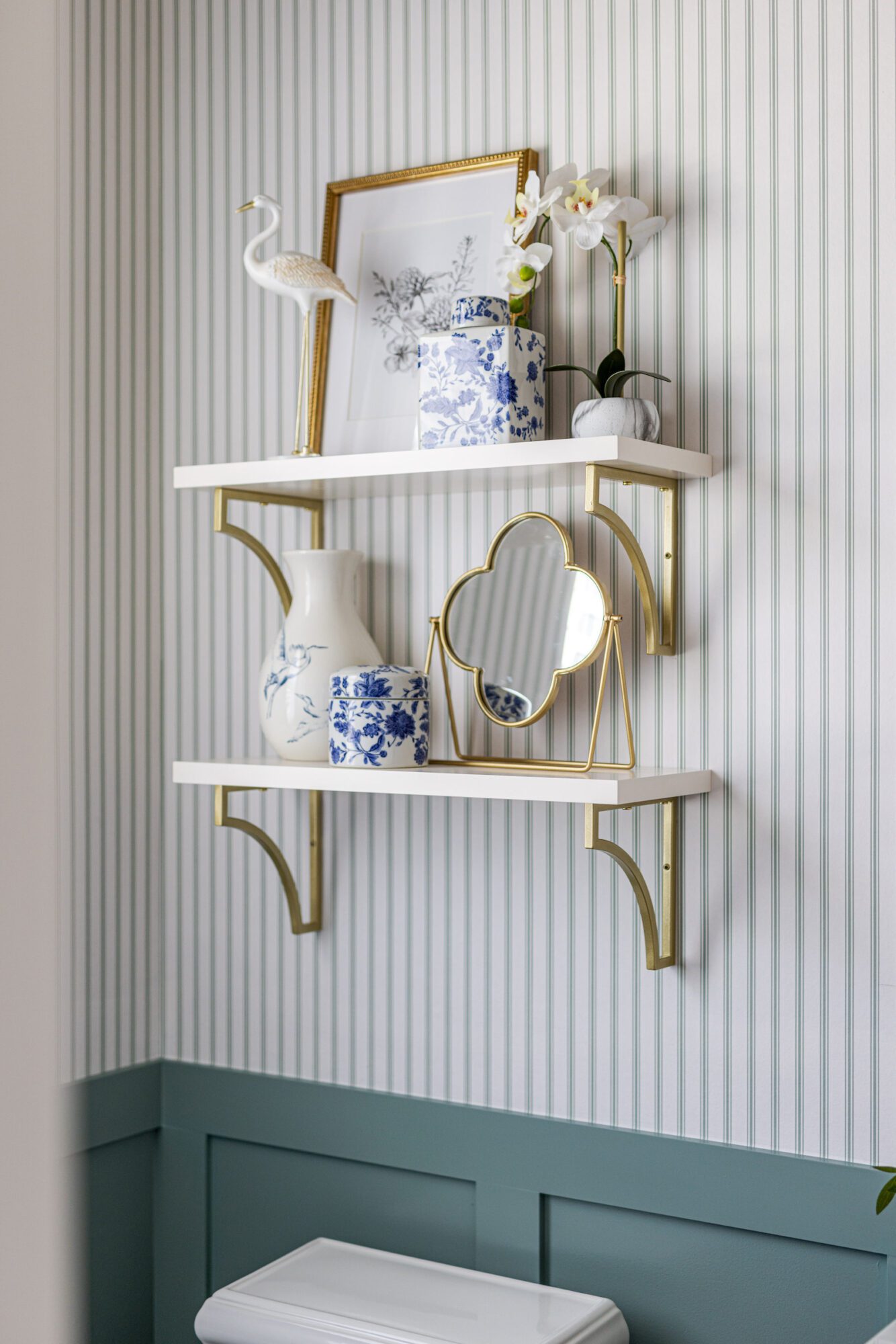
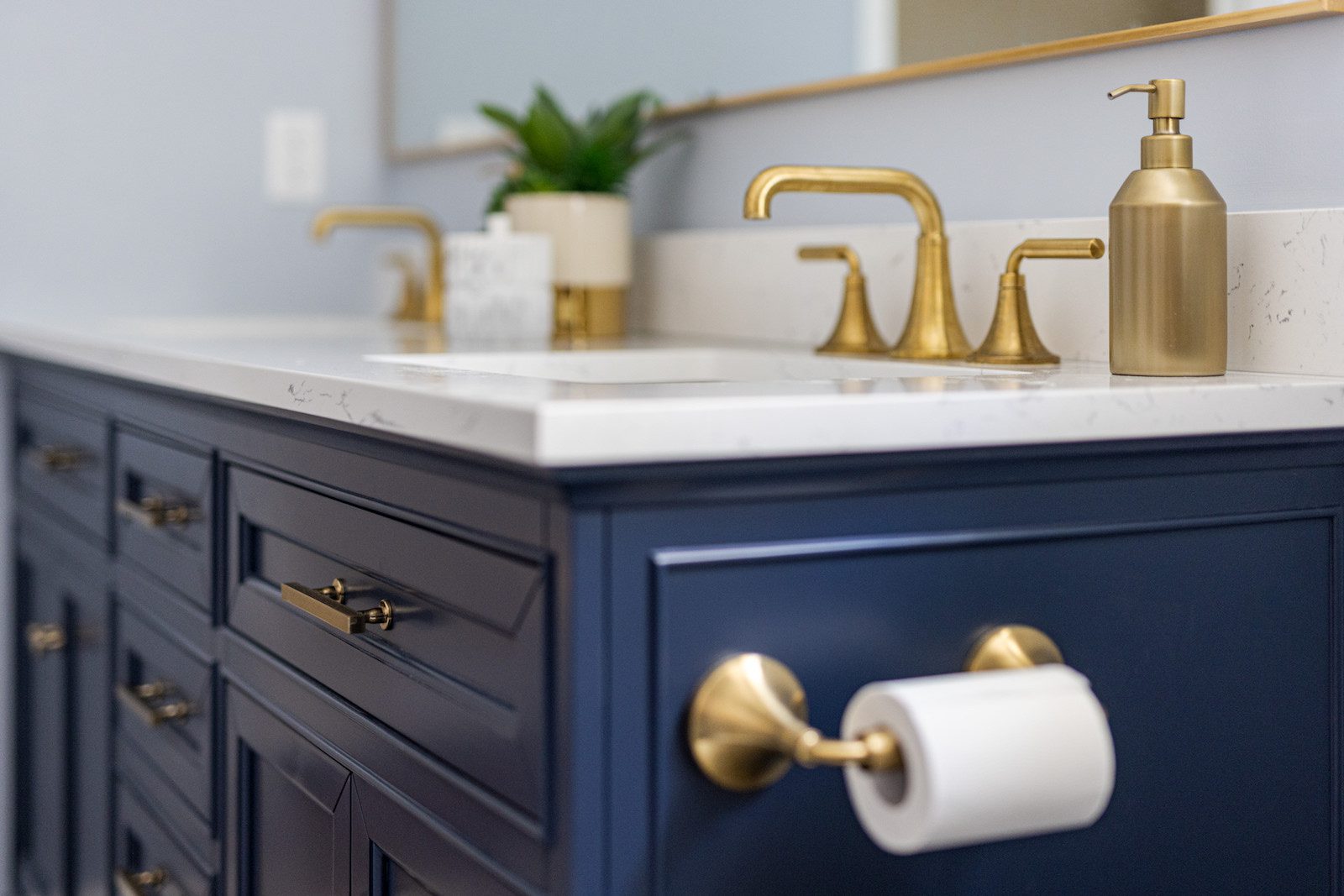
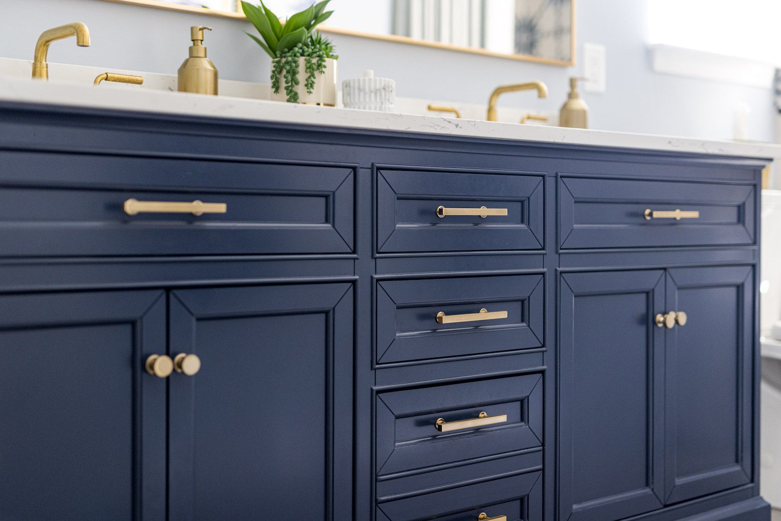
The footprint of the powder room remained unchanged, but we addressed its functional needs by replacing the existing pedestal sink with a storage vanity, which provides additional storage and introduces navy blue and gold into the space. We added additional navy blue and gold accents through open shelving, sconces, and a vanity mirror. We also incorporated green crown molding and a gold wallpaper accent on the ceiling (salvaged from the original primary bedroom makeover). The pinstripe wallpaper complements the soft blue-green color scheme of the cornices while providing some much-needed character.
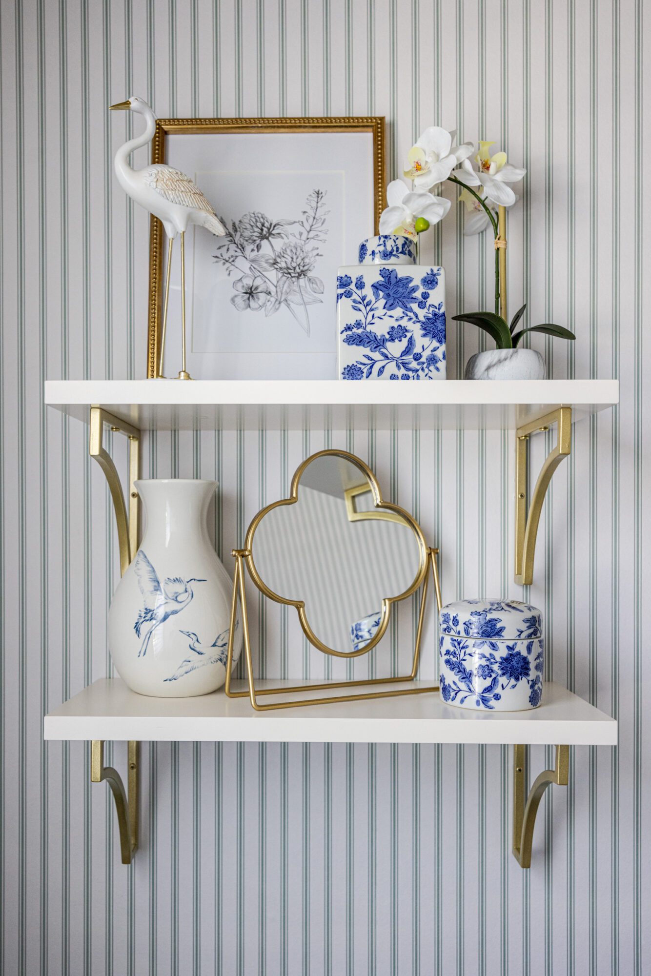
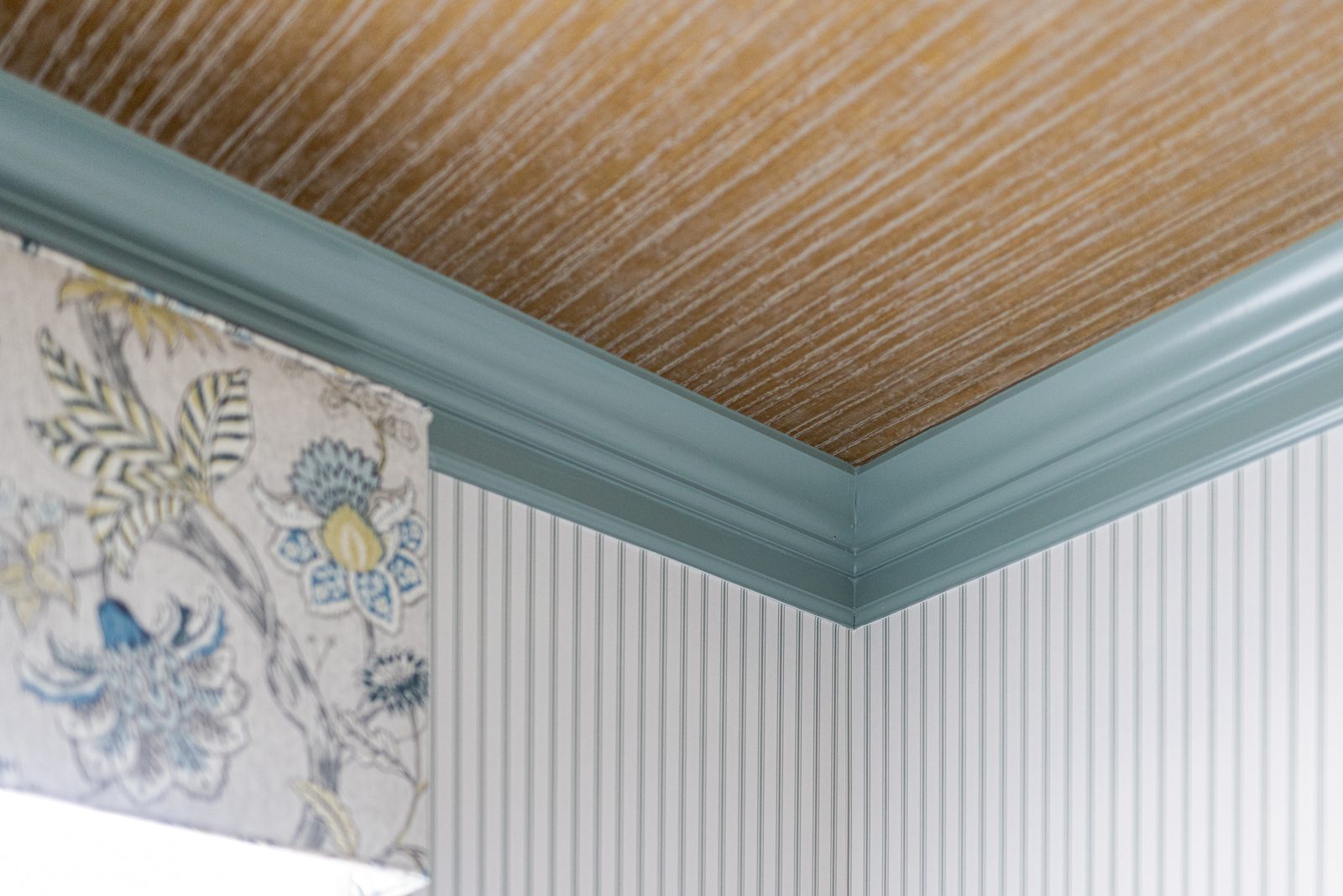
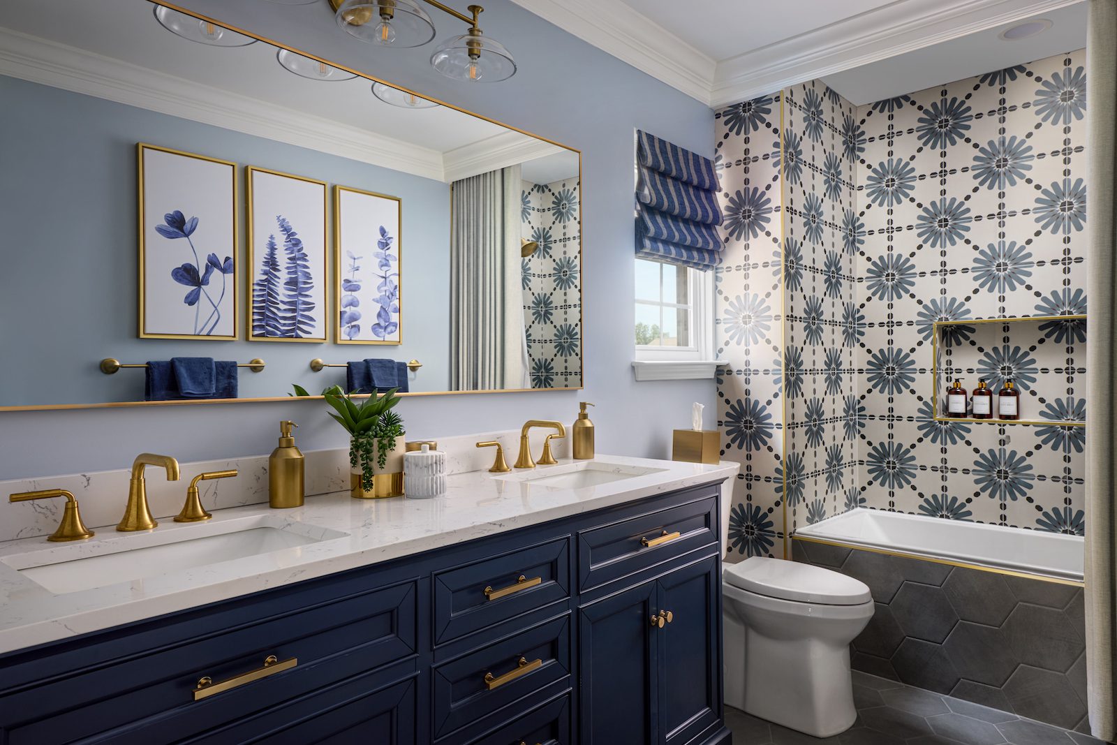
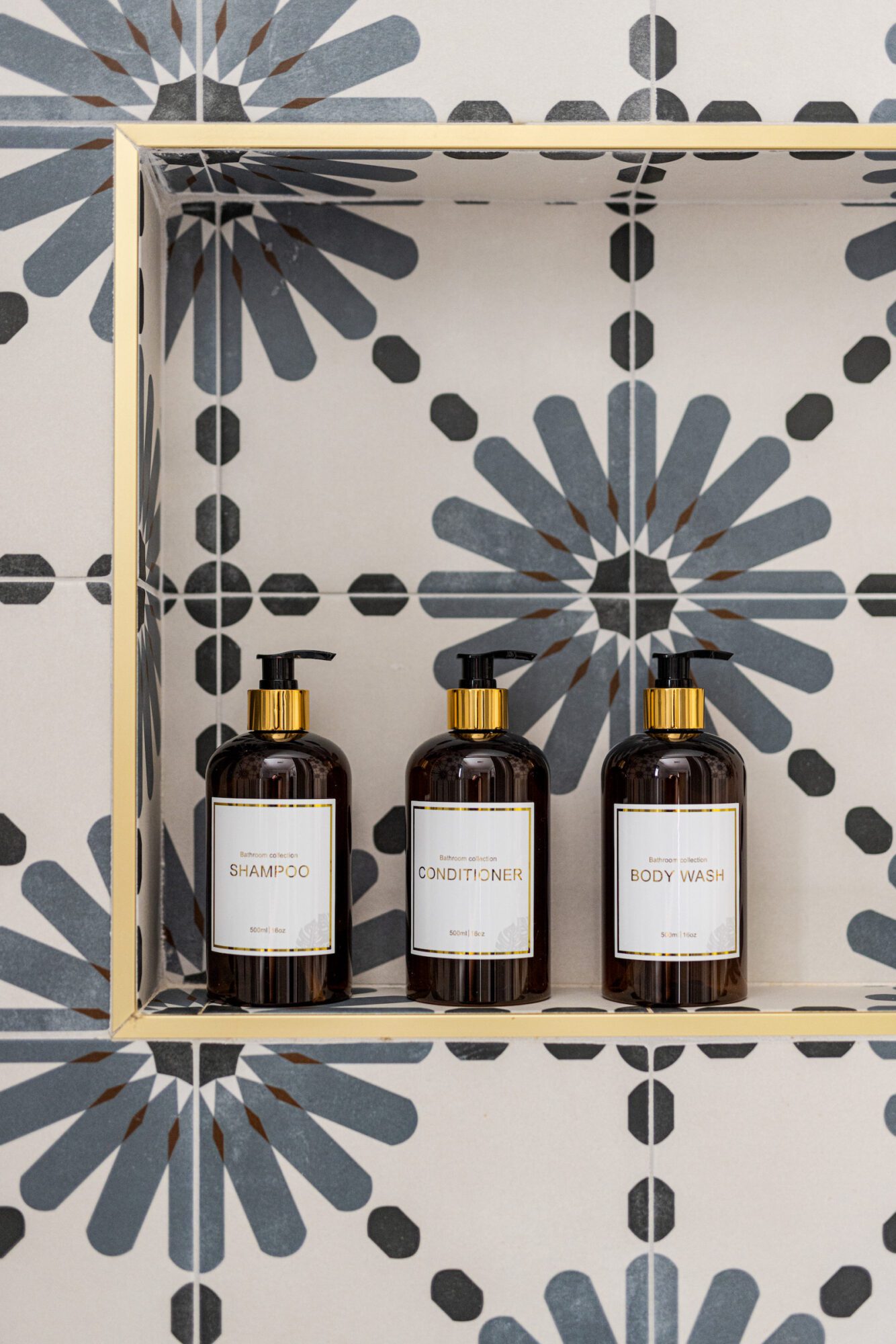
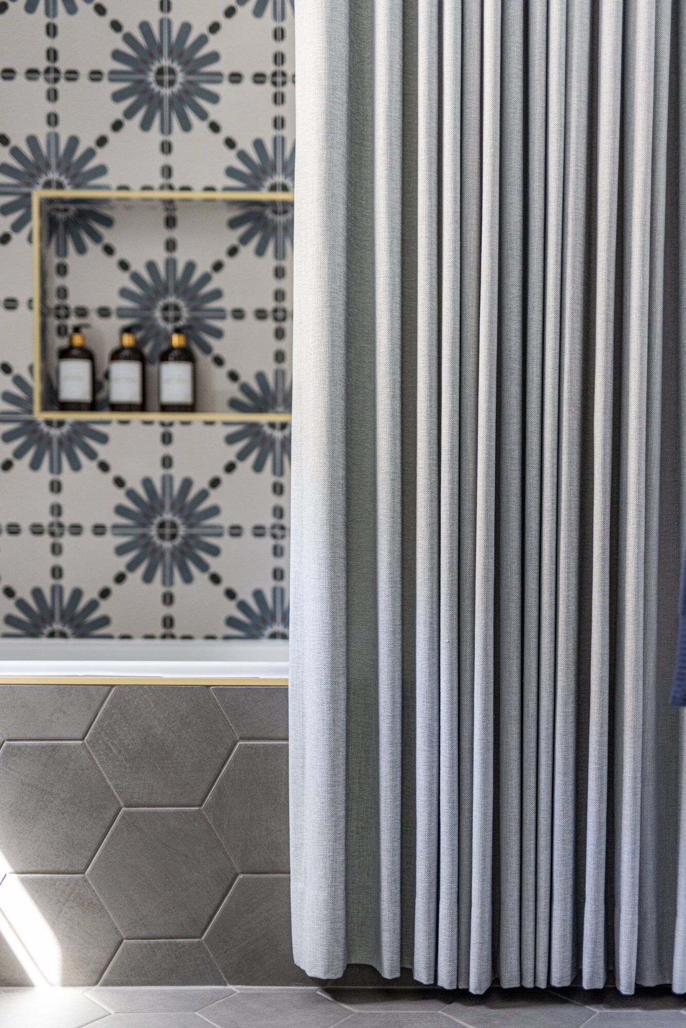
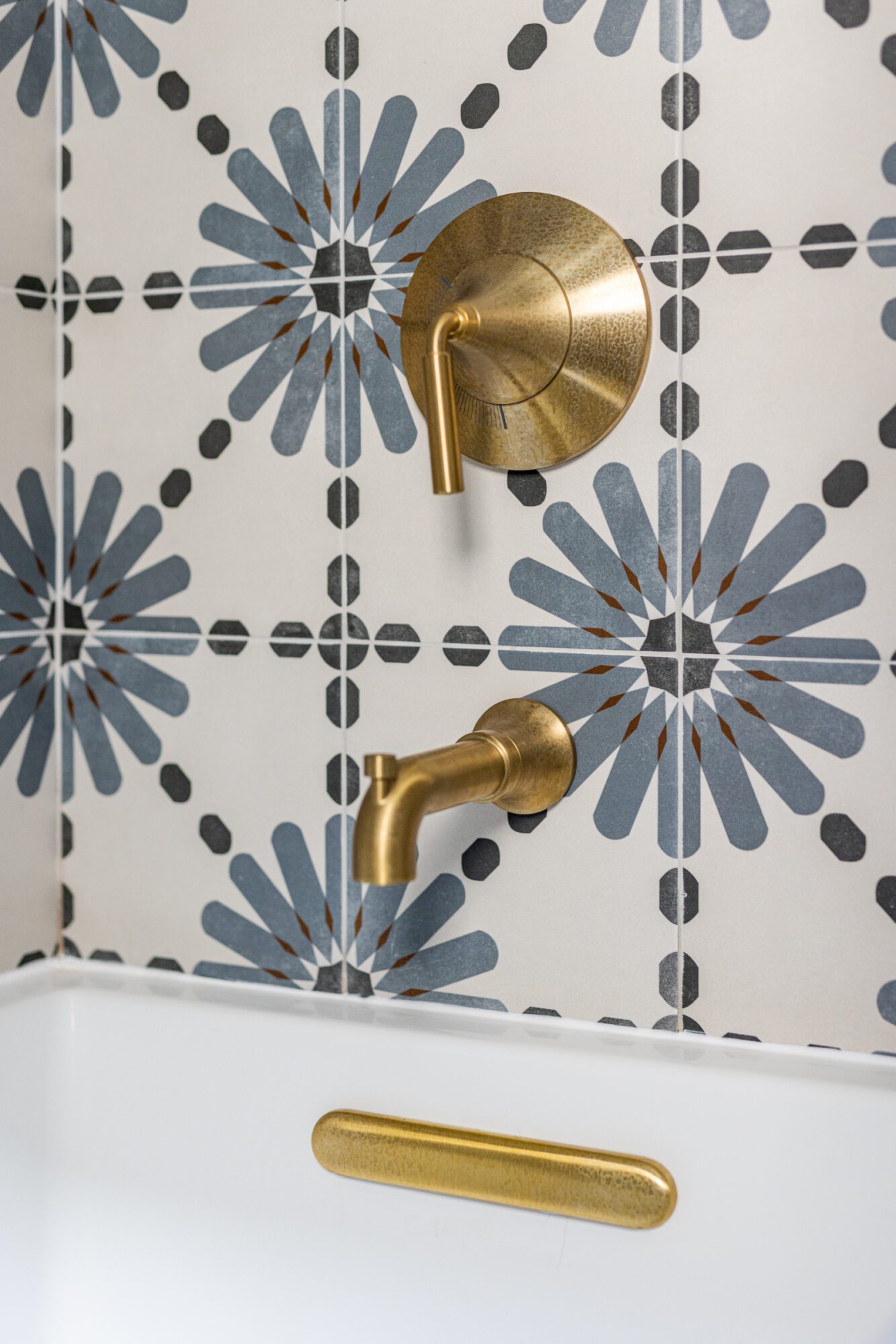
The shower was also refreshed with a seamless niche and a custom shower curtain concealed behind a gorgeous crown detail. We upgraded the traditional alcove tub to a drop-in style with a tiled front for added interest and sophistication. And of course, we couldn’t forget about incorporating some gold through the shower niche Schluter, vanity hardware, mirror and art frames, plumbing, and light fixtures.
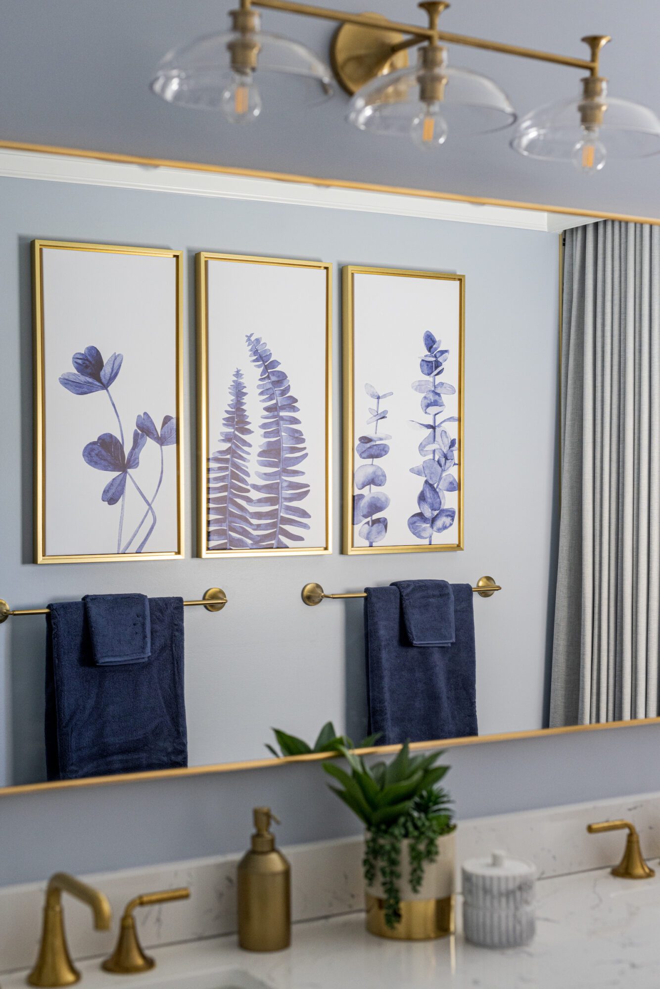
Finally, the room that saw the biggest transformation—the primary bathroom. Since the primary bedroom was renovated in 2015, the bathroom needed to blend seamlessly with the bedroom and coordinate with the existing cornice fabric.
The original bedroom, like the rest of the home, lacked charm and personality. To infuse the space with style, we added millwork details, crown molding, statement pendants over the nightstands, window treatments, and wallpaper that include Elise’s favorite blue-green color.
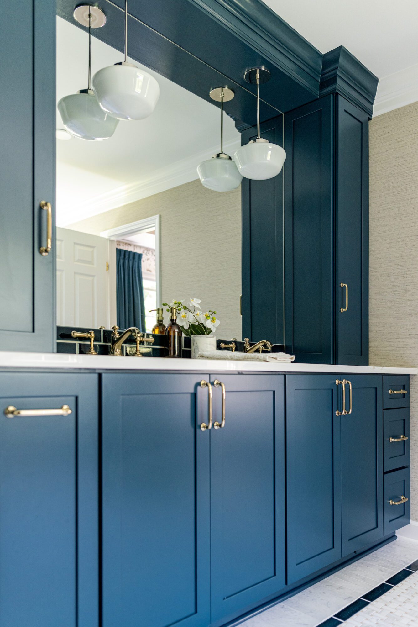
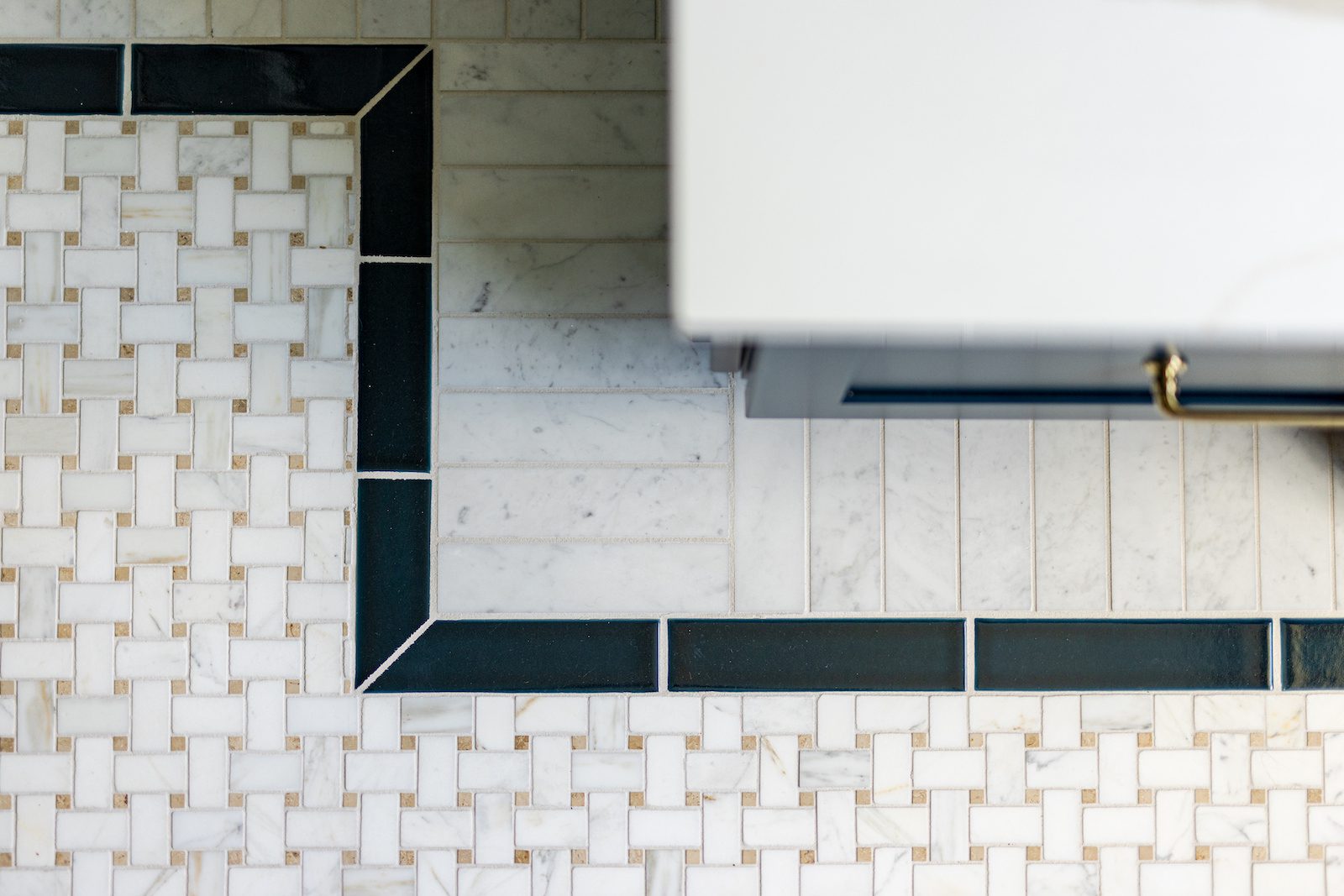
The primary bathroom is the only room in this renovation that underwent a floor plan change. We removed the jacuzzi tub and shifted the shower to double the space’s size. Elise and Mike wanted to add interest through the floor tiles, so we chose a basket weave pattern in warm marble that complements the vinyl grass wallpaper and harmonizes with the existing cornice. We concealed the shower niche behind the wall, extended the floor border into the shower, and added a linear drain for a clean sightline.
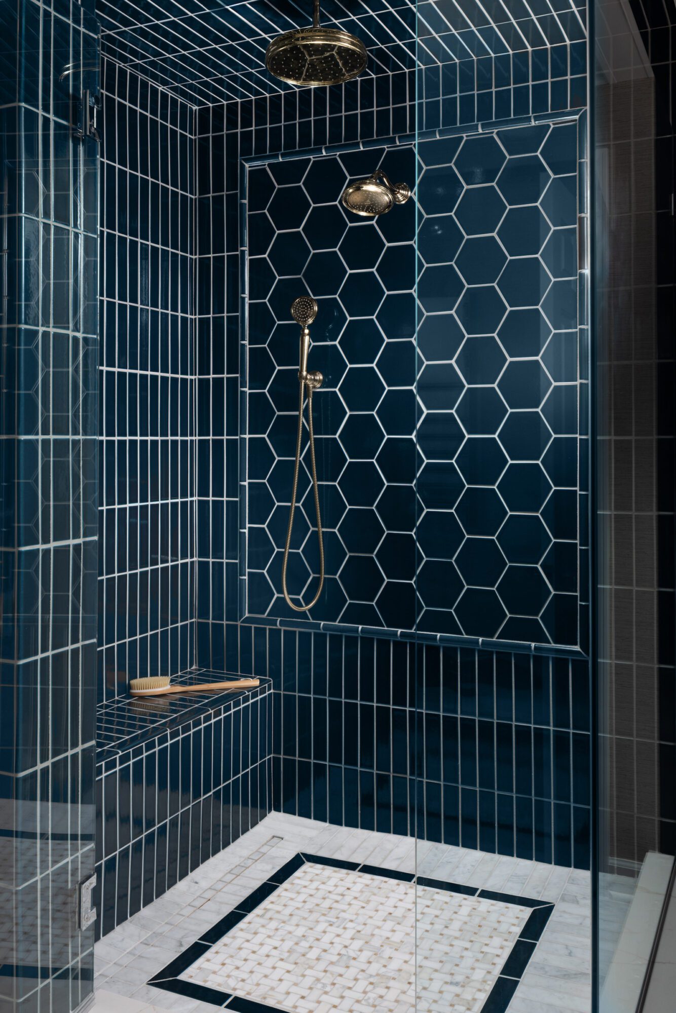
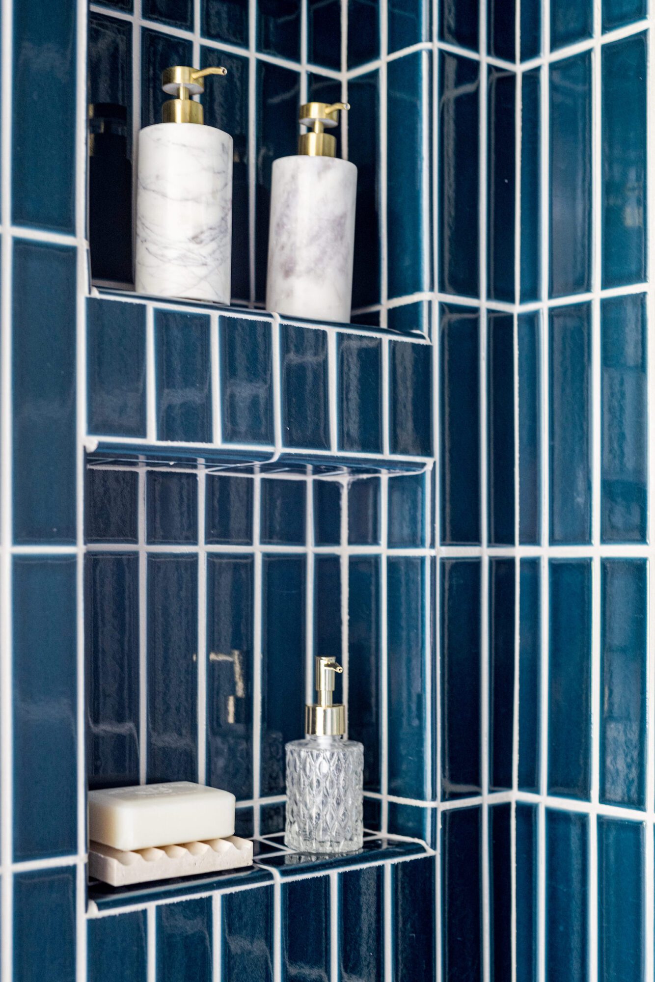
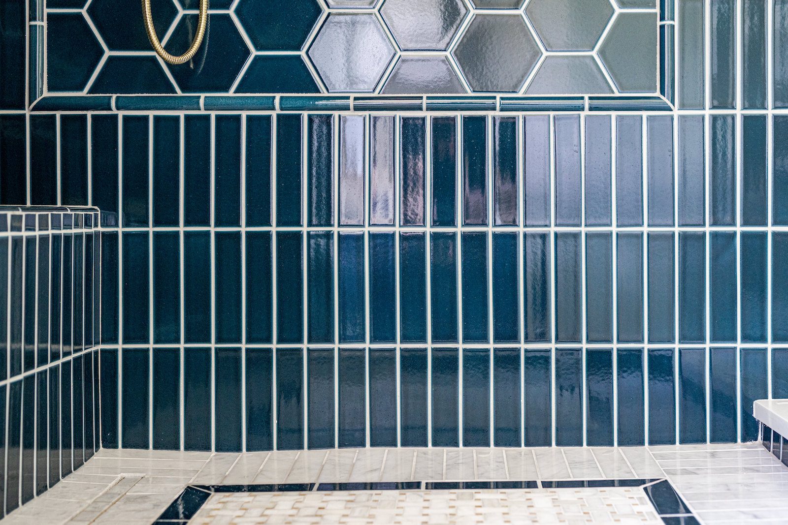

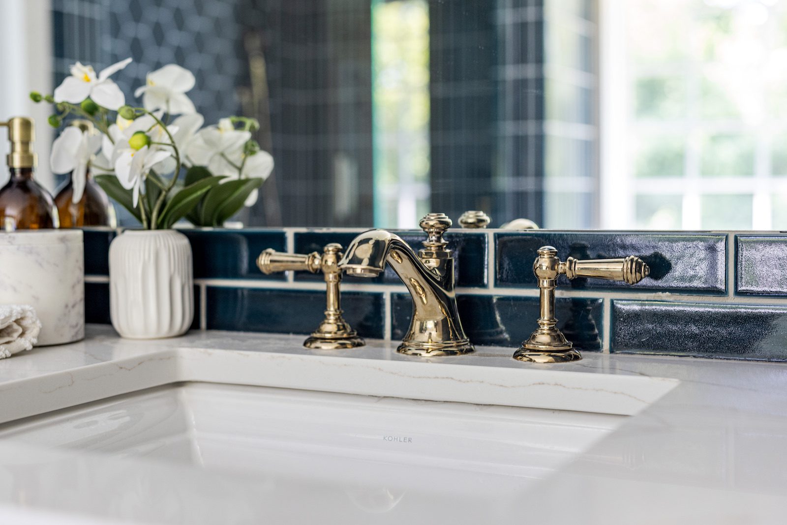
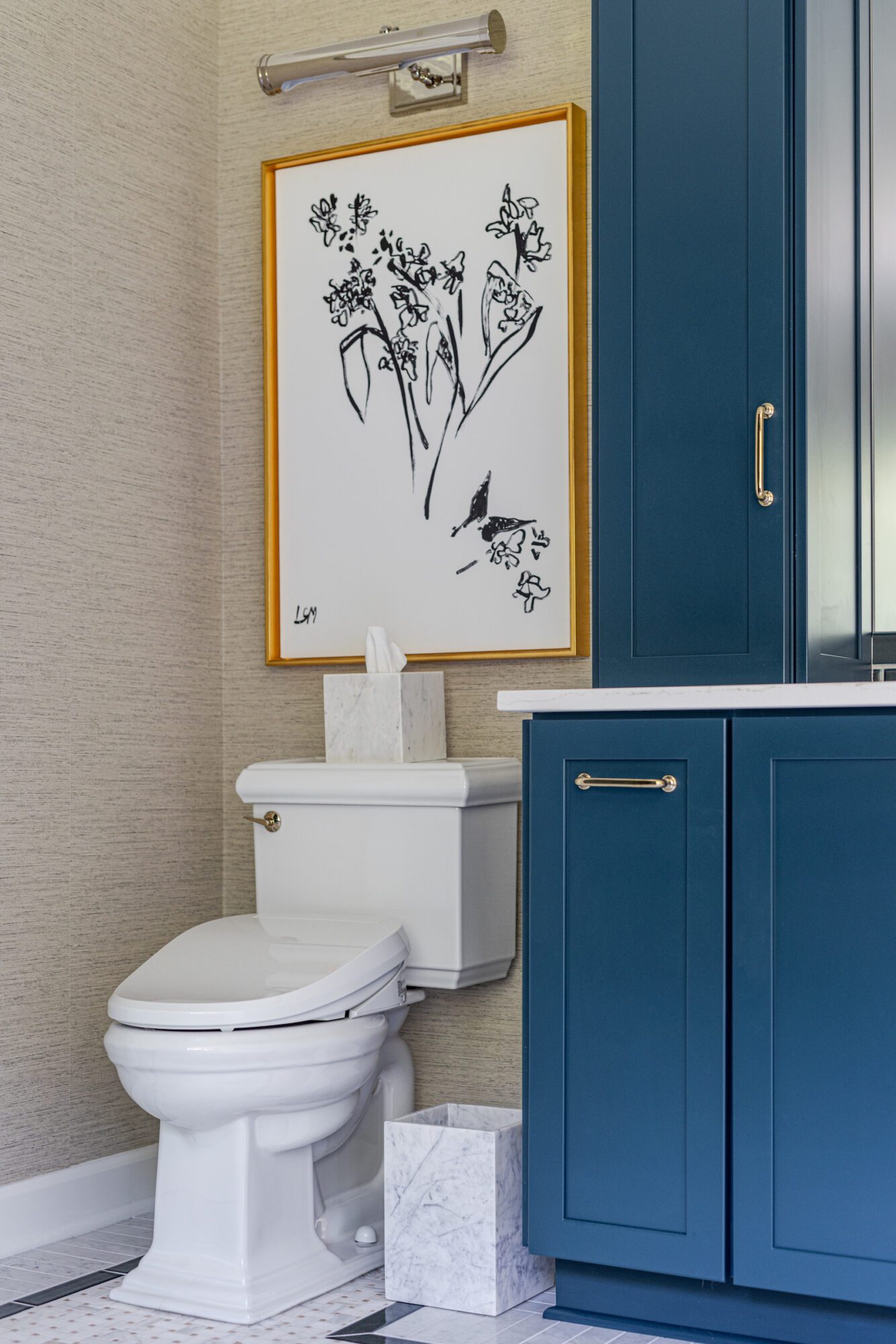
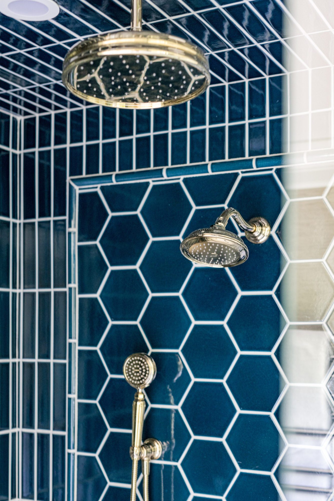
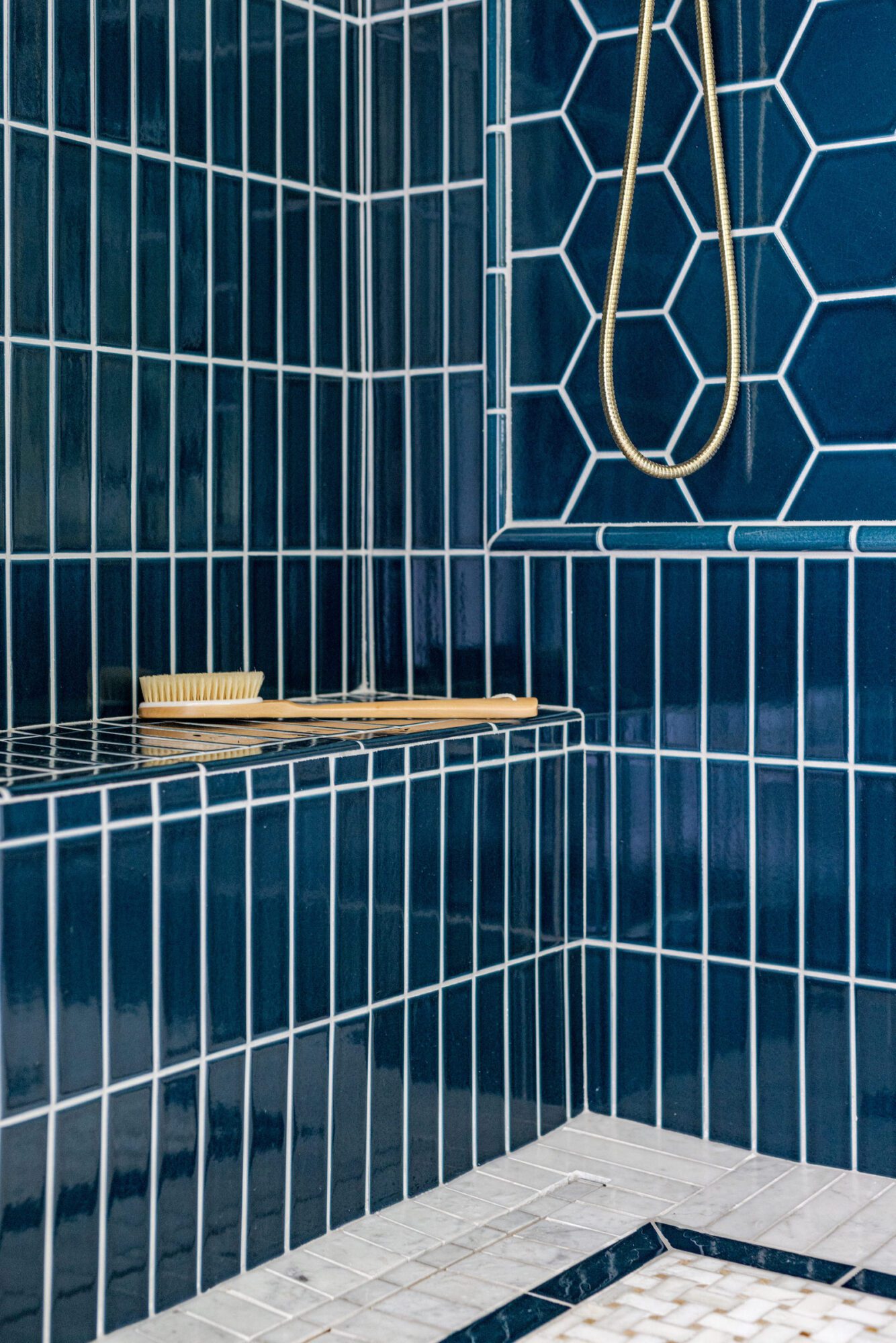
We matched the blue-green shade from the primary bedroom's wallpaper with the shower tiles and vanity paint. By removing an unused wall, we transformed the original vanity into a double vanity to maximize functionality.
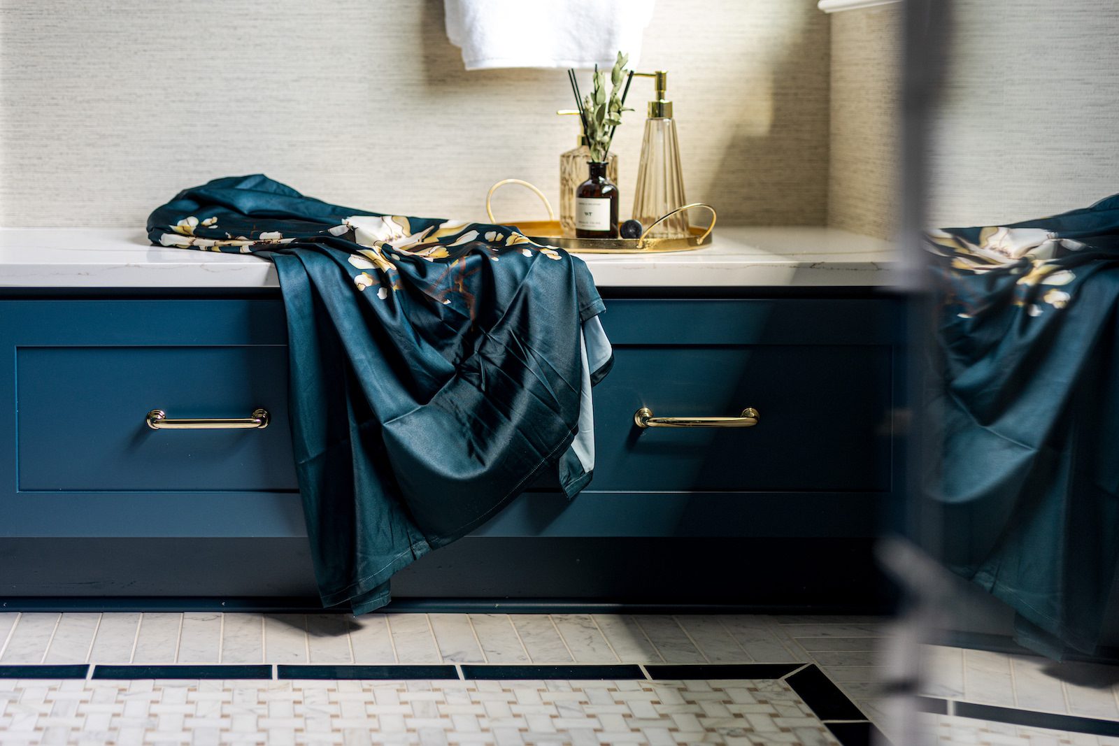
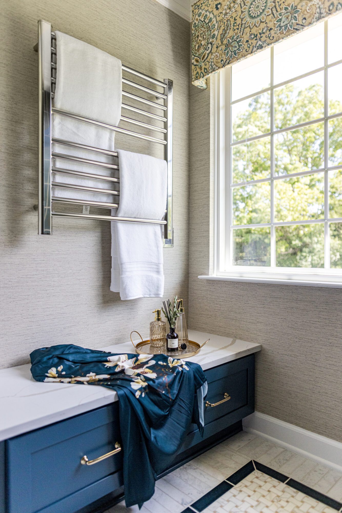
Finally, to meet Elise and Mike's key request for a dedicated changing area, we created a separate dressing space for added convenience while they get ready for work. We added a storage bench painted to match the cabinets and installed a chrome towel warmer for a touch of luxury.
Making News

AWARD: Interior Use of Tile – 3rd Place