Suburban Sanctuary - Concetti

Suburban Sanctuary

Collaborators
American Manufacturing & Industry Corp. (Jason Moreen)
TYPE
Residential
Location
Michigan
PHOTOGRAPHY BY
Brett Mountain + Ellie Frances
From the very beginning, our client knew exactly how they wanted their home to look and feel; a serene, open-concept oasis, flooded with natural light, and seamlessly connected to the outdoors. As an independent and spiritual Aries, they understood the impact of clutter on their well-being and mental health, making the mission clear: to craft the Suburban Sanctuary of their dreams.

Our Goal:

At Concetti, we understand the significant role our surroundings play in shaping our mood and mindset. That's why we prioritize creating spaces where authenticity thrives. This particular client understood that a home is more than a living space; it's an extension of their very being. With a deep love for simplicity, nature, and all things minimal, they sought to transform their colonial into a sanctuary that would not only reflect their lifestyle but also support their mental health.

Our client’s 100-year-old house was a charming yet disjointed canvas awaiting transformation. But how do you make renovations that seamlessly blend with the vision of its owner? That was our challenge, and we embraced it wholeheartedly.
Our Solution:

The century-old home underwent several renovations over the course of its long life, yet they didn’t quite meet our client’s needs. Outdated features like popcorn ceilings, traditional molding, and inconveniently placed walls didn't align with our client's vision for a simple, modern, and open-concept home.

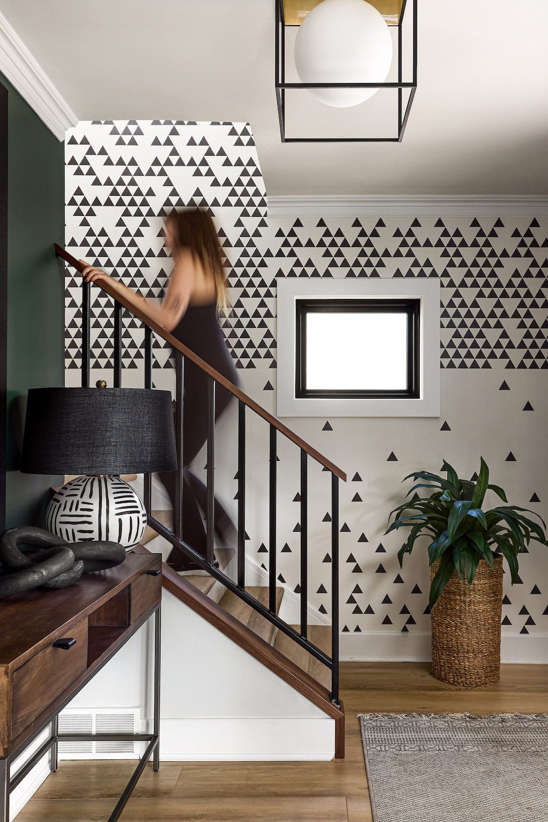
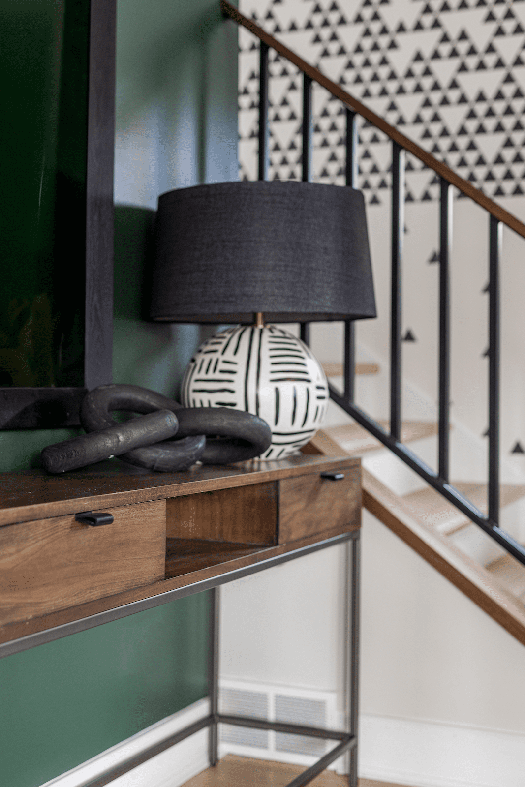
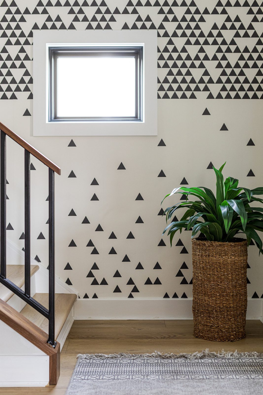
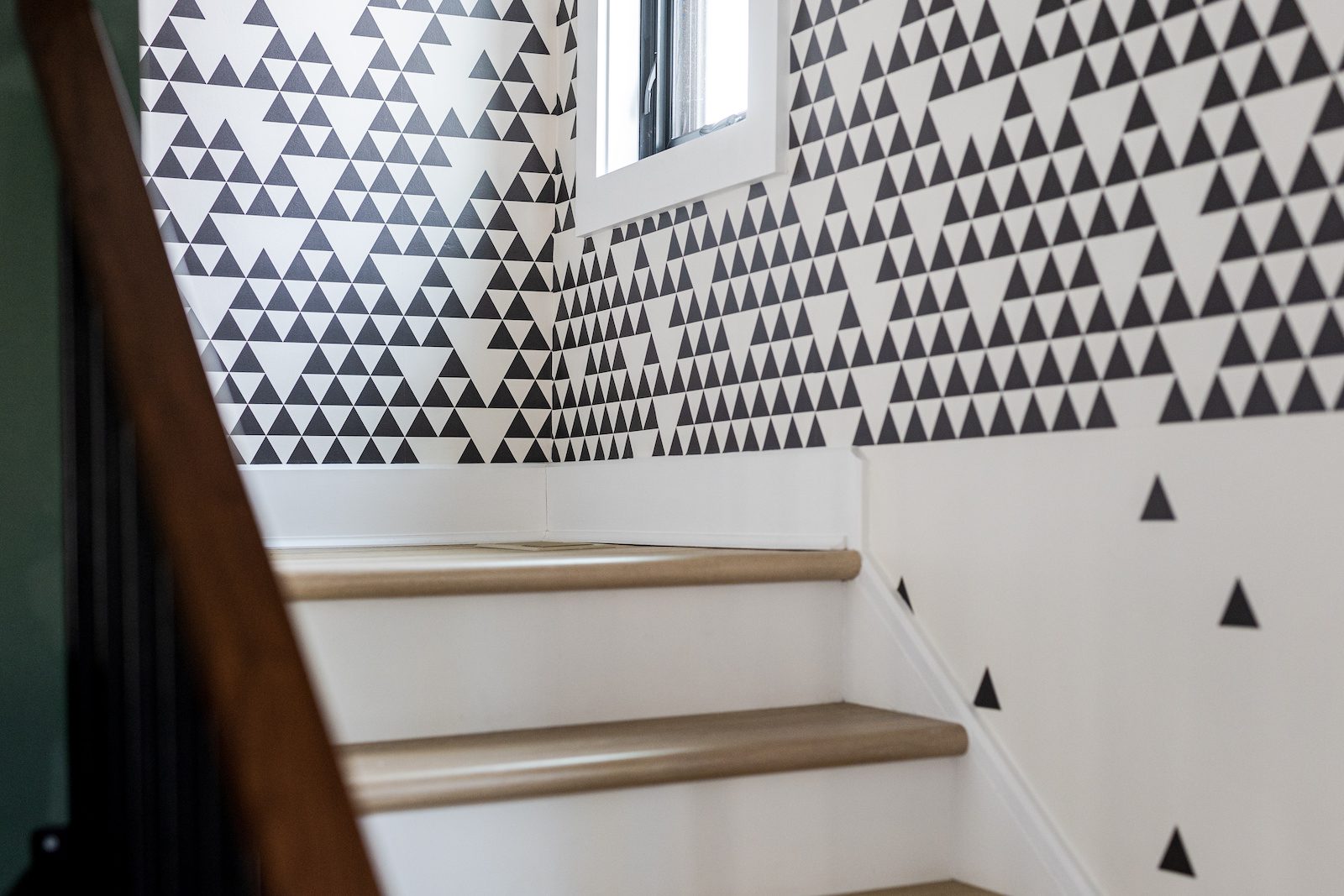
Even before stepping inside, our upgrades began upfront, starting with the installation of a sleek and contemporary front door. High contrast was a key aspect of the Visual Guidelines, so we incorporated it in every room of the home, beginning with the entryway. Simple yet effective upgrades such as a black and white geometric wallpaper traveling up the now modern and streamline staircase, and a sleek console table sets the tone for the rest of the home. We also painted a deep green accent wall to tie in our client’s love of natural elements as well as their hobby of tending plants.
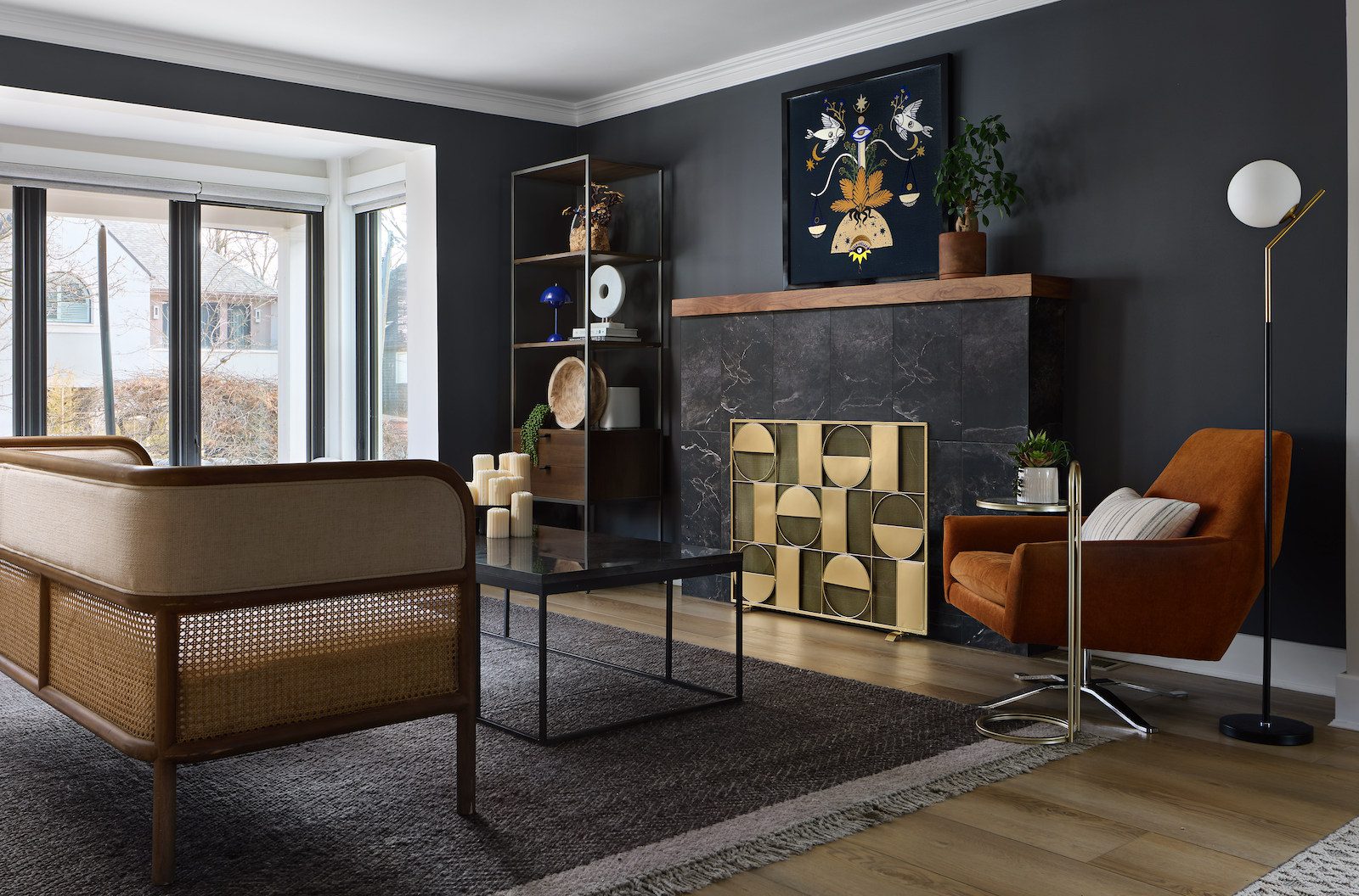
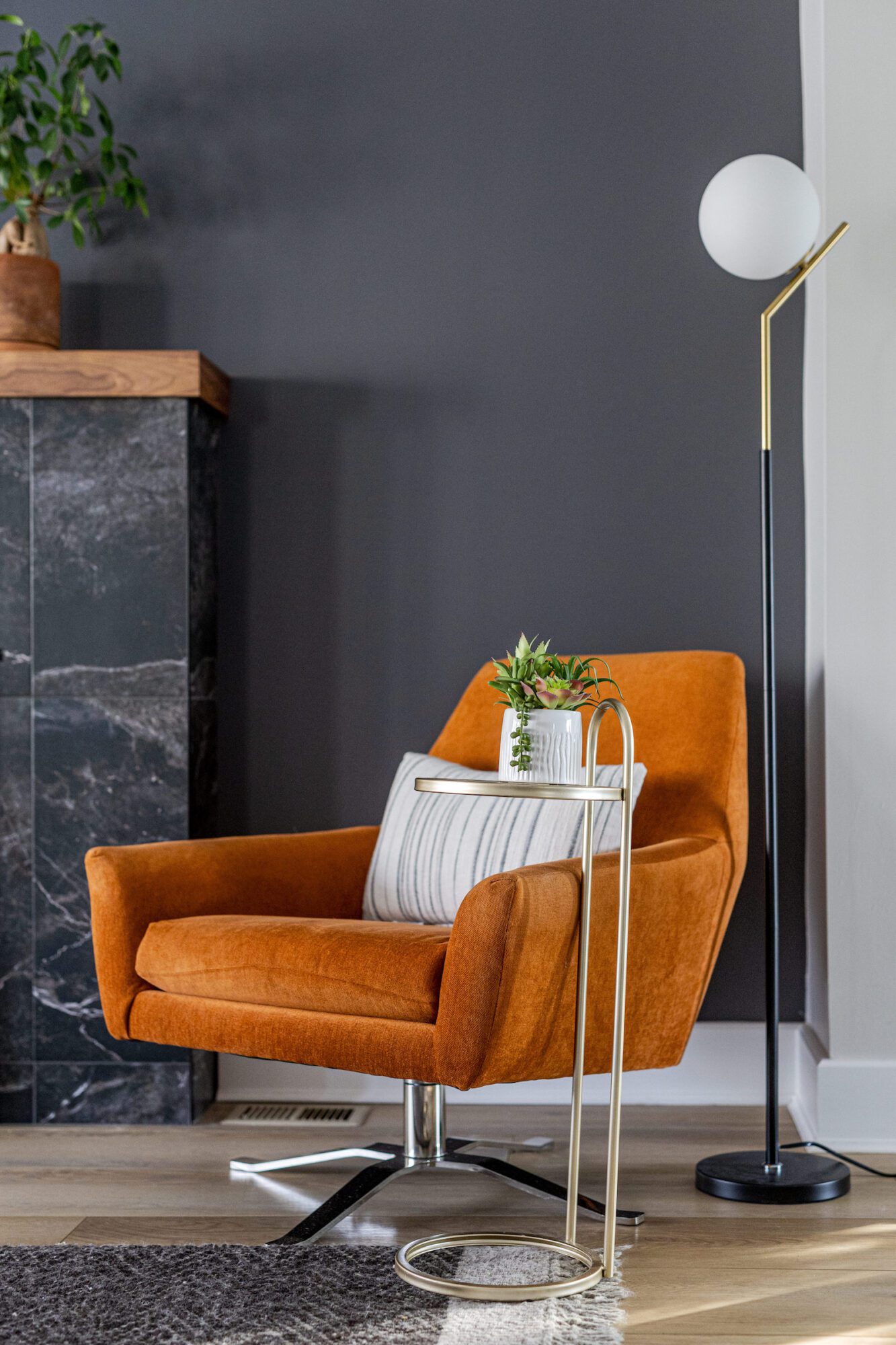
While the foyer sets the tone with modern touches, the sitting room illuminates natural textures, pops of earth tones, and minimalist decor. Our client had a clear vision for what they wanted this space to look like, making it easy to identify what needed to be upgraded, specifically the traditional fireplace mantle. While it was beautiful, it didn’t fit the desired aesthetic of our client, so we opted for clean and simple dark stones and a natural wood mantle to connect with natural elements, bringing the outside in. Additional thoughtful and intentional changes include brass accents, a naturally woven rug that matches the color of the fireplace, and earth tone accessories.
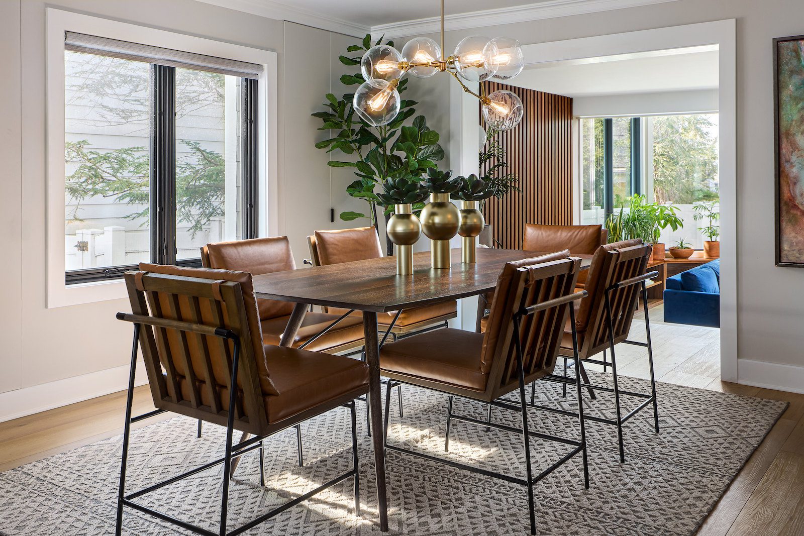
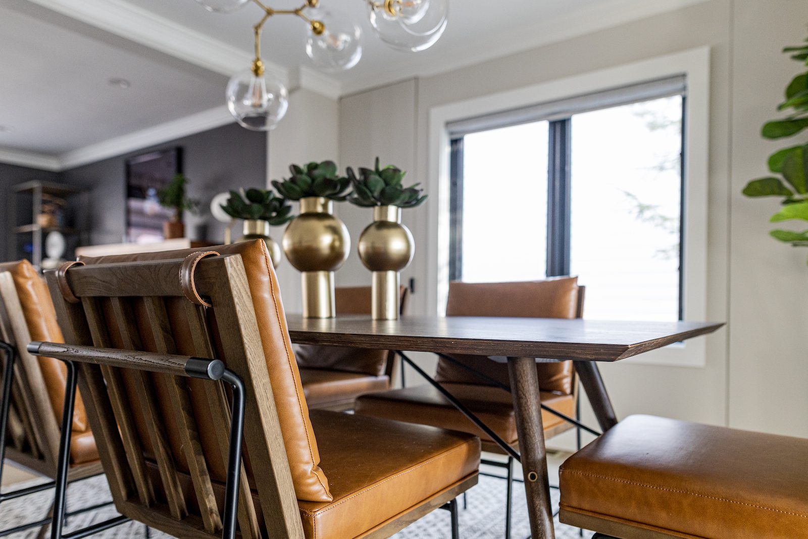
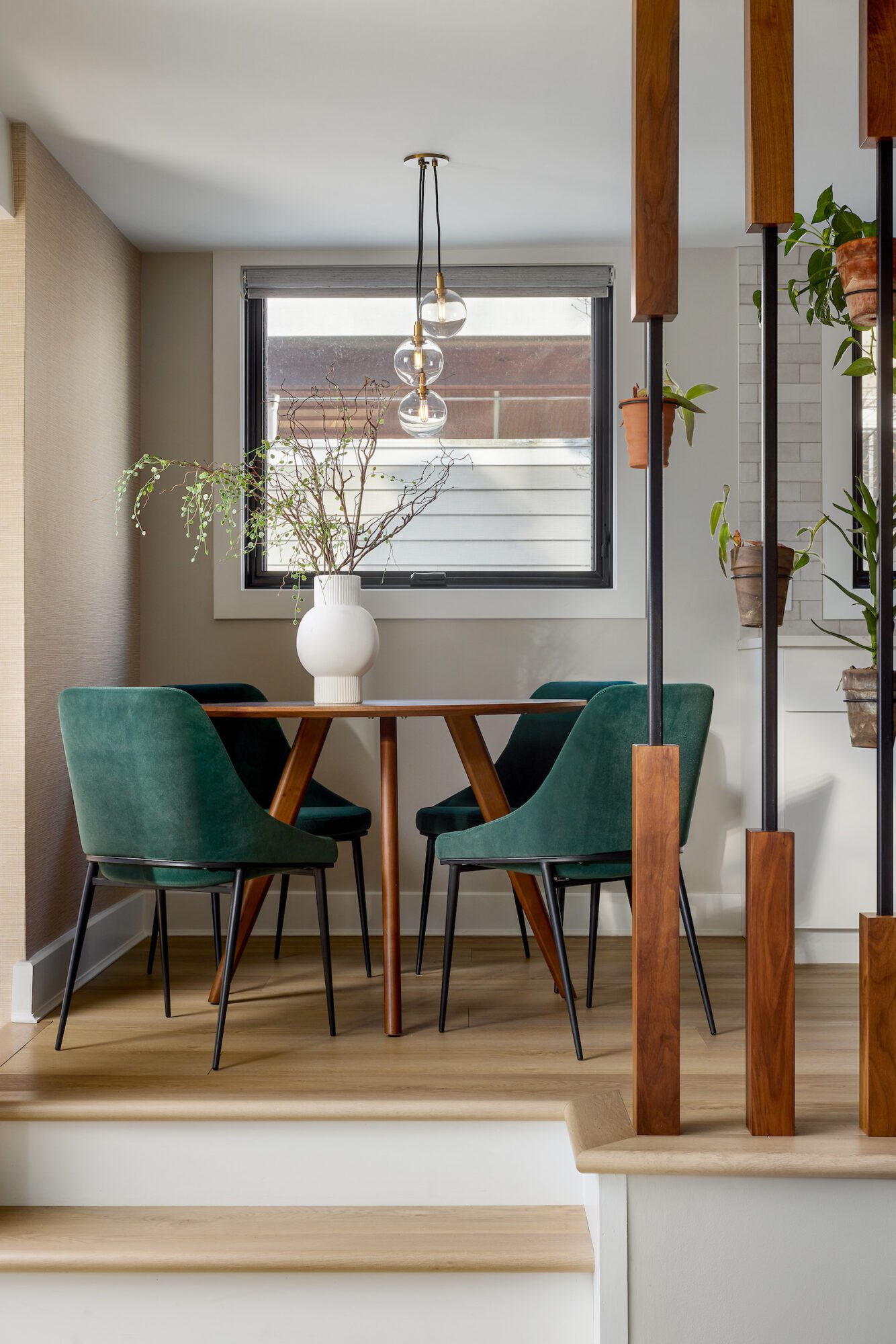
Remember how we previously talked about inconveniently placed walls? The former dining room is where this was the most evident, with a wall at one end of the room that prevented an open flow concept and blocked natural sunlight from the large bay window overlooking the backyard in the main living area. Our first order of business was evident – to remove that wall and allow sunlight to pour in from all angles, honoring two of the top priorities of our client in this renovation. Now, the area capitalizes on natural light and implements an open floor plan. To further connect the space to nature and keep things minimal, we sourced this gorgeous mid century modern dining table with unique dining chairs. You know we couldn’t forget about the outdated light chandelier, so we replaced it with this modern bronze and glass bulb light fixture. And of course, we added lots of greenery to give the room a natural feel. 
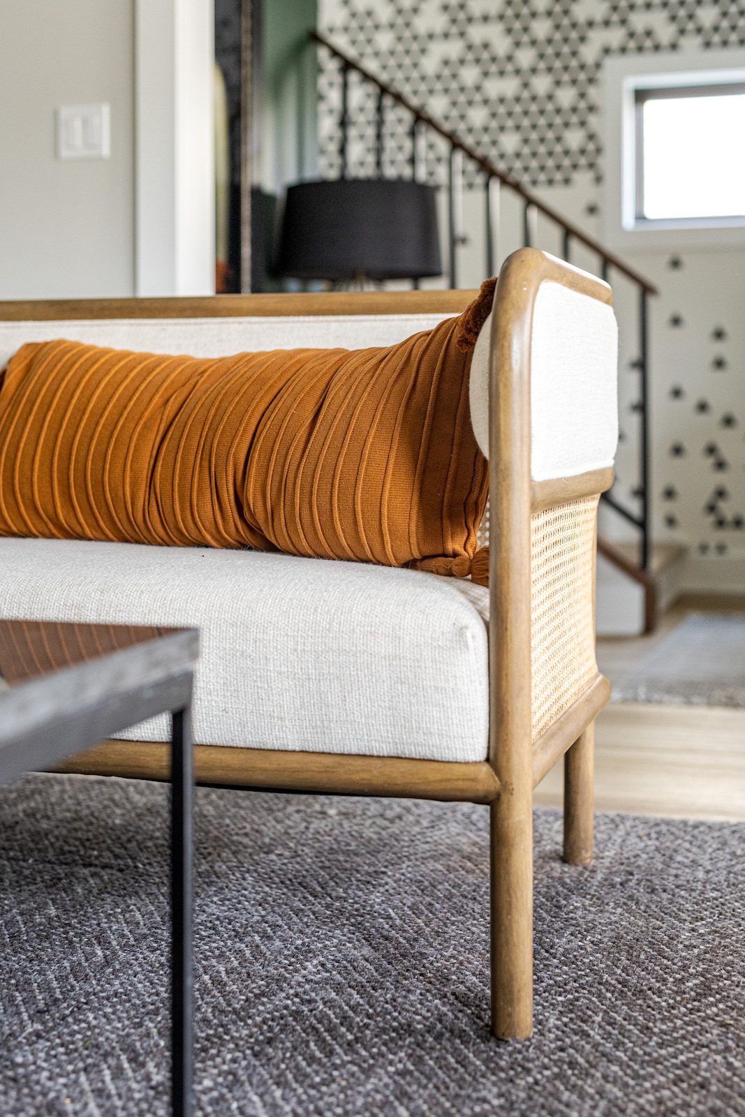
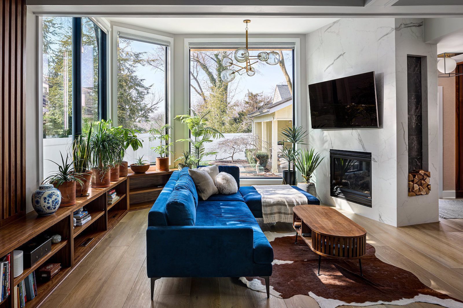
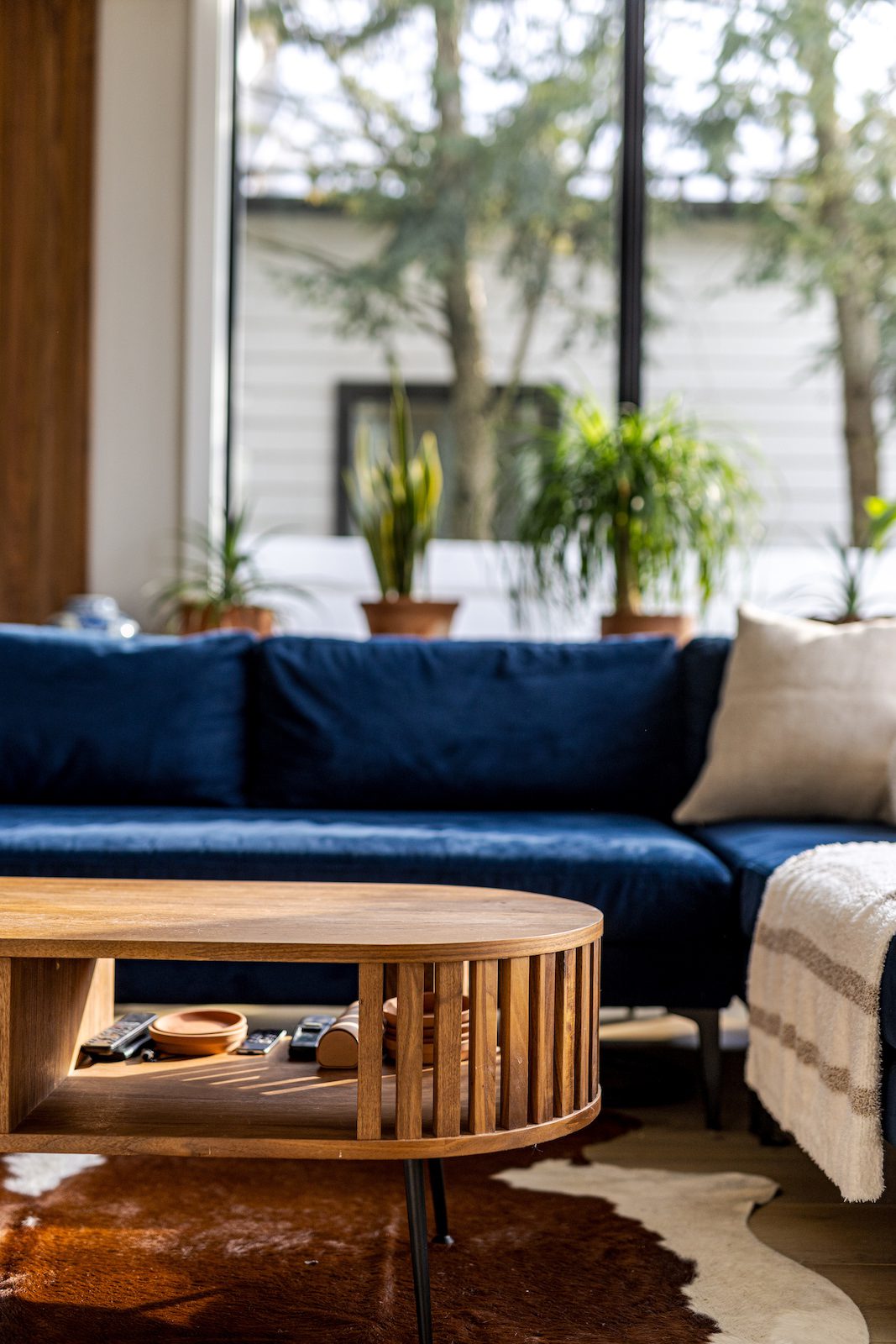
Just a few steps down is the main living area, where our client spends most of their time – and we can see why. As previously mentioned, the giant bay window overlooks the backyard, making this room the perfect place to curl up with a book in front of the fireplace – which, by the way, did receive a makeover. The big outdated molding also occurred in the living area, so we first removed those to open up the walls, utilize the high ceilings, and bring a sense of modernity. Next, we brought the existing fireplace all the way up to the ceiling, again utilizing the existing high ceilings and creating a more clean and simple look. The fireplace is often the centerpiece of the room, so we paid extra time and attention to detail to ensure it was cohesive with the rest of the home while still remaining functional. We then reoriented their sofa to face the fireplace and mounted the TV above it so they can enjoy their favorite show in front of the fireplace AND an outdoor view. 
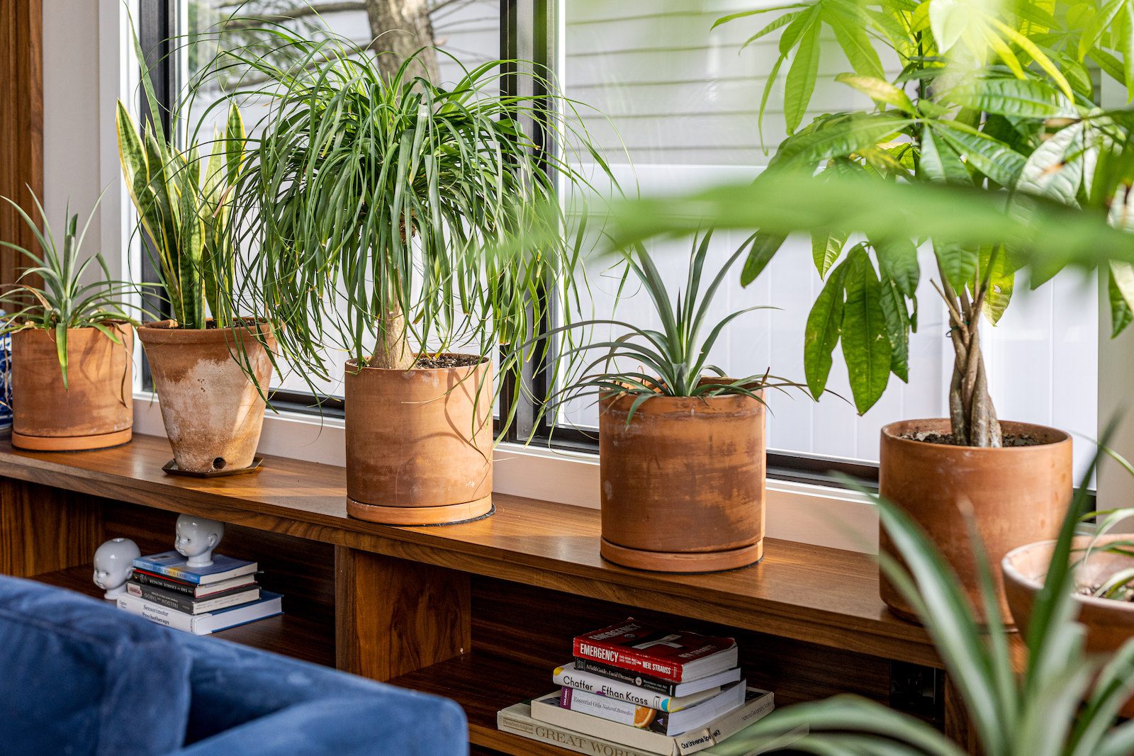
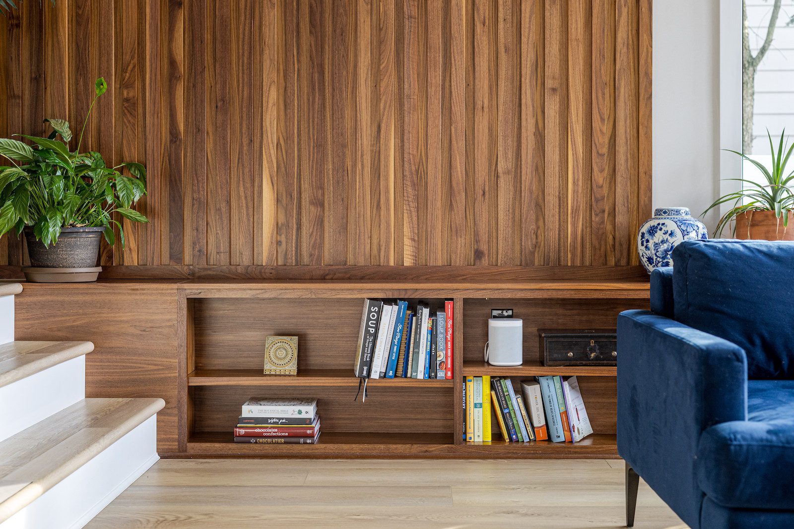
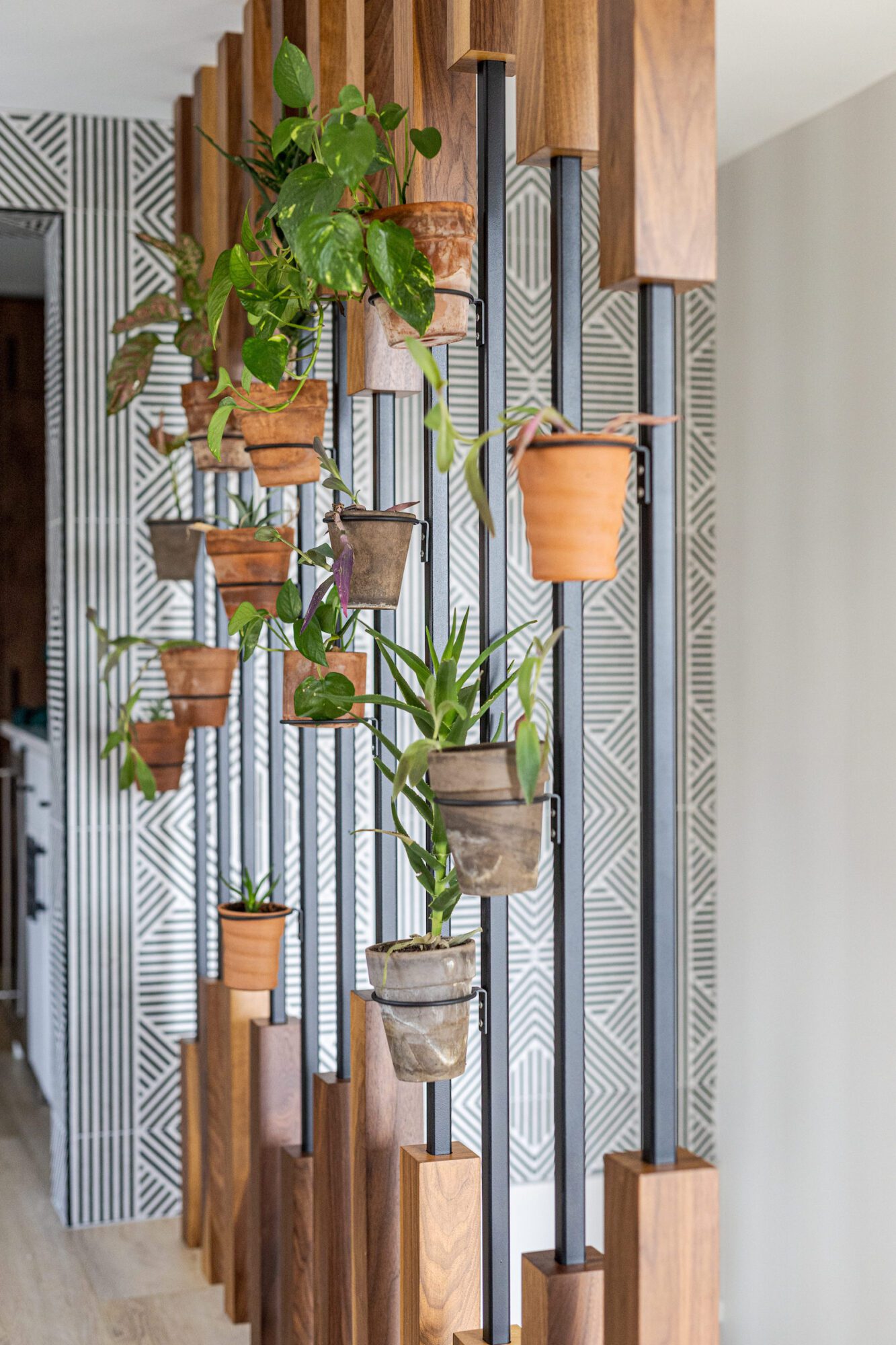
Perhaps the star of the show in the main living area, however, is the custom millwork and slatwall. We understood how much clutter impacted the mental well being of our client, so we intentionally created additional storage solutions while further emphasizing the connection to nature through sleek natural wood tones and – you guessed it – more plants.
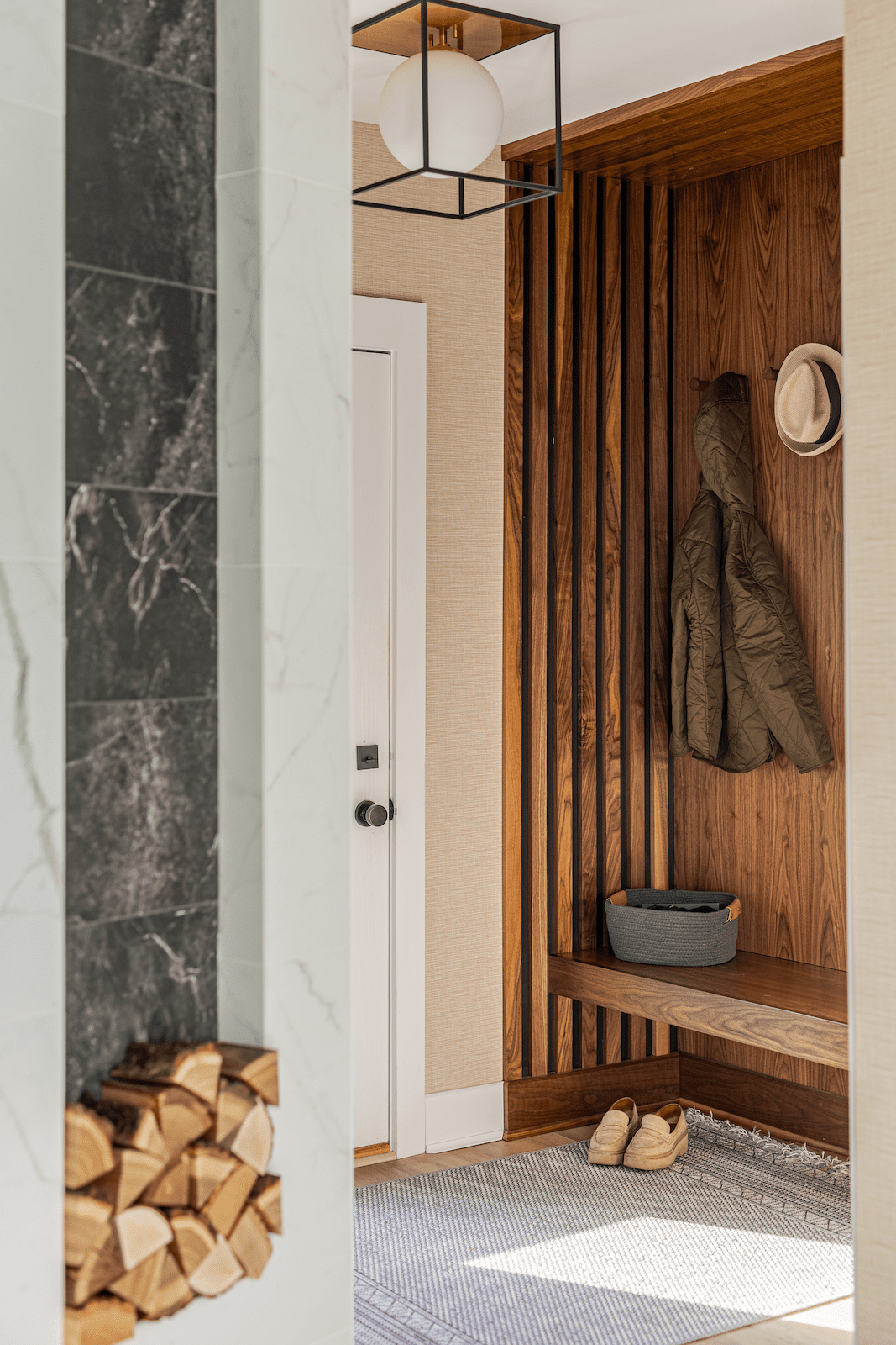
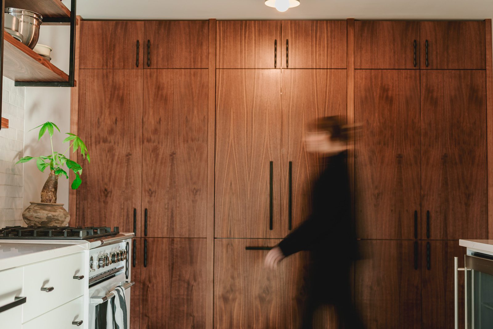
Before we head into the kitchen, we want to take a moment to check out the mudroom. What first existed as a simple closet is now a custom built-in storage solution seamlessly incorporating the wood tones and textures found throughout the rest of the home, creating the perfect blend of functionality and aesthetics.
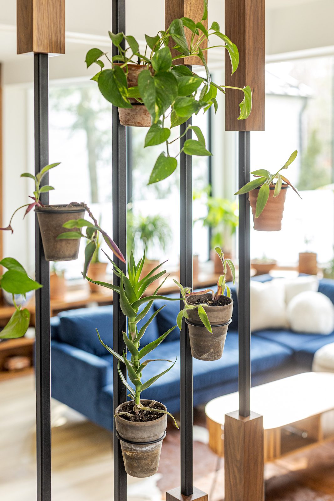
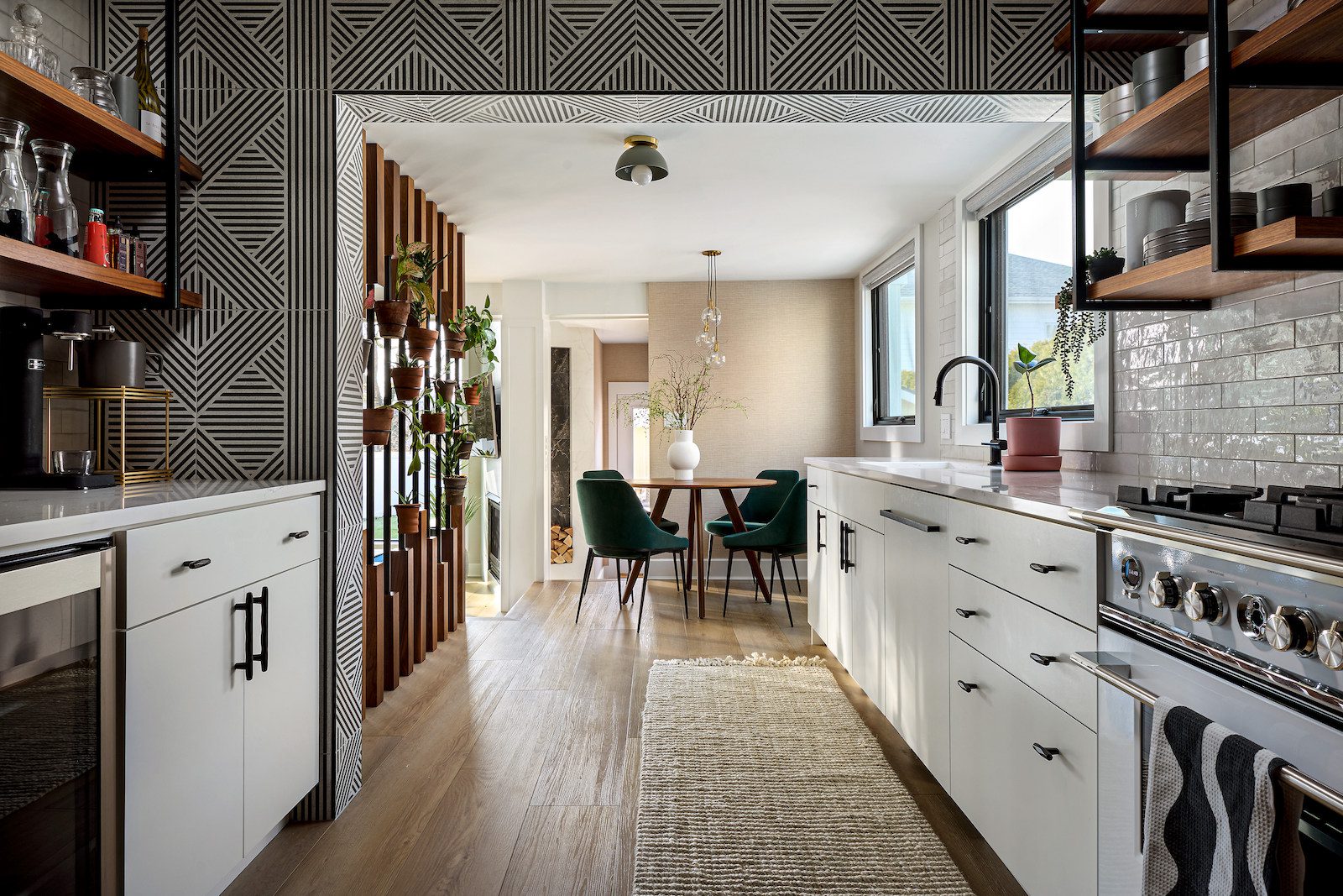
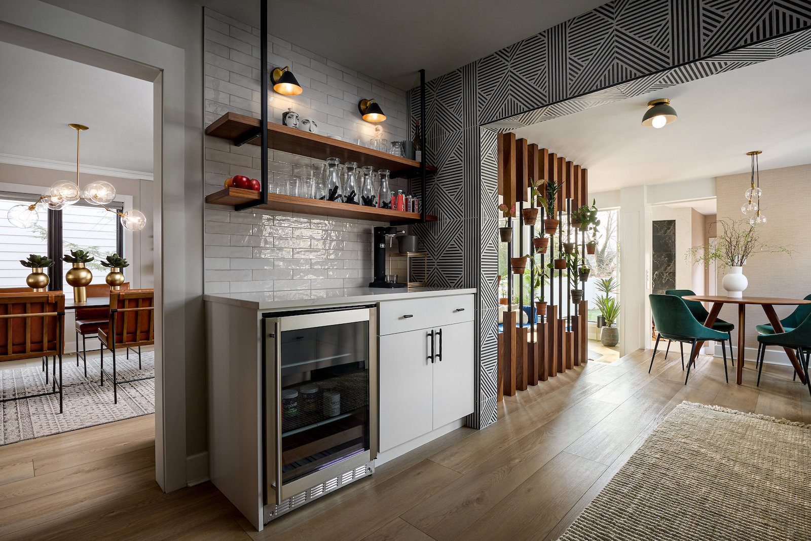
We can’t focus on the kitchen without first gushing over the custom built plant wall. The eat-in kitchen included yet another inconveniently placed solid wall that prohibited the open-concept and naturally lit home our client dreamed of. However, by replacing it with a thoughtfully crafted plant wall, our client achieved several objectives: seamless integration between kitchen and living space, improved natural light flow, and an elegant display for their cherished plant collection.
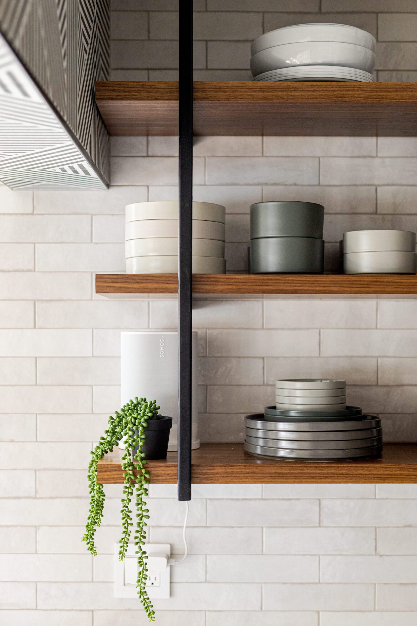
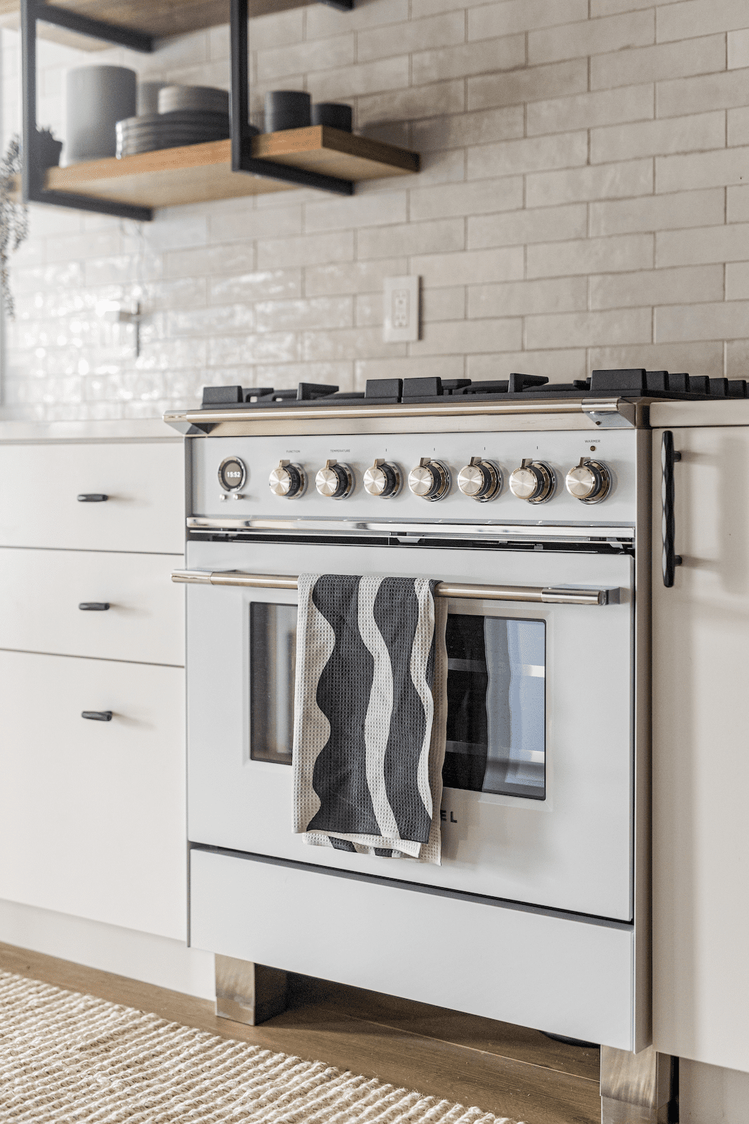
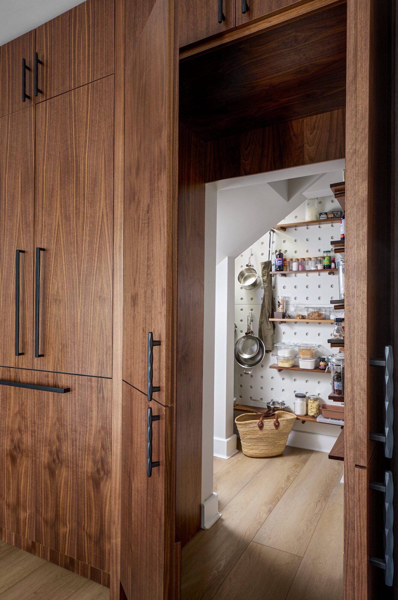
As for the rest of the kitchen, functionality meets aesthetics with a hidden fridge, walk-in pantry, and sleek open shelving that invite effortless organization. The kitchen contained a load bearing wall, meaning it could not be removed in its entirety leaving a header. So how did we embrace it? By creating contrast with clean, modern tiles so it becomes a design feature in its own right. 
Although the home had great bones to begin with, the previous floor plan felt disjointed, preventing the flow, harmony, and clutter-free environment our client was looking for. Luckily, crafting space that supports how you live is what we do best! In this particular home, we capitalized on every available inch, especially here in the kitchen where we strategically converted the existing underutilized foyer coat closet into a hidden kitchen pantry beneath the stairs, providing much needed kitchen storage.
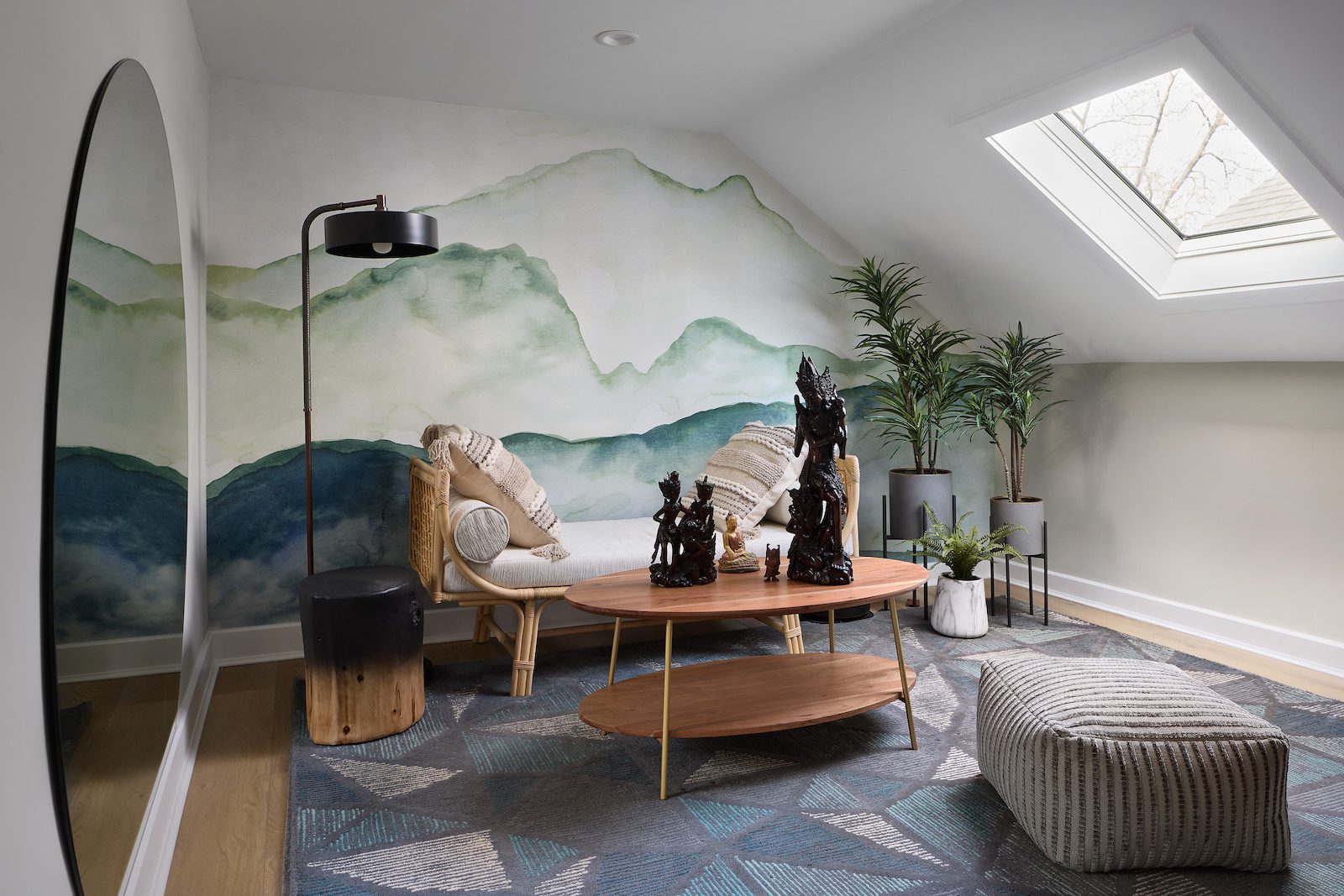
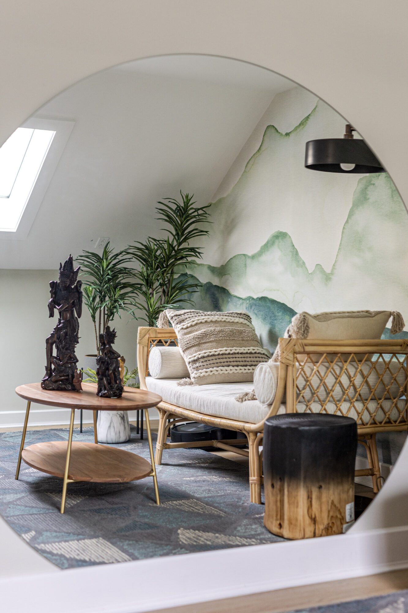
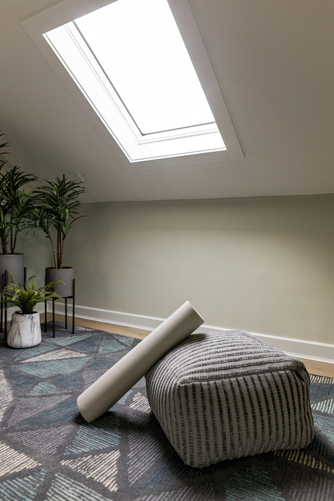
Heading upstairs, let’s stop and take a moment of gratitude in the meditation room. The meditation room offers a serene retreat, with ample natural light through an existing skylight and minimalist decor, setting the stage for moments of introspection and mindfulness. As a spiritual sanctuary, we prioritized a clean, calm environment without sacrificing the existing items used in their mediation practice. The watercolor accent wall features soothing shades of blue and green, complemented by natural woven textures in the daybed and rug. A full circular mirror allows our client to check their form during their yoga practice while reflection the natural sunlight beaming in from the skylight. Additional greenery under the skylight adds to the peaceful ambiance.
Down the hall lives the primary bedroom and bathroom which underwent a complete metamorphosis. Our client previously used the guest room as their bedroom, however we saw the potential in transforming their primary suite and en suite bathroom into a sanctuary.
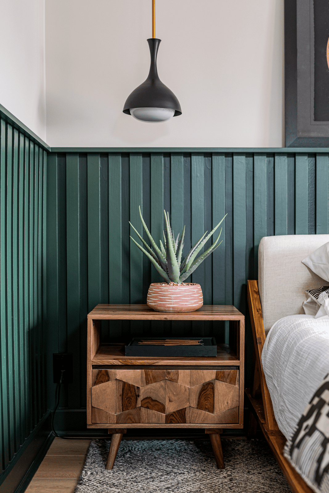
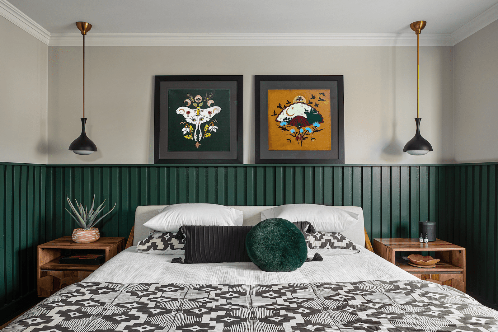
We began by installing custom millwork in the bedroom, painted in the same green hue as the foyer to maintain consistency with the natural elements and color palette present throughout the home. Accompanied by a natural wood bed frame and nightstands accessorized with plants, books, and other essentials, the space radiates a harmonious blend of modernity and tranquility. Modern pendant lights add a touch of contemporary elegance, perfectly aligning with our client's vision for a sleek and clean aesthetic.
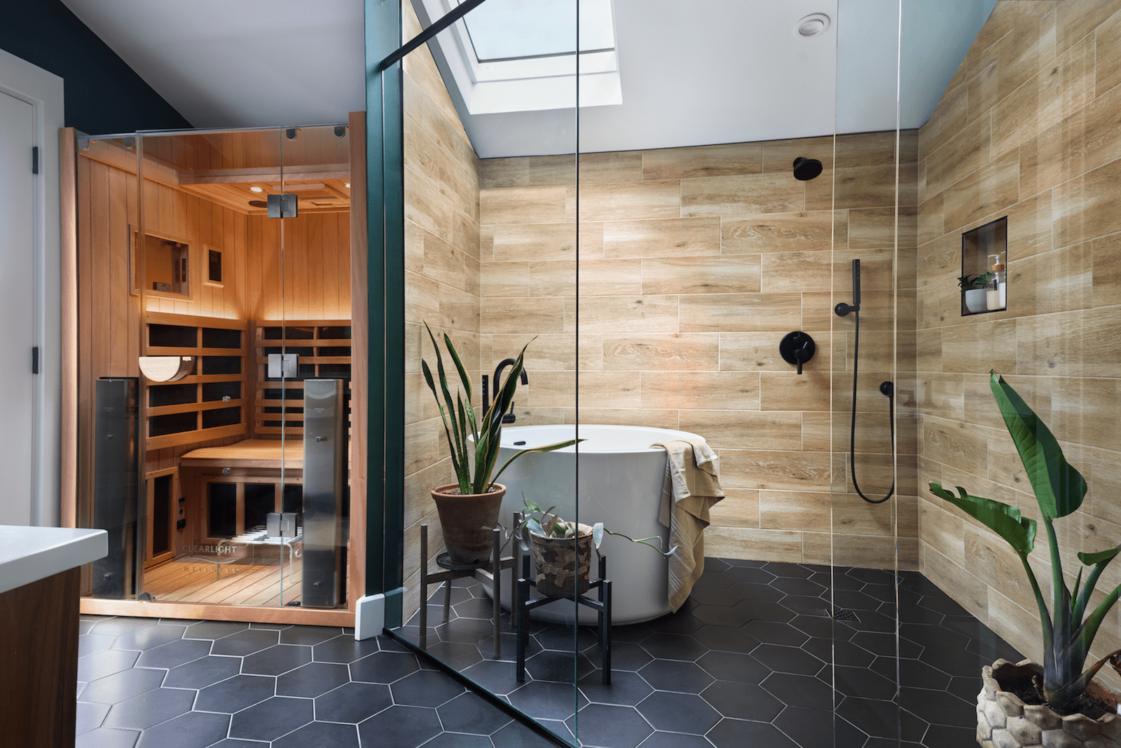
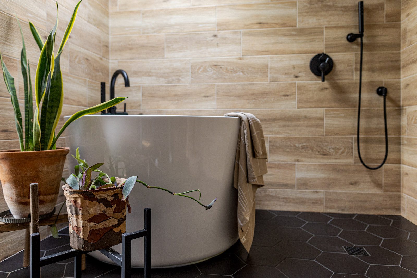
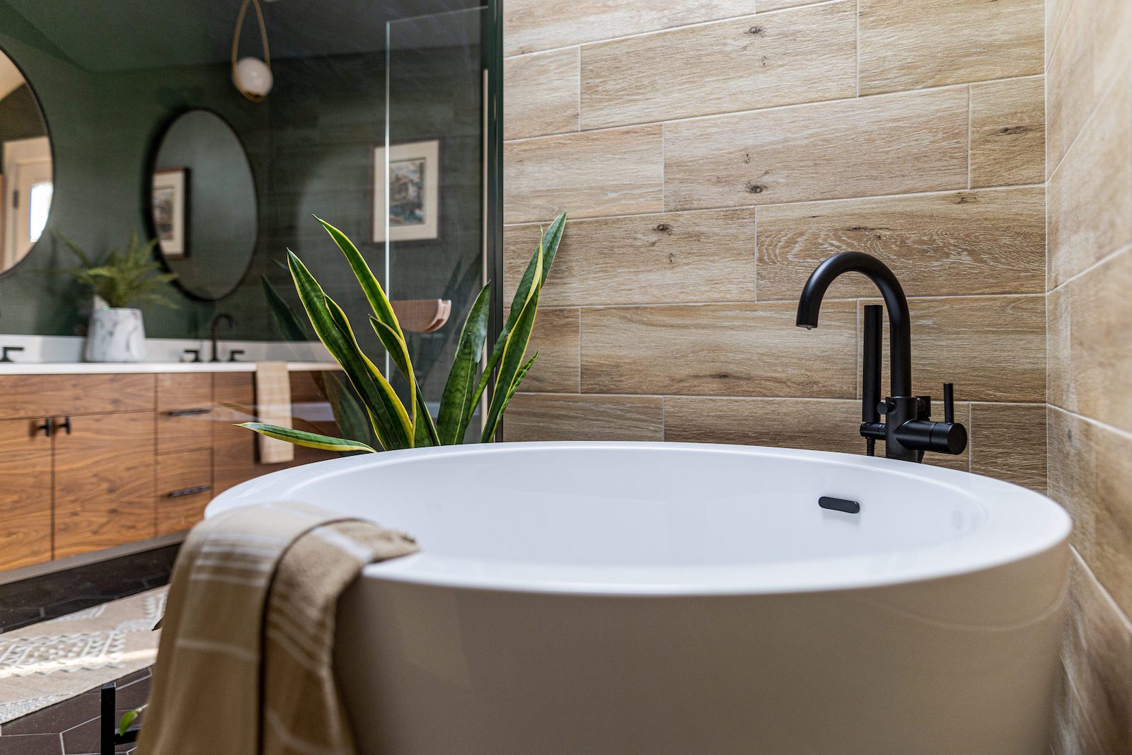
Finally, we stepped into the primary bath, which arguably underwent the biggest transformation. The existing layout felt disjointed and lacked authenticity for our client's vision. The bathroom is a great opportunity to continue to commit to wellness practices, and with meticulous attention to detail, we transformed this space into an at-home, spa-like retreat. To fix the layout, we tucked the toilet behind the door, created a modern wet room style shower, and gave the Japanese soaking tub its own spotlight under the existing skylight, seamlessly integrating with a large walk in shower with natural plants.
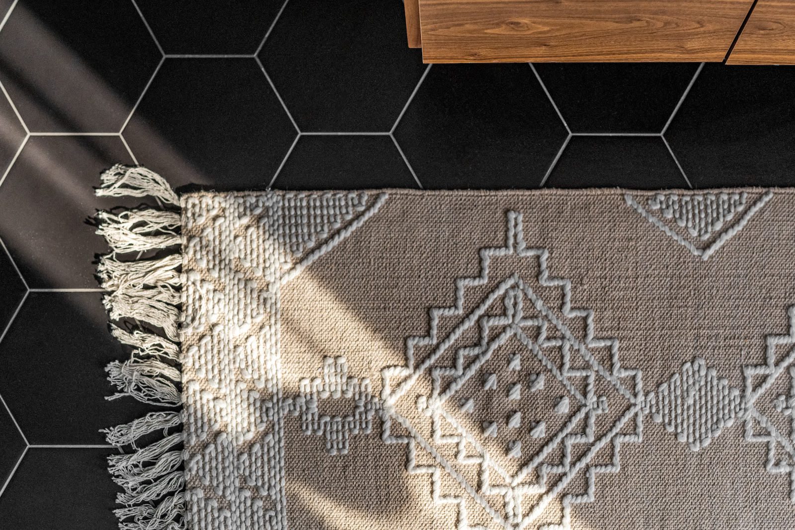
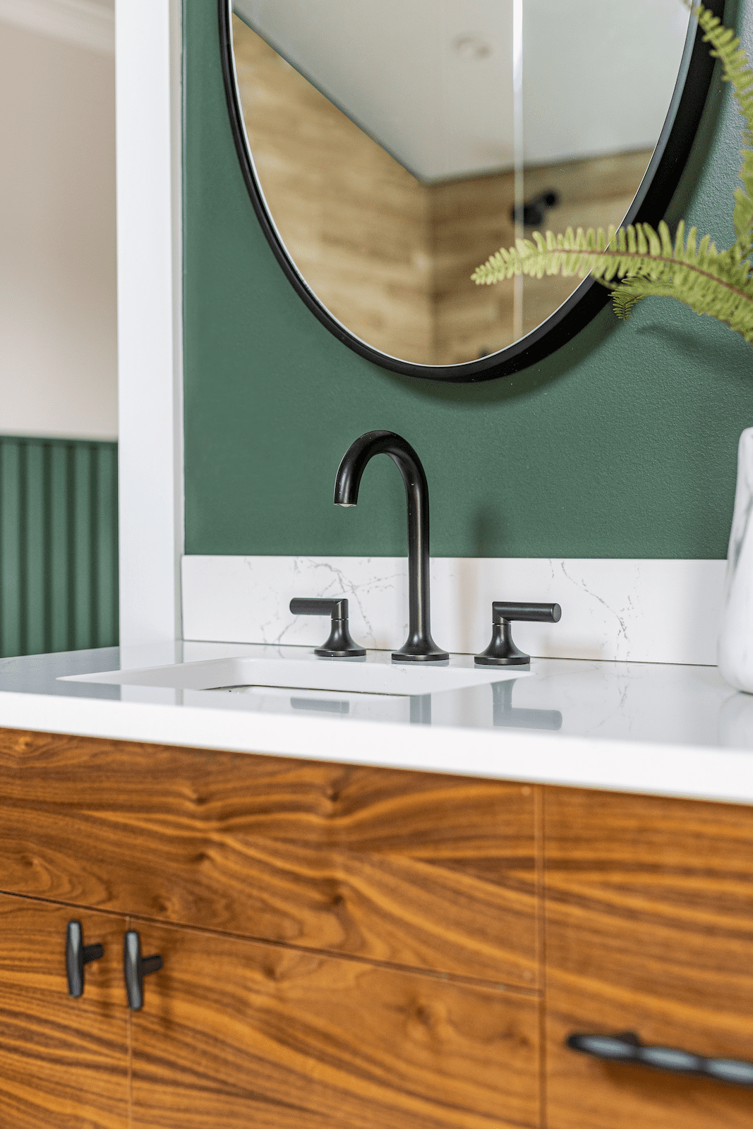
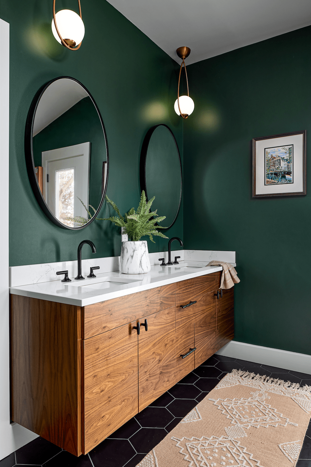
Continuing the theme of natural elements, you'll find the same soothing green tones as the bedroom and foyer – designed to effortlessly harmonize with natural wood accents, black hardware, and more plants. Contrast is created through the custom vanity, complemented by white stone countertops and sleek black geometric floor tiles. And as a final touch, we included a modern sauna to offer a serene space to unwind after a long day.
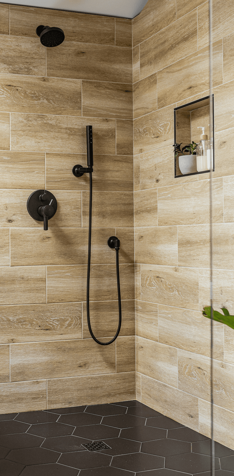
Every aspect of the home speaks to our client's values and passions, from the carefully curated color palette to the thoughtful integration of natural elements. It's more than just a renovation; it's a testament to investing in one's home and, by extension, oneself.
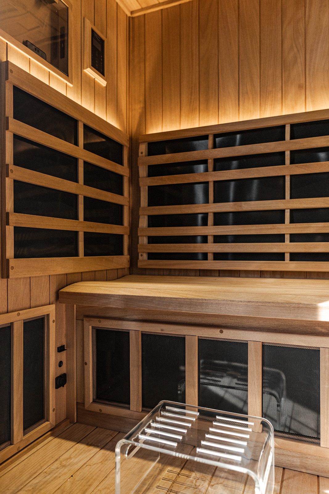
In the end, the home became a reflection of its owner, a haven that supports their commitment to mental well-being and nurturing their soul. And isn't that the true essence of home?