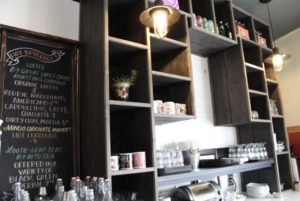
 We know, it seems like we’ve been flying under the radar when it comes to our blog. But, never fear…we’re still here! During our hiatus, we’ve been busy building out a 1,500 sq. foot office space, adding to our team of strong, powerhouse women, and oh yeah – one of our favorite things ― working alongside other Detroit small businesses. So, let’s talk more about that. We’ve been working on a project for Brooklyn Street Local you know, that delightful little restaurant on the corner of Michigan Ave. and Brooklyn Street in Corktown? Yep, that’s them!
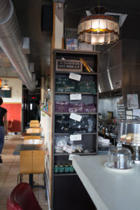 If you’re a frequent Brooklyn Street patron ― you may remember them being closed for a bit last month, well, this is why! By using our six step process, we were able to create a functional, but beautiful space ― that just so happens to be owner Deveri Gifford’s, favorite development so far. “The back wall where we’re adding all the shelving ― Gifford said, “I never felt like we were using that space to its full potential, and I also never really felt like it looked great, and now, I think this is gonna look really great. So, I’m excited to kind of see the next step of our evolution.” If you haven’t checked it out, you should! The rustic wood boxes filled with porcelain cows and colorful Faygo bottles add to the urban farmhouse charm that is Brooklyn Street.
So, let’s take a trip down memory lane, so we can tell you how we got here. We met Brooklyn Street’s sweet owner, Deveri Gifford, at a Bamboo Detroit tax event nearly 2 ½ years ago, and instantly felt an energy that made us excited to work with her. So, we did what we do best…just asked! Of course she was kind and open to what we had to offer, which was in depth market research and a case study on her business, focusing on how design can positively impact a business. At the time we met Gifford, we were still relatively new, and working on creating relationships in the city, and we had always admired Brooklyn Street’s brand and what they stood for ― so, we felt they presented us with the best opportunity to learn and exercise the benefits of human-centered design and proper brand implementation. We know what you’re thinking ― what does that even mean? Don’t worry ― we’ll break down the details in just a minute.
We think it’s super important to be as transparent as possible throughout the entire design process, and we take pride in being collaborative and thoughtful in making sure our clients feel heard ― like they have an advocate on their side ― every single step of the way. We aren’t here just to make your space pretty ― it needs to have that ‘wow’ factor ― even after the big reveal. As designers, part of our job is to bring our thoughtful skill set into a space with fresh eyes, and offer you solutions that tie to an end goal ― supporting all users for years to come. We take great pride in doing design differently, and we do that by focusing our efforts on every aspect of you ― so, let’s break it down and talk about what exactly it is about us that helps us create spaces that set businesses apart.
 Human-centered design is all about how a person lives in, and uses a space ― so we wholeheartedly take into consideration how each person who enters, will use and interpret the space we create. And the best part is – as our client’s advocate, we’ll do the legwork ― like we did with Brooklyn Street. Gifford said, “it’s worth it to have responsibility taken off your plate, and having someone else handle it, and I really can’t stress enough ― it really did feel like a big relief having Rachel & Lauren come in. Because I knew there were issues, and it felt like “okay here’s something else I have to deal with” so if you can take something off your plate and have someone else take care of it for you as a small business owner ― its amazing. Especially when the end result makes your life easier.”
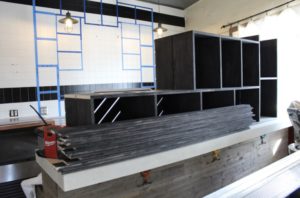 Now let’s talk about another part of our process that’s just as important ― brand implementation. It’s something that not only reflects the heart of a business, but it also plays a huge role in the overall success. Think about it, when you enter a space and feel connected and comfortable ― don’t you want to go back!?
When we started the journey, it became evident that Gifford had already worked to make Brooklyn Street’s brand a unique one, that was easily recognizable around Metro Detroit ― but it wasn’t being properly expressed in the space. We wanted to take Brooklyn Street’s urban farm-to-table brand and translate it into a 3D environment that spoke to compliment the identity she created. We started with step one of our signature six step process: the discovery process. This step is the most integral part of the process, and it’s where we dig deep to learn about the client, the brand, the customers and the employees. 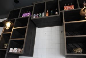 This information is what supports the foundation of brand implementation and human-centered design. We sat down with Gifford to identify what her goals were for the restaurant ― how she got to where she is, and where she hopes to be in the future. Next, we found out what issues her employees faced day-to-day, to see what we could do to make their work experience the best one possible. Then, we took to the Internet to dig into customer reviews ― we did this to see what was resonating with customers, what they liked and, what they didn’t so we could address them to make the dining experience more enjoyable, ultimately bringing in more business. Additionally, we found Brooklyn Street’s competitors, and actually went to those restaurants for a sit down meal ― to identify what they were doing well, which in turn helped us to narrow in on what made Brooklyn Street different.
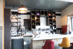 After about four weeks of examining the customer, employee and owner journey, we came back to Gifford with detailed floor plans and 3D renderings, that presented solutions to her problems with thoughtful selections that spoke Brooklyn Street’s brand language. This is where we suggested using rustic materials to bring the urban farm-to-table vibe right to Michigan Ave. ― using things like concrete, copper and distressed barnwood. It was important that the back bar was not only functional, but had the correct material language to express their brand ― as it’s the first thing your eyes see when you step in the space.
Based on our research, we suggested solutions like, putting up a half wall at the front entrance to eliminate a cold draft from the door, building a tall shelf that brought privacy to the kitchen, but also features retail products from both Brooklyn Street, and local farms. We also suggested painting the ceiling a darker color to make the space feel larger and more updated, and adjusting the traffic pattern of the front bar ― that in turn addressed the difficult access point to the back of the house for servers, and as an added bonus ― gave the staff an area for their things, and provided easy access to other necessary kitchenware.
After helping Gifford see that design doesn’t have to be overly expensive or extravagant, and could actually help her reach her business goals ― she started investing into the restaurant as she could in phases. Gifford said, “each year we try to do a little bit more to work on the space, to improve our services and the overall experience.” Ready to hear something cool about human-centered design, and see the power of a simple, strategic design implementation? Gifford said “the half wall we put in right by the door – the table right next to it was the table nobody used to want to sit in, everyone was always like ugh – can we just not sit here? And people would just be unhappy – now, that is one of our most popular tables to sit at.”
Overall, Gifford said “[the design] has definitely made the work flow easier, and the customer flow easier. I think it’s just made the space more enjoyable for the customers to be in, and certainly for the staff to be in as well. Not just in terms of work, but just visually. And it’s made it more enjoyable for me to be in too ― I’m less stressed about the way our space looks, I don’t feel that constant nagging of being unhappy, which is nice.”
We know what a powerful tool design is – but we’re bound and determined to educate the community that design done right is a vehicle to help businesses reach their goals, and positively impact lives.