
Sweet As Can Be In Beverly
Client
Katie and Tyler McVety
TYPE
Residential
Location
Beverly Hills, Michigan
PHOTOGRAPHY BY
Brett Mountain Photography + Ellie Frances Photography
Our Goal:
Although Tyler and Katie McVety initially never thought a custom-built house was in their cards, it became the best option to accommodate their growing family and desire for a unique home. We collaborated to turn an empty lot and initial architectural floor plan into their highly customized dream home.
Our Solution:
The McVety’s were quickly outgrowing their 1930s home and connected with an architect to design a modern floor plan for a new build…but it wasn’t until a year later when they found the ideal site: a lot just a few miles away from their original house. From there, they dove into the construction process. They’d been crafting the vision for their perfect home for years, with clean lines, classic color palettes, natural light, and family-friendly customizations in mind. Despite having these ideas, Tyler and Katie soon found themselves struck with analysis paralysis and in need of a partner to bring structure to their vision and help make decisions.
We first helped them identify how they wanted to feel in their home. So, we went room by room, figuring out the goals of each and how they’d be used. We captured these goals referencing the original architectural floor plan and transferred new solutions onto 2D and 3D conceptual renderings to define the vision.
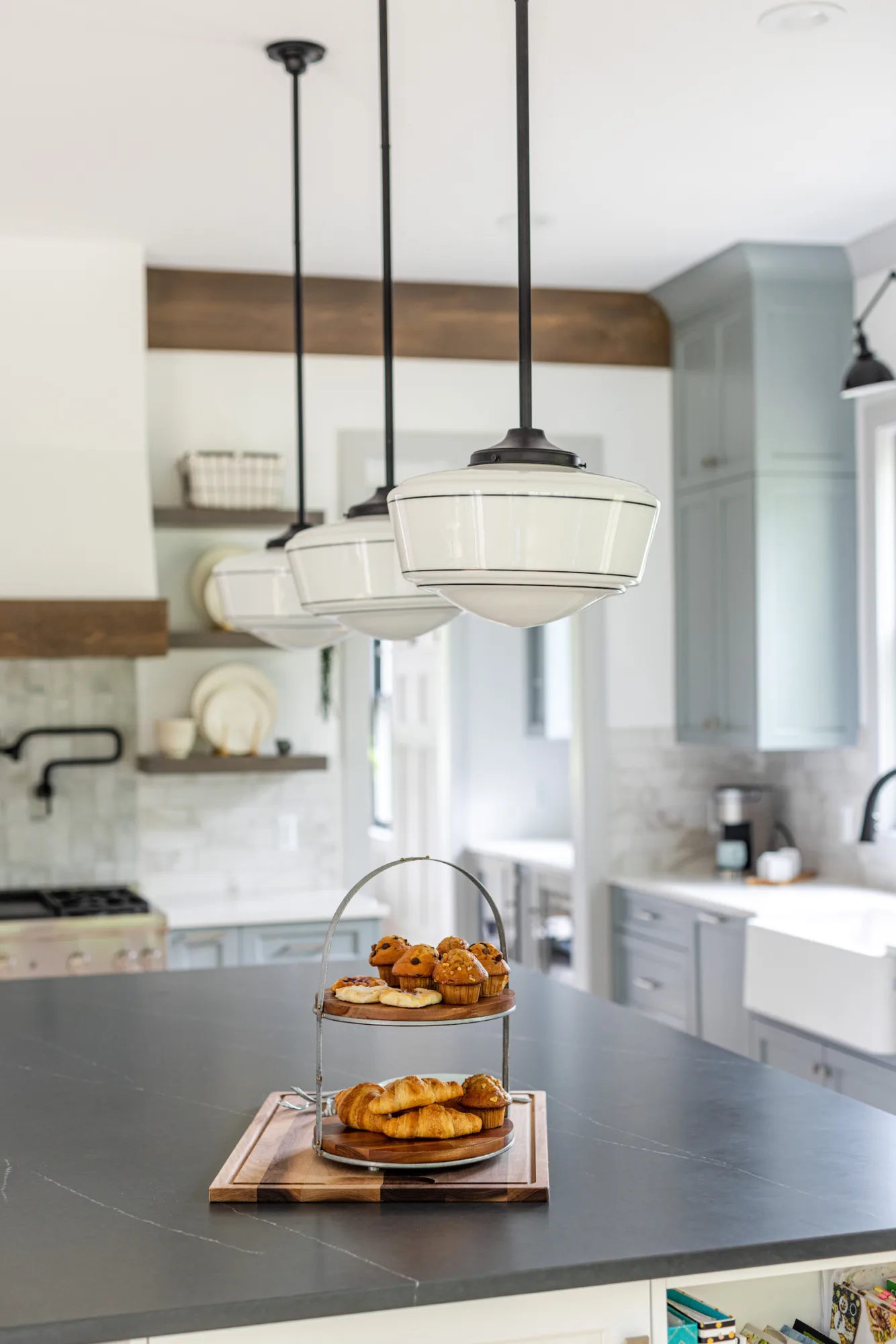
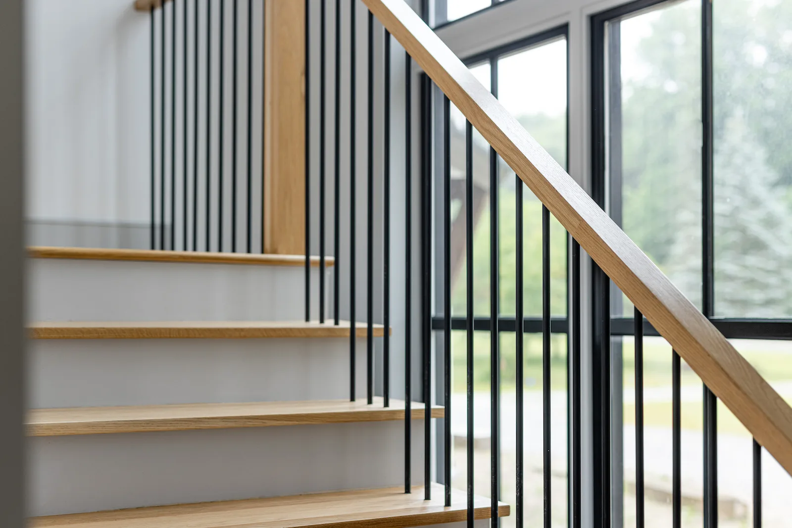
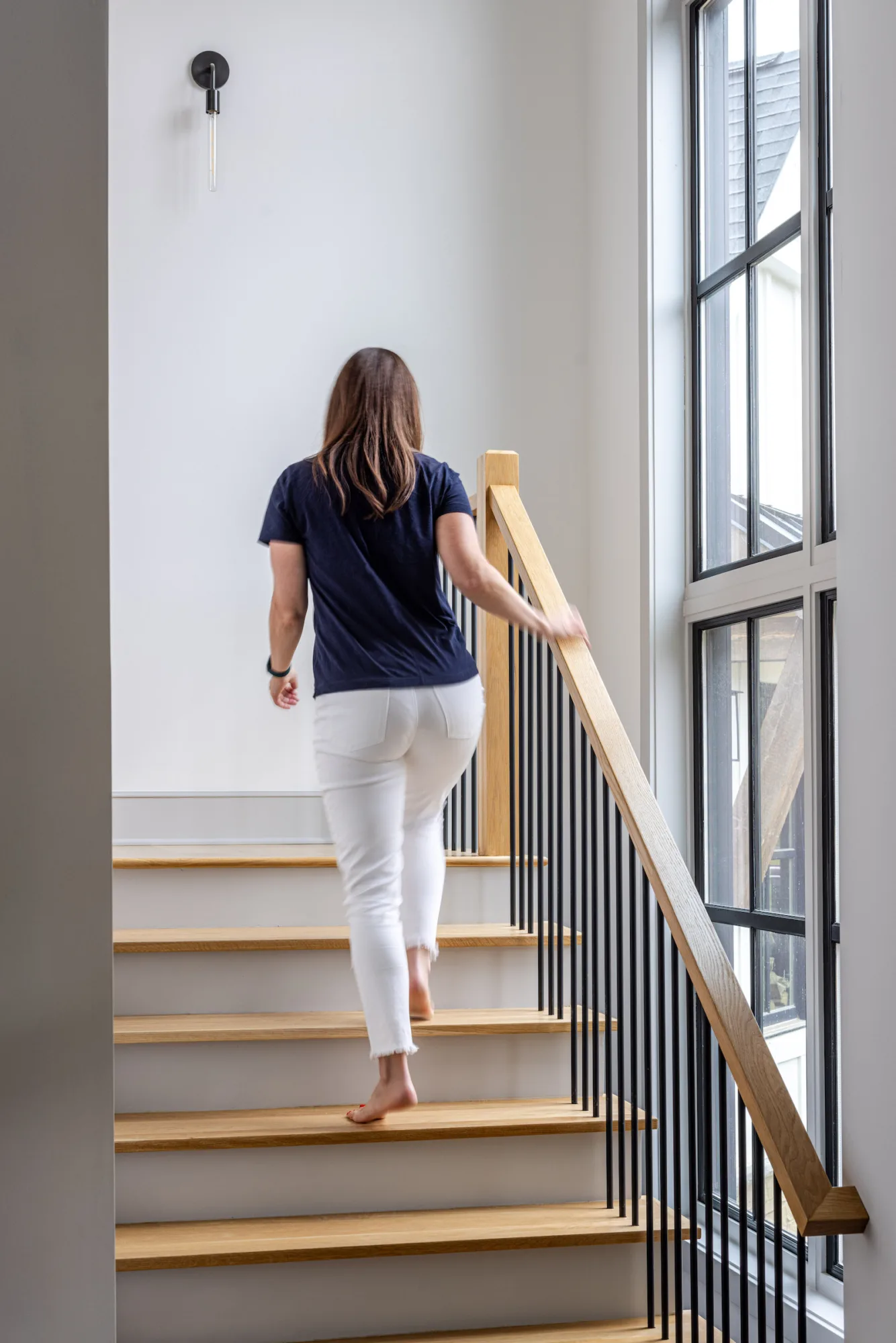
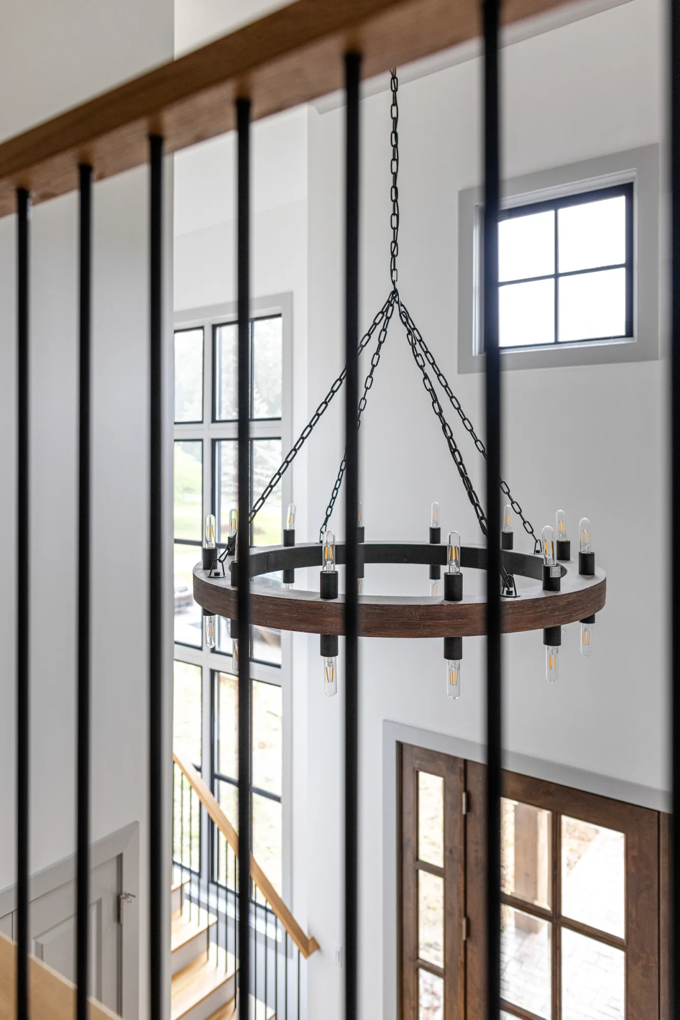
Upon entering the foyer, you’ll notice something interesting. Rather than place the staircase behind the front window like many architects do, theirs pulled the staircase away from the windows on the front façade, leaving a void between the two to bring natural light into the basement and second floor. Rather than a massive light fixture, we complimented the space’s entry with industrial-esque sconces going up the staircase. Similar style lighting can be seen throughout the rest of the home. We also designed all the material finishes in this home, like the railing design, stair tread, and risers.
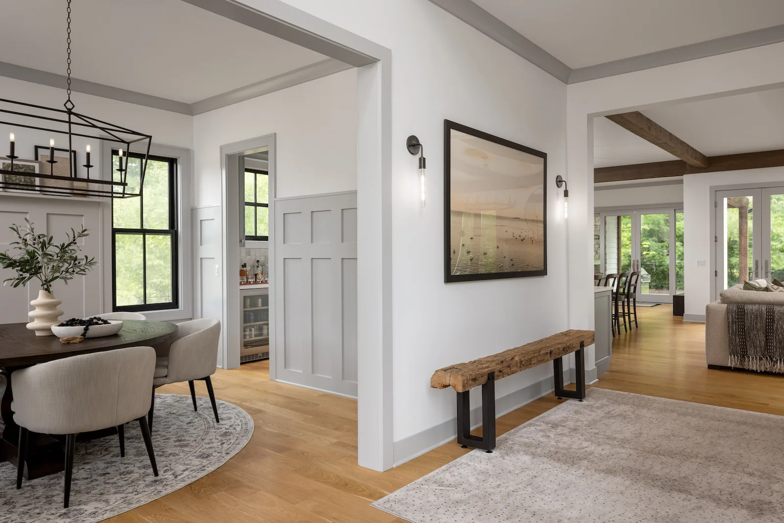
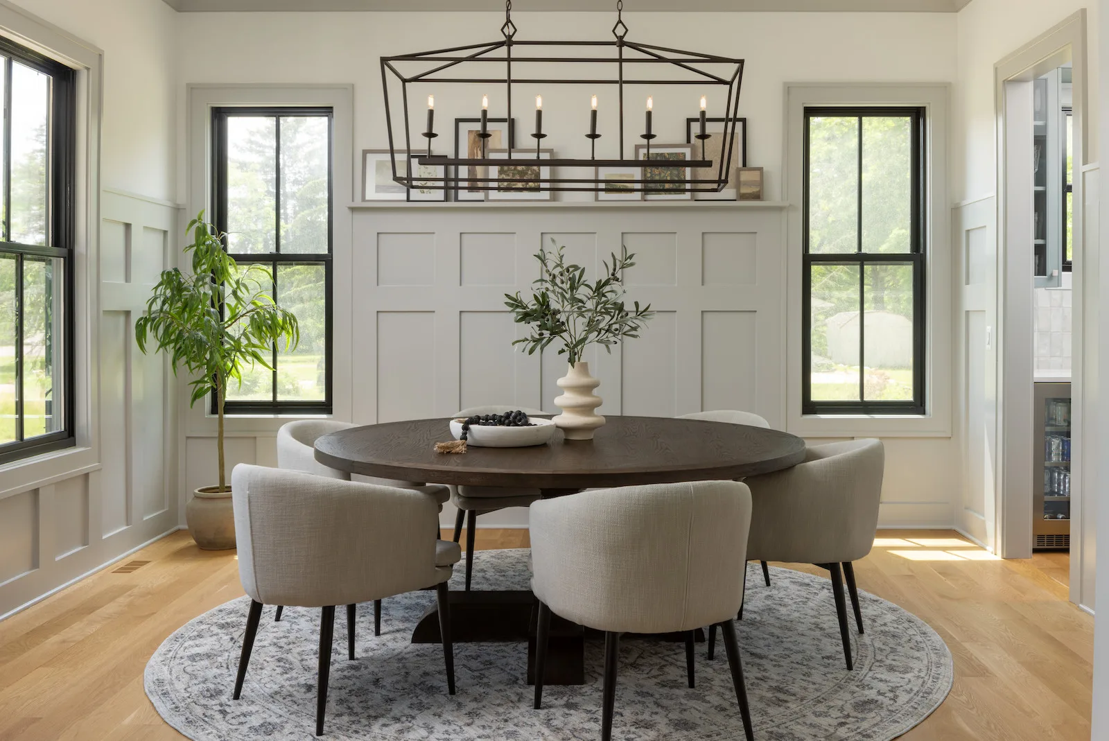
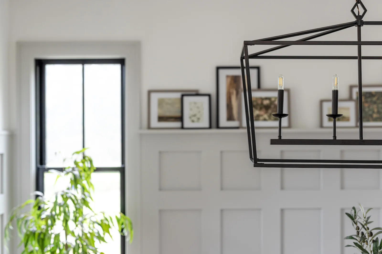
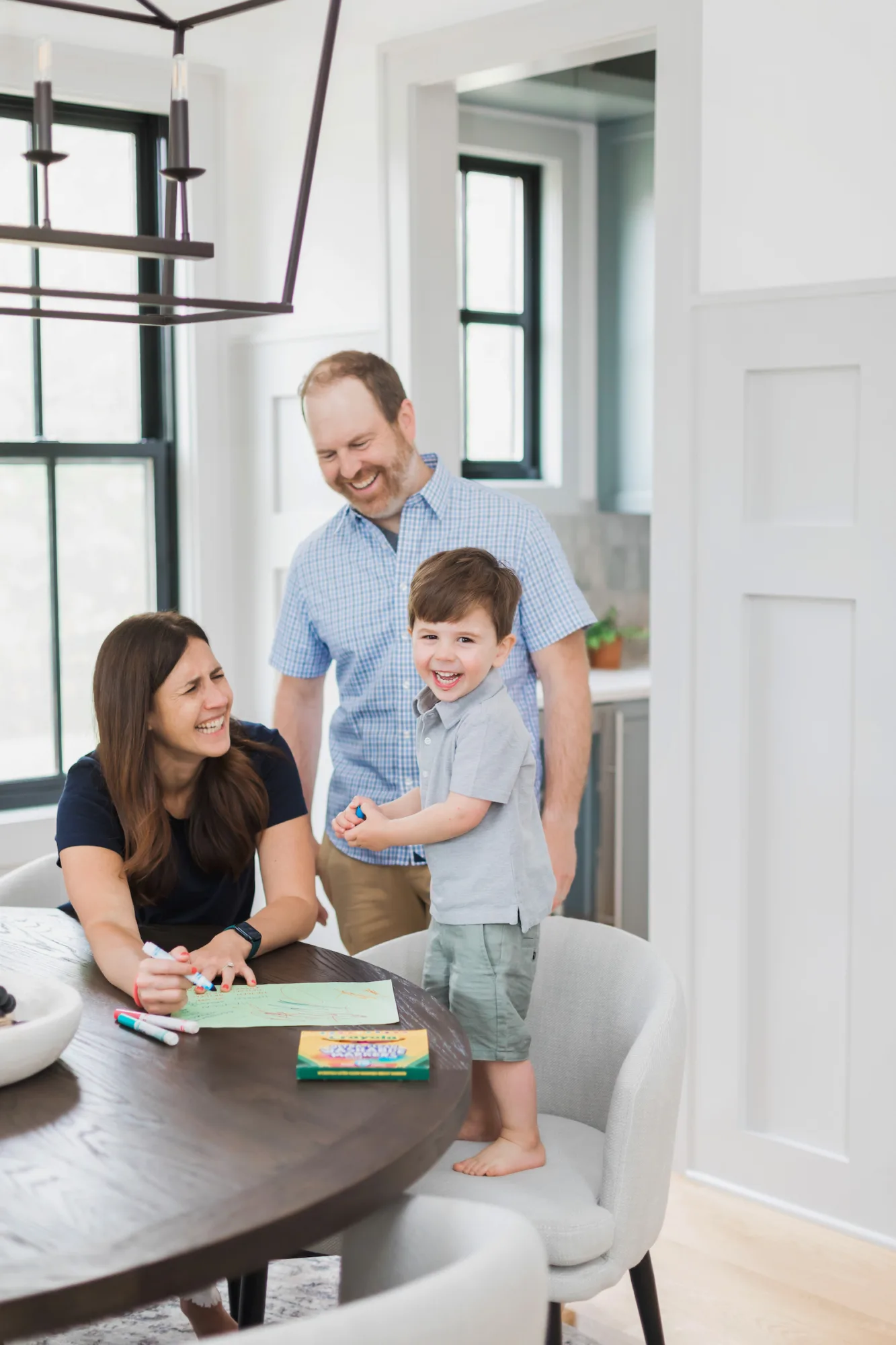
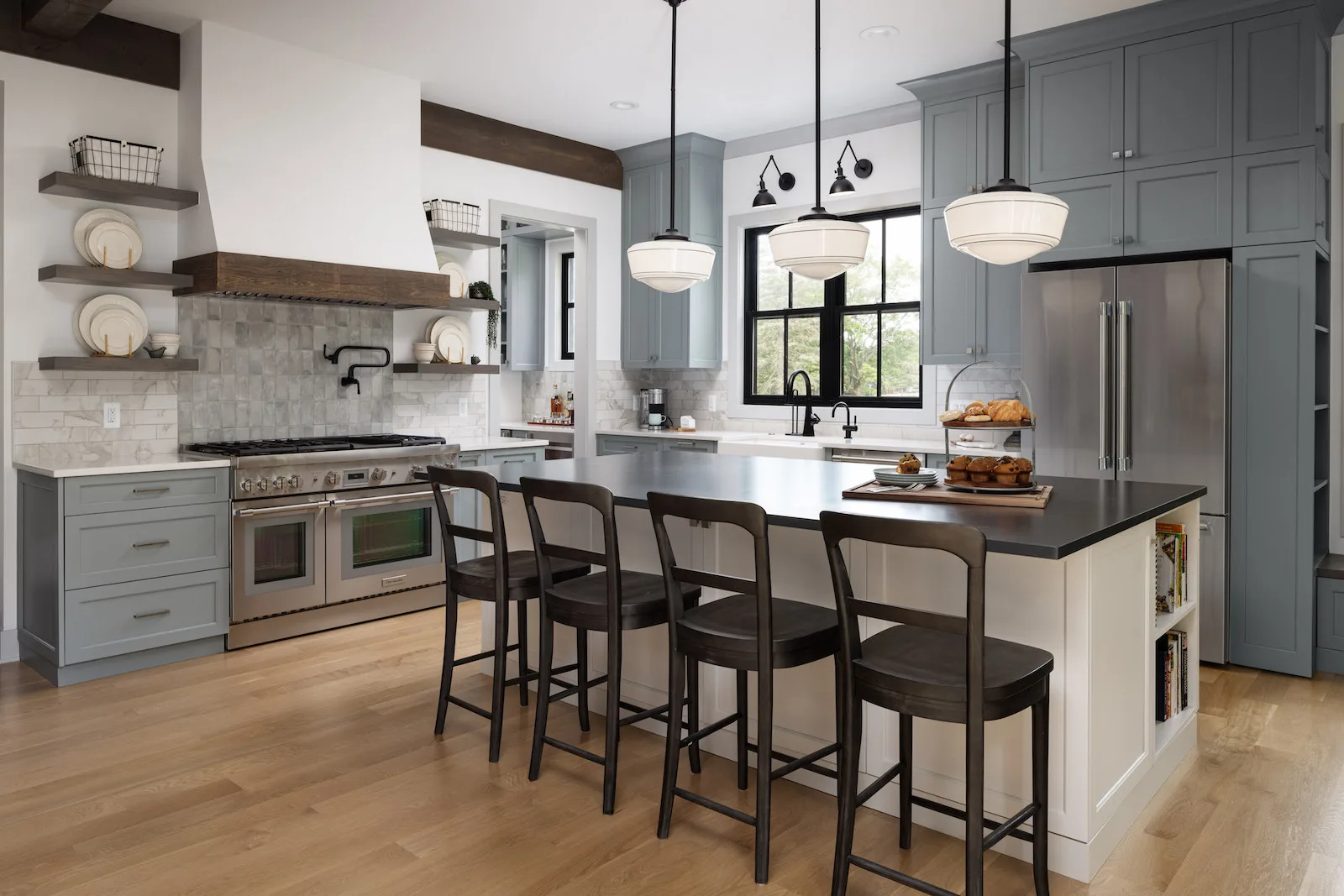
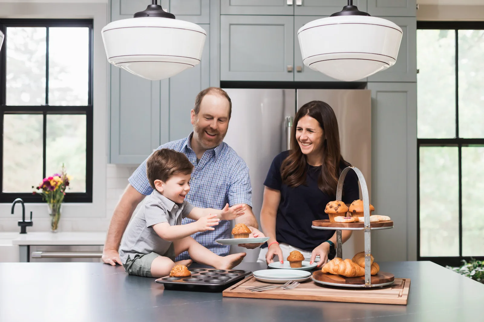
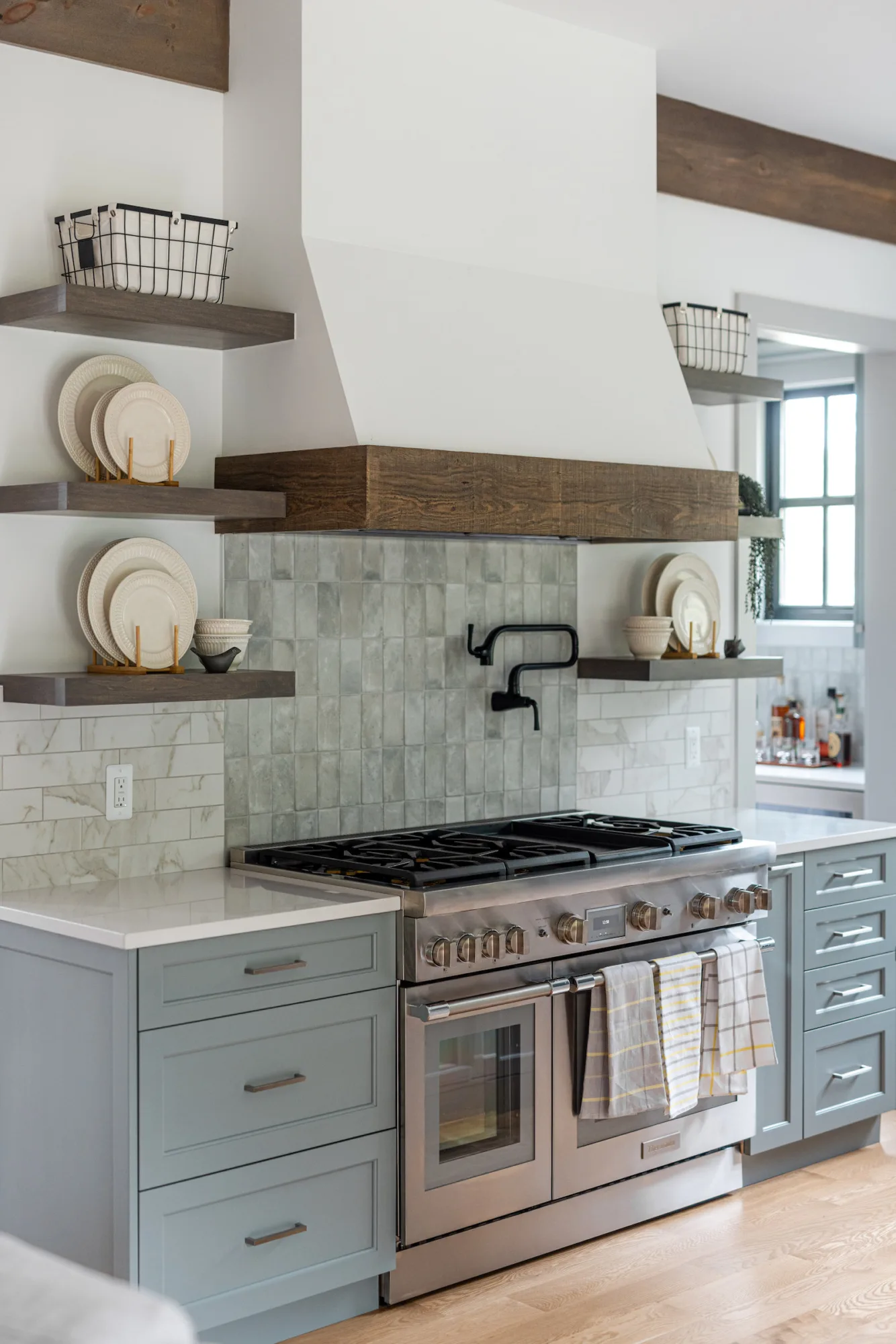
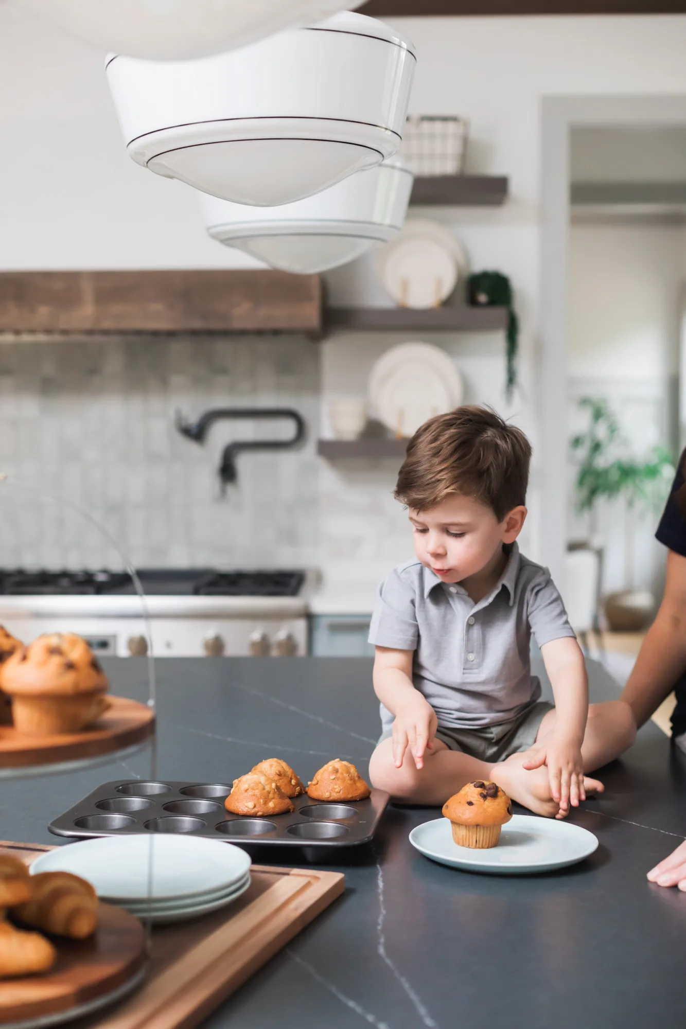
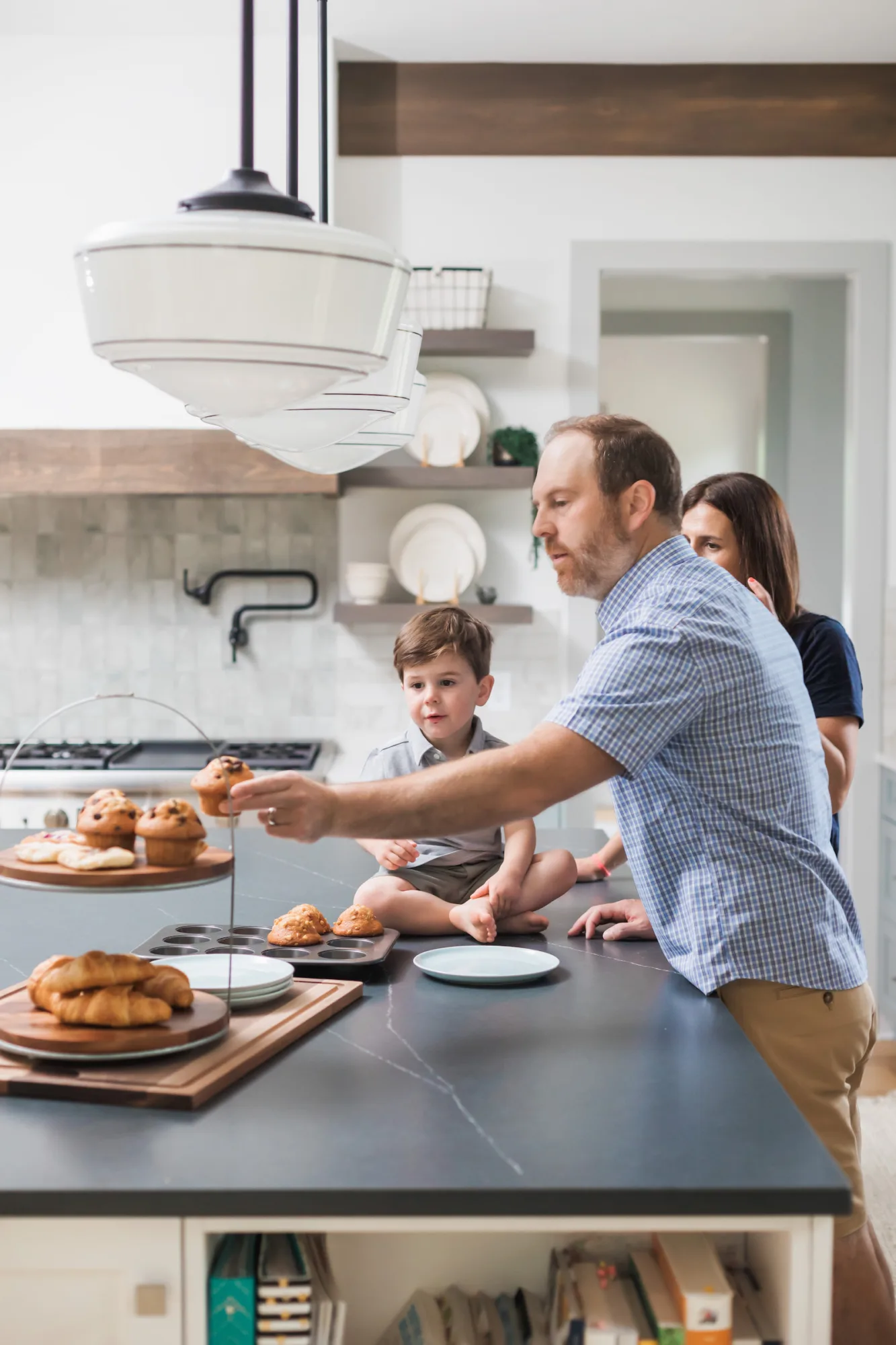
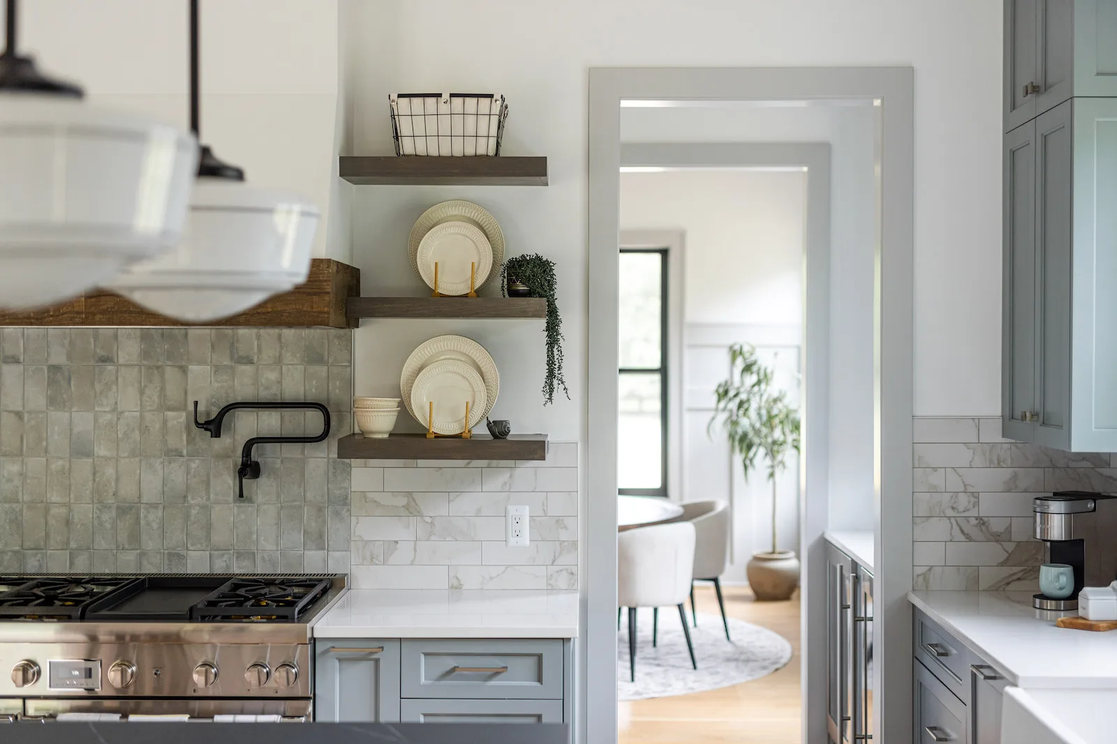
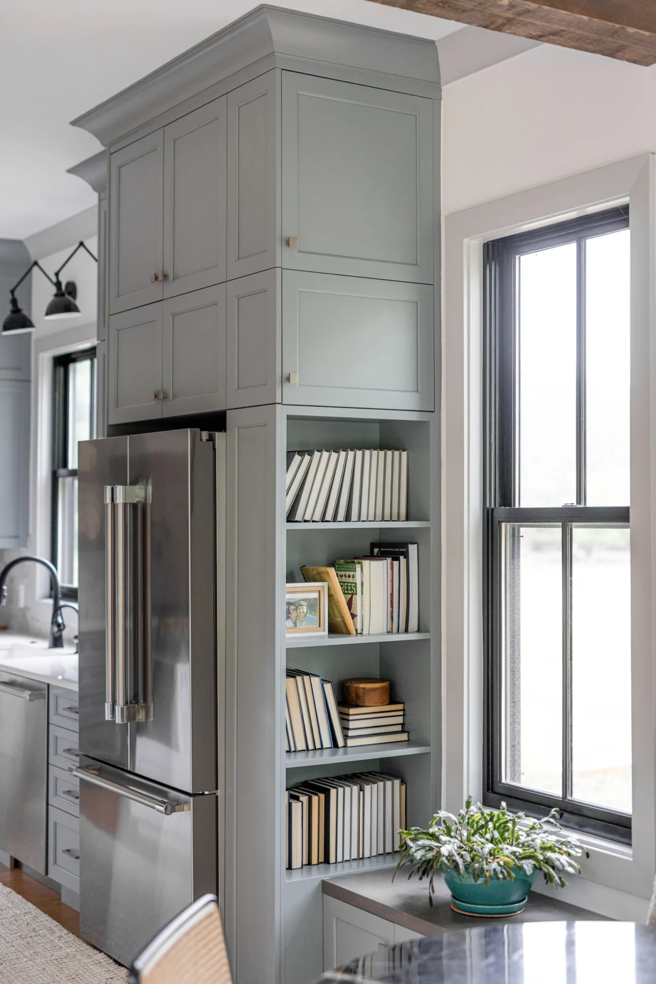
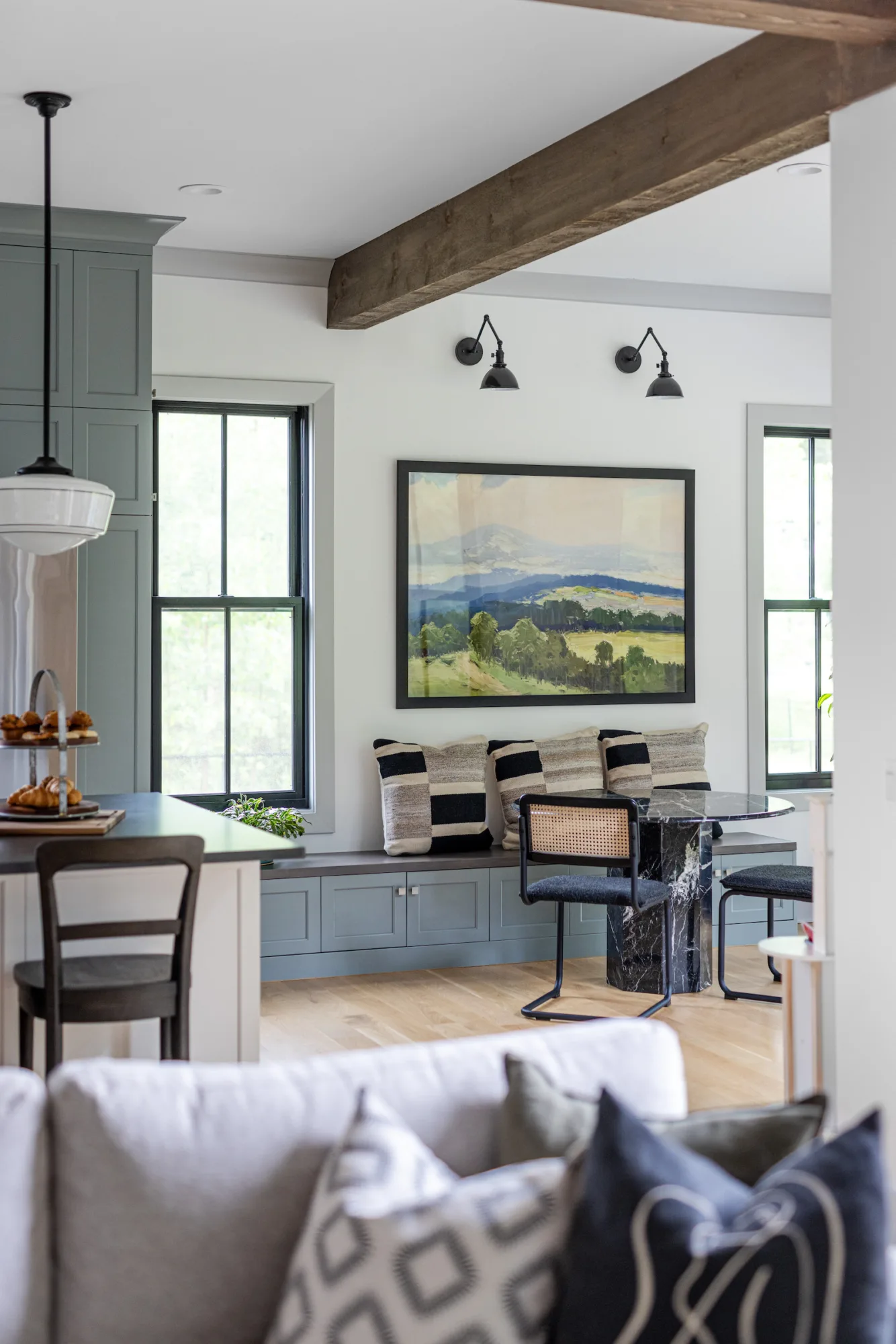
We then leaned deeply into their lifestyle needs and open concept vision, which sparked more customization in the kitchen and dining areas. After several iterations, we extended their back cabinetry wall into their second dining area to make way for an eat-in kitchen nook and an island – perfect for everyday dining with their son. The spaces adjacent to the kitchen also have multi-functionality in mind. For example, the wet bar extends into the formal dining room where they intend to entertain. Kitchen customization even got as deep as determining how each island drawer would be used (i.e. Tyler’s grilling drawer in the island is closest to the patio door for convenience).



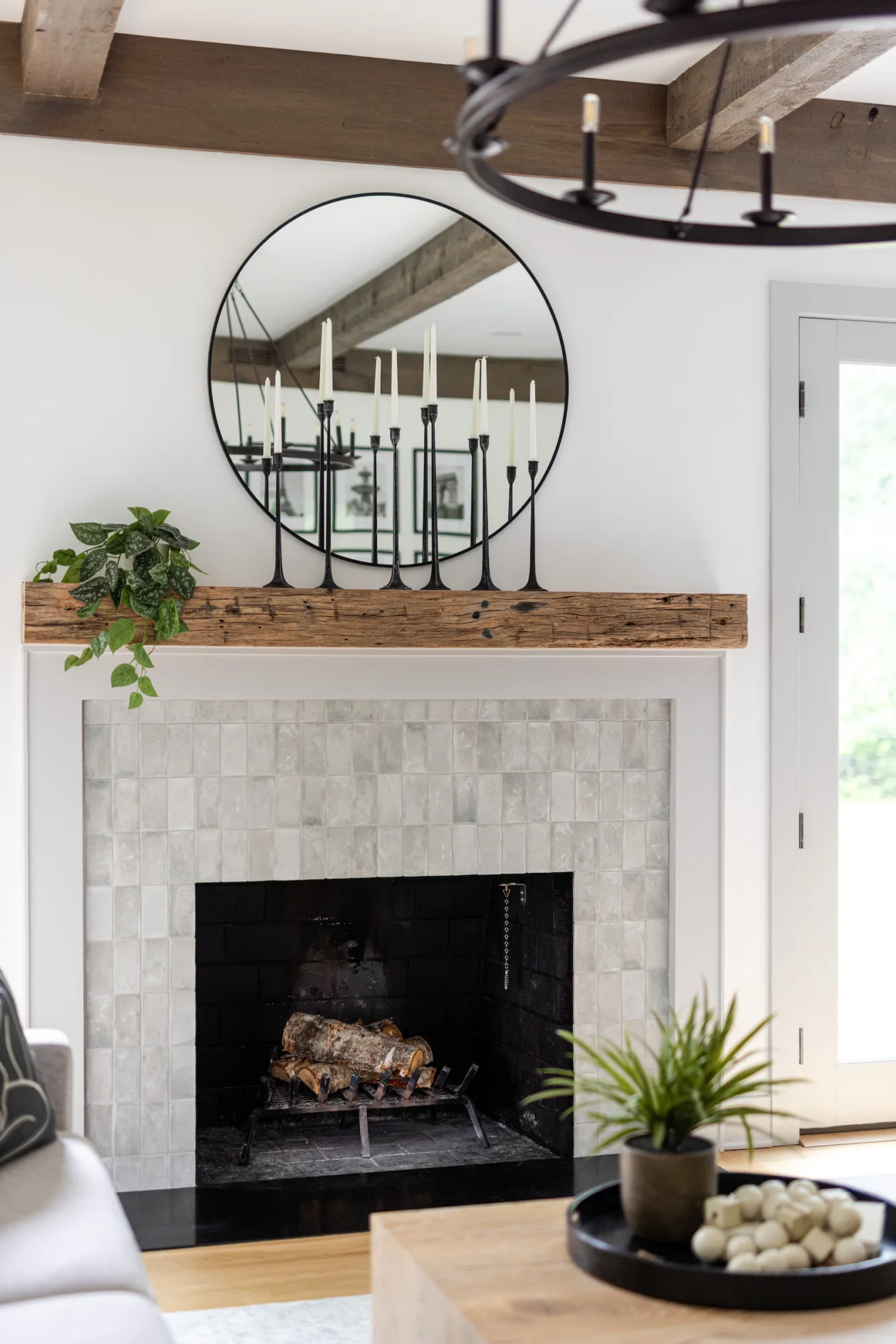
In the living room, we moved their TV from overtop the mantle to allow the wood burning fireplace to shine as the focal point when entering the home, which we made into a feature wall with a mirror and handcrafted tiles.
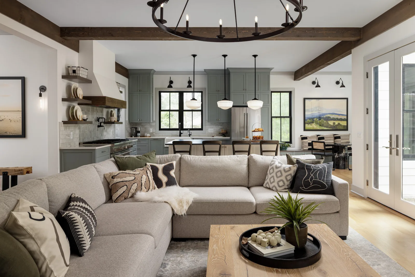
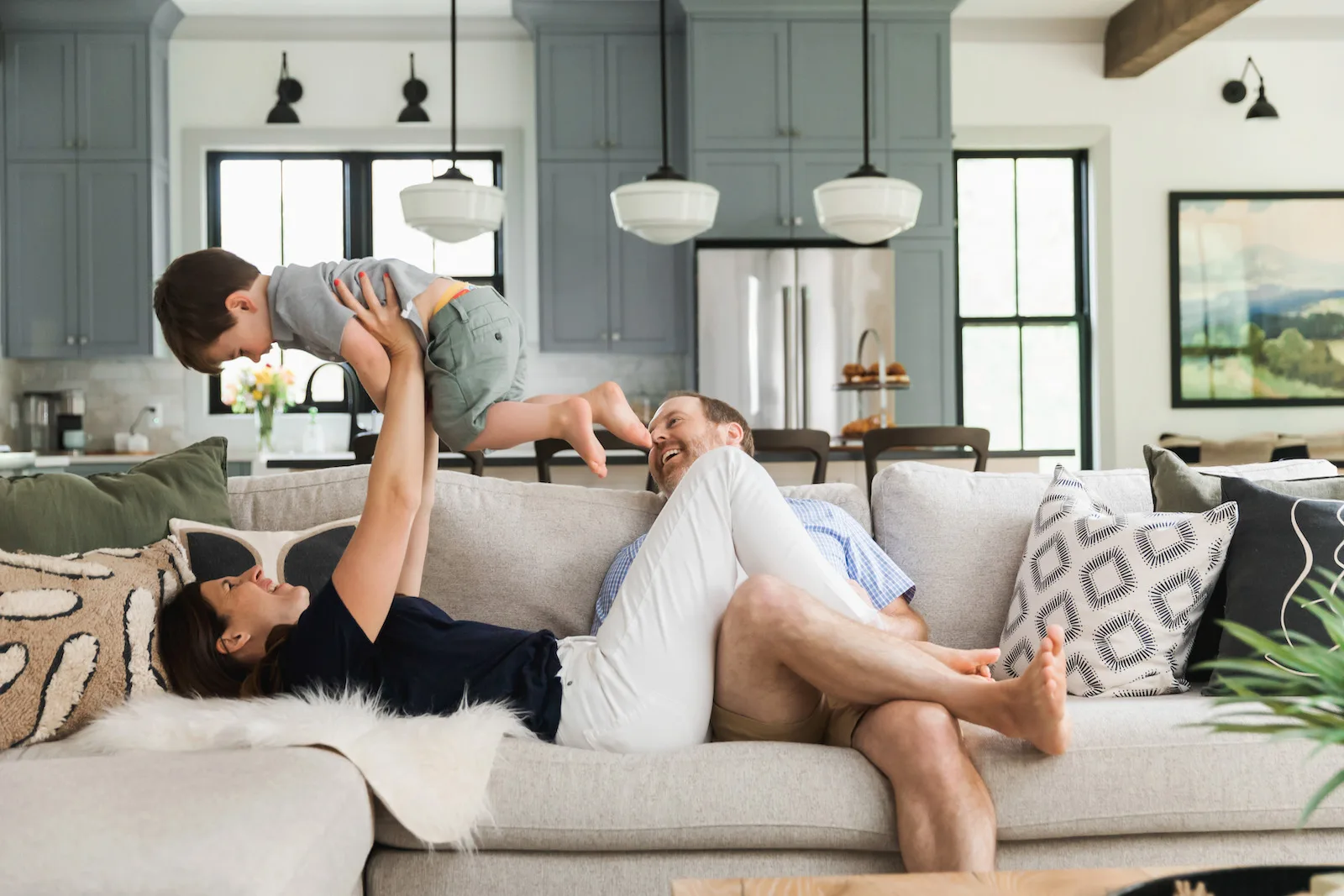
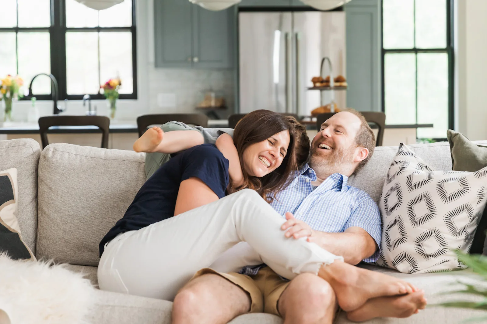
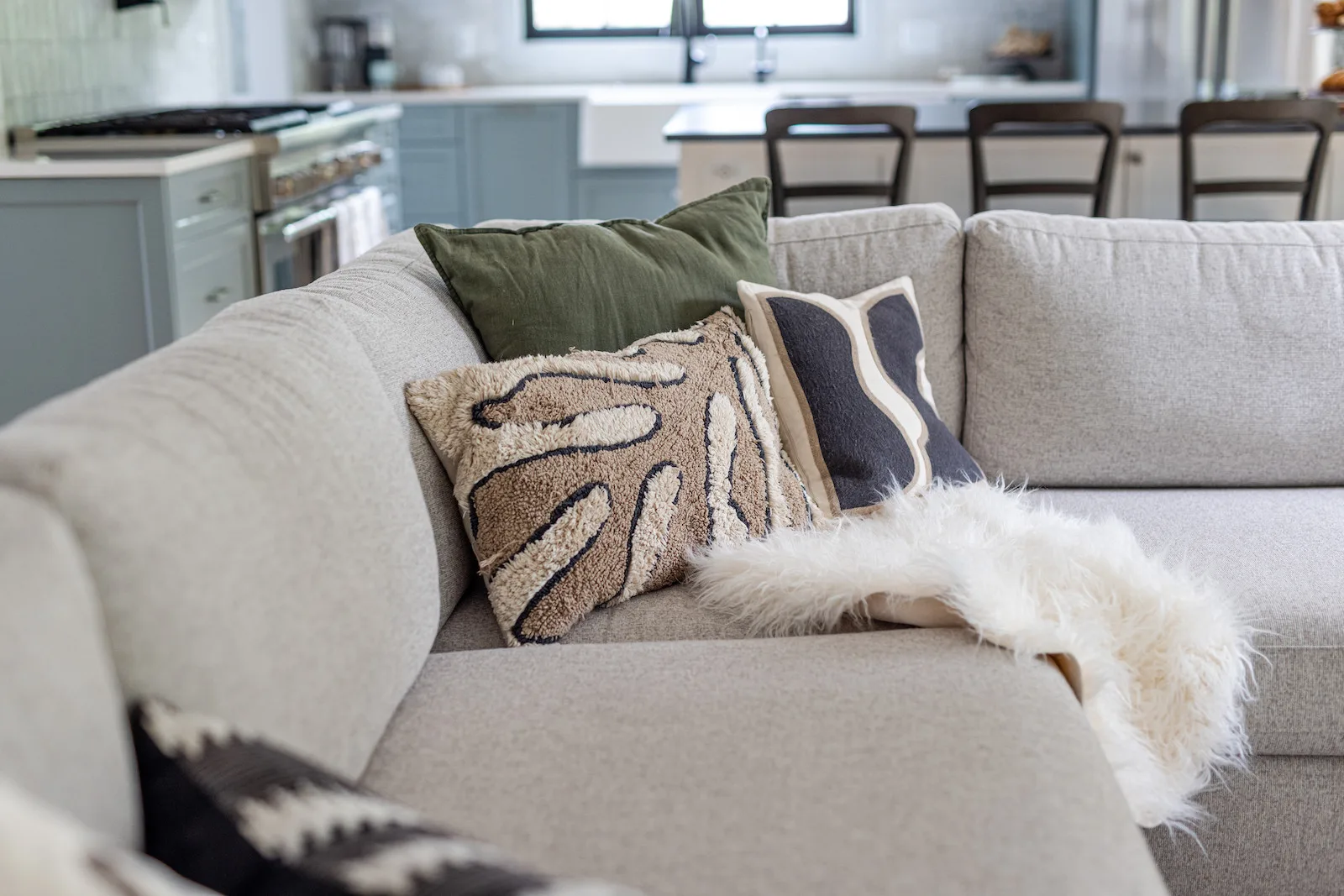
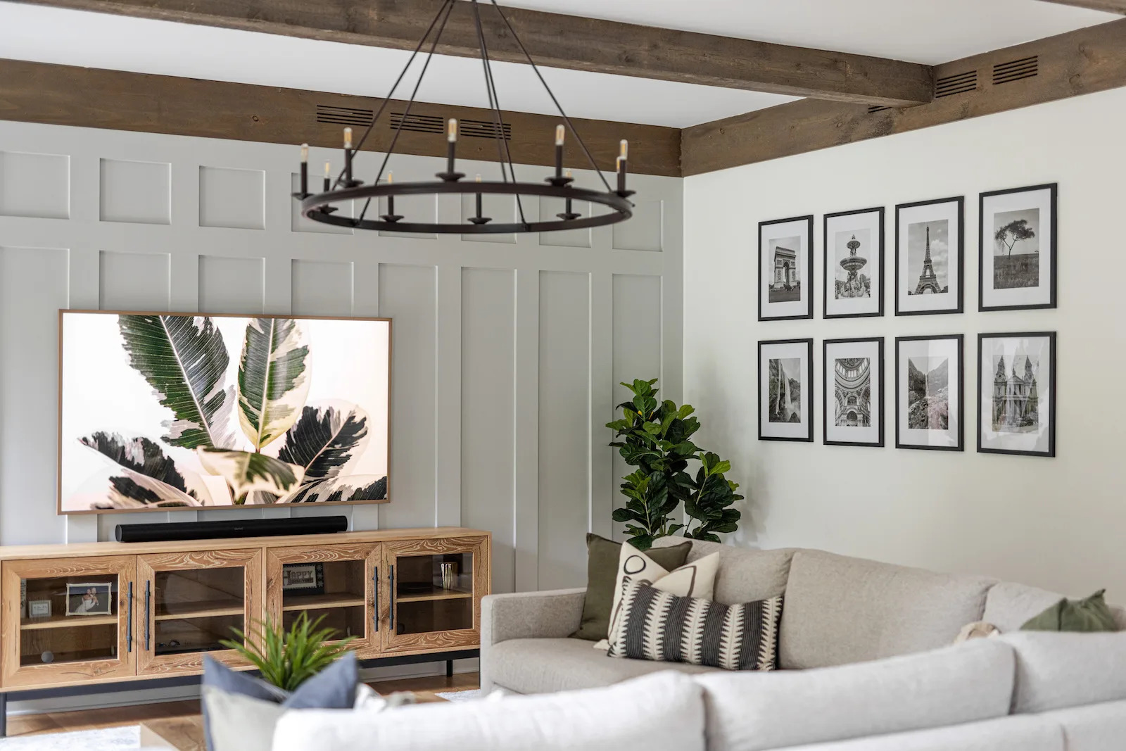
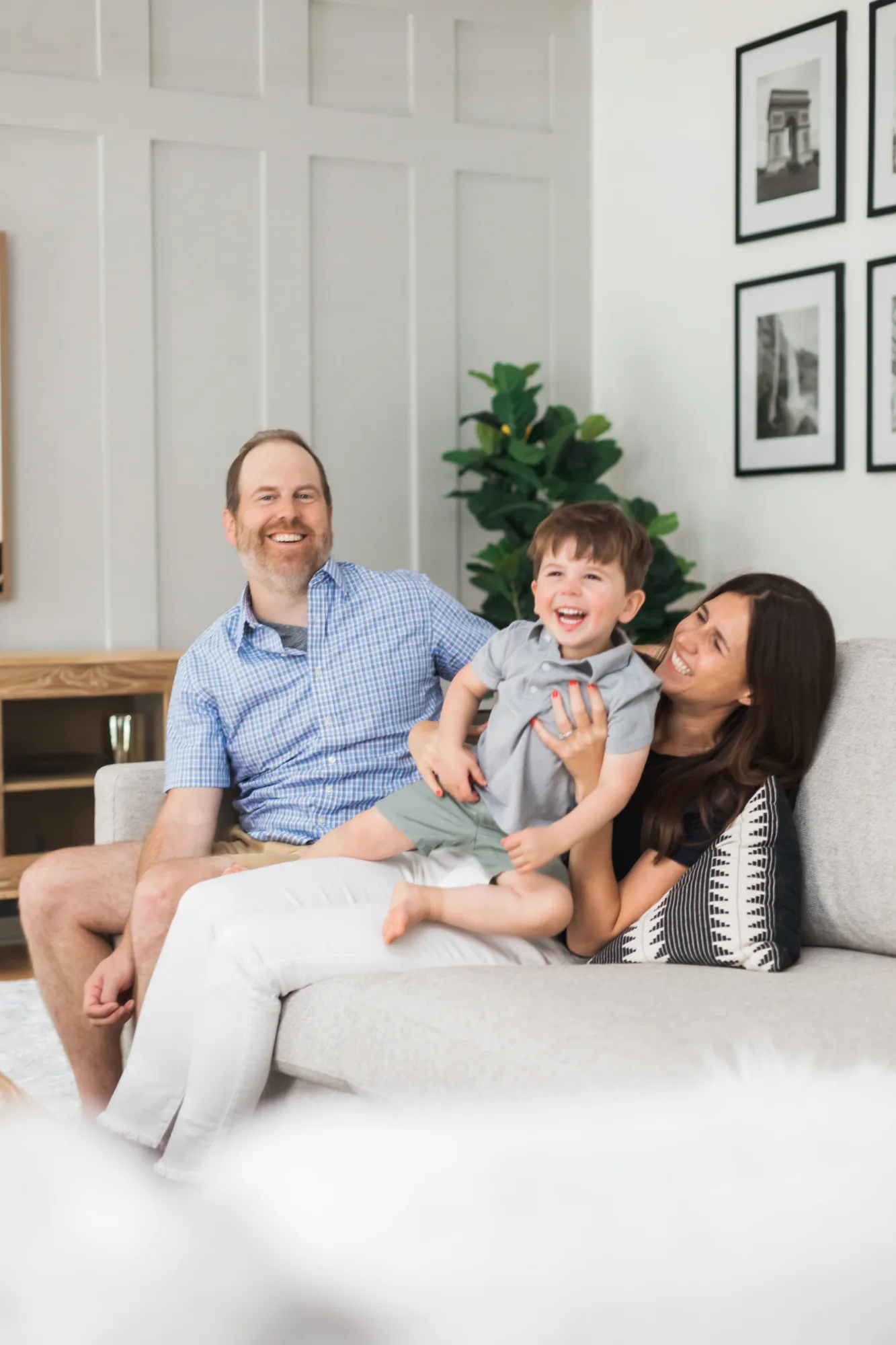
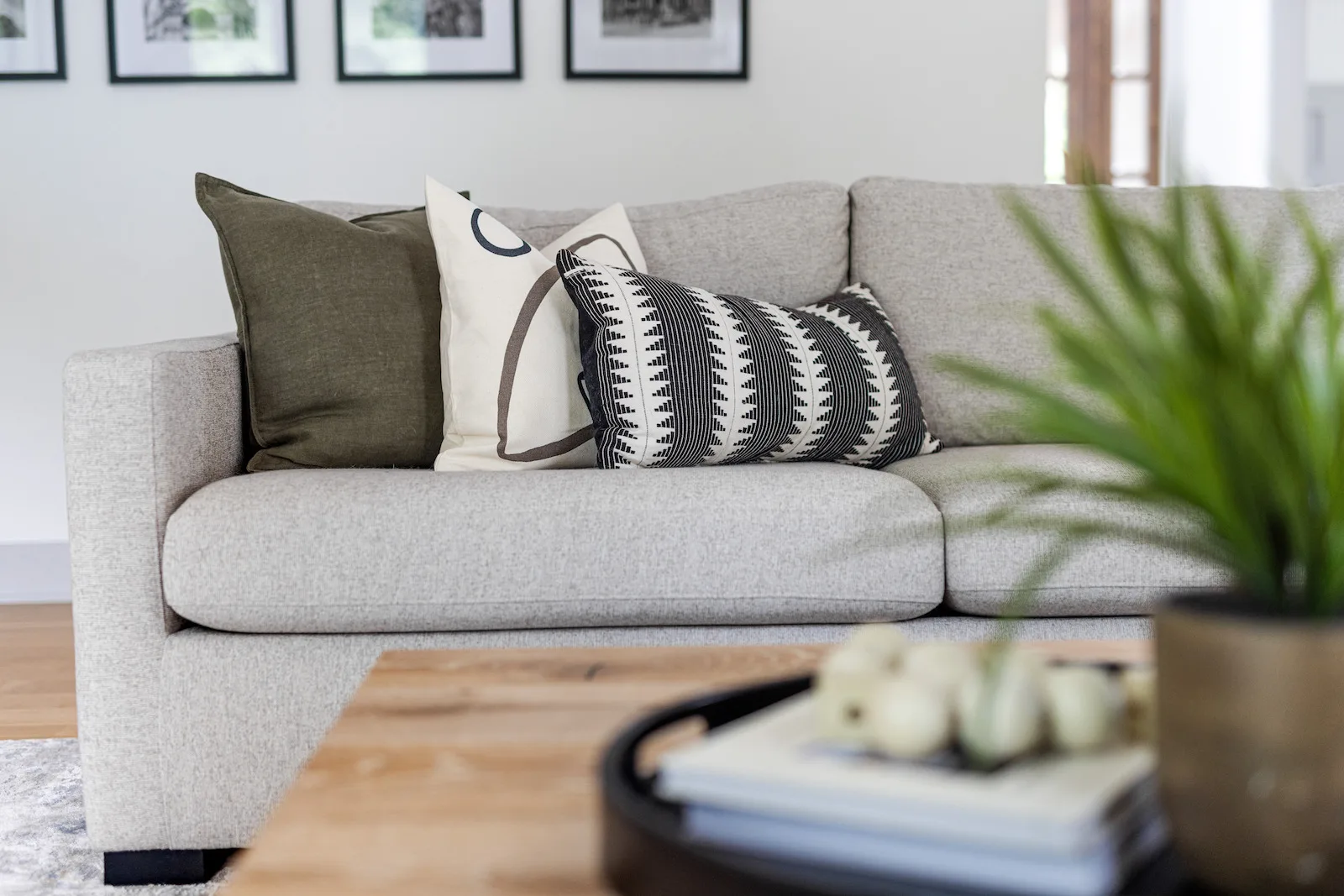
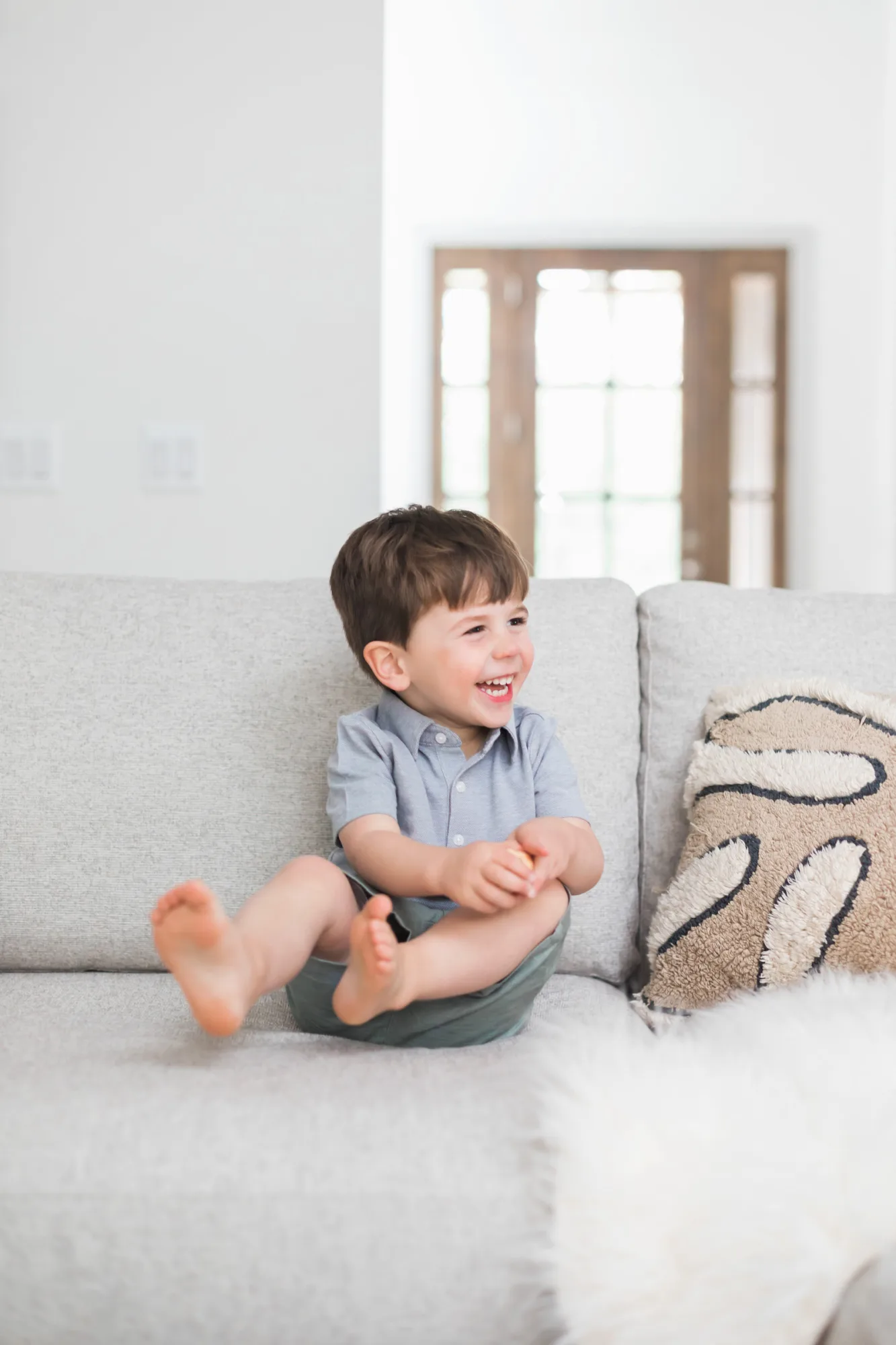
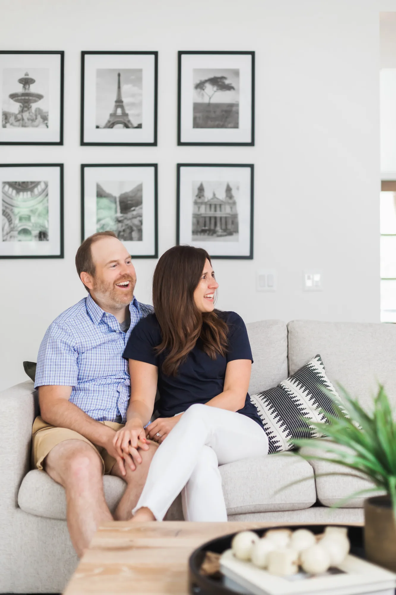
The living room is also where we dialed up the family focus. For example, the large sectional sofa was selected to fit the whole family (vs. having separate sofas and chairs) and provide comfortable TV AND fireplace orientation. We also added a contemporary gallery on an intimately placed return wall to showcase their favorite family photos.
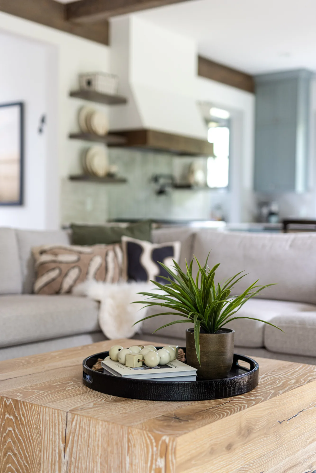
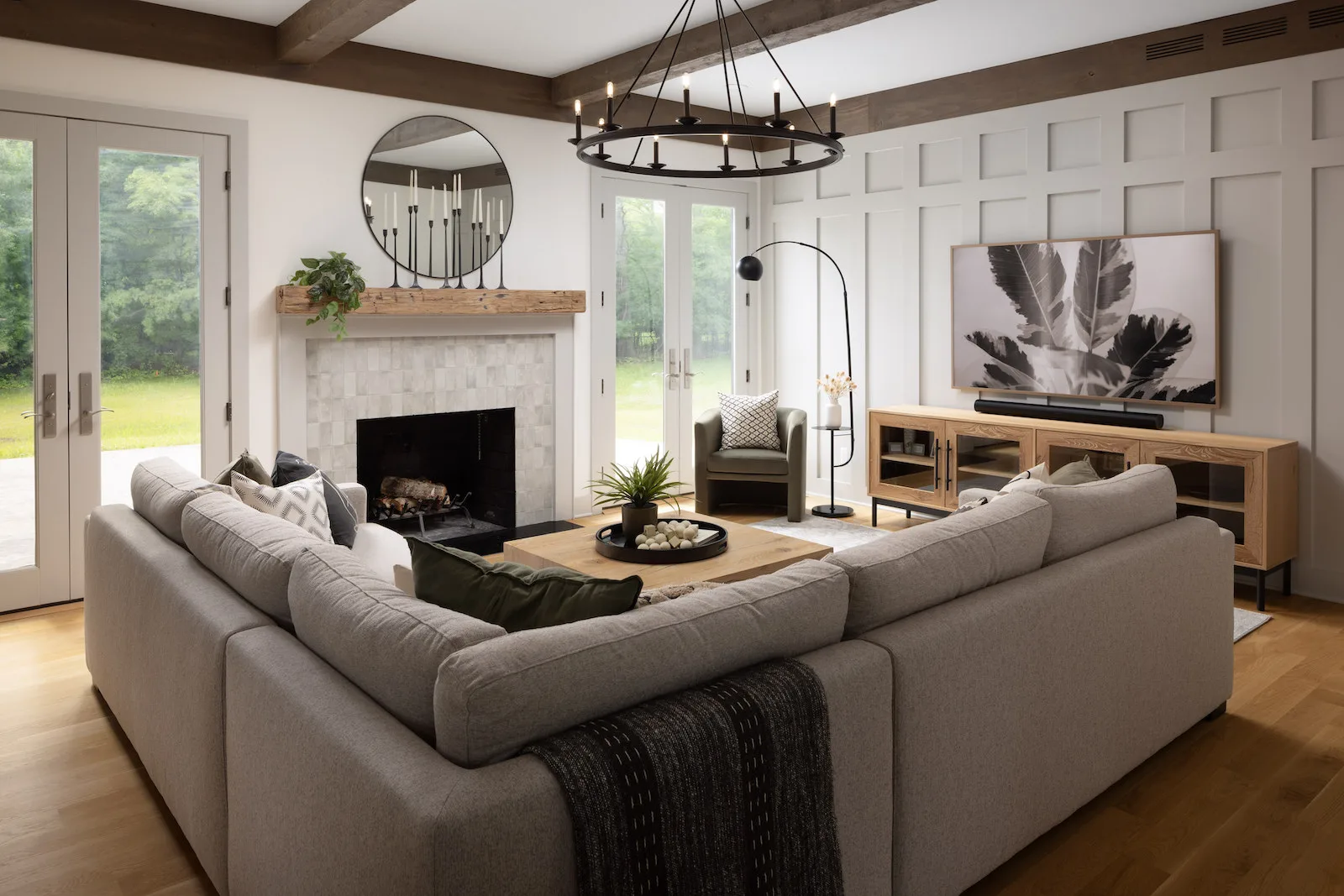
When it came to elevating the space visually, we took a few approaches. First, we grounded the TV against the large wall with repetitive wainscotting that appears at different heights in the dining and mudroom. We also added a custom beam design to the ceiling.
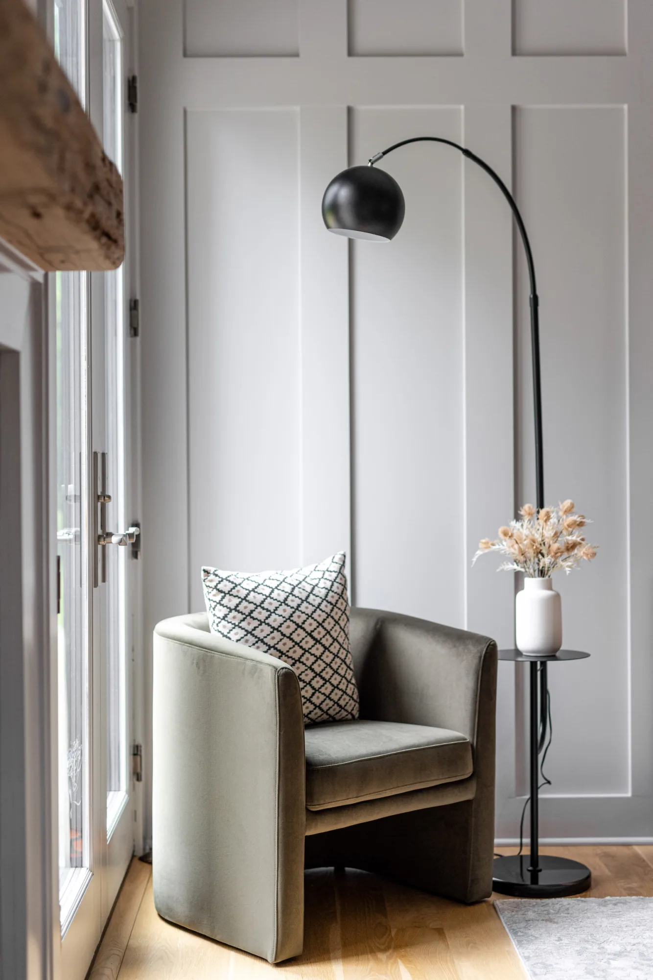
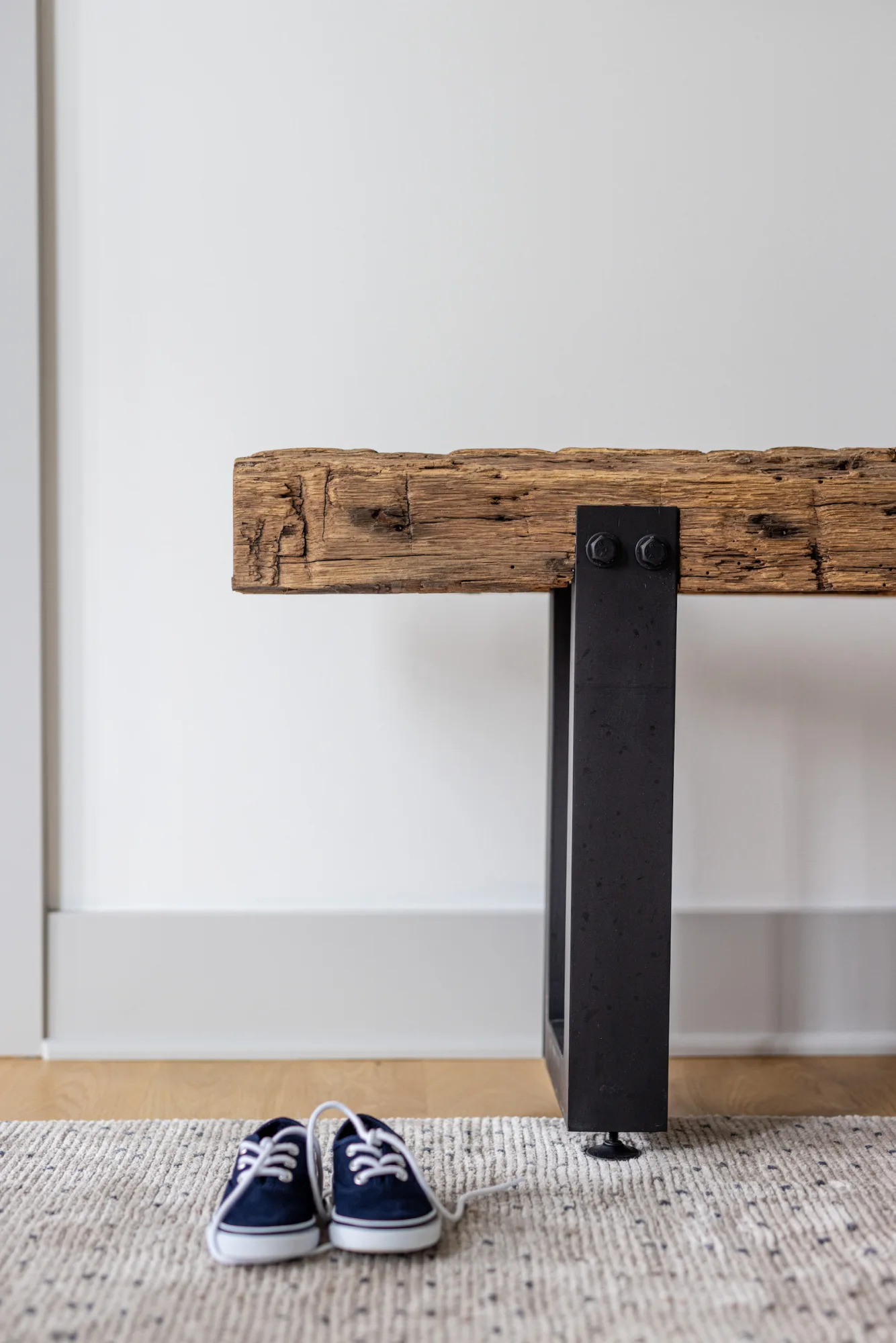
Fun fact: Tyler fell in love with a specific beam type at an architectural salvage warehouse, but the application wasn’t right, so we had to opt for their second option. However, we didn’t feel right about leaving his favorite out entirely. So, we went back, purchased his favorite beam, and made it into an entryway bench that we gifted to them to celebrate the project’s completion.
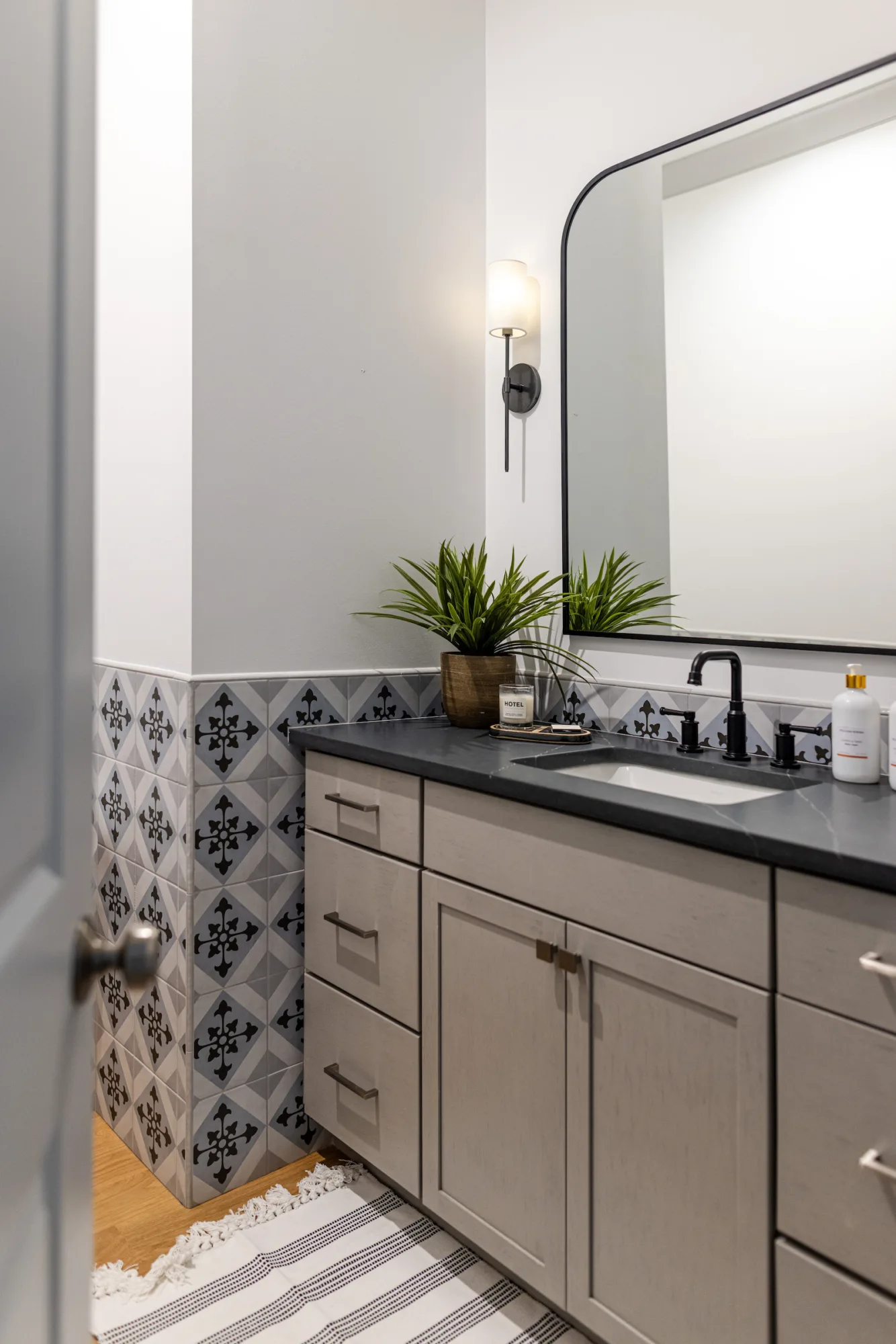
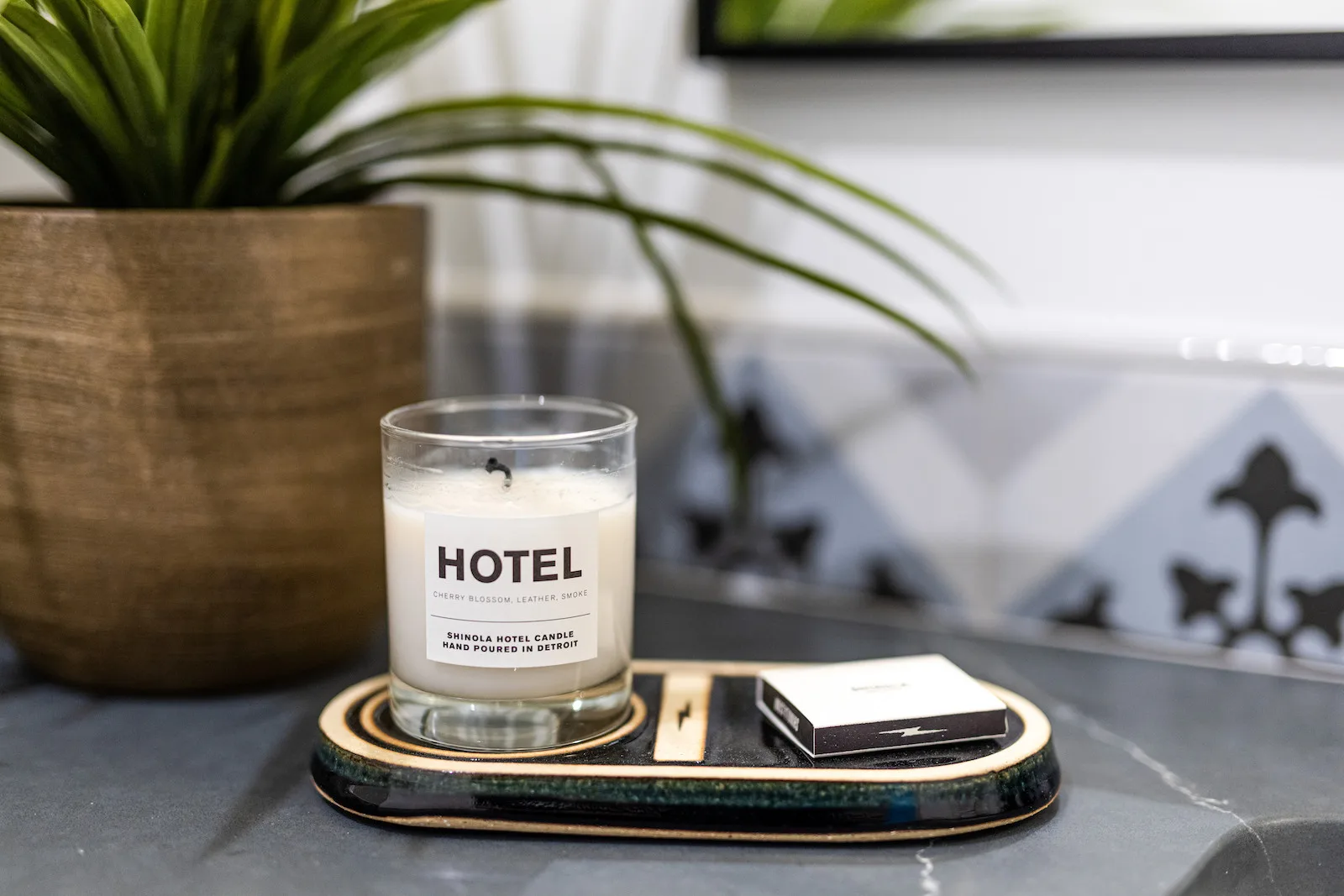
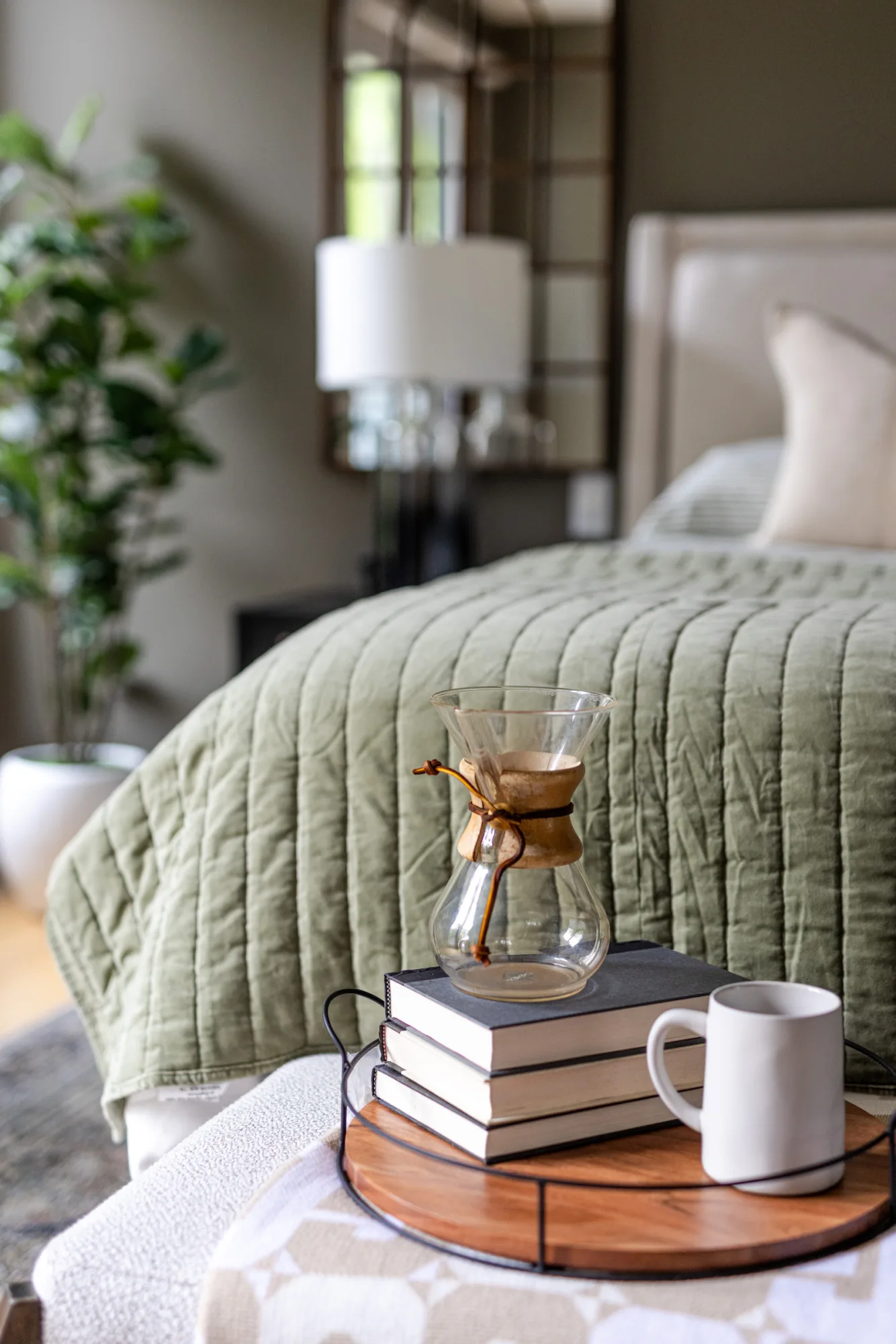
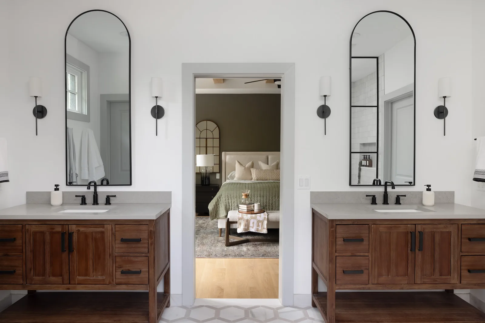
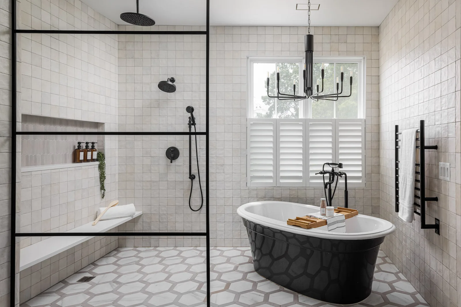
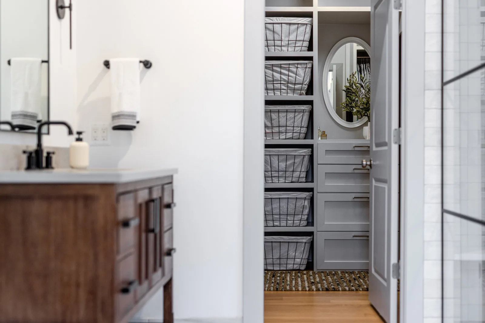
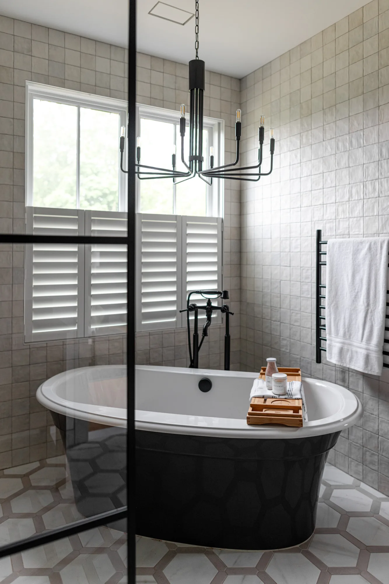
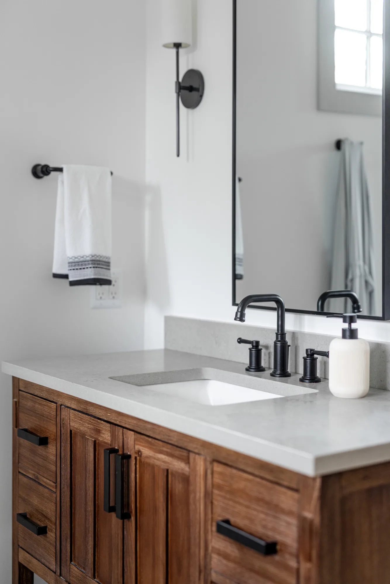
In the upstairs floor plan, we made some lifestyle-oriented adjustments. The main transformation was in the primary bathroom, which started out as three separate rooms. We adjusted plans to make it one large space with his and her vanities and a wet room configuration. With a young son bound to splash around at bath time, a wet room made the most sense for their needs.

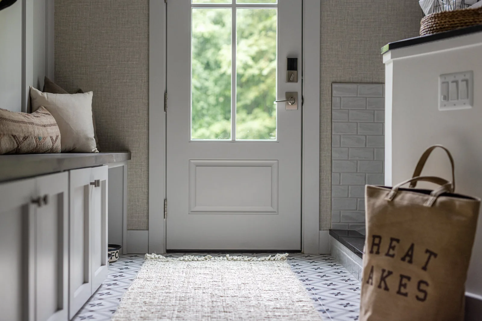
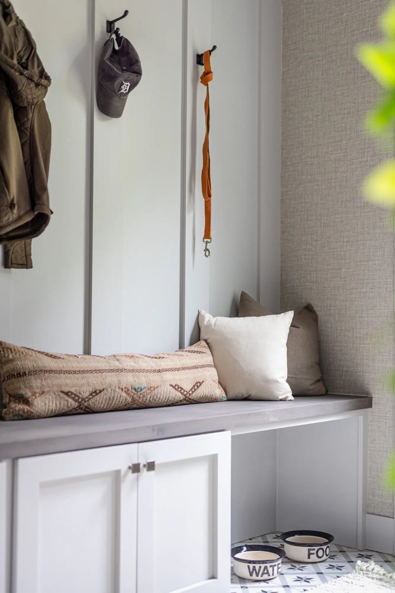
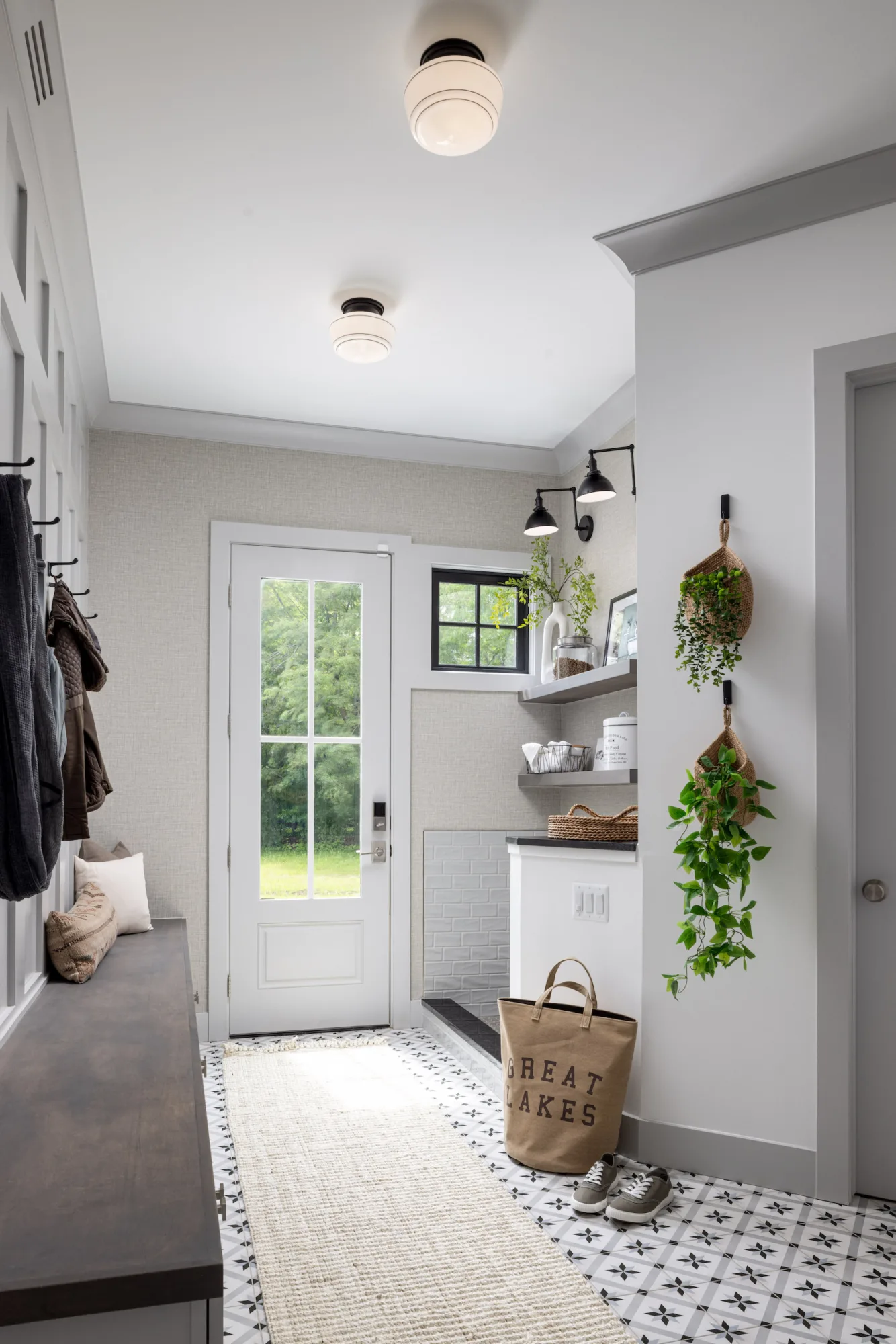
We even worked with the McVety’s to ramp up customization for their dog! They asked their architect to include a dog wash station in the mud room; however, the original wash station wall went all the way up to the ceiling, creating somewhat of a cavern out of the space. We converted the station into a half wall, adding more framing, width, natural light, and visibility on the floating shelves and sconces.

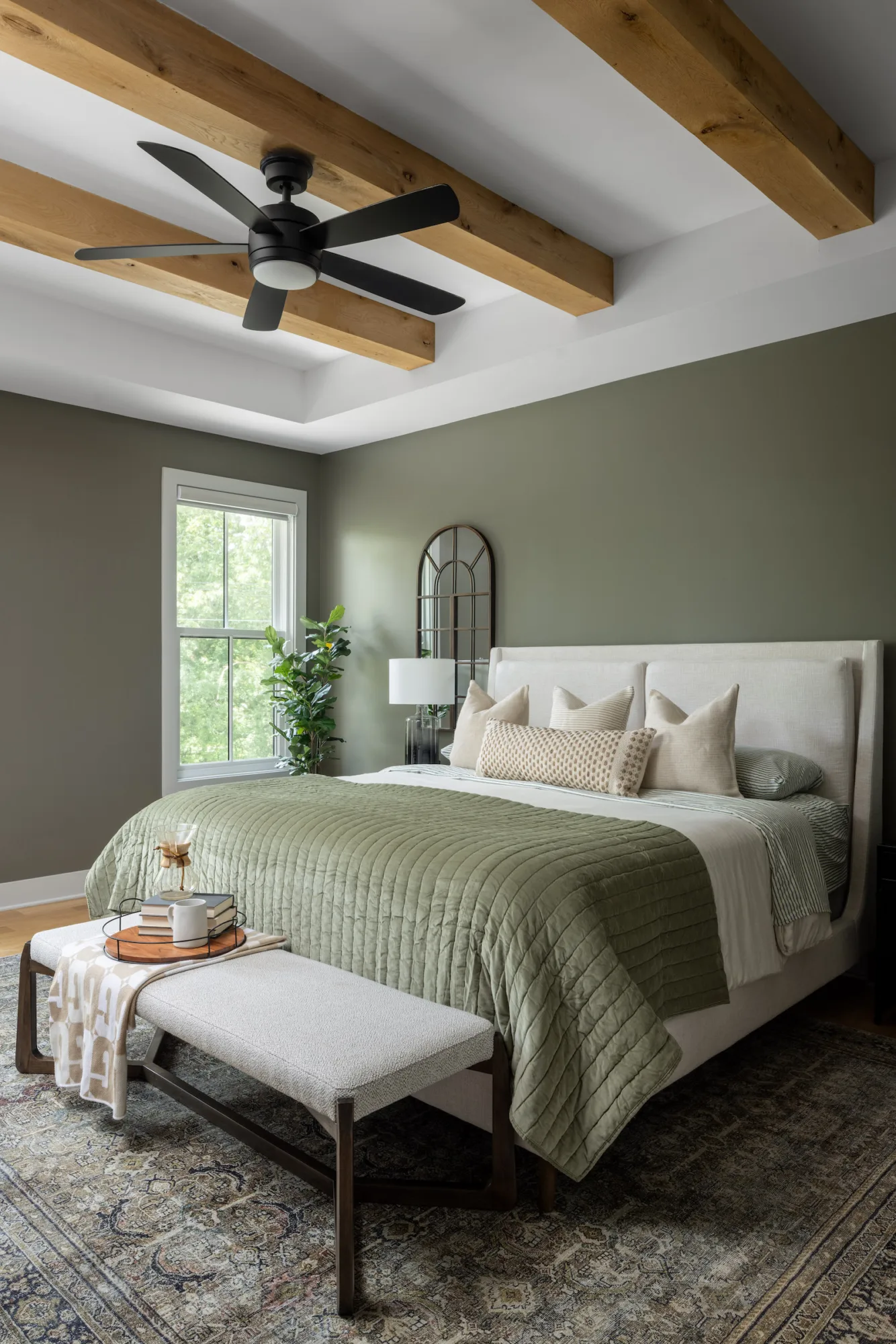
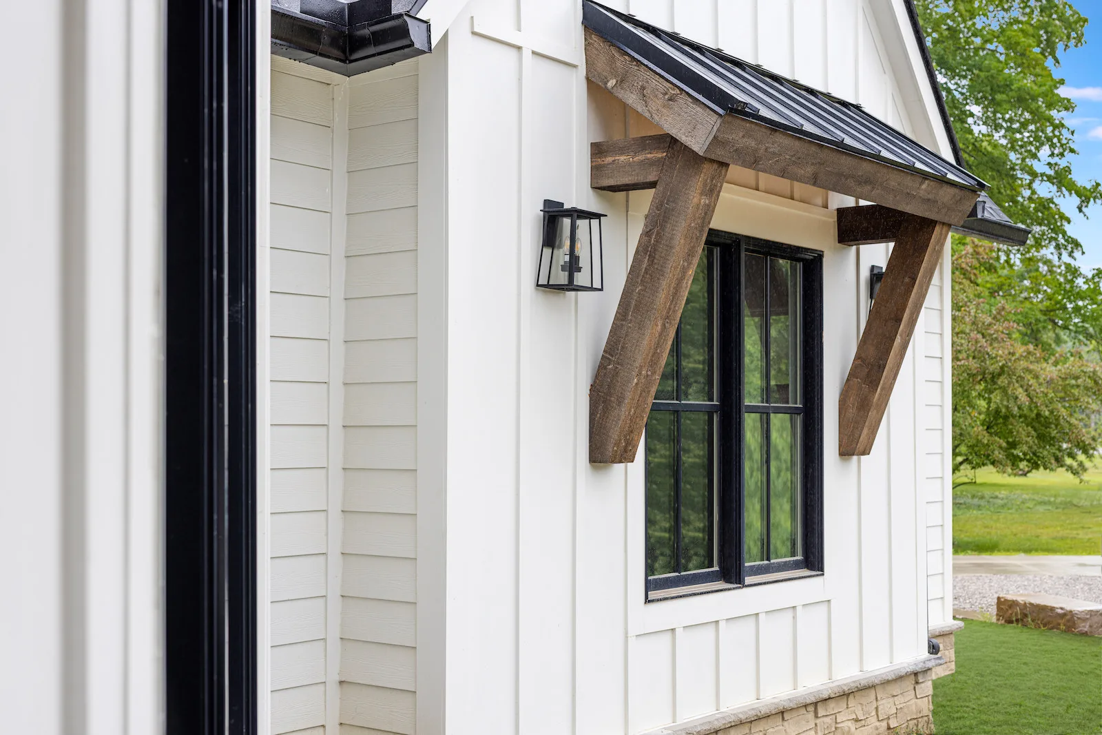
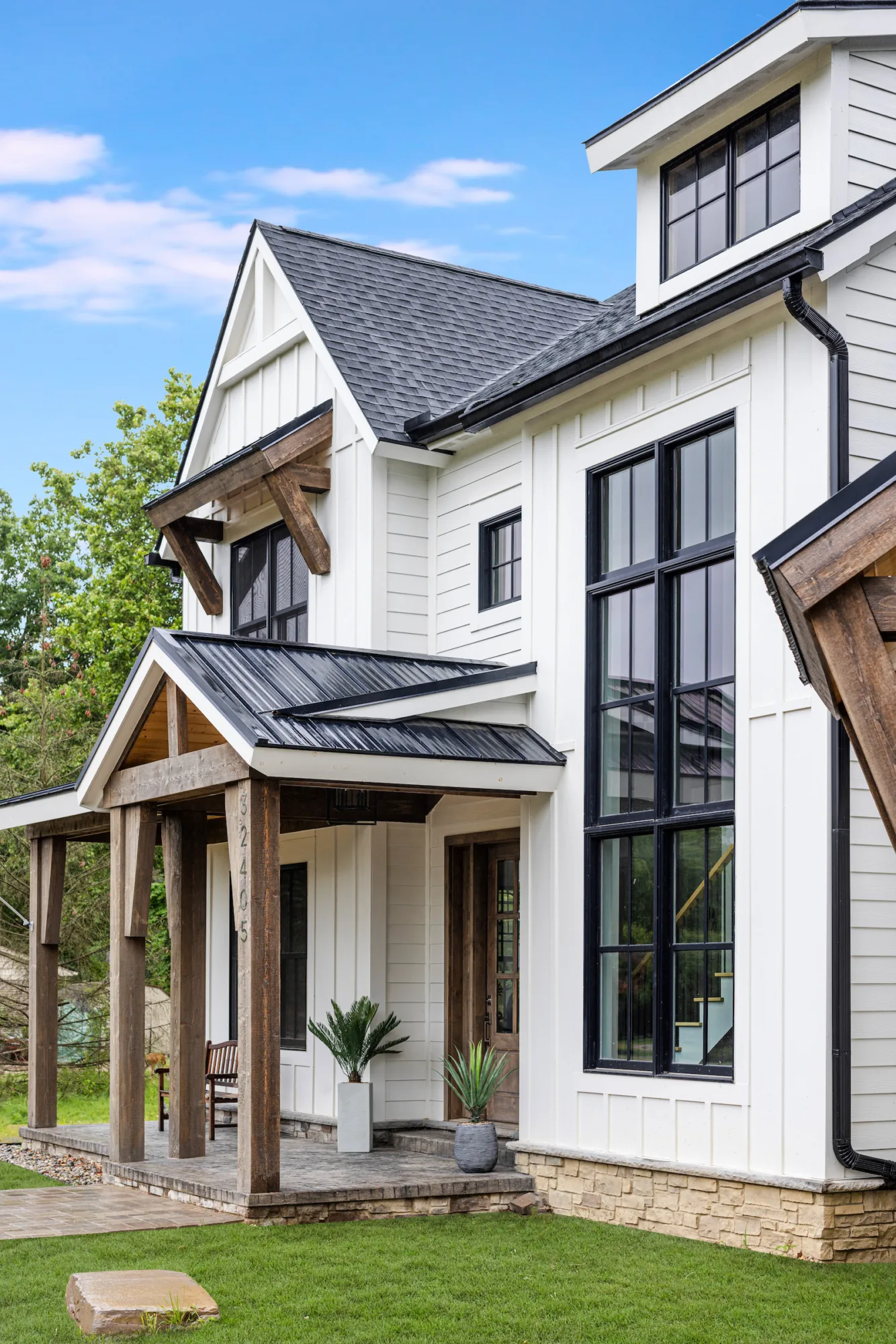
To better emphasize the home’s color palette, the interior has two types of wood: oak in the furniture details and overhangs and walnut in the architectural details. Although we don’t typically do exterior finishes, we carried the walnut feature outside of the home, too.
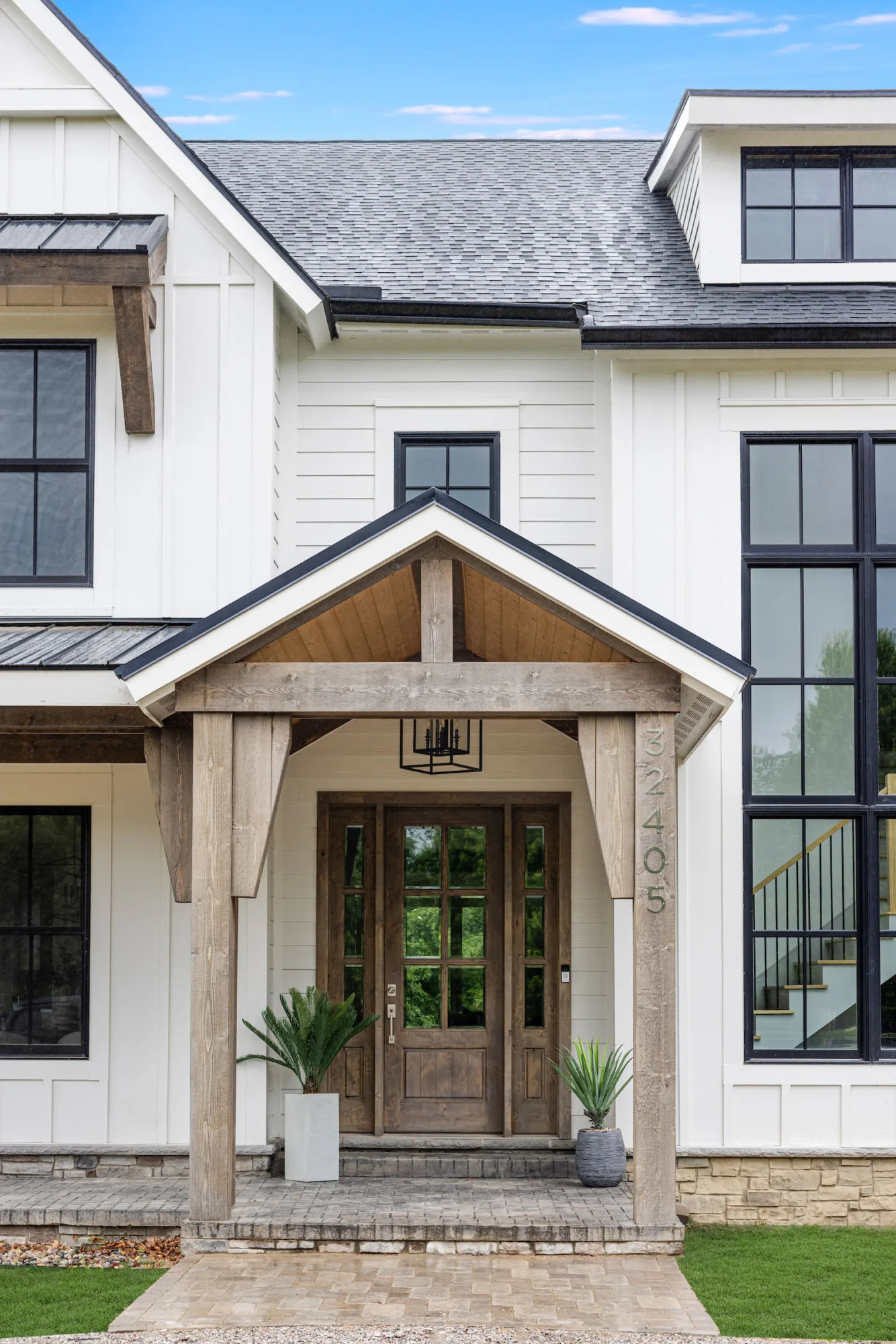
For Tyler and Katie, visualizing their family’s dream home was the easy part. Modifying the floor plan and diving into construction, however, turned out to be a whole new ball game. We were able to give back valuable time to McVety’s, advocate for their vision’s success, and uncover customizations that truly made their new-build house a beautiful, functional family home.
Making News

AWARD: interiors – traditional master suite – 3rd place