
Nothin’ But a Green Thang
Northville, Michigan
Concetti believes that authenticity is timeless, and our most recent project perfectly embodies that principle. As one of his first moves as a new bachelor, our client sought to embrace his true self through his home, and turned to us to infuse it with his distinctive masculine energy. By re-evaluating floor plans, creating personalized Visual Guidelines, and fostering a collaborative partnership, we helped him reclaim his space as he embraces his most authentic phase of life yet.
Our Goal:
Our client, Nick, had previously hired another interior designer with his former partner to design their home. However, the resulting style and aesthetic did not reflect his true masculine, moody personal taste. The home was beautifully designed, but he no longer resonated with the bright colors and bohemian, feminine furnishings.
Discover how Phases 1 and 2 of the Concetti Process helped Nick transform his home into a deeply personal and authentic reflection of himself.
Our Solution:
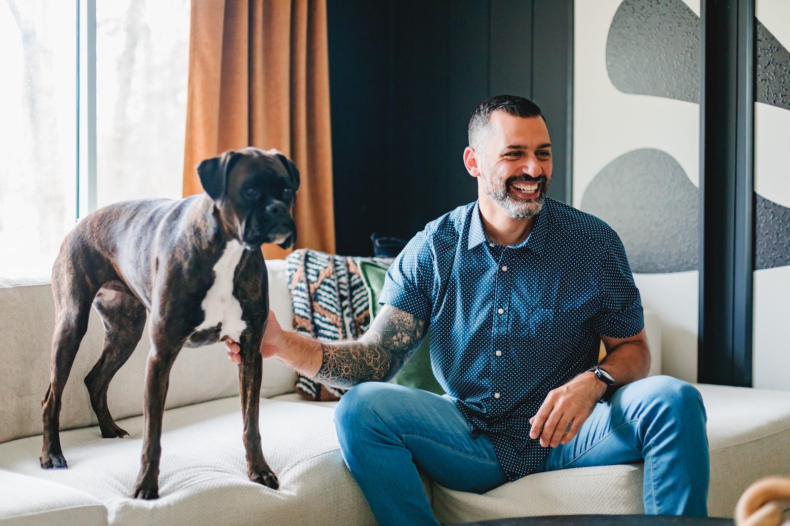
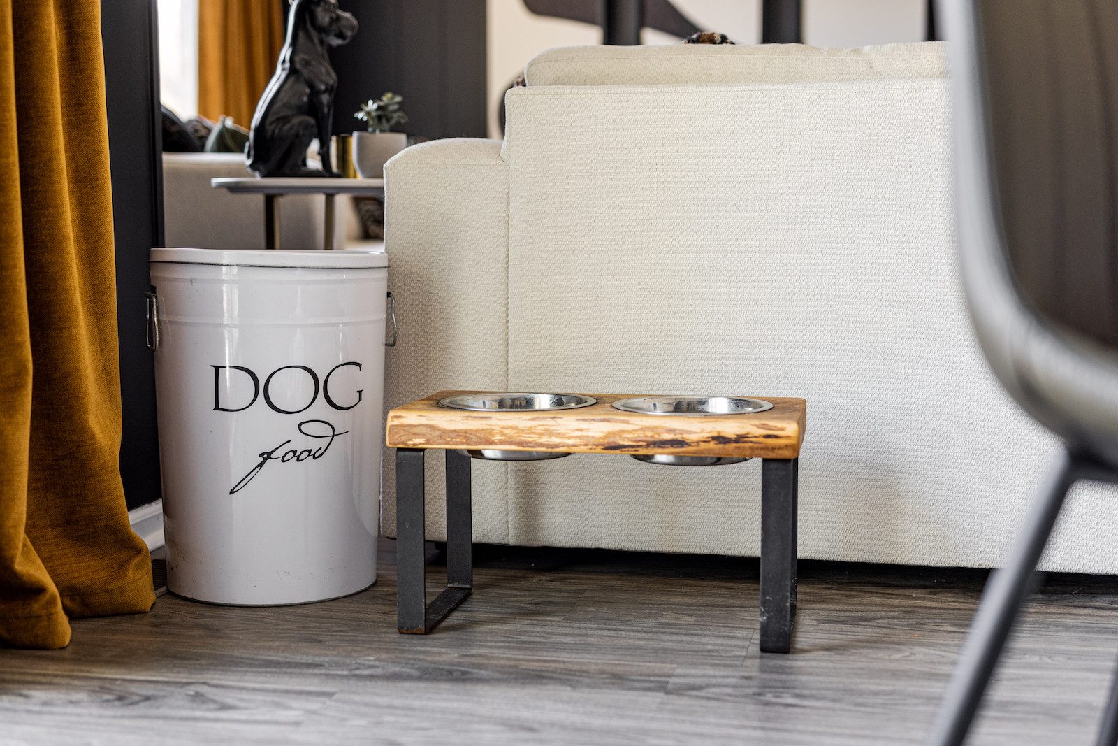
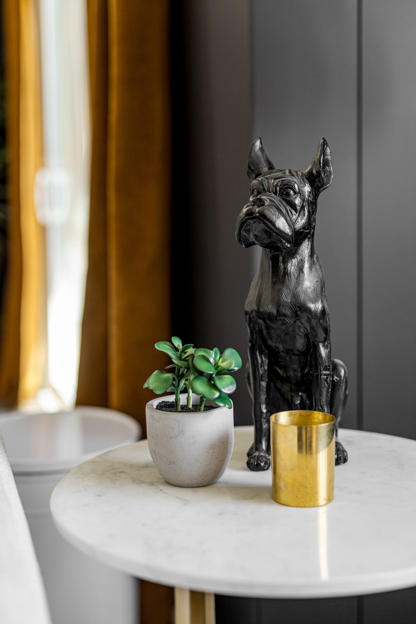
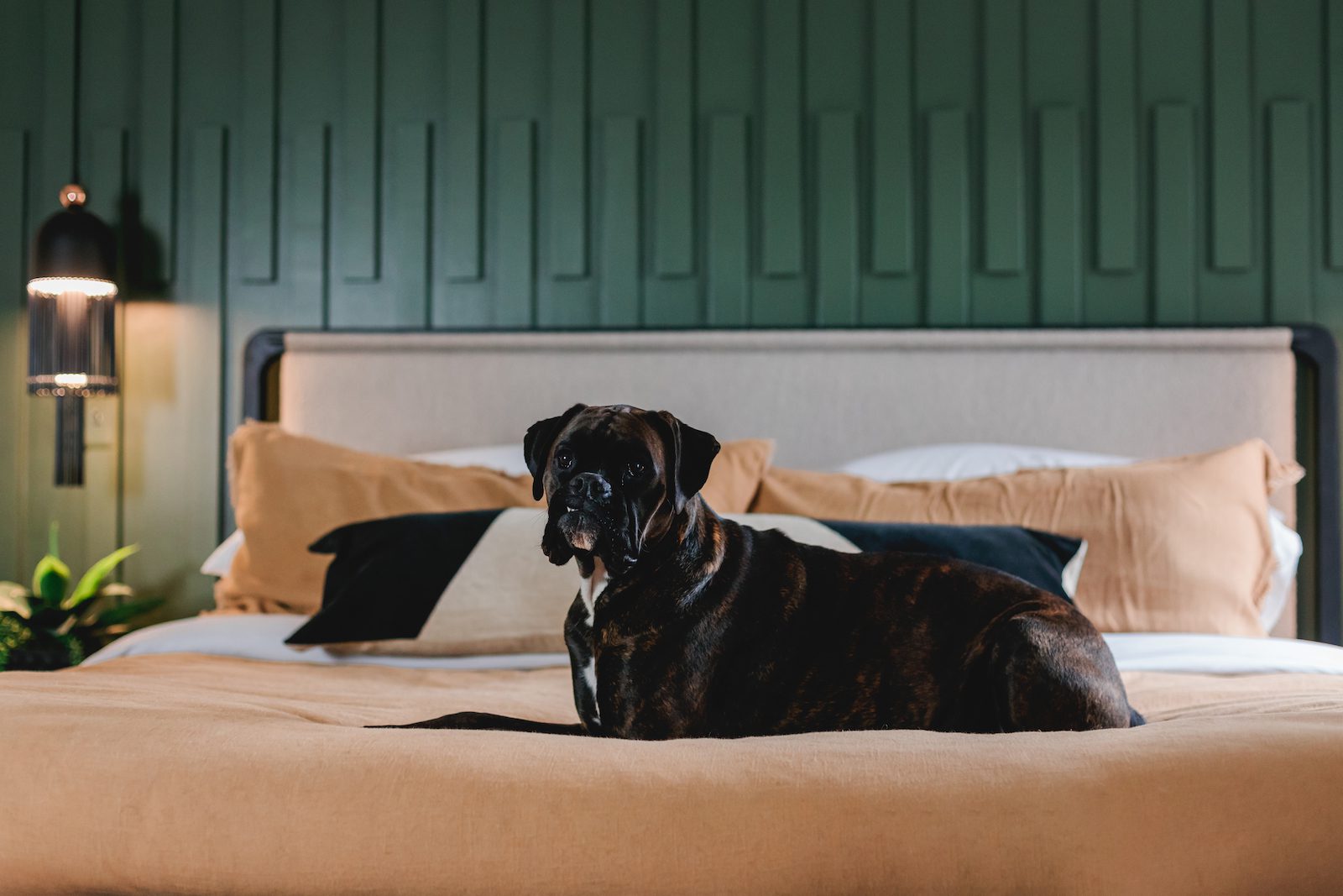
In Phase 1 of our three-phase approach, we focus on understanding our client on a deeper level—who they are, what they love, and what their everyday life looks like. Through this process, we discovered that our client has a passion for his dog, Sonny; the outdoors; and cigars and whiskey. This insight helped us clearly identify his masculine, moody aesthetic with mod touches and how we wanted to incorporate that into every room we worked in.
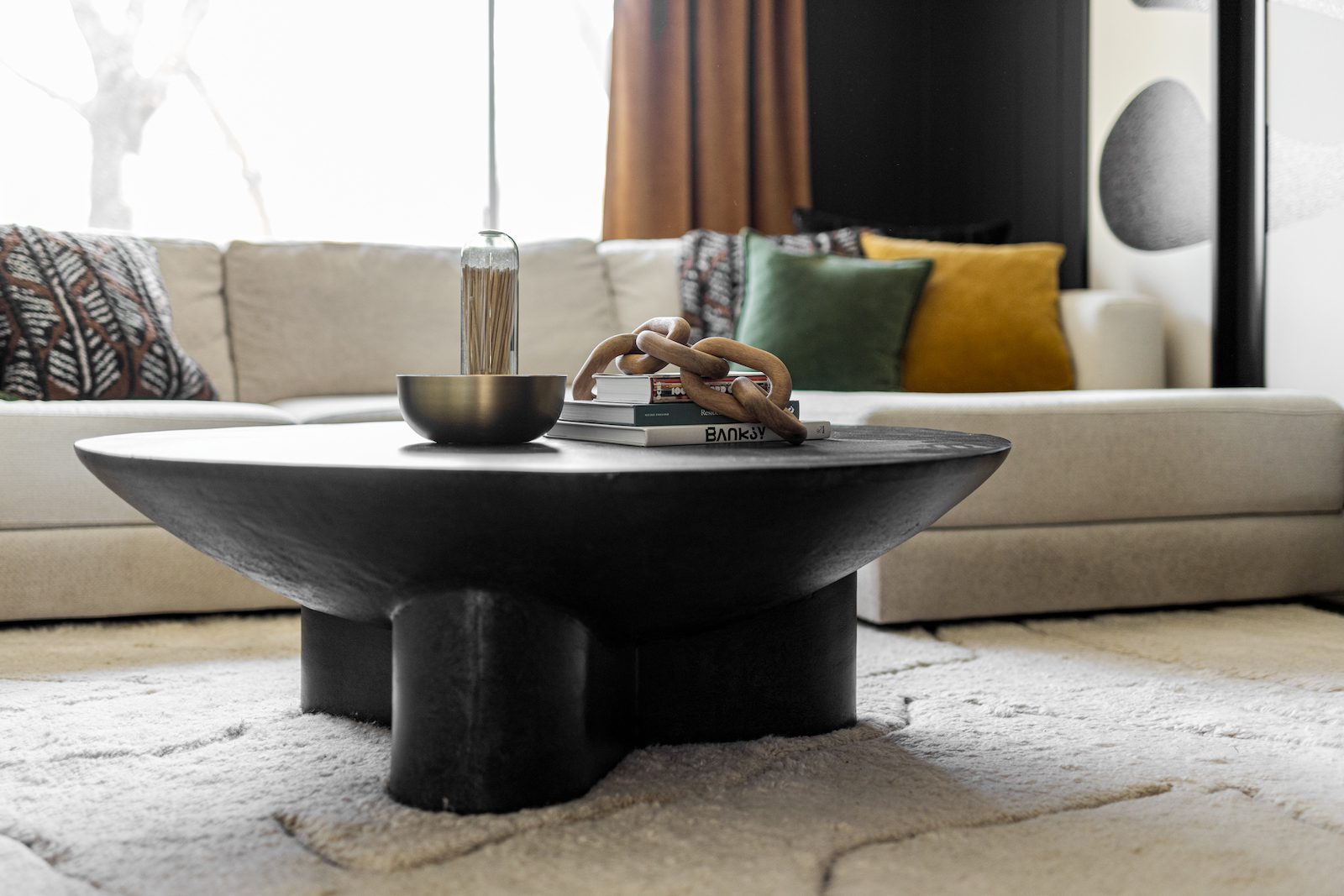
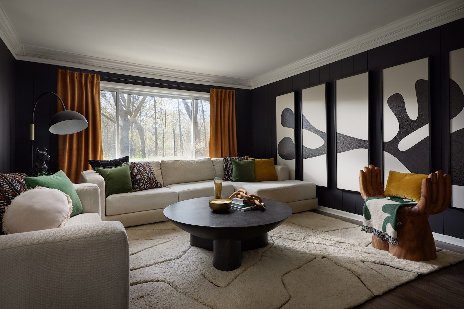
Beginning in the newly transformed living room, this space showcases how strategic design solutions can elevate your existing space to reflect your personal style. The previous space had good bones but was very bright and feminine, and lacked Nick's interests and personal style.
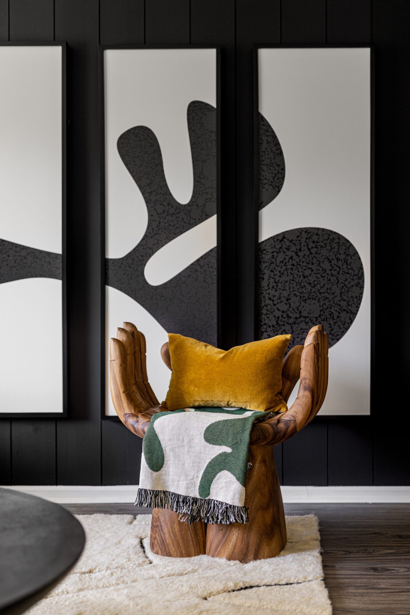
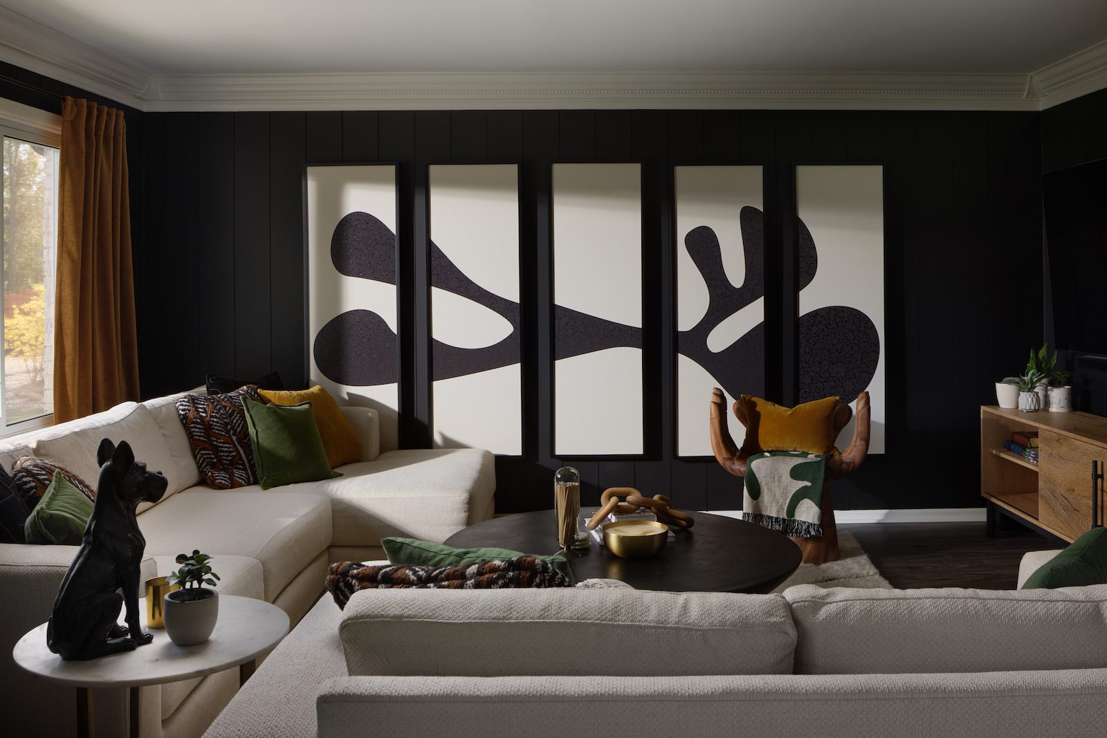
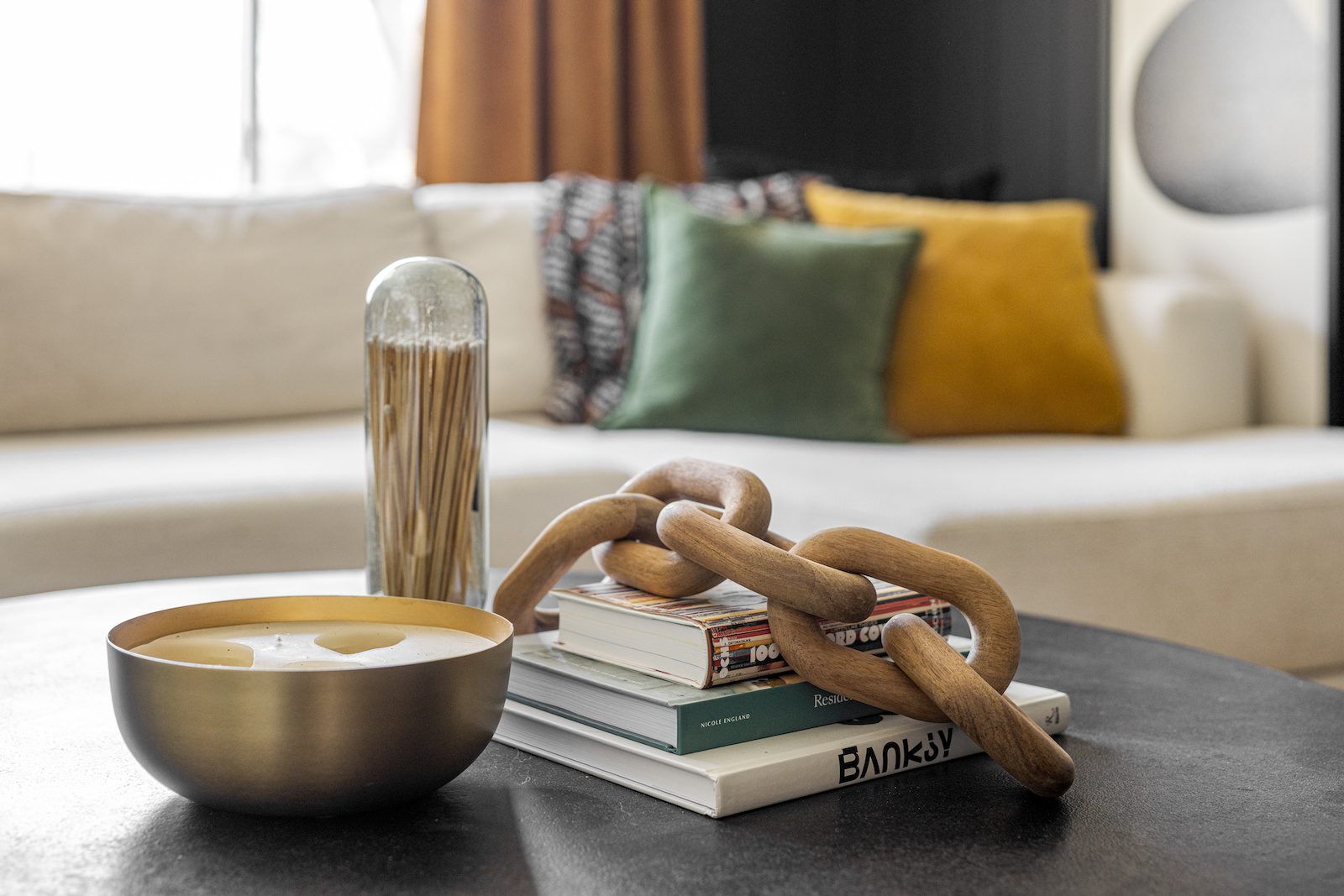
Because this was a Phase 1 & 2 project, we used furniture to make effective changes rather than structural solutions. Our first move was painting the white walls black to dial up the moodiness. We kept the existing sofas, rug and wall paneling but jazzed things up with warm oranges and greens in the styling—especially using the same warm orange drapery found on the first floor to tie the space together. Adding a dark wooden coffee table and a hands-shaped accent chair kept the room balanced. And let's not forget the star of the show—the oversized black and white art piece—bringing in contrast and a modern vibe. The existing black and white rug mirrors the organic shapes in the new art, adding another layer of mod and high contrast to the space.
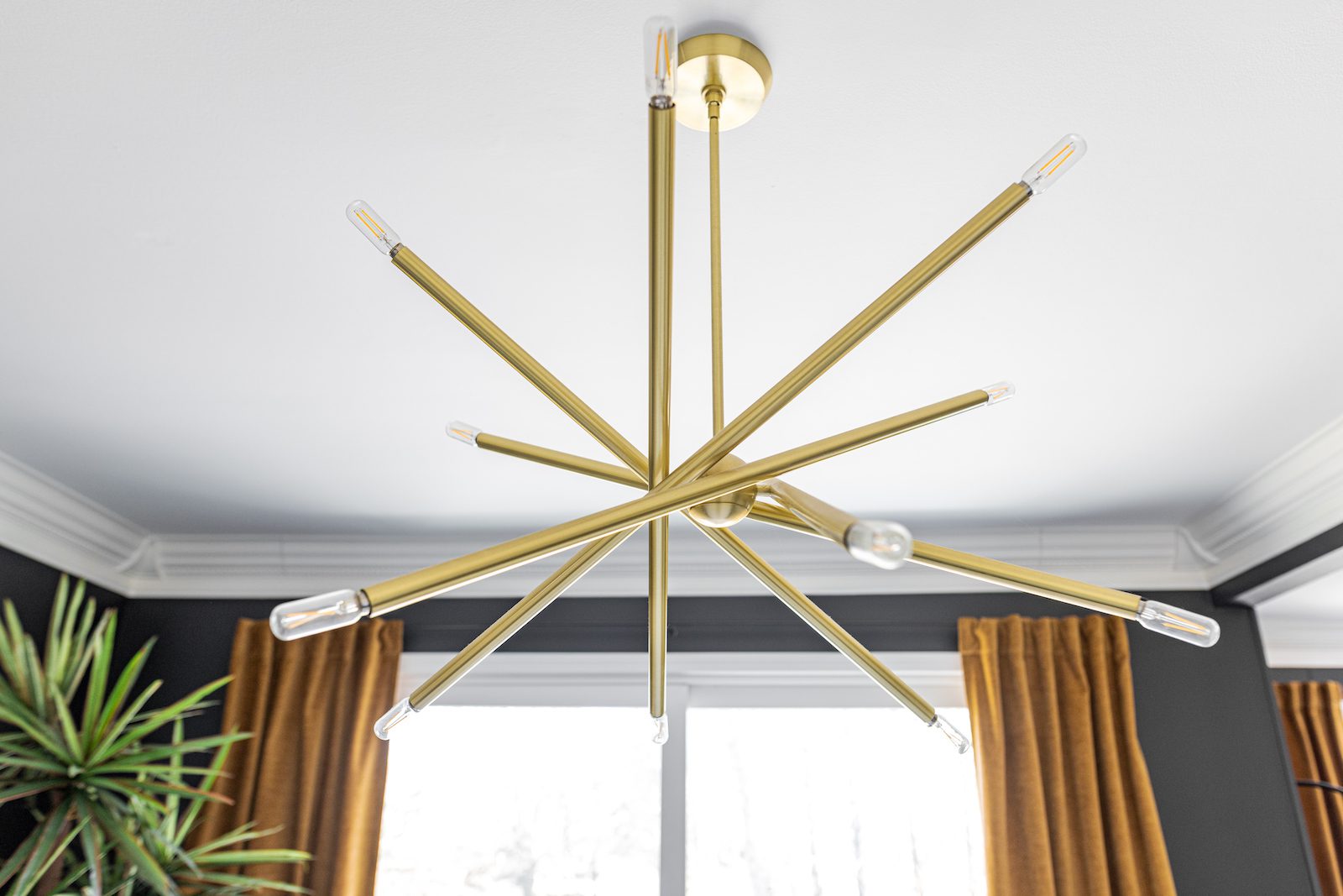
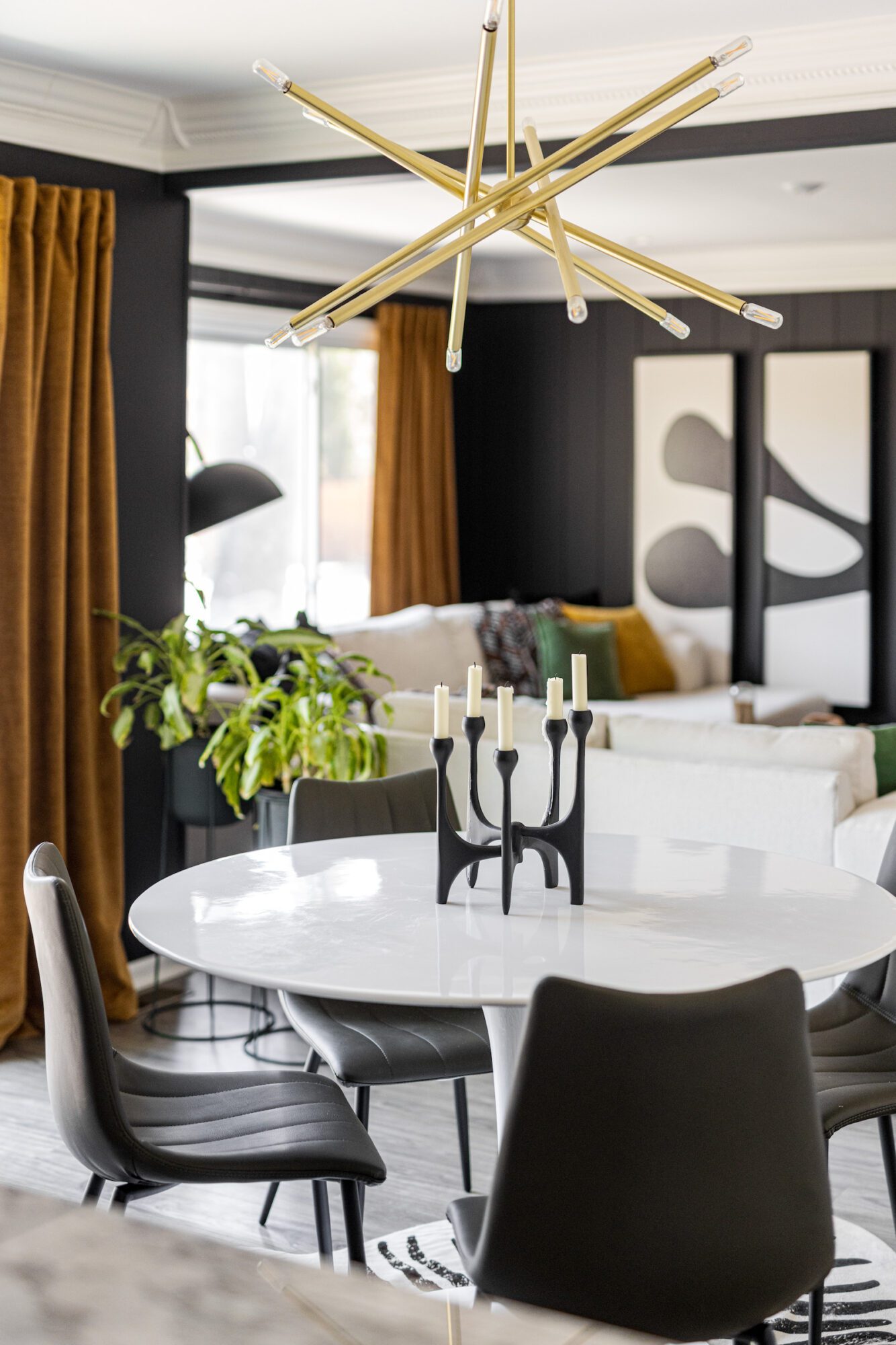
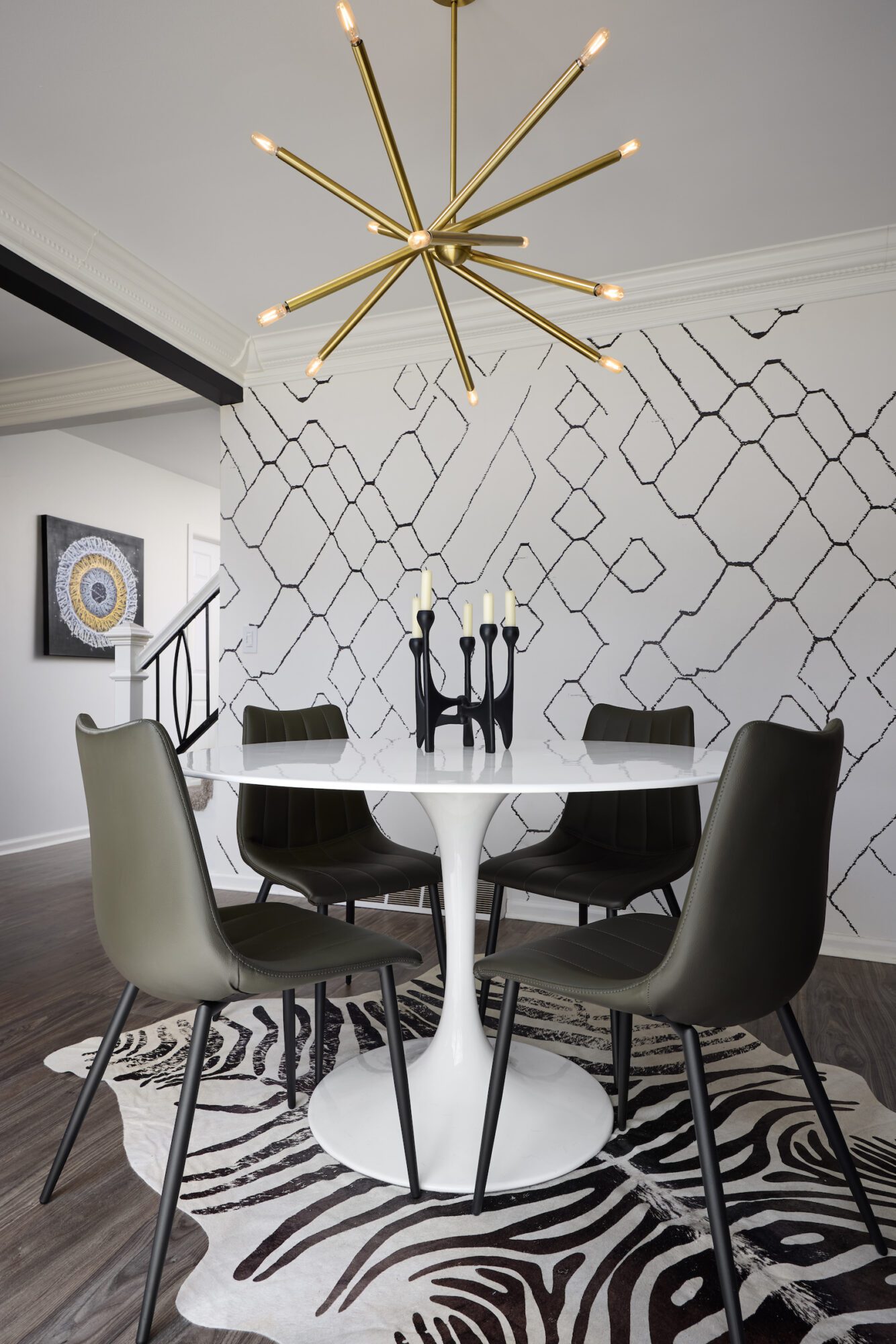
Just off the living room is the eat-in kitchen featuring black and white wallpaper and a hint of color and moodiness. We fell in love with the existing wallpaper by Sarah Sherman Samuel and felt as though it connected to the desired aesthetic. A simple swap of dining chairs, and a new rug to anchor the space created a completely new aesthetic.
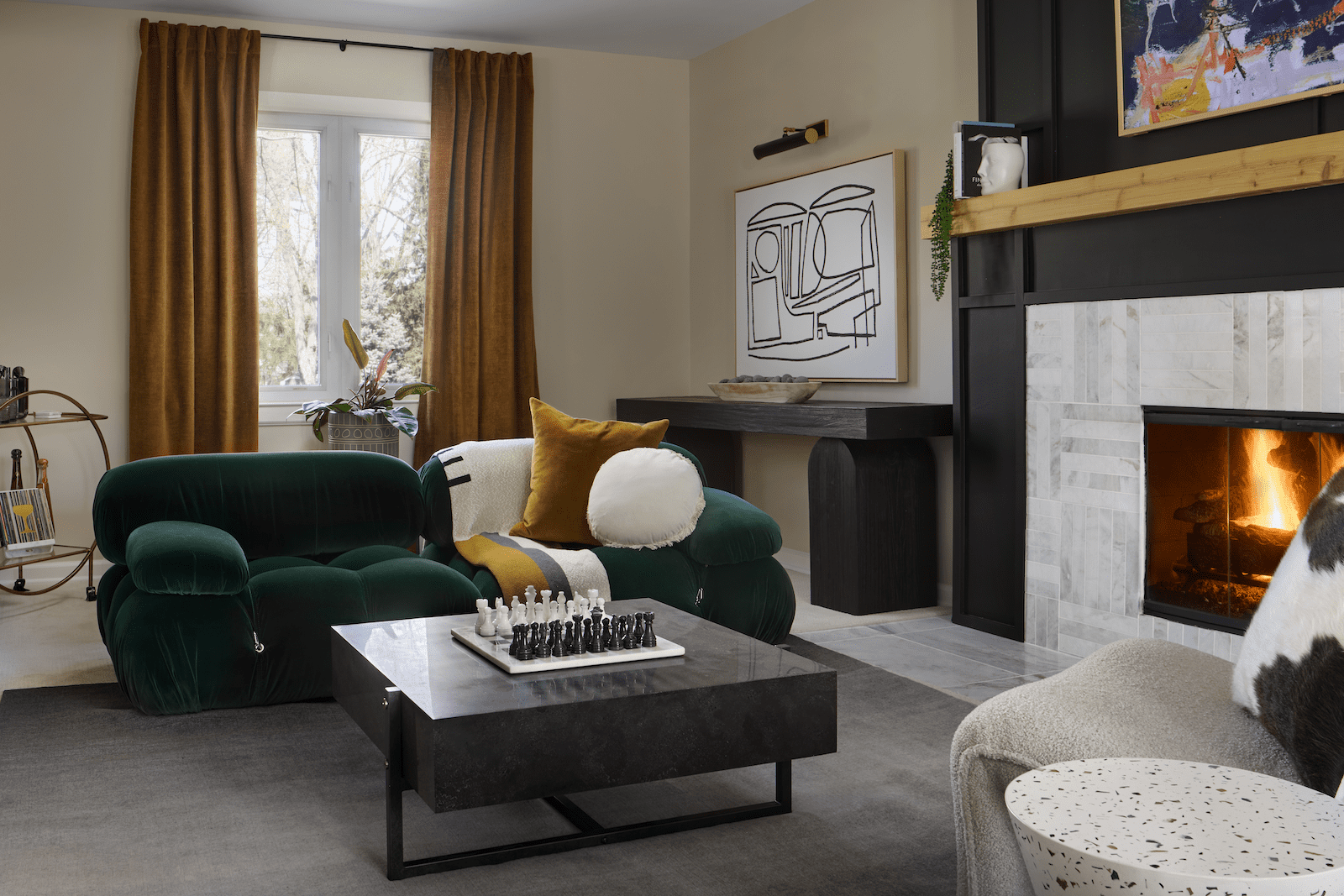
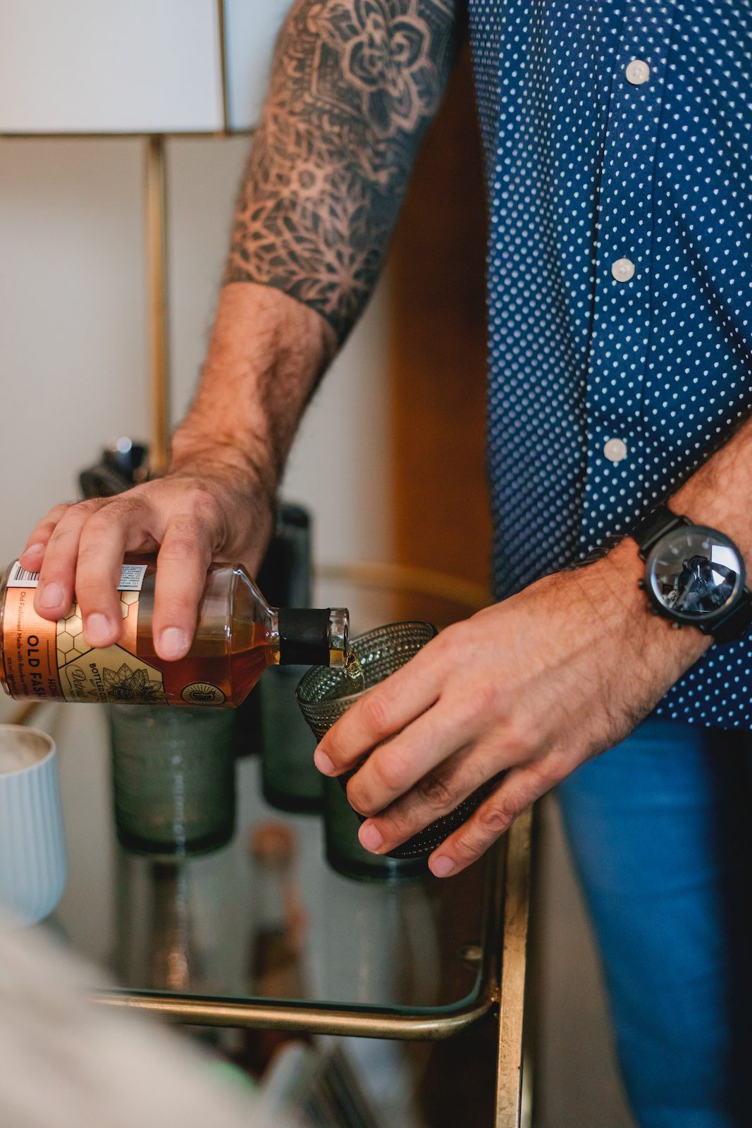
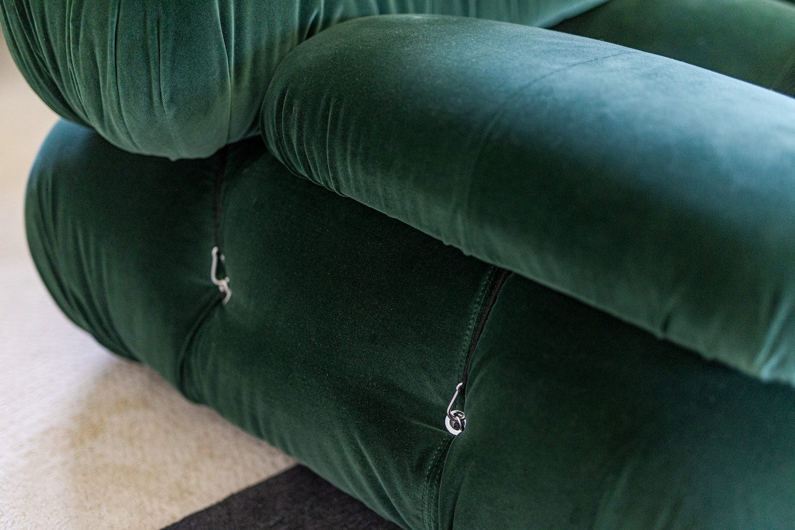
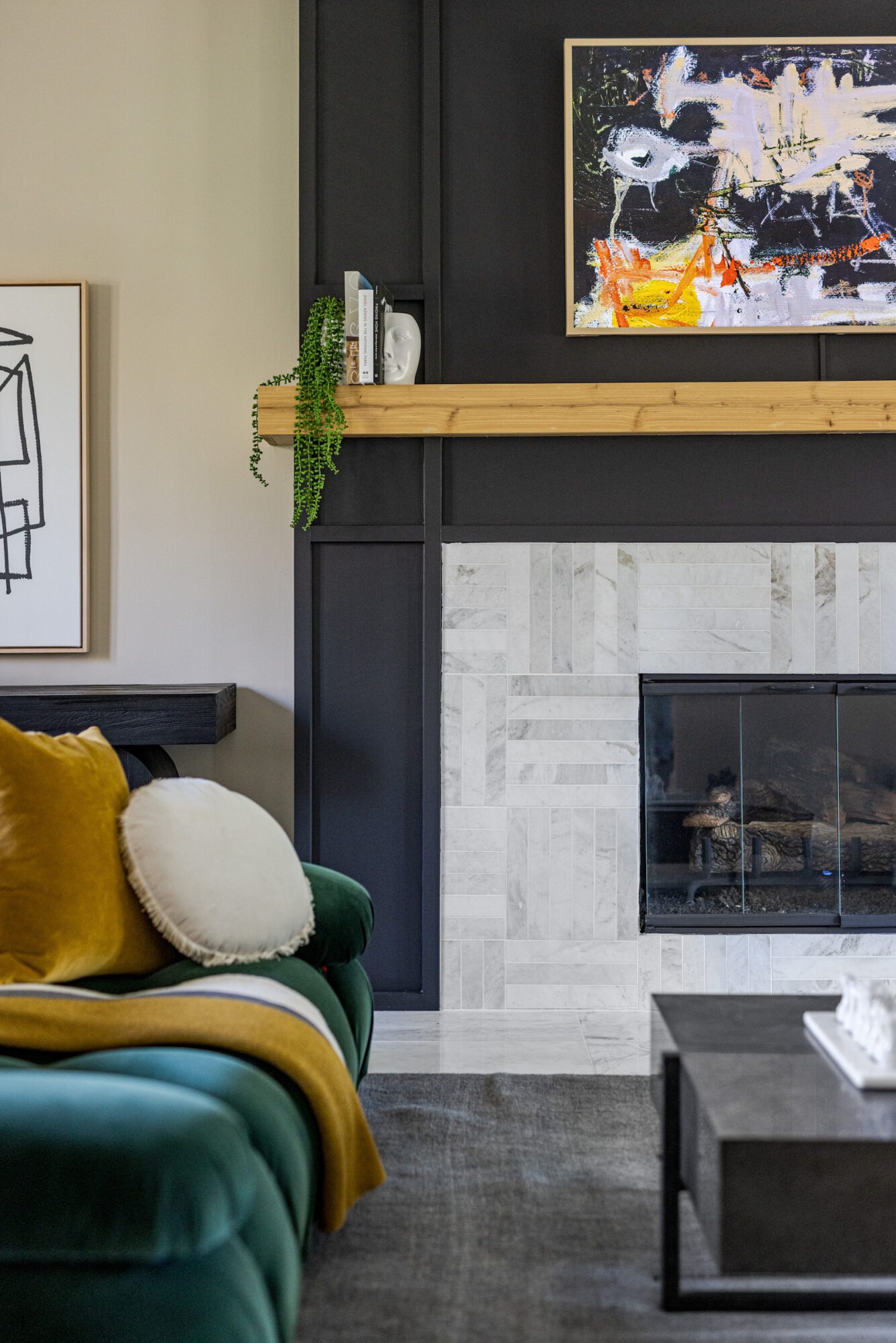
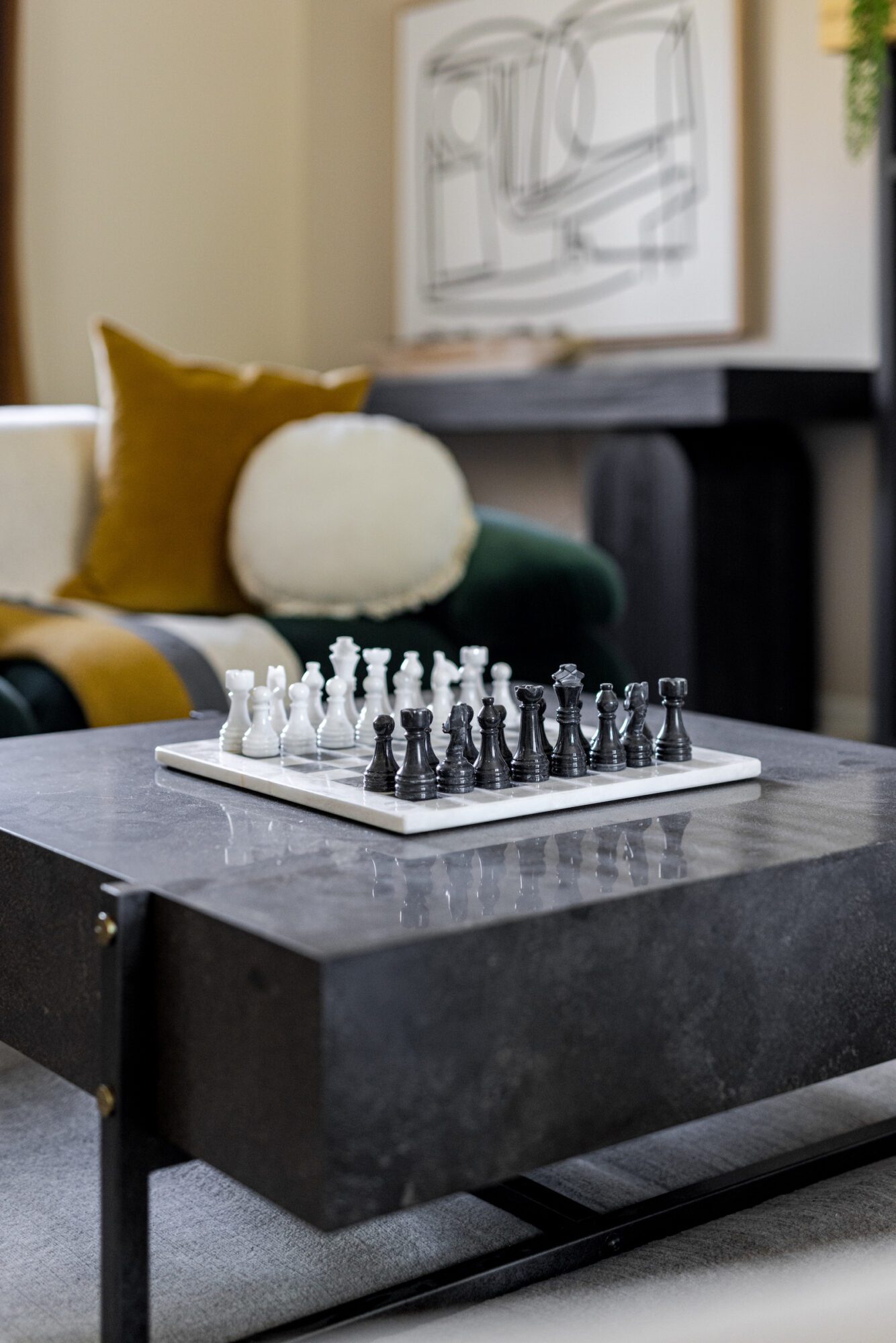
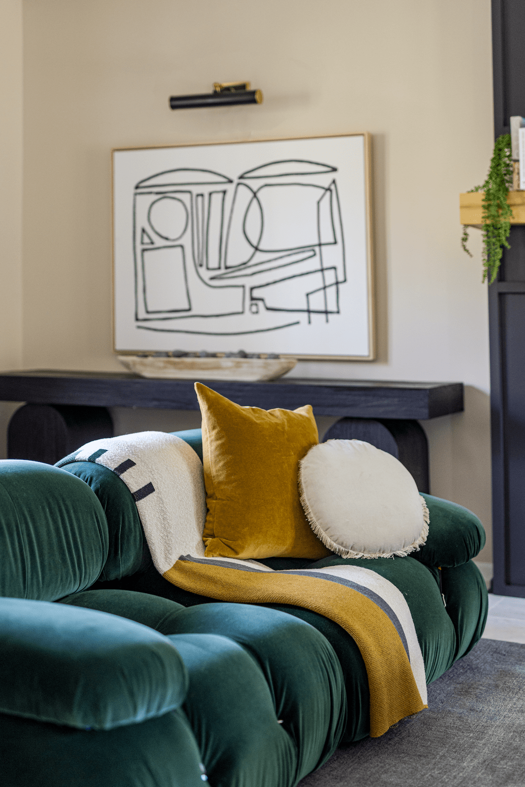
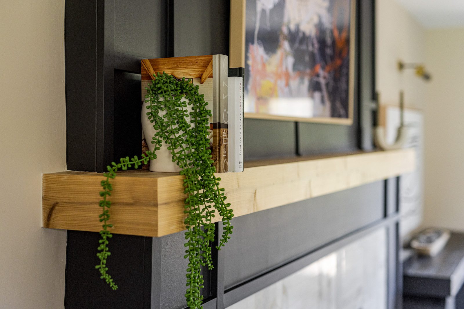
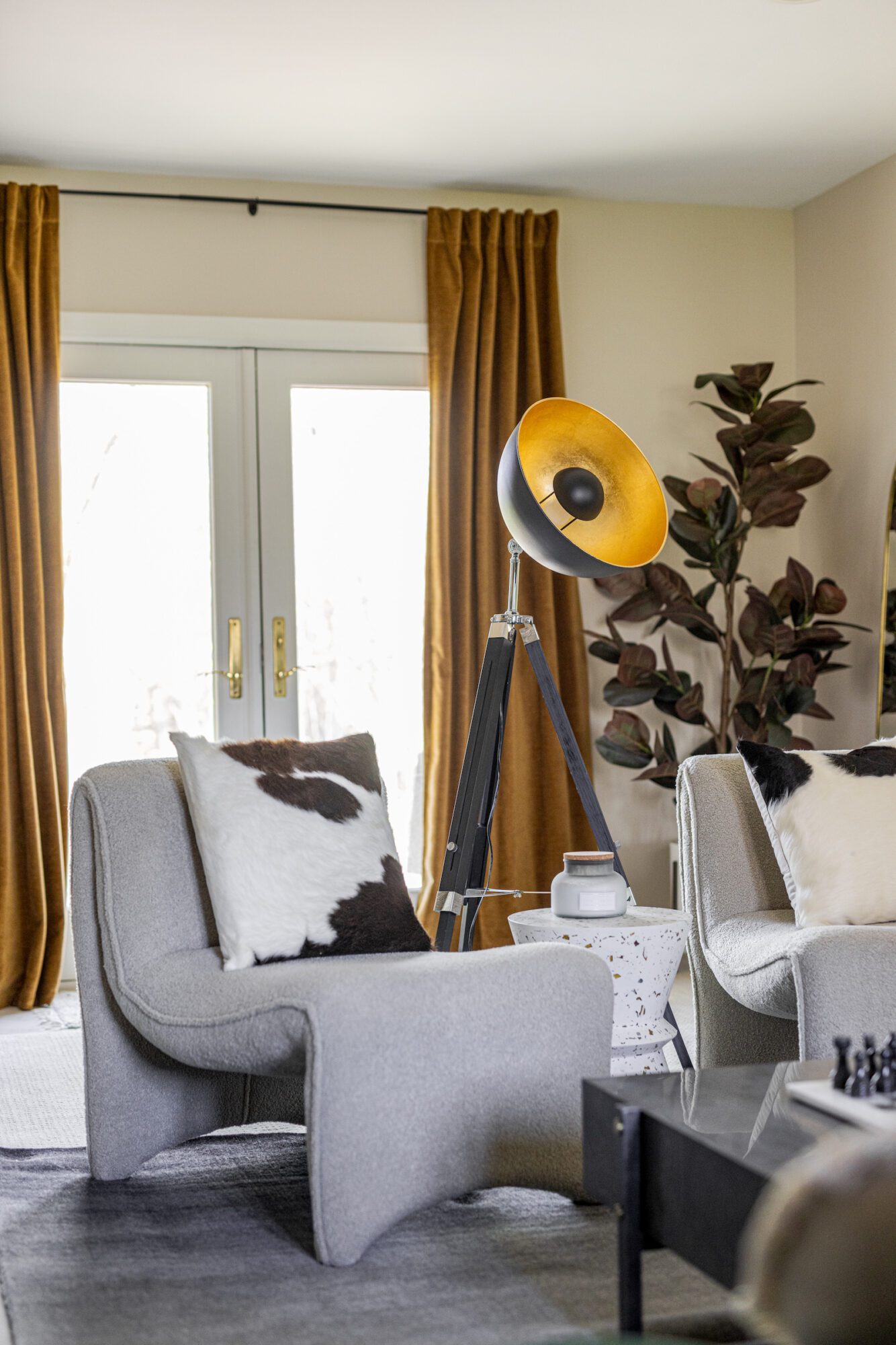
Now we enter the star of the show; the sitting room. The aim for the sitting room was to craft a dramatic yet cozy and welcoming space where Nick could entertain and savor Old Fashioned cocktails with his guests. Our approach included a careful reevaluation of the floor plans, and strategic furnishing changes. Previously one large space, this sitting room underwent a remarkable transformation. We centered the design around the fireplace, painting it black for a bold focal point. The walls received a fresh coat of warm neutral paint, instantly brightening the space. The addition of a new green sofa, cozy accent chairs, a sleek cocktail table, and dark wood credenzas completely revamped the room's aesthetic, creating contrast and incorporating Nick’s favorite design elements. To create symmetry, we purchased a matching piece of art to complement the one already owned by the client. Additionally, we utilized previously unused space behind the sofa by adding a stylish bar cart to maximize functionality.
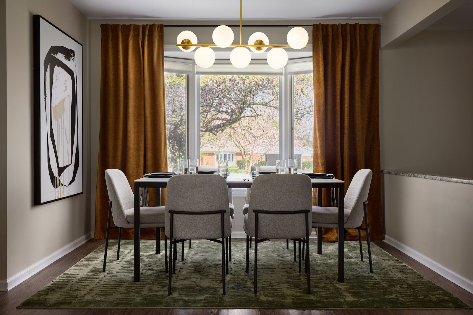
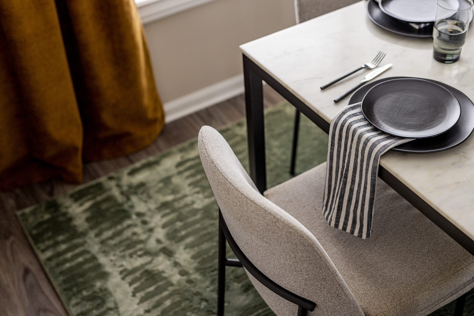
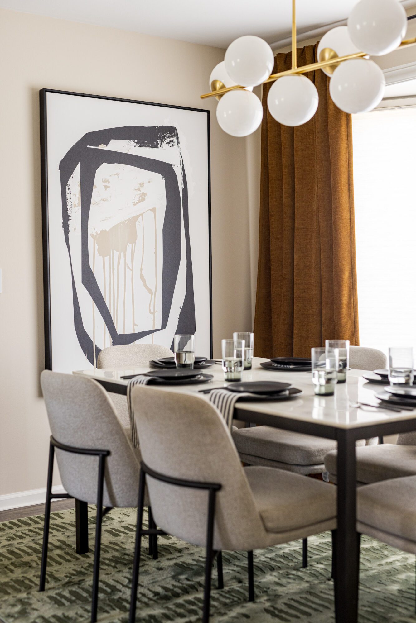
Now, let's step into another ideal spot for entertaining: The dining room. The existing dining table, chairs, and globe light fixture already blended seamlessly with the space's new style, so we continued the neutral color scheme from the living room. Graffiti-style art and the same orange panels seen throughout the first floor added a cohesive touch. We also introduced more green with a washable rug to harmonize with the green tone found in the nearby sitting room sofa.
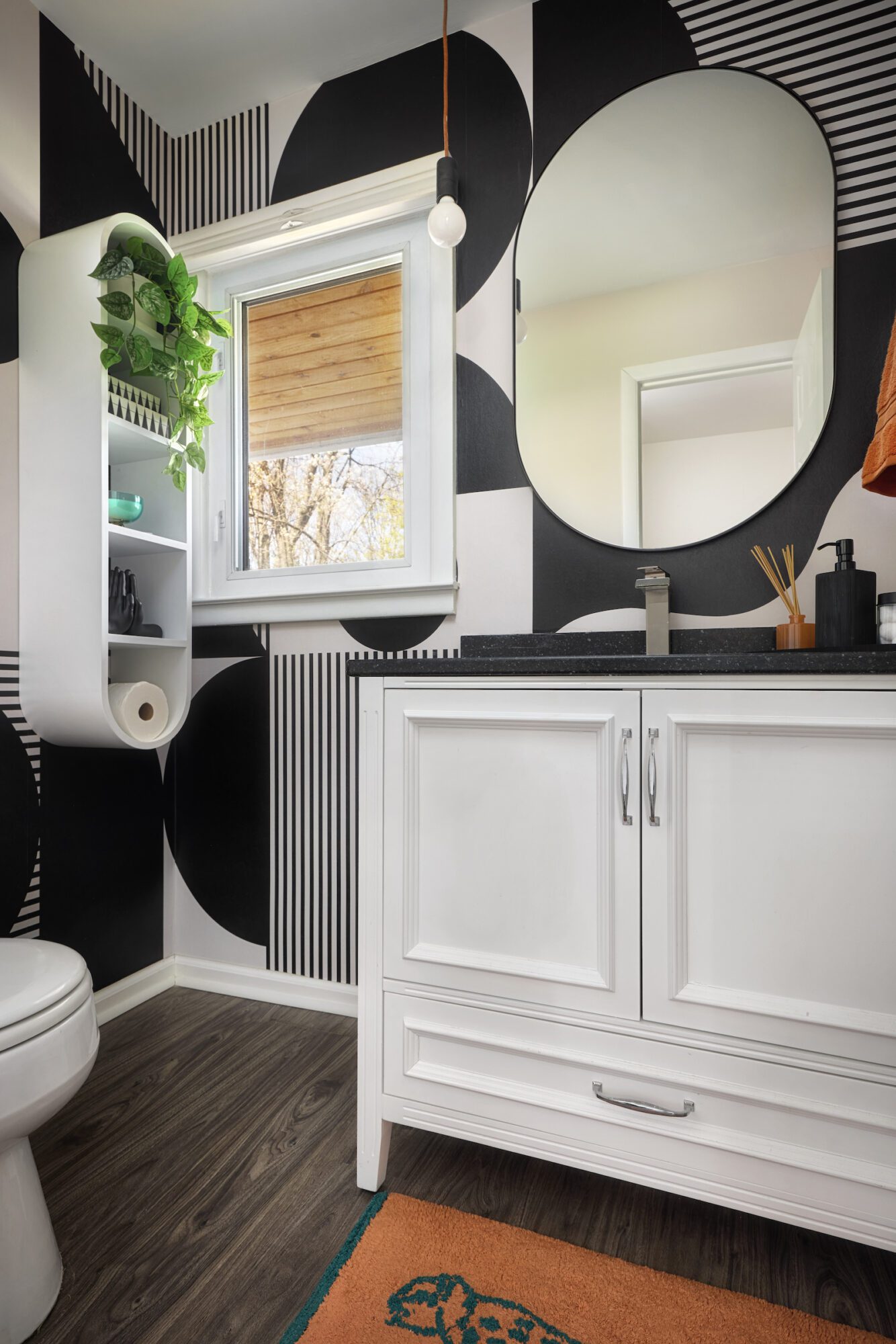
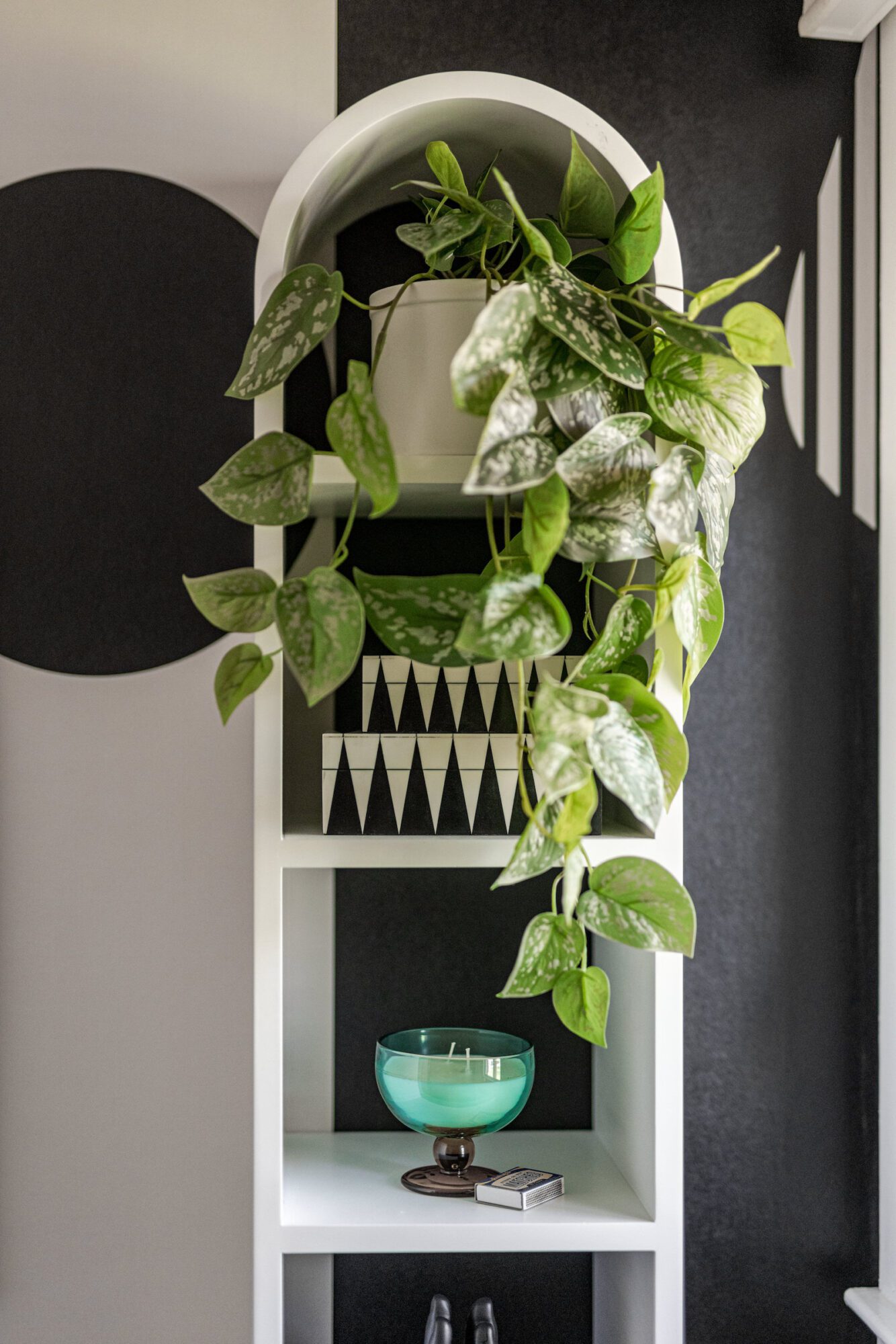
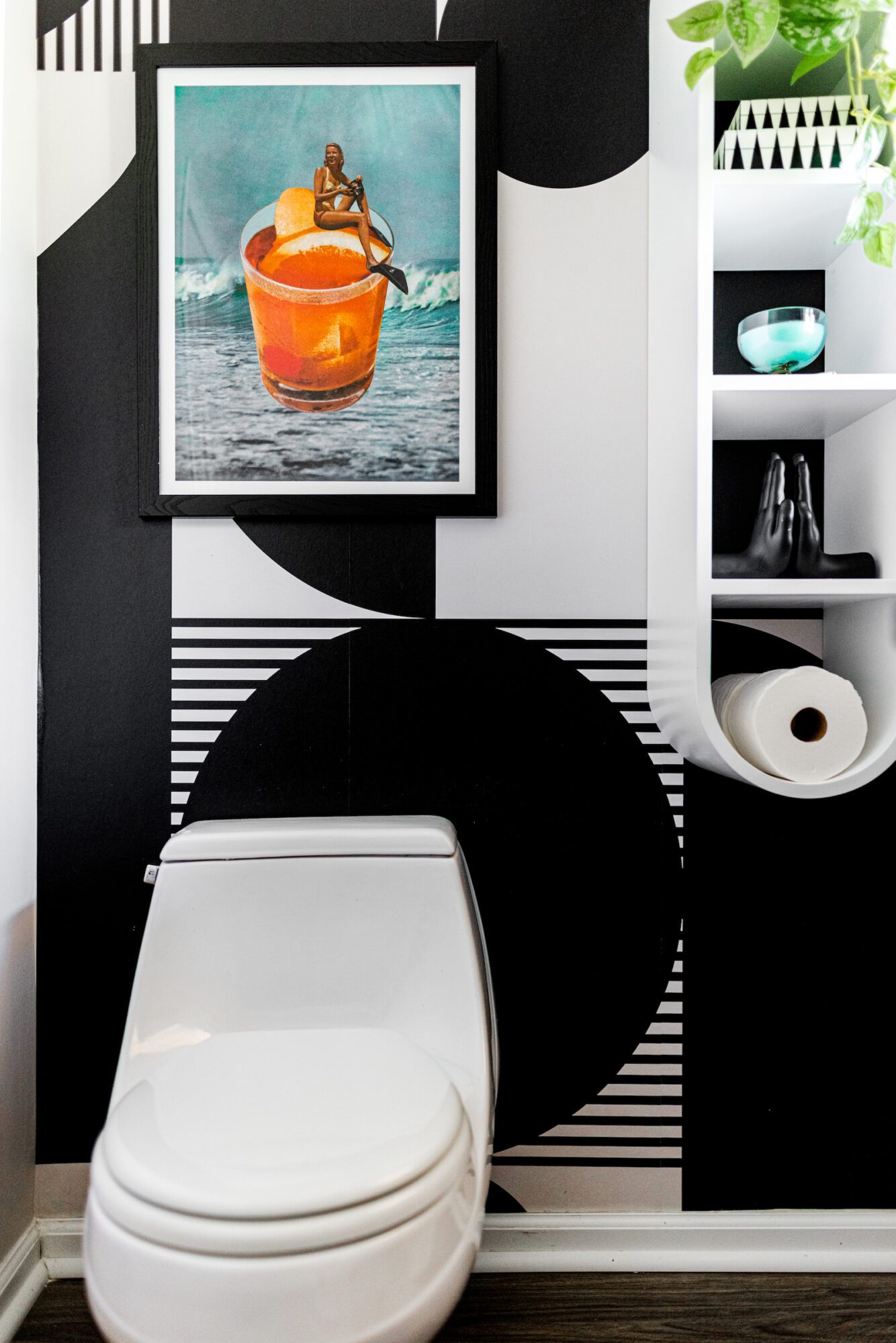
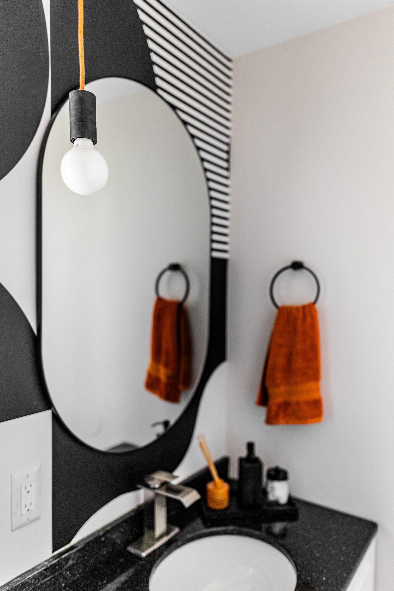
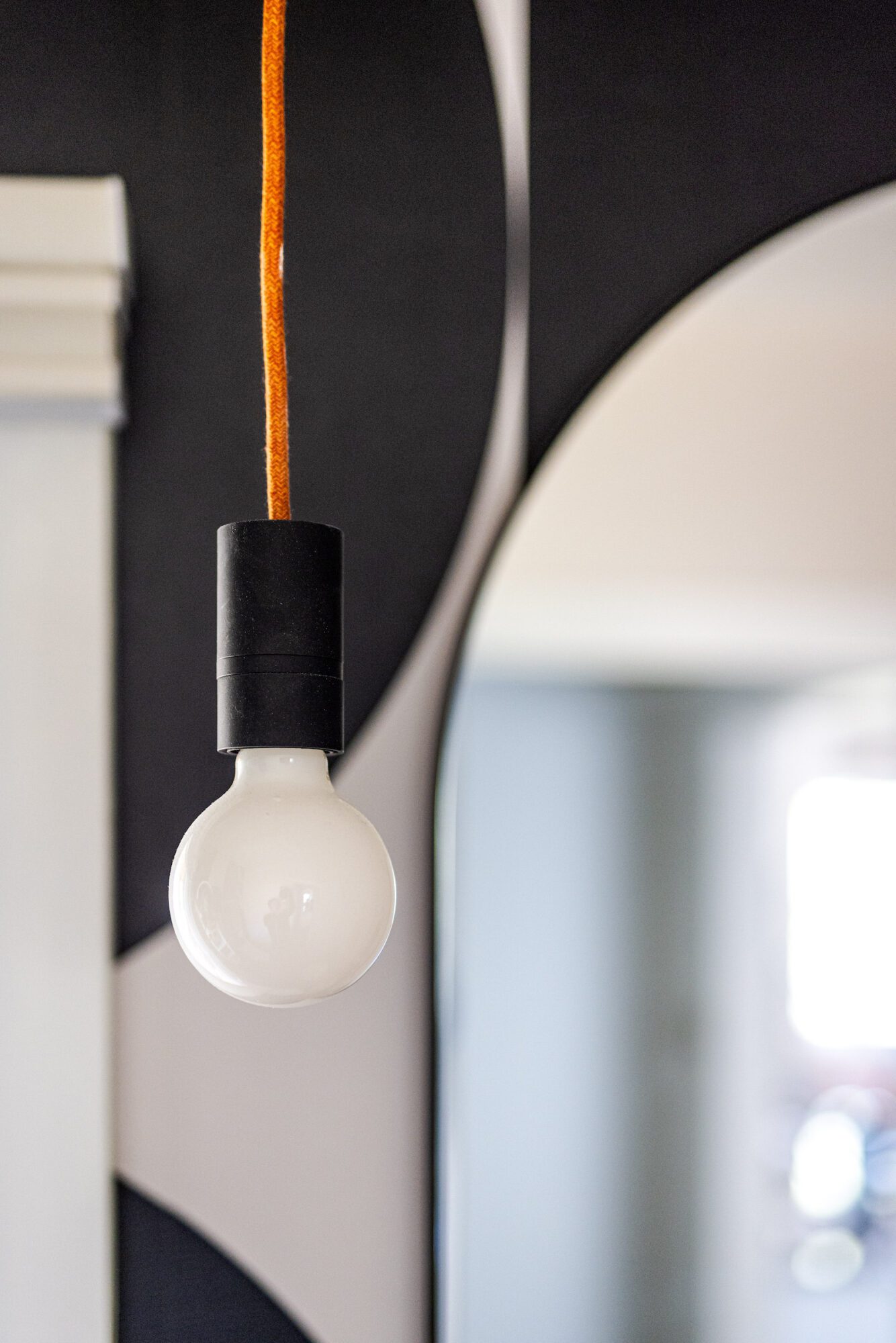
Right off the dining room is arguably the most mod room yet – the powder room. This space underwent a significant transformation, swapping its previous palm mural for a more intentional and modern look. We opted for striking black and white graphic mod wallpaper, featuring circles and straight lines for a bold aesthetic. To maximize space and echo the wallpaper's design elements, we installed a wall-mounted storage unit with shapes that mirror those found in the wallpaper. The room now exudes a cohesive vibe with its predominant black and white palette. Adding a playful touch, we incorporated a fun piece of art reflecting the client's love of whiskey. To tie everything together, we infused color accents from the cord of the light fixture, hand towel, and other styling elements, resulting in a powder room that's both stylish and functional.
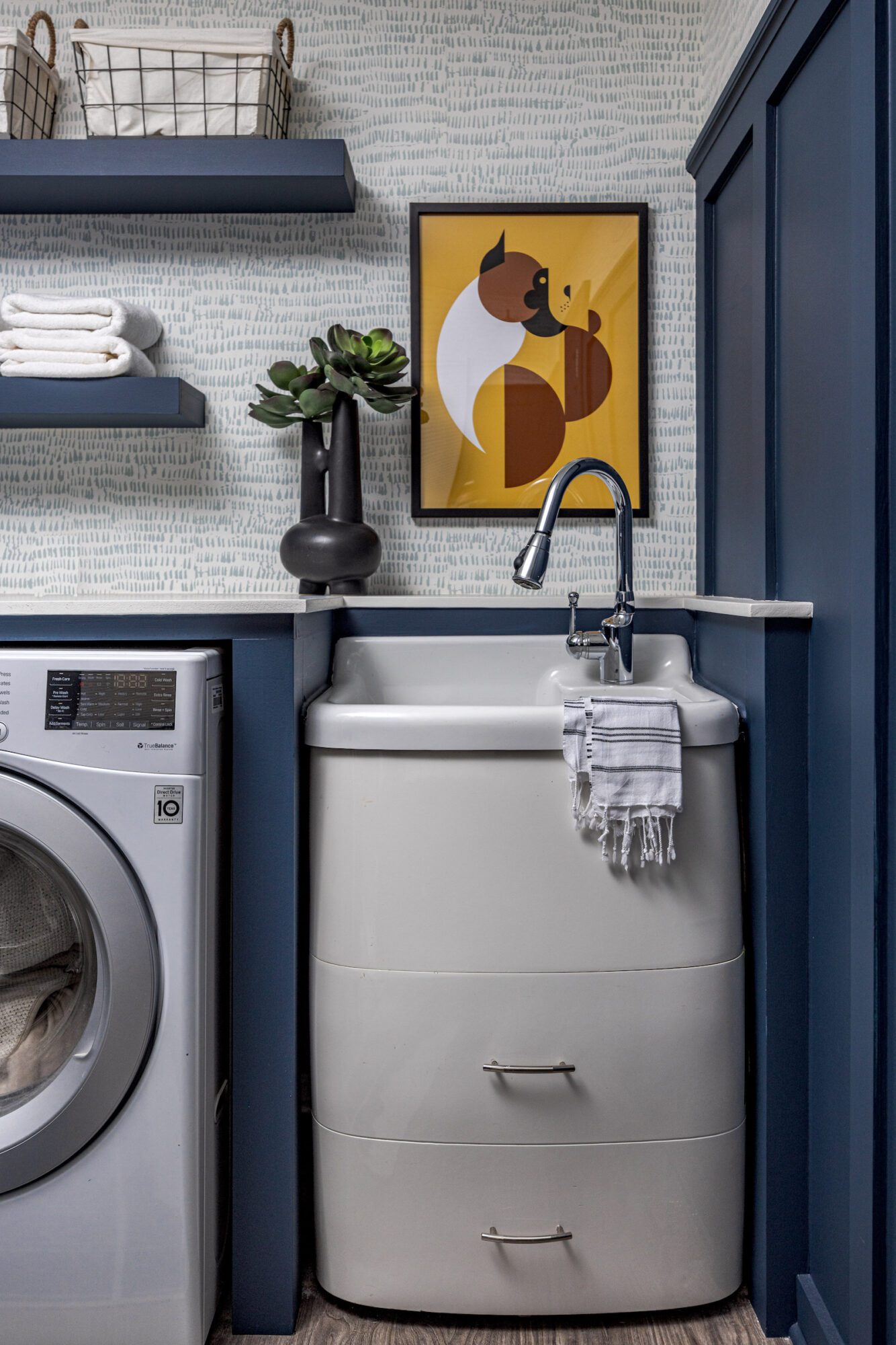
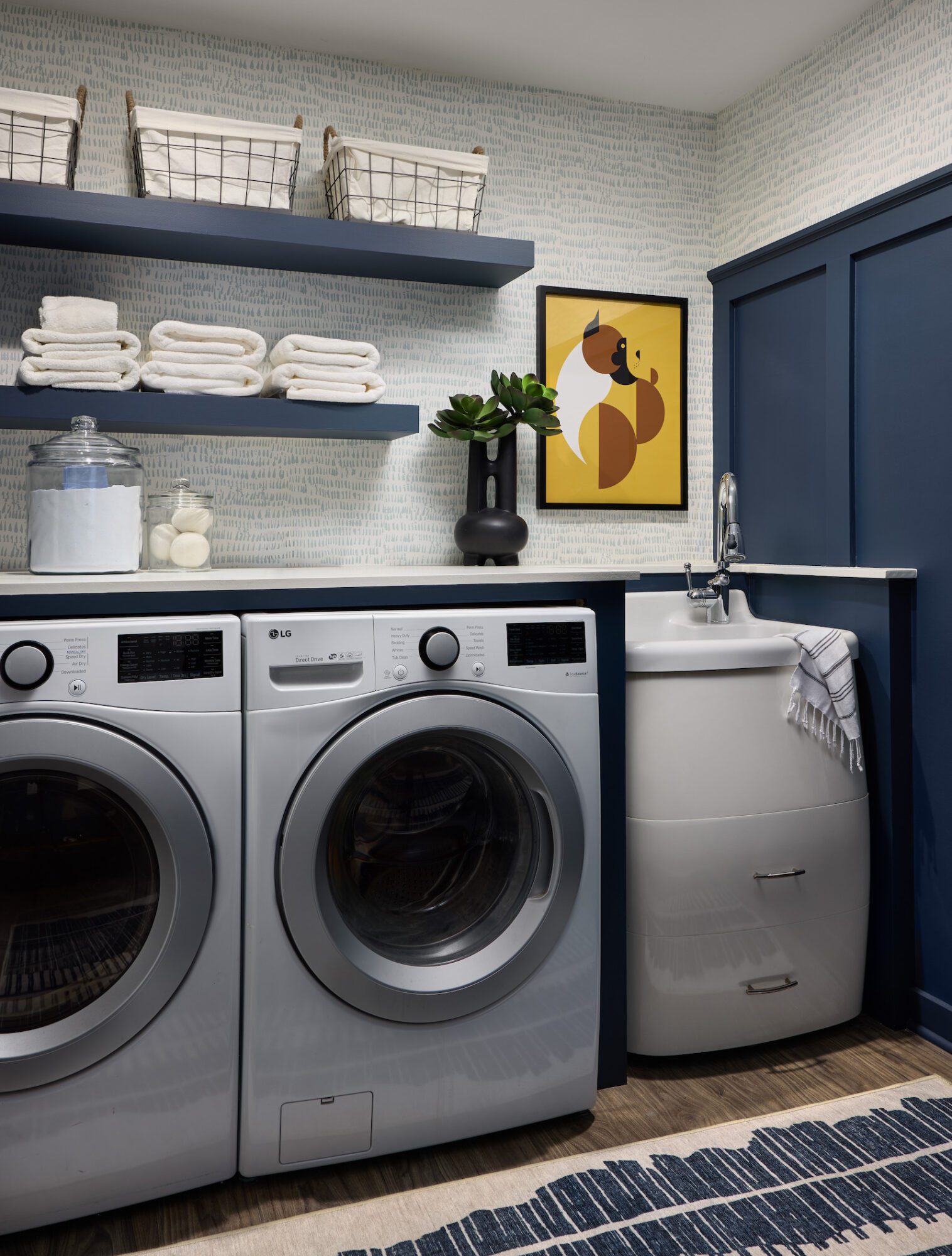
Before we head upstairs let's make a quick stop in the laundry room to see how simple paint and accessories helped to transform the laundry room. The existing design was very feminine with white and blue wallpaper, white floating shelves, and no presence of Nick’s personal style. To keep things cost effective, we suggested keeping the wallpaper and adding dark blue paint to the trim and shelves for a more masculine touch. We tied in more of the blue shade through the rug and added wire baskets for organization as well as a custom abstract mod art piece, which is a subtle geometric portrait of Nick's dog, Sonny.
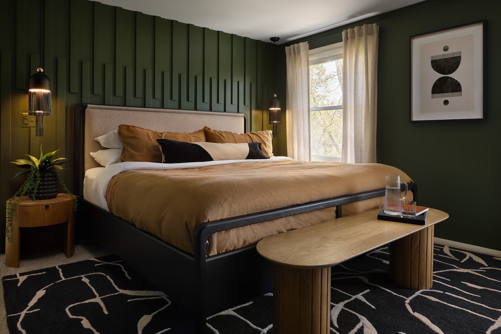
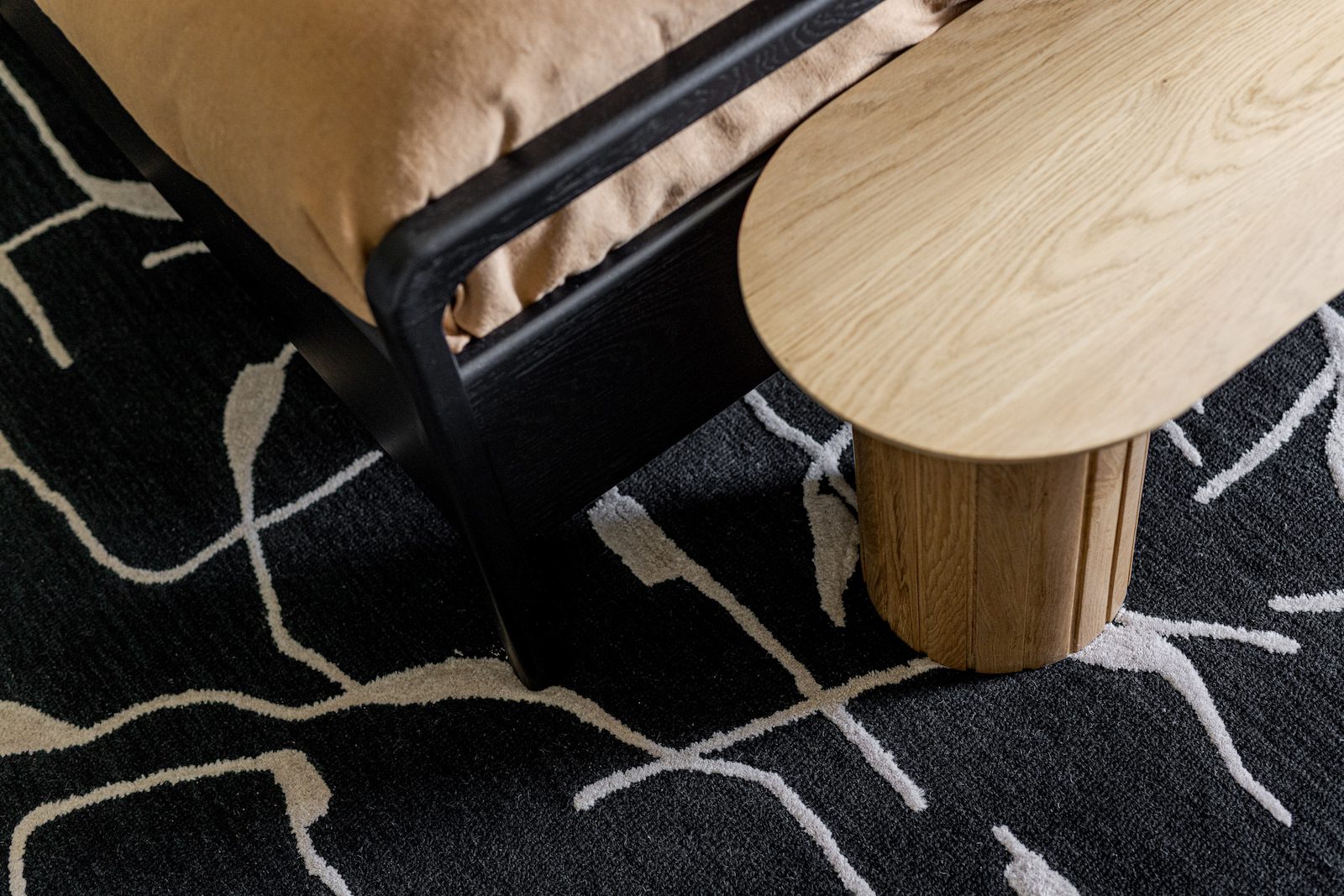
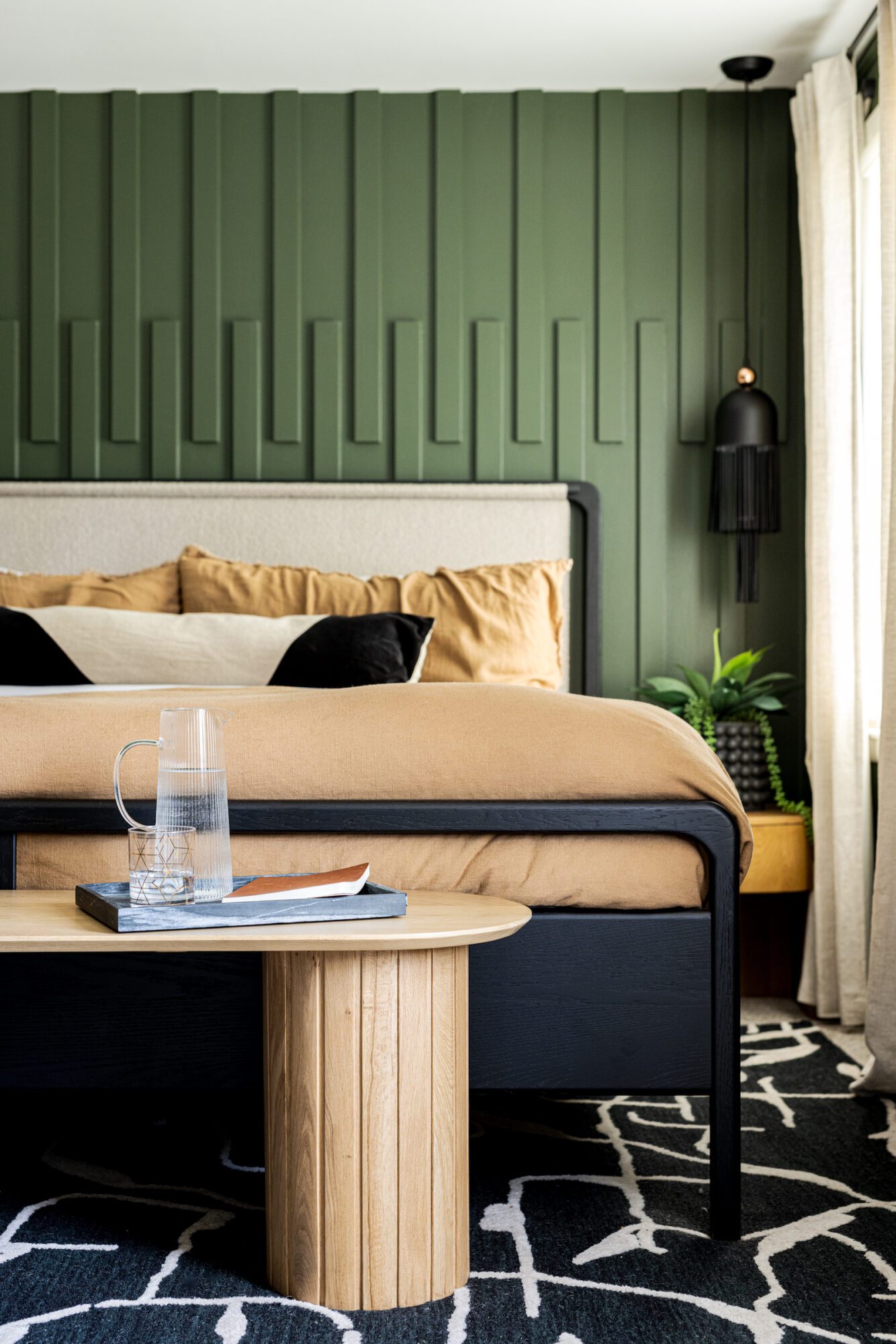
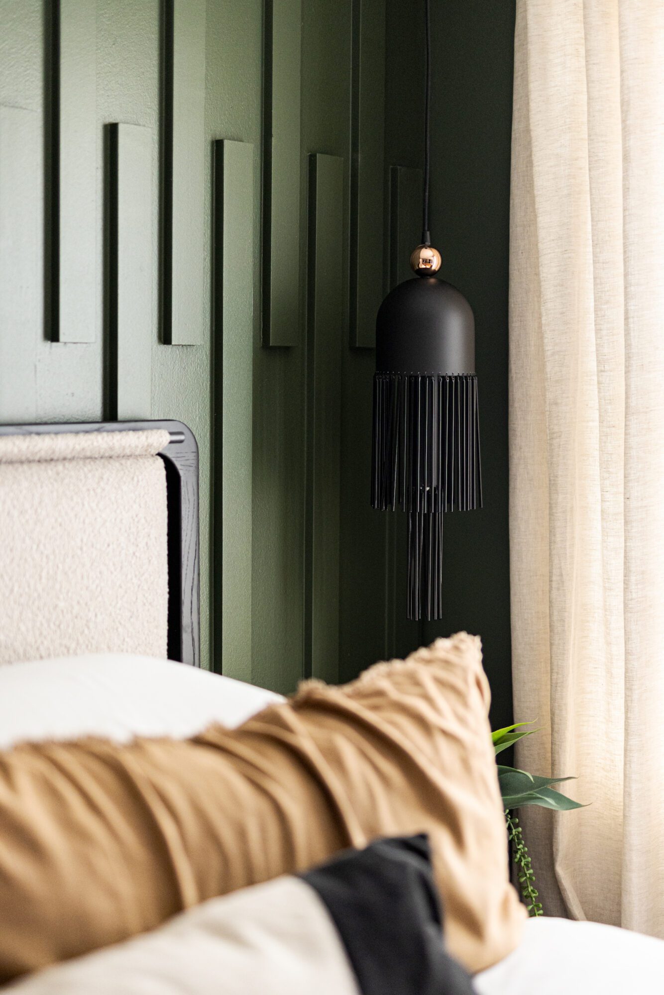
Upstairs is the final room we touched: the primary bedroom. Previously, only the trim wall was green, but we chose to drench the entire room in a warmer woodsy green shade to create a more dramatic effect. The previous pink, feminine bed was replaced with a sleek black metal and upholstered headboard, staying true to our color palette of green, burnt orange, and dark neutrals. To complement the deep green walls, we introduced burnt orange bedding for a pop of warmth. Inspired by the existing mod art that we found in the space, we sourced new light fixtures that played into the decorative shapes. Adding texture and contrast, we incorporated a black and white rug, anchoring the room's design. Circular nightstands and a complementary bench replaced their square counterparts, adding sophistication and cohesion. Overall, the primary bedroom now exudes a harmonious blend of masculine style and contemporary flair.
Embracing authenticity lies at the heart of this home's transformation. It's not just about updating decor; it's about creating a space that authentically reflects our client's true self. Every design choice, from the color palette to the furnishings, has been carefully selected to resonate with his unique style and personality. By embracing authenticity, this home became more than just a place to live—it evolved into a space where our client can truly be themselves and feel at peace.